

Task
To develop a corporate identity for the branding agency Refresh brand,
the main activity of which is the re-branding of already established brands.
To develop a corporate identity for the branding agency Refresh brand,
the main activity of which is the re-branding of already established brands.

Concept
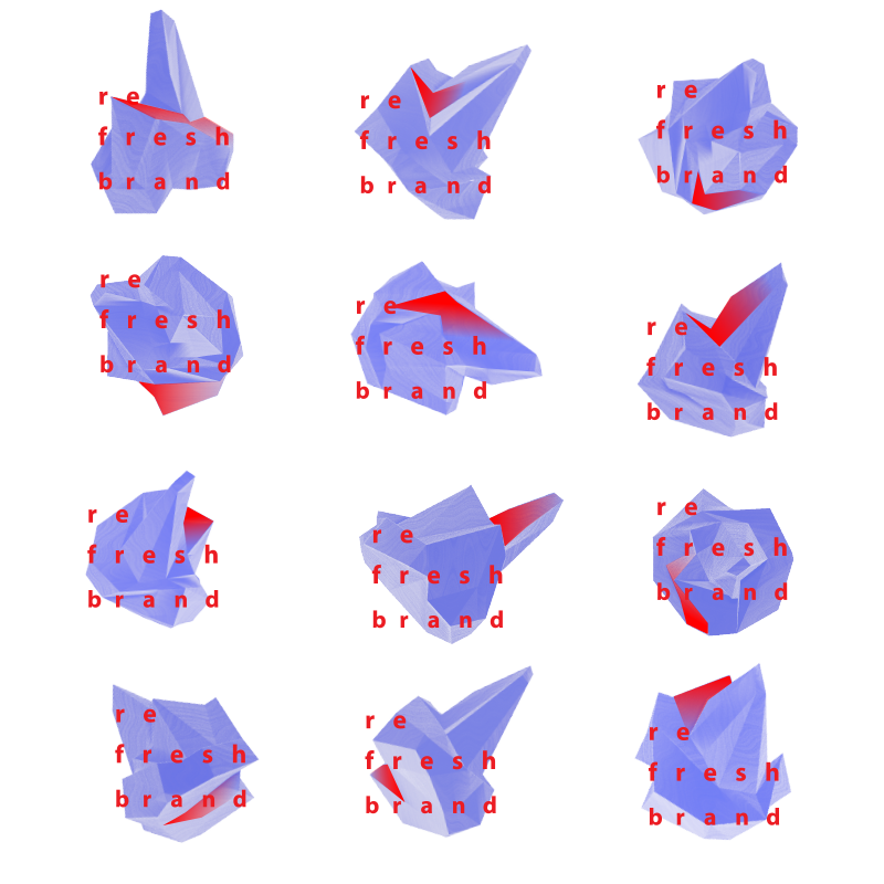
The essence of the brand of any company is formed on the basis of various factors that can change during the lifetime of the brand. But only the external "distilled" part, which determines the perception of the company in the eyes of the target audience is shown the potential consumer. This outer part can be compared with the tip of the iceberg, which has typical shape, while the body of the iceberg (array) is hidden under water. That’s why the image of the iceberg is at the core of the company's logo, which correlates with the main activity of the company - creation of an appropriate image of the brand. The image also correlates with the name of the company - it's hard to imagine something more refreshing than ice.
The essence of the brand of any company is formed on the basis of various factors that can change during the lifetime of the brand. But only the external "distilled" part, which determines the perception of the company in the eyes of the target audience is shown the potential consumer. This outer part can be compared with the tip of the iceberg, which has typical shape, while the body of the iceberg (array) is hidden under water. That’s why the image of the iceberg is at the core of the company's logo, which correlates with the main activity of the company - creation of an appropriate image of the brand. The image also correlates with the name of the company - it's hard to imagine something more refreshing than ice.

Logotype
The company's activity is to operate with images. The dynamic corporate style emphasizes this feature, namely its figural part will become dynamic - a corporate logo. I have designed a shape of the tip of the iceberg, then I made this figure dynamically rotate, showing different sides of the figure to the viewer.
Font: "The prefix “re-” means “repeat”, the repetition of the action.
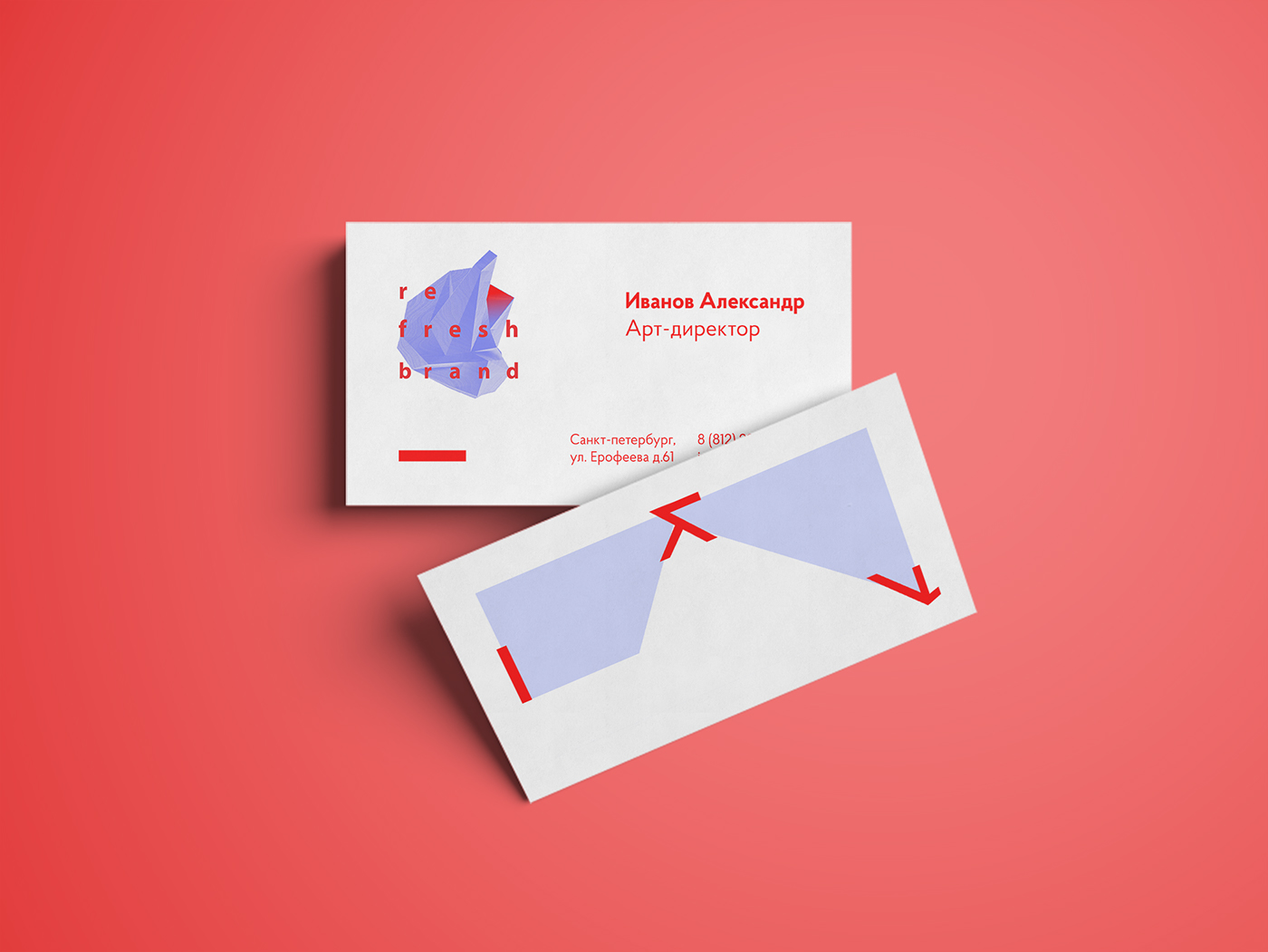
Identity
In the search for a graphic image I decided to turn to the ideological component of the logo - surfaces / cuts of the figure, but I tried to turn it in a different way, while preserving the overall harmony. After analyzing the structure of the figure and revealing remarkable collisions of surfaces, I found a set of symbols and shapes that are visually simpler, than the classic logo, but because of its dynamic nature it allows to create similar sharp compositions.
In the search for a graphic image I decided to turn to the ideological component of the logo - surfaces / cuts of the figure, but I tried to turn it in a different way, while preserving the overall harmony. After analyzing the structure of the figure and revealing remarkable collisions of surfaces, I found a set of symbols and shapes that are visually simpler, than the classic logo, but because of its dynamic nature it allows to create similar sharp compositions.


Thank you for watching


