


DISCLAIMER (This is a student project, not for commercial use)
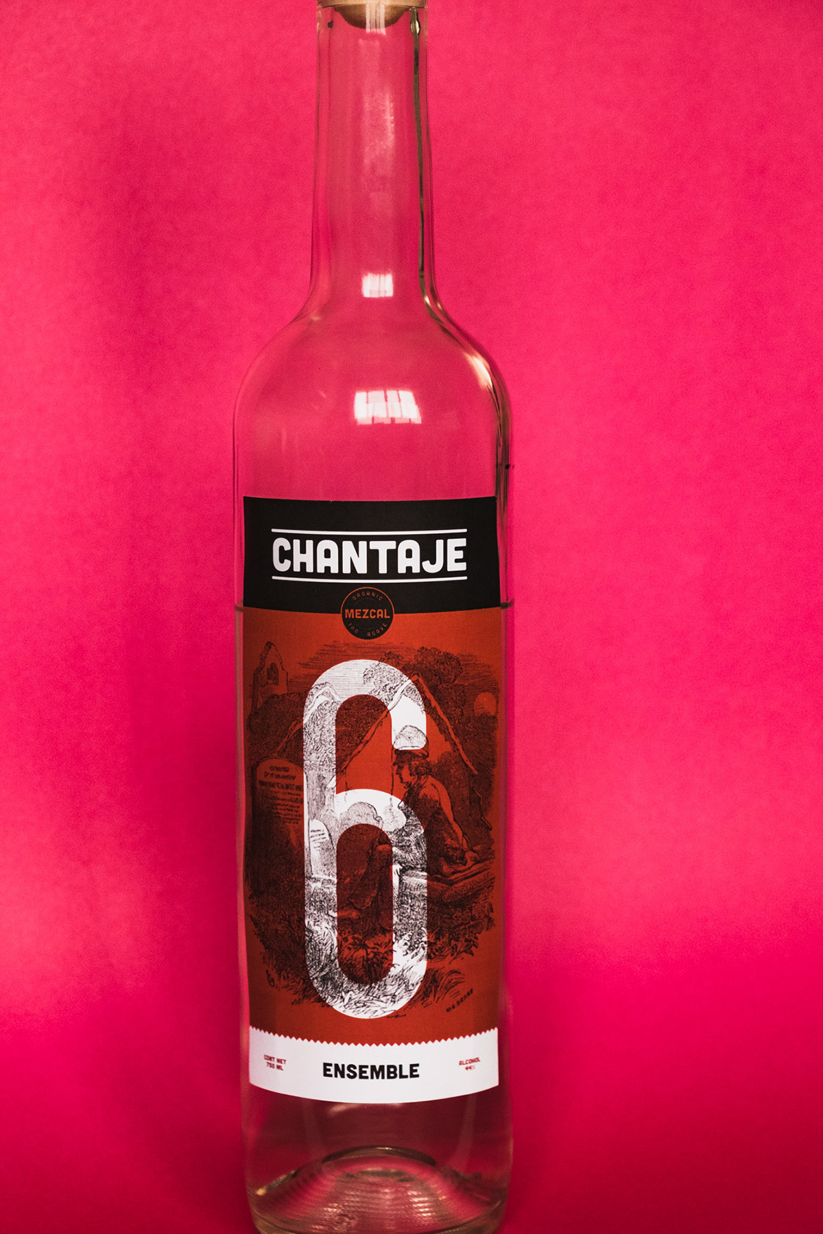
CHANTAJE is a rebranding direction of an independent manufacturer from Mexico. The current style of the labels were not designed for the American market and have struggled to grow. I took on this project because of its unique story regarding the owner. He comes from 5 generations of producing mezcal and took on the great undertaking of farming the agave, distilling, bottling, label design and distributing his product. The taste is rich and distinctive that I thought it deserved a label to match.
Looking at the current version, I knew that it had to be simplified down to its easiest appearance. After spending time looking other popular mezcals and tequilas, it was clear that this simpler direction needed contrast against the others to stand out. It shouldn't be too minimal that it looks like a minimalist poster and it shouldn't be peppered with decorative, illegible, cursive text like so many other labels. From my observations these are the two extremes, and with some thought, there could be some strong visuals that could be done.
Timeless elements of Mexican culture can be observed in their use of bright colors of textiles and ornate intricate illustrations by the Aztecs. There are 7 types of Meazcals that are sold by Benesin, so it was important creating a simple design that would be cohesive throughout all labels. I decided to use colors and numbers to make it easy and intuitive for customers to see the difference between each one. These are the results.