
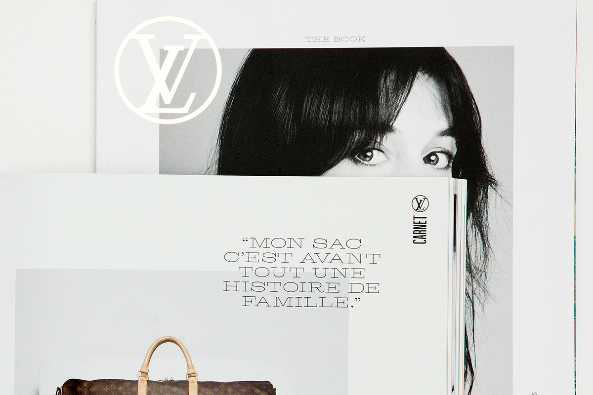


LV Clémence addresses the stylistic requirements of the Louis Vuitton magazine design while serving crisp titling on the publication’s slick coated paper. The typeface is a slab serif design with an extended width that allows headlines to stretch across spreads. It has features typical of the Clarendon classification, with frank and large square serifs and an almost monolinear contrast.
LV Loys Sans Condensed is a single-weight sans serif design that flexes three different uppercase heights: normal full height, an intermediate height between uppercase and lowercase, and a “unicase” height aligned with the lowercase. The purpose of this unusual feature is to allow for various uppercase/small cap mixes, with effects ranging from basic all-caps to more engaging settings. A mix of the three heights can be used within a short sentence, allowing for the harmonious mingling of sizes without having to resort to scaling.
Read more on Production Type website.


