
DXB202: One Image Per Day
Week 1: Inspiration

(c) Jemma Salume 2017 [Source: http://oxboxer.deviantart.com/art/Chill-677308109]
Jemma Salume
Jemma Salume cleverly uses geometric shapes and muted colour palettes to bring harmony and balance to their work. Their style is minimalist and modern, utilizing pops of bright colour and sharp, dark lines for contrast and harmony. This artist unique style and effective use of shapes has influenced my own digital artwork, in which I aim to replicate their sense of harmony through symmetry, simple shapes and aesthetically pleasing colour palettes. Much like Jemma Salume, I enjoy challenging myself by using restricted colour schemes with complimentary and contrast colours, often using unexpected colours to surprise viewers and to add interest. Throughout this project, I hope to be able to utilize and improve upon my own style, experimenting further with materials and mediums I am not very familiar with, such as photography, installation pieces and collage.
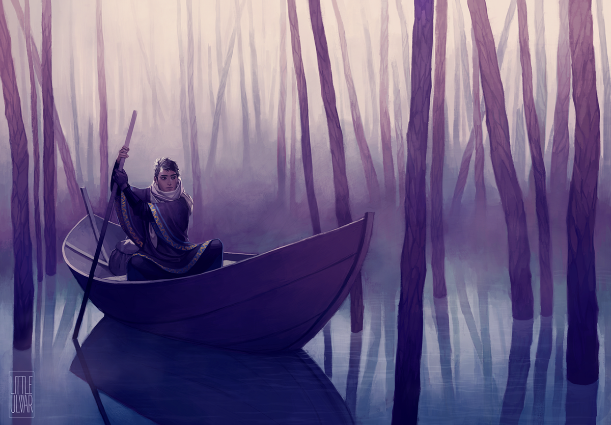
Katarzyna Ulvar Bekus 2017 (c) [Source: http://littleulvar.deviantart.com/art/what-aboat-that-672924299]
Katarzyna Ulvar Bekus
This artist first introduced me to the complex world of digital paintings, and inspired me to develop my own technique. Through her use of lighting, contrast and restricted colour schemes, each painting appears to tell a story, inviting the audience into their unique and mysterious world. Despite her painterly style, her brush strokes are sharp and clean to add texture throughout the illustration. Bekus also demonstrates particular attention to detail, illustrated by their complex fabric patterns and the texture of the trees.
Week 1: The Passing of Time
Images as Documentation

Day 1: Leaf Decay
Technique:
Paper, 2B Faber-Castell Pencil
Paper, 2B Faber-Castell Pencil
Process:
I began by collecting a variety of leaves at various stages of decay as references for my sketches, and arranged them by their stage of decay. I studied them briefly by noting the different signs of decomposition, such as black spots, dry patches, colour changes and holes, picking the three leaves that best depicted signs of decay. I began the sketching process by lightly sketching the rough outline of the leaves, then adding details such as spots, holes and jagged edges, as well as a subtle, smooth shading to bring depth and realism to my sketches. I revisited the outline of the leaves with thicker, darker lines for contrast, and added a light shadow outside the leaves.
I began by collecting a variety of leaves at various stages of decay as references for my sketches, and arranged them by their stage of decay. I studied them briefly by noting the different signs of decomposition, such as black spots, dry patches, colour changes and holes, picking the three leaves that best depicted signs of decay. I began the sketching process by lightly sketching the rough outline of the leaves, then adding details such as spots, holes and jagged edges, as well as a subtle, smooth shading to bring depth and realism to my sketches. I revisited the outline of the leaves with thicker, darker lines for contrast, and added a light shadow outside the leaves.
Inspiration:
Initially I had planned to collect leaves with the intention of assembling them in order of decay and photographing them. However, I was informed that the images for Week 1 were to be traditional illustrations. Thus, I opted instead to pick three leaves to sketch, each depicting a different stage of decay. My initial inspiration for this project stemmed from my commute between home and work, where at this time of the year, my path is often littered with dead and dying leaves. Subsequently, I decided to collect a variety of these leaves with the intention of using them for this project.
Initially I had planned to collect leaves with the intention of assembling them in order of decay and photographing them. However, I was informed that the images for Week 1 were to be traditional illustrations. Thus, I opted instead to pick three leaves to sketch, each depicting a different stage of decay. My initial inspiration for this project stemmed from my commute between home and work, where at this time of the year, my path is often littered with dead and dying leaves. Subsequently, I decided to collect a variety of these leaves with the intention of using them for this project.
Challenges:
I felt that this medium limited my ability to accurately portray the stages of decay, as colour is such a vital aspect of this transition. I believe photography would have more effectively captured the leaves transition from luscious green to yellow, orange, red and finally brown. While I could have used coloured pencils to portray this, but I believe this would have had adverse effects on the aesthetic aspect of this piece, making it appear flat or childlike. Thus, I opted to keep it simple and grey-scale, allowing me to provide my illustration with depth through shading. However, I plan to challenge myself in the future by using colour.
I felt that this medium limited my ability to accurately portray the stages of decay, as colour is such a vital aspect of this transition. I believe photography would have more effectively captured the leaves transition from luscious green to yellow, orange, red and finally brown. While I could have used coloured pencils to portray this, but I believe this would have had adverse effects on the aesthetic aspect of this piece, making it appear flat or childlike. Thus, I opted to keep it simple and grey-scale, allowing me to provide my illustration with depth through shading. However, I plan to challenge myself in the future by using colour.


Day 2: Candle Melt
Technique:
2B Pencil, Paper, Candles
Process:
I began by burning candles to use as references for my candle sketches. I allowed the candles to burn for several hours, and sketched this process every few hours to note the change. Over time, the candle lost it's shaped and oozed onto the plate on which it was standing, the wax resembling lava. Eventually, the candle was too small and the flame fizzed out, shown in the third candle image. To depict this, I held the pencil sideways and moved it along the paper with swift, fluid motions for a smoky effect. I used a darker, thicker line for the outlines of the candle to add depth and contrast to the image.
Inspiration:
At home, we always have scented candles spread throughout the house. I noticed the way the wax dripped down the candles over time, forming lava-like puddles of wax, which I thought would be interesting to study and draw. In my sketches, I wanted to accurately portray the gooey-ness and texture of the molten wax as it collected at the base of the candle, and achieved this effect through soft shading.
Challenging:
It was challenging to remain patient while waiting for the candles to burn down, as it took several hours between each sketch. Several times I also forgot about the candles and forgot to check on them. The most challenging part to draw was the flame in the first picture as I was unsure how to make it look like it was glowing, despite being a pencil sketch on paper. Again, I felt that this traditional medium was slightly limiting, as I was unable to portray the warm glow of the flame and the way the flame back-lit the candle, but I was too timid to use coloured pencils in case of adverse effects on the sketch.

Day 3: Bloom
Technique:
Copic Markers, 2B Pencil, Paper
Process:
Using a bouquet of flowers on our dining table as reference, I began by lightly sketching the outlines of flowers that were at different stages of blooming. I wanted to challenge myself and use Copic Markers this time, which I had not previously used a lot before, as I usually use digital mediums. It was important to sketch lightly, as once I applied the Copic Markers, I would be unable to erase the underlying pencil lines. I began by applying a dark green colour on the stems, and gradually using lighter shades of green to add detail and depth. I also used a hint of yellow for variety. Next, using broad, smooth and confident brush strokes, I used a warm pinkish-red colour to depict the flower petals. I also added some leaves for balance.
Inspiration:
I felt I had not challenged myself enough in my previous sketches by avoiding the use of colour, so I actively sought out a subject that would force me to use colour - flowers. Often my inspiration for my sketches and illustrations stems from household objects (such as candles, or in this case, flowers).
Challenges
As I am more used to digital mediums, I often lack the confidence to create smooth, strong strokes when using markers or liners. However, with this piece I challenged myself to embrace my mistakes, allowing myself to create smoother strokes in the process. Additionally, it was challenging to sketch lightly enough for the pencil lines not to be visible underneath the marker. However, despite my efforts some of the lines remained visible.

Day 4: Burnout
Technique:
Staedtler Pigment Liner, HB Pencil, Paper
Process:
I used large matchsticks and extinguished them at various stages of burning to achieve a gradient of burnt wood, which I would use as a reference for my illustration. This time I used a liner instead of just pencils - another more permanent medium I am not very comfortable with. Using a ruler, I drew two horizontal straight lines that I used to keep my matchstick drawings in-line with one another, and used the liner to draw each matchstick. Lastly, I used a pencil to add a subtle hint of shading at the bottom of each matchstick. By illustrating the matchsticks in-line with one another I hoped to achieve an aesthetically pleasing, minimalist illustration.
Inspiration:
I'm sure every child was warned not to play with matchsticks, as I was. I saw this as an opportunity to indulge in my inner child, and create an illustration in the process. I was inspired by a previous sketch I had done for Day 2, in which I sketched the process of a candle burning, reusing some of the matchsticks I had used previously.
I'm sure every child was warned not to play with matchsticks, as I was. I saw this as an opportunity to indulge in my inner child, and create an illustration in the process. I was inspired by a previous sketch I had done for Day 2, in which I sketched the process of a candle burning, reusing some of the matchsticks I had used previously.
Challenges:
While the first couple of matchsticks used as references were easy, as the flame travelled along the matchstick it became increasingly dangerous to hold. I also wanted to avoid the matchstick breaking into two, thus they were also very fragile. I overcame this by placing the matchsticks on a plate while they burned, in order to avoid burning my fingers.
While the first couple of matchsticks used as references were easy, as the flame travelled along the matchstick it became increasingly dangerous to hold. I also wanted to avoid the matchstick breaking into two, thus they were also very fragile. I overcame this by placing the matchsticks on a plate while they burned, in order to avoid burning my fingers.

Day 5: Succulents in the Sun
Technique:
HB Pencils, Prismacolour Coloured Pencils
Process:
I placed one of my succulents in direct sunlight, but facing the opposite direction. The first sketch depicts the succulent in the morning, the second in the middle of the day, and the third in the evening. I also adjusted the shading to account for the light source (in this case, the sun moving along the horizon). As succulents move quite slowly, I used my pre-existing knowledge of succulents to note the change in direction, as it did not move quite as dramatically as depicted, instead focusing more on the shading and light-source. To challenge myself and add interest to the sketches, I added hints of colour to my succulents.
I placed one of my succulents in direct sunlight, but facing the opposite direction. The first sketch depicts the succulent in the morning, the second in the middle of the day, and the third in the evening. I also adjusted the shading to account for the light source (in this case, the sun moving along the horizon). As succulents move quite slowly, I used my pre-existing knowledge of succulents to note the change in direction, as it did not move quite as dramatically as depicted, instead focusing more on the shading and light-source. To challenge myself and add interest to the sketches, I added hints of colour to my succulents.
Inspiration:
Collecting and growing succulents is one of my main hobbies. As I frequently sit by them and study them, I've noticed the way succulents react to the sun; while succulents are known to be slow moving, over time they tend to lean into the direction of the sun, just like any other plant. Thus, I decided to study one of my succulents during the process of a day and document it moving towards the sun.
Collecting and growing succulents is one of my main hobbies. As I frequently sit by them and study them, I've noticed the way succulents react to the sun; while succulents are known to be slow moving, over time they tend to lean into the direction of the sun, just like any other plant. Thus, I decided to study one of my succulents during the process of a day and document it moving towards the sun.
Challenges:
The process of succulents leaning into the sun is rather slow, so I slightly exaggerated the movement to make the change clearer. Normally, such a change would occur over the process of a week, rather than a day. However, I did not think of this idea early enough, and thus was not able to document the change during the week. Additionally, I also decided to challenge myself through the use of colour, adding subtle gradients of blue, pink and a hint of yellow, reflecting the colour of my succulents. The combination of subtle colour tones and grayscale shading turned out better than expected, resulting in a more dynamic, lively illustration.
The process of succulents leaning into the sun is rather slow, so I slightly exaggerated the movement to make the change clearer. Normally, such a change would occur over the process of a week, rather than a day. However, I did not think of this idea early enough, and thus was not able to document the change during the week. Additionally, I also decided to challenge myself through the use of colour, adding subtle gradients of blue, pink and a hint of yellow, reflecting the colour of my succulents. The combination of subtle colour tones and grayscale shading turned out better than expected, resulting in a more dynamic, lively illustration.
Week 2: Portraits & Commentary
Images as Commentary

Day 6: Someone Who Lives With You
Technique:
Photography (Olympus Digital Camera (E-M5 Mark11), ISO-640, f/5.6, focal length 42mm, exposure time 1/100)
Process:
Using an aperture of f/5.6 to create a sense of depth in the image, my sister distracted the cat while I crouched beside her to take the photograph. As the photo was taken near a window, warm light from the sunset dramatically illuminates the side of the cat's face and whiskers, creating a sense of contrast. The image was purposely taken slightly off-centre to add interest and balance, while the combination of warm evening sun and the bright orange carpet create a calm, soothing atmosphere. The focus of the image is on the cat's intense gaze - stimulated by the cat toy behind held in front of him. His pose, while seemingly relaxed, is ready to pounce at a moment’s notice.
Using an aperture of f/5.6 to create a sense of depth in the image, my sister distracted the cat while I crouched beside her to take the photograph. As the photo was taken near a window, warm light from the sunset dramatically illuminates the side of the cat's face and whiskers, creating a sense of contrast. The image was purposely taken slightly off-centre to add interest and balance, while the combination of warm evening sun and the bright orange carpet create a calm, soothing atmosphere. The focus of the image is on the cat's intense gaze - stimulated by the cat toy behind held in front of him. His pose, while seemingly relaxed, is ready to pounce at a moment’s notice.
Inspiration:
With this photograph I hoped to capture his energetic and unpredictable nature of our cat, Cojo. We recently adopted Cojo from the RSPCA, where he was rescued. He’s extremely energetic and mischievous, having ruined countless clothes and houseplants that happened to cross his path of destruction. To capture his boundless energy, I aimed to photograph him in a lion-like stance, crouching as if he was about to pounce his prey, while the orange tufts of fabric from the carpet resembles the tall grass of the savannah. While at first glance, Cojo appears relaxed yet attentive, further study of his body language shows that he is stimulated and alert, demonstrated by his wide eyes and thin pupils. Subsequently, this photograph perfectly captures Cojo’s mischievous and energetic personality.
With this photograph I hoped to capture his energetic and unpredictable nature of our cat, Cojo. We recently adopted Cojo from the RSPCA, where he was rescued. He’s extremely energetic and mischievous, having ruined countless clothes and houseplants that happened to cross his path of destruction. To capture his boundless energy, I aimed to photograph him in a lion-like stance, crouching as if he was about to pounce his prey, while the orange tufts of fabric from the carpet resembles the tall grass of the savannah. While at first glance, Cojo appears relaxed yet attentive, further study of his body language shows that he is stimulated and alert, demonstrated by his wide eyes and thin pupils. Subsequently, this photograph perfectly captures Cojo’s mischievous and energetic personality.
Challenges:
Given his endless energy, it was evidently quite difficult to get him to stay still in order to take a photograph that was both in-focus, as well as aesthetically pleasing. Additionally, he was scared of the camera's shutter noise, making it difficult to take a close-up photograph of his face. However, to overcome these challenges my sister distracted Cojo with his favourite toy, while I took this picture.

Day 7: A stranger
Technique:
Photography, iPhone camera, Retrica (iPhone app)
Process:
For this image, I aimed to experiment using my iPhone camera. Utilizing the Retrica App I selected a filter called "New Tan" and angled the camera at two overlaid reflective surfaces, achieving a ghostly, opaque look. I was pleasantly surprised at the sharpness of the image, as I was unsure how the quality would be affected when transferred from iPhone to computer screen. However, I believe the good lighting influenced the sharpness of the photograph, as iPhone photographs tend to be sharpest in bright, afternoon lighting. This may be due to the fact that iPhones do not allow the user to adjust the ISO level of the camera, which impacts the quality of low-light photographs, resulting in grain and pixilation.
Inspiration:
Initially, I was unsure how I was to take a meaningful photograph of strangers without invading their privacy. However, while waiting for the QUT shuttle bus, I noticed an interesting overlap between a glass fence and window, resulting in a refracted, overlapped effect. The resulting photograph is a ghostly portrayal of an intercity road, the figured appearing unreal and distorted like a faded memory. The filter used further enhanced this atmosphere through faded, cool tones of blue in the shadows to contrast the bright, warm midday sun. The photograph almost feels futuristic through the cluttered mess of overlaid surfaces and objects.
Challenges:
As the image taken was of a reflective surface, it was challenging not to show myself in the photograph, as this would ruin the atmosphere and mood I hoped to achieve. Thus, the image had to be taken at a strategic angle. While it is still possible for myself to find my subtle reflection in this image, for regular viewers who do now know where to look my reflection would be less obvious, particularly as it is very subtle.

Day 8: A classmate
Technique:
Photoshop, Photography (Olympus Digital Camera (E-M5 Mark11), ISO-250, f/5.6, focal length 42mm, exposure time 1/100)
Process:
To give the portrait an atmosphere of mystery and drama, we used intense direct lighting to illuminate the subject from the side, resulting in a stark contrast between shadow and light area. This effect was particularly obvious on the face of the subject, which appears calm yet focused, further enhancing the dramatic atmosphere. After cropping the image slightly to bring focus to the face of the subject, I used Photoshop to decrease the saturation to grayscale and overlaid the image with a layer of red-brown for a sepia effect, subsequently creating an aged look. The result is an intense, timeworn portrait of a young woman. Her reserved smile perhaps suggests embarrassment or her timid nature, highlighted further by her eyes, peering away from the camera lens.
Inspiration:
While we took several photographs of classmates, this one stood out to me as the most natural, calm and effective in terms of lighting and portraying the subject’s personality. I hoped to enhance the dramatic light-source further through the sepia overlay effect and ‘grain’ I added with Photoshop, subsequently giving the portrait a timeworn atmosphere.
Challenges:
Given the environment in which we were taking these photographs (inside a classroom) it was difficult to create interesting portraits. Perhaps we could have covered the peeling back wall with black fabric to enhance the dramatic lighting and create a more focused portrait, however we did not have any such materials. I feel that the current background distracts from the subject, while a solid, black background would have enhanced the contrast between shadows and light source, creating a more appealing, aesthetically pleasing photograph.

Day 9: Self Portrait
Technique:
Photography (Olympus Digital Camera (E-M5 Mark11), ISO-640, f/5.6, focal length 42mm, exposure time 1/1600)
Process:
To determine the most suitable shutter speed to best capture the motion of the water, we experimented with the exposure time settings by capturing the water trails created stones being dropped into a pool. We found a shutter speed of 1/1600 effectively captured the water while still allowing enough light to enter the camera lens. Following these trials, we experimented with various angles of water splashes on my face, including side-view, from behind, as well as front on. These images were later edited and cropped in Photoshop to eliminate distracting elements in the background and to add a blue overlay, creating a surreal, dream-like atmosphere.
Inspiration:
We often say we are “drowning” in work when we are stressed and overwhelmed by our responsibilities. I’ve personally experienced this feeling many times – often tackling such a word load seems like an impossible task, and you can feel as if you are drowning. With these images, I hoped to experiment with shutter speeds to achieve a “frozen in time” effect. Through the use of blue overlays, I aimed to create a surreal atmosphere, illustrated in the first and last image, in which the camera almost appears to be underwater, peering up at the surface. The colours are vivid and bright and time appears frozen, to further simulate a dream-like environment.
Challenges:
Due to the season, one of the obvious challenges was the temperature of the water in which I was situated, which despite the comfortably warm winter morning, was a chilly 14 degrees C. Additionally, it was difficult to aim the water into the right direction to create that “splash” effect I was after. Often the splash either missed my head, or the camera was positioned awkwardly, revealing too much of the distracting background, which created an armature impression. As I was the subject of the photograph, I had no way of influencing how the final images would turn out, and subsequently did the best I could with the resulting images.


Day 10: Illustrated Self Portrait
Technique:
Illustration (HB Pencils, Staedtler Pigment Liner, Copic Markers, Acrylic Paint, Paint Tool SAI, Wacom Tablet)
Process:
I began the traditional illustration by sketching the basic shapes for the figure using quick lines and sharp angles, exaggerating my anatomy and features wherever possible. After completing the figure, I added my favourite outfit and began to line using a thin pigment liner. After waiting for this to dry and erasing the pencil lines, I went back and added thicker lines in areas requiring further depth and shading, such as on the neck and underneath the shirt. Next, I used a light grey Copic marker to add further details, such as the sweater pattern, shoe colour and knuckles, as well as facial details. I wanted to limit the colours used in this illustration, using pops of colour sparingly for balance and added interest.
After completing this version, I decided to make use of my knowledge of digital mediums such as Paint Tool SAI to recreate my self-portrait digitally. Using the traditional illustration as a base, I blocked in the basic shapes such as legs, sweater, arms and face on different layers to allow adjustment where needed. I selected a bright colour palette with a splash of cool aqua for contrast, and coloured each layer. Afterwards, I merged the layer and added further details using thin white lines to create the illusion of lineart. I used gradients sparingly (on the face and hands) for depth.
Inspiration:
While initially I had planned on illustrating my portrait in a more realistic manner, I felt that this was an opportunity for me to utilize a more unique and visually interesting style. I took inspiration from Jemma Salume's angular style, exaggerating my most prominent features, such as the hips, short legs and indented chin. I believe that we often illustrate ourselves in a self-serving manner, brushing over more ‘unpleasant’ features while emphasizing attractive features as not to upset our perceived self-image. However, I believe it is these features that make us unique and recognisable. Subsequently, I felt it would be more interesting to illustrate myself exactly as I am, rather than an idealised version of myself.
While initially I had planned on illustrating my portrait in a more realistic manner, I felt that this was an opportunity for me to utilize a more unique and visually interesting style. I took inspiration from Jemma Salume's angular style, exaggerating my most prominent features, such as the hips, short legs and indented chin. I believe that we often illustrate ourselves in a self-serving manner, brushing over more ‘unpleasant’ features while emphasizing attractive features as not to upset our perceived self-image. However, I believe it is these features that make us unique and recognisable. Subsequently, I felt it would be more interesting to illustrate myself exactly as I am, rather than an idealised version of myself.
Challenges:
As always when using a fineliner, I was worried of making mistakes or smudging my illustration, either while drawing or while erasing the pencil lines. My concerns were confirmed when I erased part of the face too early, resulting in some smudged lines around the eyes. However, I managed to reconcile these mistakes using white acrylic paint to lightly cover the smudged line. In the digital version of my self-portrait, I challenged myself to use a restricted colour palette, similar to the style of Jemma Salume, as well as using a lineless style. While the digital reiteration allowed me to adjust some previous anatomical mistakes, the traditional version feels more natural and lively, particularly in the facial area.
As always when using a fineliner, I was worried of making mistakes or smudging my illustration, either while drawing or while erasing the pencil lines. My concerns were confirmed when I erased part of the face too early, resulting in some smudged lines around the eyes. However, I managed to reconcile these mistakes using white acrylic paint to lightly cover the smudged line. In the digital version of my self-portrait, I challenged myself to use a restricted colour palette, similar to the style of Jemma Salume, as well as using a lineless style. While the digital reiteration allowed me to adjust some previous anatomical mistakes, the traditional version feels more natural and lively, particularly in the facial area.
Week 3: Documenting the EKKA
Images as Storytelling

Day 11: Carseldine Farmers Market
Technique:
Photography, iPhone 6s Camera, Retrica App
Process:
While I was unable to attend the Ekka, I instead visited a local farmers market, which celebrates fresh, local Australian produce and homemade products, including homemade honey, sausages, fruit & vegetables, but also pottery, clothing, plants and wooden furniture. While browsing this market, I came across the above-pictured spice and honey stand, displaying a colourful and exotic assortment of spices, arranged in aesthetically pleasing piles. The atmosphere of the spice stand resembled that of a bustling Indian market, highlighted by the vivid and warm orange tones of the tent and spices. To further enhance this atmosphere, I used a bright, warm filter called “New Tan” on the app Retrica.
Inspiration:
The Ekka, first held in August 1876 under the title “Brisbane Exhibition”, aims to celebrate Australian agriculture, including cattle, agricultural innovations and produce. In lieu of attending the Ekka, I instead celebrated the Ekka holidays by attending a local farmers market to support local Australian farmers, true to the spirit of the Ekka. This particular photograph was taken at the Carseldine Farmers Market at a stand selling a variety of spices and honeys. However, what captured my attention was the arrangement of spices, displayed in neat, lavish piles. The reflected light of the orange tent created a warm, bright orange atmosphere, reminding me of a bustling Indian market, filled with exotic scents and foods. I hoped to capture this atmosphere in my photograph through the use of a filter to enhance these colours.
Challenges:
The crowded, public setting in which this scene took place created a challenging environment for me to take a sharp photograph. The use of an iPhone camera restricted my influence on the focal point of the image through the use of f-stops to create a depth of field, on which the viewer should focus. Subsequently, due to the lack of depth and distracting background elements, the image appears quite busy. However, this “flaw” could be interpreted as one of the images attributes, as I hoped to replicate the busy atmosphere of an Indian market.

Day 12: Coles Turnip vs Farmers Turnip
Technique:
Photography, iPhone 6s Camera, Retrica App
Process:
To compare Coles produce with fresh produce from the farmers market, we saved the offcut of two turnips: one from Coles, one from the farmers market. To encourage the turnip offcuts to regrow, we placed them into a container of fresh water, located near a window for sunlight. This photograph was taken after approximately a week of growth. To prepare the sprouting turnips for the camera, I placed the offcuts onto a paper towel to soak up the excess moisture. Then, using thick pieces of A3 paper, I created a blank background for the turnips to be photographed against, thus focusing the viewers’ attention solely on the turnips. I used an iPhone 6s camera and the Retrica App to take the picture, adjusting the saturation and contrast for more vivid colours and a seamless transition between the A3 sheets of paper for a more professional appeal.
Inspiration:
Often when buying produce from stores such as Coles or Woolworths, they are sprayed with pesticides and other chemicals to prevent consumers from using offcuts from the vegetables to grow their own produce. However, buying from a farmer’s market ensures fresher, more organic produce, often straight from the farmer. Subsequently, I decided to use some of the turnip offcuts we had purchased from a farmer’s market to see if it would regrow. As the Ekka celebrates Australian agriculture and produce, I believe it is fitting to spend these holidays developing your gardening skills by growing your own, fresh produce. This image tells the story of the impact of chemicals supermarkets use, and the effect this has on their produce.
Challenges:
It was difficult to locate a light source from which my silhouette would not obstruct the lighting of the turnips, as I wanted a clean, bright image. To ensure my shadow would not appear in the photograph, I had to ensure that the light source would hit the turnips from the side. As I was using natural lighting from the sun, this meaning moving my entire set-up trying to find the perfect angle of lighting.

Day 13: Drawn to the Market
Technique:
Photography, iPhone 6s Camera, Retrica App
Process:
I enjoy experimenting with the capabilities of the iPhone cameras, as I have done this week. While professional digital cameras are able to produce crisp and realistic images under a variety of circumstances (as users are able to adjust the camera’s settings manually to suit the environment), I believe iPhone cameras create a more aesthetically pleasing atmosphere and mood through the use of filters, resulting in a more harmonious, balanced image. For this photograph, I experimented with a photo collage app called BeFunky, to combine four images I took with my iPhone camera on our way to the market. I used multiple images to convey the enchanted, mystical feeling of the forest in the early morning sun.
Inspiration:
I noticed the way packs of people were drawn towards the market in an almost hypnotic fashion, myself includd – the smells and sounds were both exciting and enticing, drawing people from all directions deeper into the forest towards a clear area in which the market was located. The morning sun filtered through the leaves of the trees, further enhancing a mystical, enchanted atmosphere, which I hoped to capture through my arrangement of images. The atmosphere appears hazy and calm through the use of lighting and camera angles.
Challenges:
It was difficult to capture the rays of light using my iPhone camera, without completely blinding the camera lens with the intense light. However, I did not have my digital camera with me as I did not wish to damage or lose it in the crowded market.

Day 14: Quiet Thoughts
Technique:
Mixed Media (Photography, Photoshop)
Process:
Using a notebook, I absentmindedly doodled all my passing thoughts while relaxing in the botanic gardens next to QUT. Once again I used my iPhone camera to take this photograph, using a low angle to include my legs, to convey feelings of relaxation and calmness. This angle is often used on exotic holidays, in which people take images of their serene surroundings including just a hint of their legs to demonstrate their serenity and carefree mood. Next, I used Photoshop to adjust the colour balance and lighting, and transferred my notebook doodles onto the photograph in a loose and child-like manner. The doodles were to be simple, minimalistic and carefree, as I had felt while relaxing in the botanic gardens.
Inspiration:
Due to the EKKA holiday, I had some time off that I wouldn’t usually have, allowing me some time to myself to relax and explore the botanical garden, which I have wanted to do for years but never had the opportunity to do so. The experience was very soothing and relaxing, allowing my mind to drift off and be worry free, for a brief moment. I documented my drifting, carefree thoughts through loose, child-like doodles to illustrate the childish freedom I was experiencing.
Challenges:
In times of stress, it is often difficult to let your mind run free and be carefree, and to avoid thinking about your responsibilities, which for a moment, stunted my ability to doodle my thoughts in a carefree manner. After I had overcome this, it was challenging to arrange my thoughts in a coherent and visually interesting manner on top of the photograph.

Day 15: Human Impact
Technique:
Photography, iPhone 6s Camera, Retrica App
Process:
This image was taken using me iPhone camera once again. I enjoy experimenting with the possibilities of the iPhone camera, and using apps to enhance my photographs. In this photograph, I experimented with trying to create an effect similar to an f-stop, to give depth to the image through blur, which was achieved using the Retrica App. While this effect is not the same as using f-stops with a camera, it still achieves the purpose of drawing the audience’s attention towards the focal point of the image, in this case the litter surrounding the sculpture. I made use of the bright back light behind the trees to blend out the cityscape in the background, to create a stark contrast between the serene nature and human litter.
Inspiration:
I was inspired by the devastating aftermath large public events such as the EKKA often have on our environment, with litter polluting our environment and harming our wildlife, who feed off our scraps and may become reliant on human food. In my visit to the botanic gardens, the otherwise pristine, beautiful environment and feeling of tranquillity was interrupted by the trash I discovered around this installation piece. Birds had flocked and were pecking at bits of food scraps, while other people sat in between pieces of litter, not caring enough to pick it up. Bins were less than 100m away, yet no one seemed to care, which motivated me to bring attention to this issue through this photograph.
Challenges:
It was difficult to find the right distance to still illustrate the serene environment while also showcasing the litter, which was to be the focal point of this image central to this storytelling. In this image, the litter may be a little hard to see, but had I come any closer the image would have been unbalanced, with the metal sculpture dominating the photograph.
Week 4: A Trip Down Memory Lane
Images as Storytelling
Day 16: Down the Rabbit Hole
Technique:
Watercolour Painting
Process:
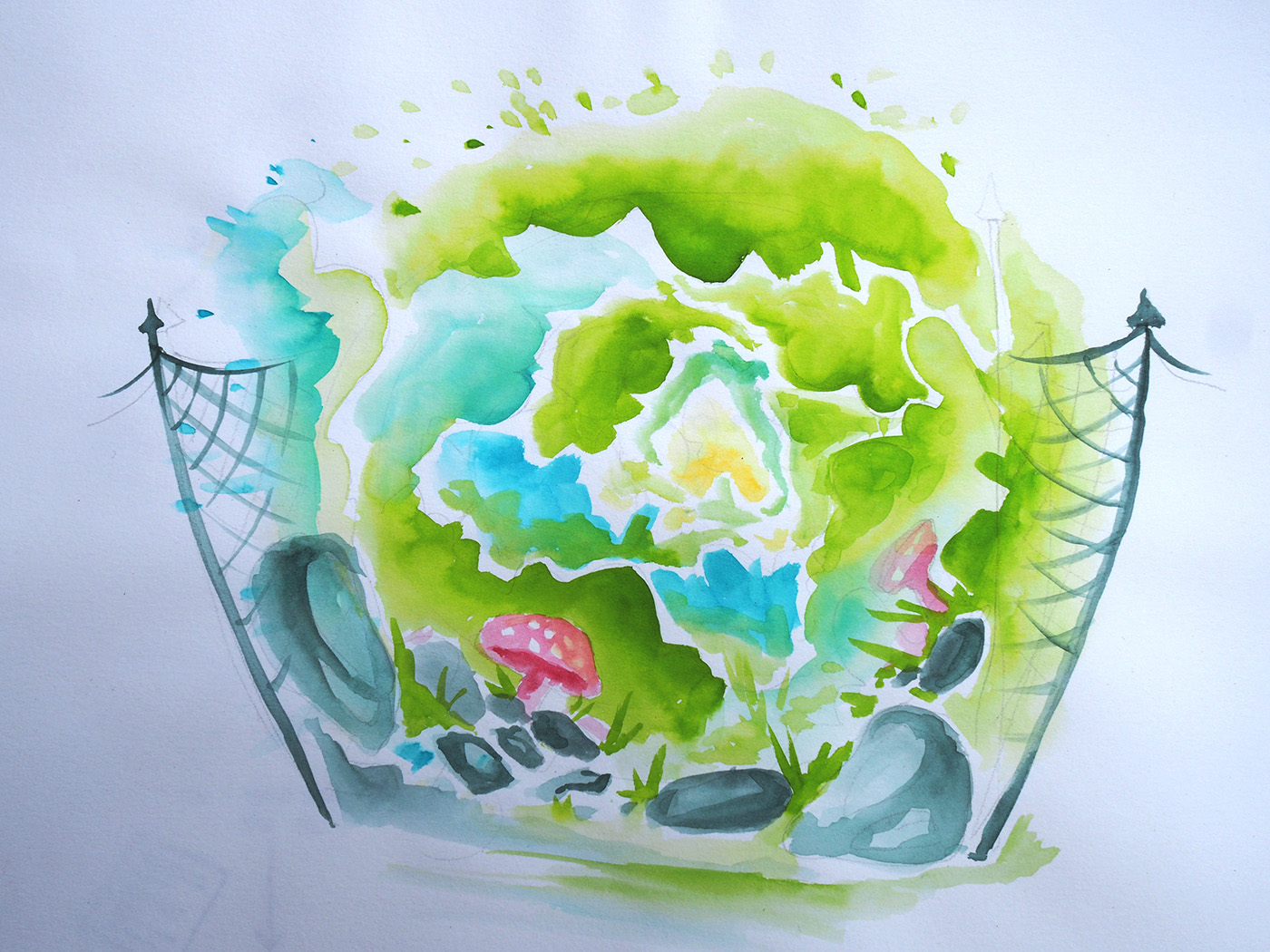
In order to challenge myself and encourage more experimentation, I decided to utilize an Aquabrush I have long owned, but never used. An Aquabrush is essentially a hollow watercolour brush filled with water, to ensure a smooth flow of colour. The majority of my childhood took place in Germany; thus, for today’s theme of illustrating a place of my childhood, I decided to paint the “Niemandsland” – No-Man’s-Land. This was essentially a secluded and fenced off area wedged between our hedge and a garbage yard, accessible exclusively via a small hole in our fence, just large enough for a small child to climb through. In summer, we (my sister and I) would crawl through this hole and use garden scissors to cut through thick brushes of thorns to create a path through the wilderness, and pick fresh raspberries and blackberries from the bushes. In this painting, I used the Aquabrush to create smooth gradients between bright tones of blue and green, and add depth and shading to mushrooms and rocks surrounding the bushes.
Inspiration:
The illustration of our Niemandsland was inspired by ‘Alice in Wonderland’; climbing through the hole in our fence always felt as if we were travelling to a magical, far-off land, secluded from society and our parents. I aimed to capture this feeling by imitating the ‘rabbit hole’ from Alice in Wonderland – the gateway to Wonderland, by illustrating the Niemandsland as an endless tunnel.
Challenges:
Having never used the Aquabrush before, it was a challenge to adjust to this tool – often the brush emitted excessive water, subsequently overly diluting the colour or wetting the paper. If too much moisture entered the paper, it would become waterborn and the colours blurry, rather than the smooth and clean transitions I was aiming for. Subsequently, I used a tissue to dry of the Aquabrush if the brush was leaking excessively. However, I also learned to recognise the advantages of using an Aquabrush – it was very easy to clean on a scrap piece of paper when switching colours, and I never had to re-dip the paintbrush into water, or risk having a grainy stroke from the brush tip being too dry.

Day 17: Gameboy Diagram
Technique:
Illustration/Diagram, Staedtler Pigment Liner
Process:
I initially began by creating a list of steps involved with playing our Gameboy, before arranging them into a rough diagram. I decided to add small illustrations as visual cues for clearance. I used a Staedtler Pigment Liner to create the line art and used Photoshop to adjust the levels and curves of the photograph for a clearer image.
Inspiration:
Thinking back on the games I used to play as a child, the Gameboy is what I remember most clearly. As a prized possession of my father, our use was limited but cherished. Back then technology was not common place in the average household, and we spent most of our time outside. Subsequently, we had a mere 30-minute allowance for playing the Gameboy each day, which often resulted in (failed) bargaining attempts with our parents for additional time. With this diagram, I aimed to illustrate our bargaining process, which usually included completing tasks and chores in return for gaming time.
Challenges
It was challenging to remember this far back into my childhood – memories fade and disappear, and I can only assume what may have been the usual process involved with being allowed to play. I do not remember if we played daily, but I distinctly remember being timed during gameplay. Nowadays, I take my adulthood autonomy (and subsequent freedom in regard to technology and gaming) for granted, so it is difficult now for me to imagine having had such strict restrictions. In hindsight though, I am thankful that my childhood was spent playing outside, climbing trees and using my imagination, rather than relying on devices for entertainment, which hinder the possibilities of play and imagination in children.

Day 18: A Childhood Treat
Technique:
Watercolour Painting
Process:
After my positive experience with using the Aquabrush, I decided to utilize it once more, this time with more confidence and thus, the urge for further experimentation. While I don’t remember much in terms of childhood snacks, I do distinctly remember Cherry Caprisuns – a sweet, refreshing cherry-flavoured juice in a small plastic pouch. I began by lightly painting a crisp outline of the Caprisun. After this had dried, I used the Aquabrush to create a smooth blue gradient along the pouch, to resemble the classic packaging of a Caprisun. Next I painted the cherries, using a cool red tone to compliment the bright blue of the packaging. I decided to add an element of visual interest by using the Aquabrush to intentionally squeeze excessive water onto the page while holding it upright, to create watercolour drips along the page, to further emphasise the freshness of the Caprisuns. After this had dried, I used a regular watercolour brush to soak up intense, saturated watercolour, and tapped it with my finger to create an explosive, ‘bursting’ effect over the illustration, to symbolise the Caprisuns bursting flavour.
Inspiration:
The taste of Caprisuns evokes nostalgic memories of warm summer days spent frolicking in our garden, exploring our Niemandsland and climbing trees, carefree and energetic. While Caprisuns are not currently available in Australia, I’ve returned to Germany on several occasions – only to discover a change in recipe to the classic Caprisun flavour to be more natural and healthy! While I doubt I will ever experience that true, intense Caprisun flavour again, I can still cherish the memory.
Challenges:
This time I had a lot more control over the Aquabrush, but creating that drip effect and the watercolour speckles was daunting out of fear of ruining the illustration. I tested it out several times on a scrap piece of paper to ensure the effect would turn out how I expected. In the end however, I really like how it turned out, as it adds a bit more visual interest and appeal to what would otherwise simply be a picture of a Caprisun.
Day 19: Home
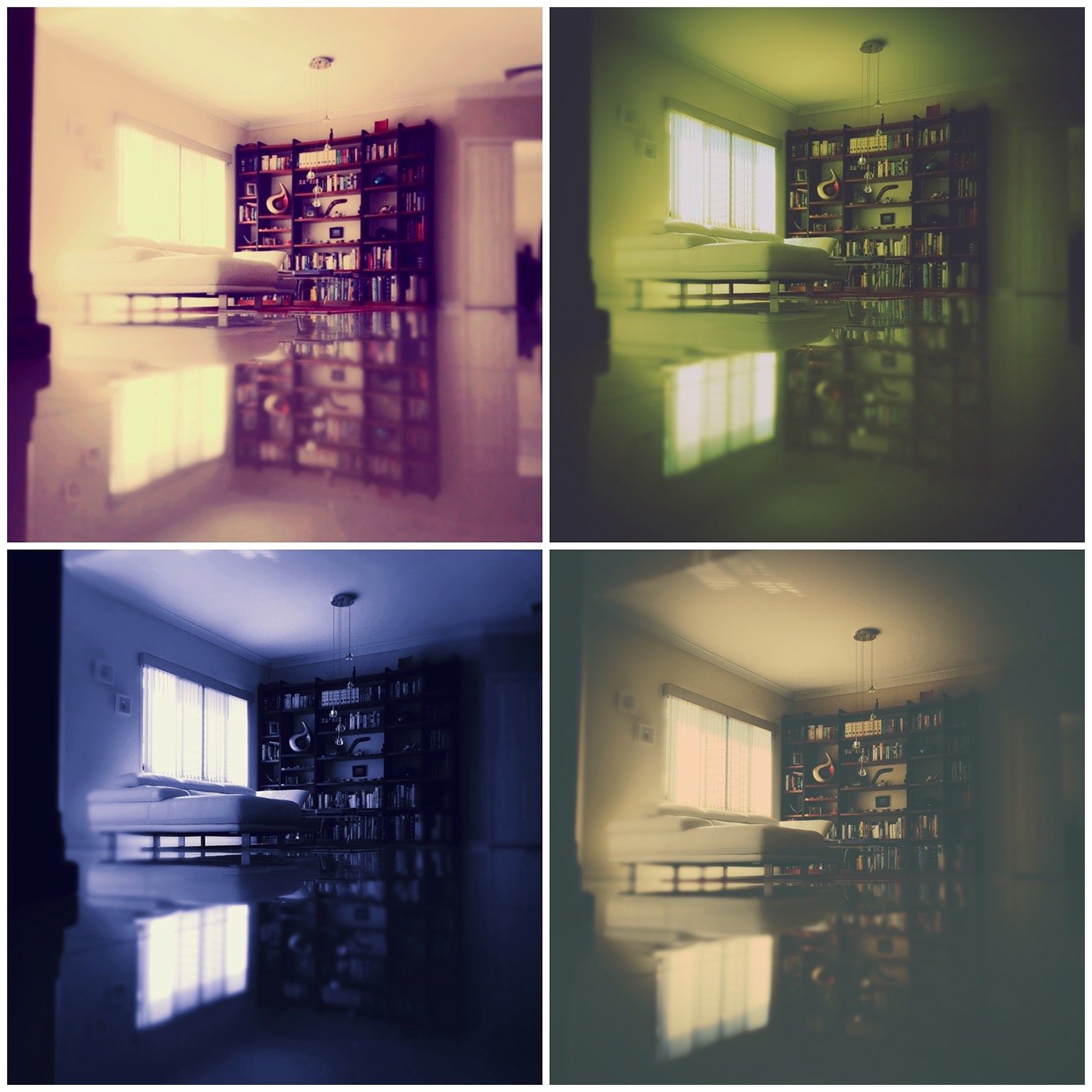
Technique:
Photography, iPhone 6s Camera
Process:
Initially, I attempted to photograph our house from the outside, however despite trialling a variety of angles the resulting images appeared bland and emotionless. Subsequently, I decided to utilize the reflective surface of our floor tiles in addition to a low angle to create a surreal and visually engaging piece. I used a lens blur effect to focus the viewer’s attention towards the window, the focal point of this piece – it’s bright light immediately drawing in the viewers’ attention. Meanwhile the clear and crisp reflection of the surroundings on the floor tiles creates a surreal, glass-like effect, enhanced further by the filters used. The floor almost appears like the gateway to another dimension – similar to the mirror in “Alice in Wonderland”, which leads Alice to the Wonderland once more.
Inspiration:
While experimenting with the various available effects on the Retrica App, I noticed the impact these filters had on the mood and atmosphere of the images. Subsequently, I aimed to create four completely different moods simply by varying the filter used in the Photograph. The first image appears warm and homely, tinted with light orange tones which welcome and relax the viewer. The second image uses a cool green overlay, creating an eerie and abandoned atmosphere – it feels as if you are experiencing a vivid nightmare in which you enter your home, which has been twisted and distorted by your mind into an unnerving reflection of what once was. The third image uses a blue overlay, creating a sombre, dark atmosphere, like a distant memory or flashback. The last image utilizes a faded overlay with warm brown undertones. It appears distant and timeworn, like an old photograph.
Challenges:
Initially I struggled to take a visually engaging photograph of our house without taking the brief too literally, subsequently resulting in bland images that did not evoke any kind of emotion or memory.

Day 20: Sunset, 5:30pm
Technique:
Photography (Olympus Digital Camera (E-M5 Mark11), ISO-640, f/10, focal length 17mm, exposure time 1/500)
Process:
To ensure that I would catch the sunset at the optimal time, I set up the camera outside using a tripod, and connected it to an ipad using Bluetooth to allow me to remotely control the camera. While waiting inside working on other assignments, I watched the sunset progress through the ipad and shot the photograph. While I hoped to capture a bright pink sunset, the resulting images were more of a warm orange. The weather played a vital part in this photograph – I hoped to capture a sky adorned with light fluffy clouds, which would allow for that pink sunset I was hoping for. The time was 5:30pm.
Inspiration:
While at first glance, this may look like simply a photograph of a sunset taken in front of a front yard, to me and my family this view is a symbol of our achievement and success. For the majority of our life we had rented houses and moved from place to place, before finally purchasing our first house 4 years ago. Since then, we have made several renovations and improvements to this house, including our sunroom from which this photograph was taken. Thus, this view symbolises our hard-earned success, and reminds us of how lucky we are. In this room, we have spent many nights watching the sunset while sipping cocktails. Thus, for me this image conjures up many pleasant and warm family memories.
Challenges:
At first I was unsure how to set up the tripod and ipad app to allow me to remotely control the camera, thus I had to request my father’s assistance. Additionally, I was unsure how the sunset would turn out, as I have no influence on the colours or weather on the day of the photograph. Several nights earlier I had already tried to capture the sunset, with little success due to bad weather, with thick dark clouds covering entirety of the sunset.
Week 5: See that thing?
Images as Persuasion/Lighting 2


Day 21-23: Outer Space
Technique:
Iphone 6s camera, Retrica App, Photoshop
Process:
While I had not initially intended this image to be used specifically for this project, I felt that it suited the theme very well. Whilst taking a simple picture of a sunset, I noticed that when rotated, the sky resembled the surface of a planet. Subsequently, I used Photoshop to experiment with three variations of text, experimenting with the impact this text would have on the atmosphere and mood of the images.
Inspiration:
Initially I was drawn in by the bright pink and blue tones of the sunset, which not even a professional camera could quite capture. Instead, I used my phone camera as the filters allowed me to adjust the colours to most accurately reflect the brilliant tones of the sunset. Through the addition of text, I aimed to create three different moods and atmospheres. In the first image, the vertical orientation of the text as well as the content of the message, encourages the viewer to turn their head on the side. Thus, what previously appeared to be a photo of a planet taken from space, is revealed to be a sunset, encouraging the viewer to see the world from a new perspective. The second image is designed to look like a movie poster about the discovery of a new planet. The image appears mysterious, but the warm tones of the image indicate a sense of hope. The last image appears vaguely threatening – the idea that we are not alone in the universe is both a relief, but also terrifying at the same time.
Challenges:
The movie poster was the most difficult to design, and I had to use inspiration from other movie posters to get a sense of what movie posters about space usually looked like, thus gaining insight into the fonts and colours typically used.


Day 24: Animal Splatters
Technique:
Watercolour
Process:
Using a spray bottle, I lightly moistened the paper and repeatedly pressed a watercolour palette dish onto the page. Next, I folded the paper in half vertically and pressed the two sides together, rubbing over the folded paper to encourage the mixing of shapes and colours. I unfolded the paper and let the results dry.
Inspiration:
When I was a child, we often made illustrations using paint splatters by folding and pressing the paper, trying to decipher shapes and animals from the resulting mix of paint. I decided to play on this idea and used watercolours
Image 1: While at first glance, the splatter appears abstract and foreign, the eye is immediately drawn towards the centre, which resembles a bull charging at a s crescent moon shape. Meanwhile, if one looks at the entirety of the image, the splatter resembles the shape of a bull’s face in frontal view.
Image 2: When turned one way, the splatter resembles a butterfly. But when turned on its head, two shadowy bear figures appear, leaning against each other holding an indistinct object. The symmetry of the image adds additional interest, while the shadowy nature of the bears creates a sense mystery and suspense.
Challenges:
Due to the windy weather, it was a challenge to stop the wind from ruin the wet image by moving the paint further before it had a chance to dry, or splattering it across the page, as this would have distorted the shapes.

Day 25: On The Lookout
Technique:
Photography (iPhone camera)
Process:
I used a stapler as the ‘boat’ shape and a miniature wire statue as the human figure, situated against a tapered white background and lit with an iPhone, while the photograph was taken with a second iPhone. Initially, I had attempted to use a regular torch, however the light from this torch was not bright enough to result in a crisp shadow.
Inspiration:
One evening I was playing with ideas on how I could breathe life into ordinary household items through the use of shadows, and noticed the boat-like shape of a stapler when placed upside down. While this was already interesting, I wanted to add another ‘human’ element to give the photograph some personality, and subsequently used a small wire statue to imitate a man steering his ship while peering into the distance, his arm raised above his head to shield off the sun. Through this little addition, the image appears to tell a story, as well as adding a bit of personality and charm.
Challenges:
It was a challenge to capture a crisp and identifiable shadow, as the illusion was only effective when lit from a very low angle. Subsequently, I had to wait until evening to be able to take this picture, as natural night never hit the arrangement quite right.
Week 6: Light and Scale
Images as Abstraction

Day 26: Frost
Technique:
Photography (Olympus E-M5MarkII, f/6, ISO-500, 43mm focal length – macro-lens)
Process:
I used a macro-lens to get a close-up shot of one of the plants in our garden. The texture of the wood when seen up-close, in addition to the late-afternoon lighting resembled, resembled that of frost. I used a low f-stop to create a narrow depth of field, focusing only on the branch itself while blurring the background.
Inspiration:
Having never used a macro-lens before, I experimented by taking a variety of close-up images of natural elements in our garden. The cool blue undertones and warm yellow lighting create a soothing wintery atmosphere, further enhancing the frost-like pattern on the tree branch. The off-centre positioning of the tree creates a sense of balance and harmony, while the contrast between cool blue and warm yellow highlights creates interest and tension. The narrow depth of field focuses the viewers’ attention on the branch.
Challenges:
It was a challenge to get the camera lens to focus on the area I wanted it to. Additionally, the cameras would go out of focus easily, particularly when stepping too close to the subject. The slightest shake would result in a blurry photograph, which was a challenge to me as I do not have the steadiest hands.

Day 27: Morning Dew
Technique:
Photography (Olympus E-M5MarkII, f/6.3, ISO-200, 43mm focal length – macro-lens)
Process:
I used a spray bottle to create water droplets on the leaves of one of my succulents, and used a macro-lens to capture a close-up shot of these droplets. I used a low f-stop of f/6.3 to create a narrow depth of field and focus the viewers’ attention on the water droplets in the image.
Inspiration:
While watering my succulents, I noticed how the water was repelled off the leaves, resulting in the formation of small round water droplets. Thus, I decided to use a spray bottle to create many small droplets on one of the leaves, to imitate the effect of morning dew on leaves. The cool undertones and warm lighting contributes to that cold, winter morning atmosphere. I believe the image is effective through the off-centre positioning of the leaf and focal point, while the blurred background focuses the viewers’ attention on the droplets. Through the use of the macro-lens, the viewer is able to see ever miniscule detail of the succulent leaf, including the leaf’s texture and the reflections of sunlight in the droplets of water.
Challenges:
Once again, it was difficult to achieve a crisp image due to the sensitivity of the camera, as small movements would result in the photograph being blurry.
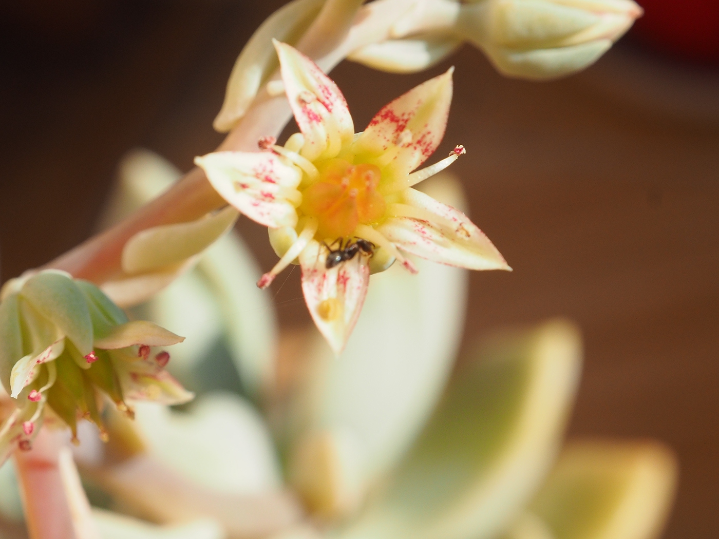
Day 28: The Ant and the Flower
Technique:
Photography (Olympus E-M5MarkII, f/11.0, ISO-500 – macro lens)
Process & Inspiration:
While relaxing next to my newly flowering succulents, I noticed that an ant had made its way up to one of the small blooming flowers. I used a macro lens to capture the details of the flower petals, as well as the ant. I utilized the warm evening lighting to my advantage, emphasizing the flowers warm, bright colours and creating a relaxed atmosphere. The use of a low f-stop focuses the viewers’ attention solely on the two flowers in the foreground, while eliminating the distracting background, creating a shallow depth of field.
Challenges:
It was a challenge to get both the flower and ant in focus, as the image needed to be captured quite close for viewers to be able to recognise the ant, but far away enough for the focal point to be in focus.

Day 29: Tutorial Activity
Technique:
Photography (Canon EOS 700D, F-Stop 6, ISO-200)
Process:
Using a Canon Camera and Macro-lens we took several close-up shots of the succulent garden at QUT. We used a low ISO due to the bright lighting as not to over-expose the image, and a low F-stop to decrease the field of focus.
Inspiration:
After unsuccessfully trying to create a micro-landscape using a toy car, we decided to experiment with more natural subjects such as succulents, due to the alien-like appearance and spiral shapes found in these plants.
Challenges:
It was challenging to use a camera I was unfamiliar with, and I was not too fond of the overall results. Many of our images turned out blurry or overexposed due to lack of experience with the camera. However, I was unable to bring my own. Overall, the field of focus in this image and balance is quite good, however the overall colour scheme is not as pleasing as the results I achieved at home.
Day 30: Tiny Savannah
Technique:
Photography (iPhone 6s Camera)
Process:
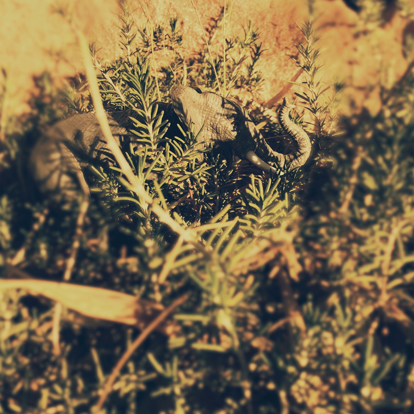
I used a small elephant figurine and played with various angles and placements around our garden to find a spot to realistically portray a savannah environment. I used lighting and shadows to unify the elephant figurine with the environment, creating a more realistic and natural look. I used a rosemary bush to mimic savannah-type shrubbery, and an orange, faded filter to obscure the reality behind the image.
Inspiration:
For this image, I decided to challenge myself by creating a micro-scape photograph without the use of a macro-lens. I was inspired by my father’s small bonsai garden, with through the addition of small rocks and naturally growing weeds, looks like a miniature forest. As a child, I used to own a wide variety of realistic plastic figurines of animals. When I rediscovered one of these figurines, I thought it suitable to use for this week’s topic of micro-scape, inspiring me to experiment with the elephant figurine and areas of our garden.
Challenges:
Originally, I had intended to use dad’s small bonsai forest to further enhance the realism factor. However, as the bonsai were potted, it was impossible to take a convincing image as the pots made the image less convincing.
Week 7: Textures and Patterns
Ethics, Textures and Patterns

Day 31: Texture from Nature
Technique:
Photography (Olympus E-M5MarkII, f/6, ISO-200, 43mm focal length – macro-lens)
Process:
I used a macro-lens with a low f-stop to take a close-up shot of the surface of a palm tree. The slightly off-centre positioning of the photograph creates interest, while the shallow depth of field focuses the viewer’s attention on the white, spotted segments of the tree-texture. The sharpness and low angle of the photograph accentuates the textural element of the image, so that the viewer can almost ‘feel’ the texture through the screen.
Inspiration:
This week’s theme of ‘ethics’ in combination with textures and patterns immediately reminded me of trees and the impact we as humans have on nature through deforestation. The black and white spots of the trees texture, while interesting, appear burnt and sickly, like a disease spreading throughout the bark of the palm tree.
Challenges:
As I was using a macro-lens, it was difficult to capture a crisp image due to the sensitivity of the lens. Additionally, the bright lighting of the sun resulted in the risk of overexposing the image – thus, I had to lower the ISO of the camera.
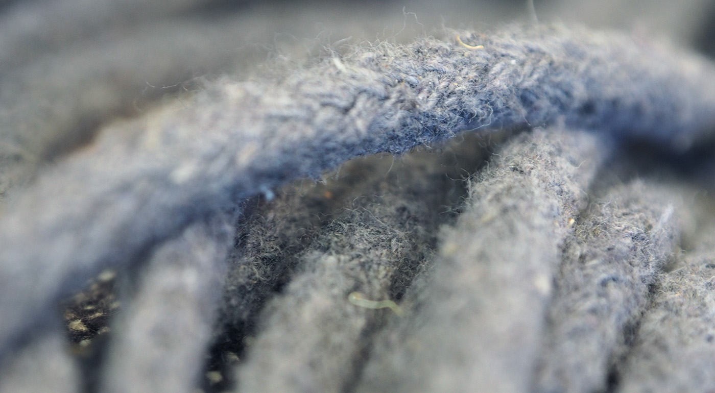
Day 32: Texture from man-made object
Technique:
Photography, Photo Manipulation (Photoshop)
(Olympus E-M5MarkII, f/6, ISO-100, 43mm focal length – macro-lens)
Process:
Once again, I used a macro-lens to capture the fine texture in the strings of a hammock. I felt the use of a macro-lens was necessary in order to capture the individual hairs of fabric, interwoven to form the string. I used Photoshop to crop the image slightly to bring balance to the image, as previously too much of the image had been put out of focus due to the low f-stop used. I also adjusted the colour tones in the image and brightened it slightly.
Inspiration:
I wanted to photograph strings as I knew that through the use of a macro lens I would be able to effectively capture all the individual hairs of fabric, clearly demonstrating the texture of the strings.
Challenges:
Due to the low f-stop, too much of the image was out of focus. Subsequently, I had to adjust the image using Photoshop to bring balance to the image.
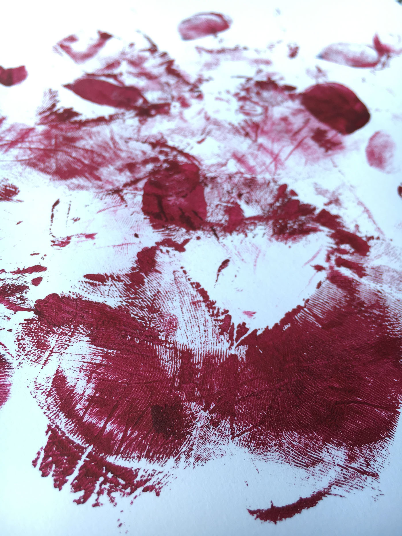
Day 33: Texture created by You
Technique:
Finger Painting (Acrylic Paint)
Process:
I used acrylic paint to cover the palm of my hand and create several handprints on the page to capture the texture of my skin.
Inspiration:
I was inspired by finger painting techniques used as a child. I wanted the result to appear wild and ‘rough’, as if someone had walked all over the page while paint covered their feet.
Challenges:
While the skin texture was obvious in person, it was difficult to capture in photograph format.

Day 34: Pattern Mathematically Created by You
Technique:
Hand-Drawn Repeating Pattern (Illustrator, Photoshop)
Process:
I began by sketching and lining the middle of my pattern, following the instructions of Julia Rothman’s tutorial, linked below. However, instead of cutting it, I imported the image into Photoshop and manipulated it this way in case of mistakes. After cutting and rearranging the pattern, I filled in the new centre with more plants and decoration, imported the pattern into illustrator and used image trace for a smooth, crisp line. I then imported the file back into Photoshop to create my repeating pattern.
Inspiration:
I was inspired by the style and technique of Julia Rothman, and used her tutorial on how to create hand-drawn repeating patterns, seen here: https://www.skillshare.com/tutorials/5-Steps-to-Illustrating-a-Repeat-Pattern-by-Hand/59 I used my succulents as inspiration, illustrating a variety of plants throughout the pattern.
Challenges:
The biggest challenge was cutting the image in order to rearrange the content of the pattern. After taking a photograph of my pattern illustration (for safety in case of mistakes), I attempted to cut the paper – however, as the paper was not a perfect square and was not cut straight, the illustrations did not line up. Thus, I decided to finish the pattern using Photoshop and Illustrator.

Day 35: Pattern from Nature
Technique:
Photography (Olympus E-M5MarkII, f/6.3, ISO-100, 43mm focal length – macro-lens)
Process & Inspiration:
Through the use of a macro-lens, I aimed to capture the delicate pattern of an avocado leaf. My aim was to reconnect our minds with nature by drawing on our similarities when viewed at a micro level. When viewed up close, the pattern of the leaf resembles that of the pattern on our skins – large veins diverging into increasingly smaller veins, forming a web-like pattern on our skin and on the surface of this leaf. Learning from my past struggles with achieving a sharp image due to the sensitivity of the lens, I used a tripod to keep the camera as still as possible, allowing me to focus on the delicate details of the leaf.
Challenges:
While there were no obvious challenges, in hindsight I feel the image could have been further enhanced through the use of water-droplets to add further interest to the image. Additionally, the use of the natural warm afternoon lighting may have enhanced the mood and atmosphere of the image. However, I believe that overall the image successfully captures my intended meaning.
Week 8: Image Manipulation


Day 36: Beach Sunsets 1
Technique:
Photography (Olympus E-M5MarkII, f/16.0, ISO-500)
Process & Inspiration:
I used a low f-stop and ISO to capture the cool blue tones of the sunset. I aim to use this image as part of my image manipulations.

Day 37: Beach Sunset 2
Technique:
Photography (Olympus E-M5MarkII, f/16.0, ISO-400)
Process & Inspiration:
Once again, I aimed to capture the bright orange light of the sunset in this image. The dark clouds were of particular interest to me, due to the stark contrast with the bright yellow backlight. I aim to combine this image with the previous sunset due to the contrasting yet complementary tones of warm yellow and cool blue.


Bay 38: Bluescreen Photos
Technique:
Photography, Bluescreen (Olympus E-M5MarkII, f/16.0, ISO-200)
Process and Inspiration:
I used my sister as a subject and created a ‘bluescreen’ effect using a blue blanket which would allow me to easily edit the images in Photoshop. I aim to use them to create a Double Exposure effect, for which I am using this Photoshop tutorial: https://www.youtube.com/watch?v=iOYz669WNpU&t=191s

Day 39: Bonsai Branch
Technique:
Photography (Olympus E-M5MarkII, f/6.3.0, ISO-100 - macro lens)
Process and Inspiration:
I used a macro-lens to capture the details of the tree-bark to use as a texture in my photo manipulations. I edited the image in Photoshop using a technique outlined in the above Youtube tutorial to isolate the branches from the background.
Day 40: Image Manipulations

Image 1: Separated
For this image I created a Double Exposure effect in Photoshop using the above tutorial. After isolating the subject from the background, I decreased the saturation of the subject for a gray-scale effect. I used the selection tool to cut slices out of the subject’s face and create spaces between the slices for a floating effect. Next, I transferred the file into Paint Tool SAI, a tool I am more familiar with and which allowed me to edit the image more efficiently.
In this program, I used a clipping mask to mask the bonsai tree texture against the subject, and used an overlay layer effect for the background and sunset overlay. I used the brush tool to create a shadow behind each slice to give the head a ‘hollow’ appearance. Through some adjustment layers and colour adjustments, I hoped to create a haunting, mysterious atmosphere, inspired by surrealism. The image resembles a distant and distorted nightmare.

Image 2: Liquid Gold
In this photo manipulation, I combined two of the sunset images, contrasting the cool blue tones against the warm yellow hues of the third sunset image. Next, I once again used a Double Exposure effect using the third sunset image, aligning the skyline of both sunsets for a more realistic effect. I duplicated the subject layer and used a ‘lighten’ layer effect to make visible the face of the subject, while erasing other parts of the subject.
Using Paint Tool SAI, I used the brush tool to create the liquid gold, seemingly spilling over the subject’s face. I used colours from the sunset for a seamless transition between illustrated and photographic elements. Once again I was inspired by surrealism, and hoped to create a warm, soothing dream-like atmosphere.


