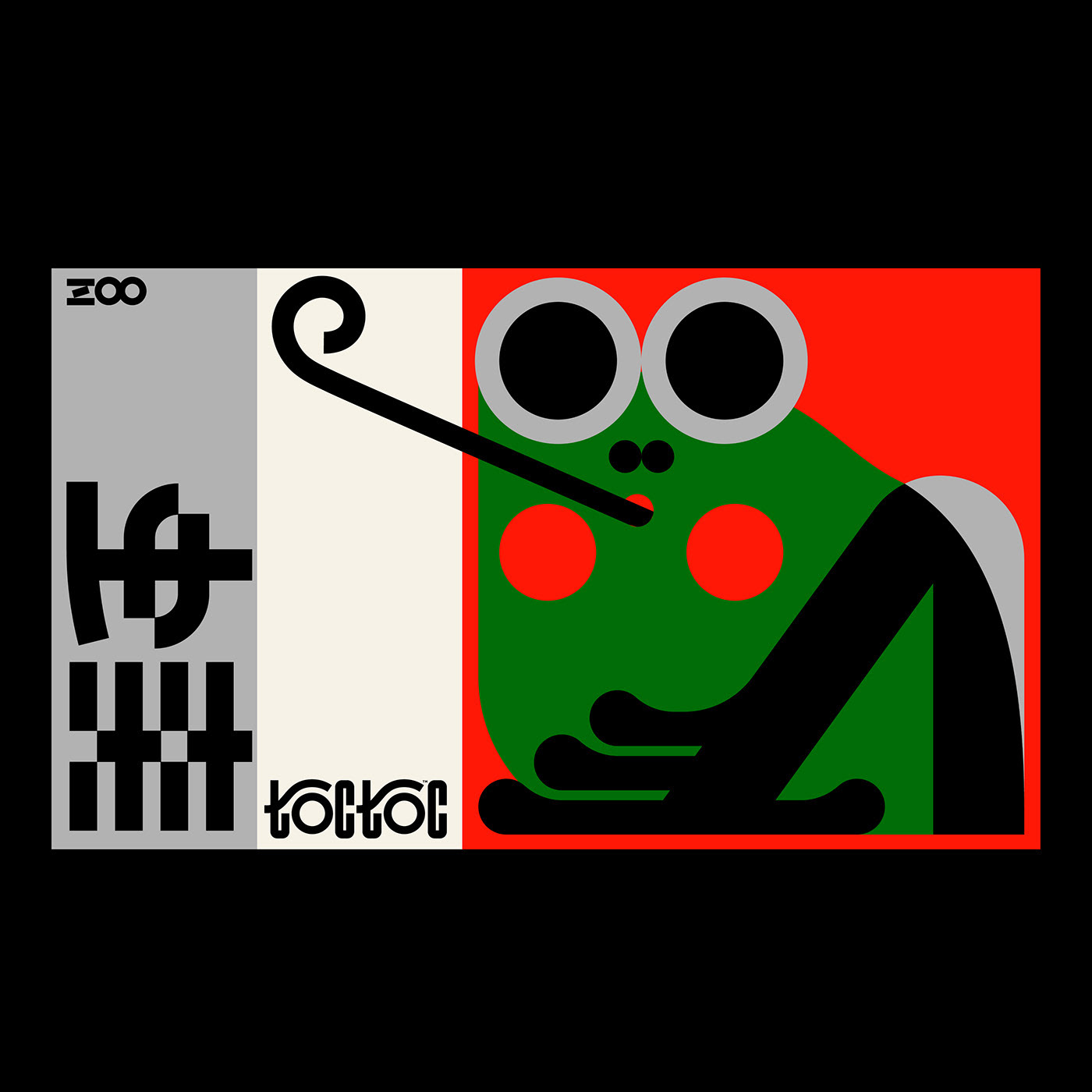
Creating a new corporate brand catered to children and educational products for them. A brand that is both open-ended in terms of business opportunities, yet has the vibrant, youthful nature of a child.
The brand was to give a feeling and sense of trust & stability along with fun.
The stability and strength is shown in the strong type that is bold yet playful. The placement of the type along with the multi-colour gives a sense of fun and enjoyment along with the hidden smile. The "G" itself has a duel meaning, since it can be seen as both lowercase and uppercase it symbolizes a parent and child.


