
Description
The project involves the creation of an online magazine about typography. The choice of the subject has been relegated to the typography world since the purpose of the magazine is to propose an unconventional approach to the subject in order to reach both the sector enthusiasts and the newcomers through sharing, as well as editorials and interviews , useful resources and thoughtful tips that allow the user to keep up-to-date on the latest developments in the industry and trends, but also a look at the history and at the basis of typography.
Naming
The choice of the name is due to the fact that embossing is a dry printing technique that allows embossing figures and typefaces on paper; The technique is used to highlight a particular, in the same way that the magazine wants to emphasize the art of typography. In addition, the term “em” represents: in the printing press the so-called “quadratone”, a metal parallelepiped having the same size as the body of the typeface of which it is part, in the specific the letter “m”, serving as a unit of measurement to define the various types of spacing; In digital typography it is instead a unit of measurement for the body of the typeface; finally in html the <em> tag allows to emphasize what is enclosed in it.
Setting goals
First of all, the basic goals of the magazine have been defined: as already mentioned, it is aimed at both industry enthusiasts and newcomers, so the tone of voice and the way in which topics are dealt with is essential for articles, they do not have to be tedious but at the same time neither superficial: in medium stat virtus. Subsequently, categories were defined: “history” that will deal with articles about the history of typography, “case study” that will provide insights into the use of typography and lettering by companies or services, “trends” that will signal all industry trends, “diy and resources” that will provide tutorials and free resources, “contest” that will allow readers to get involved, and “events” that will provide monthly calendars of major visual communication events. The articles will be on a daily basis.
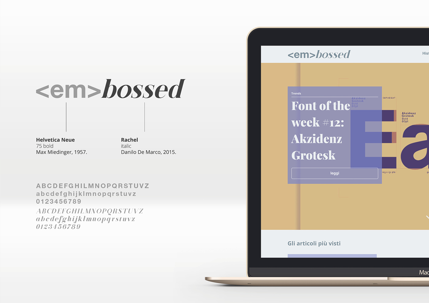
Typography and colours
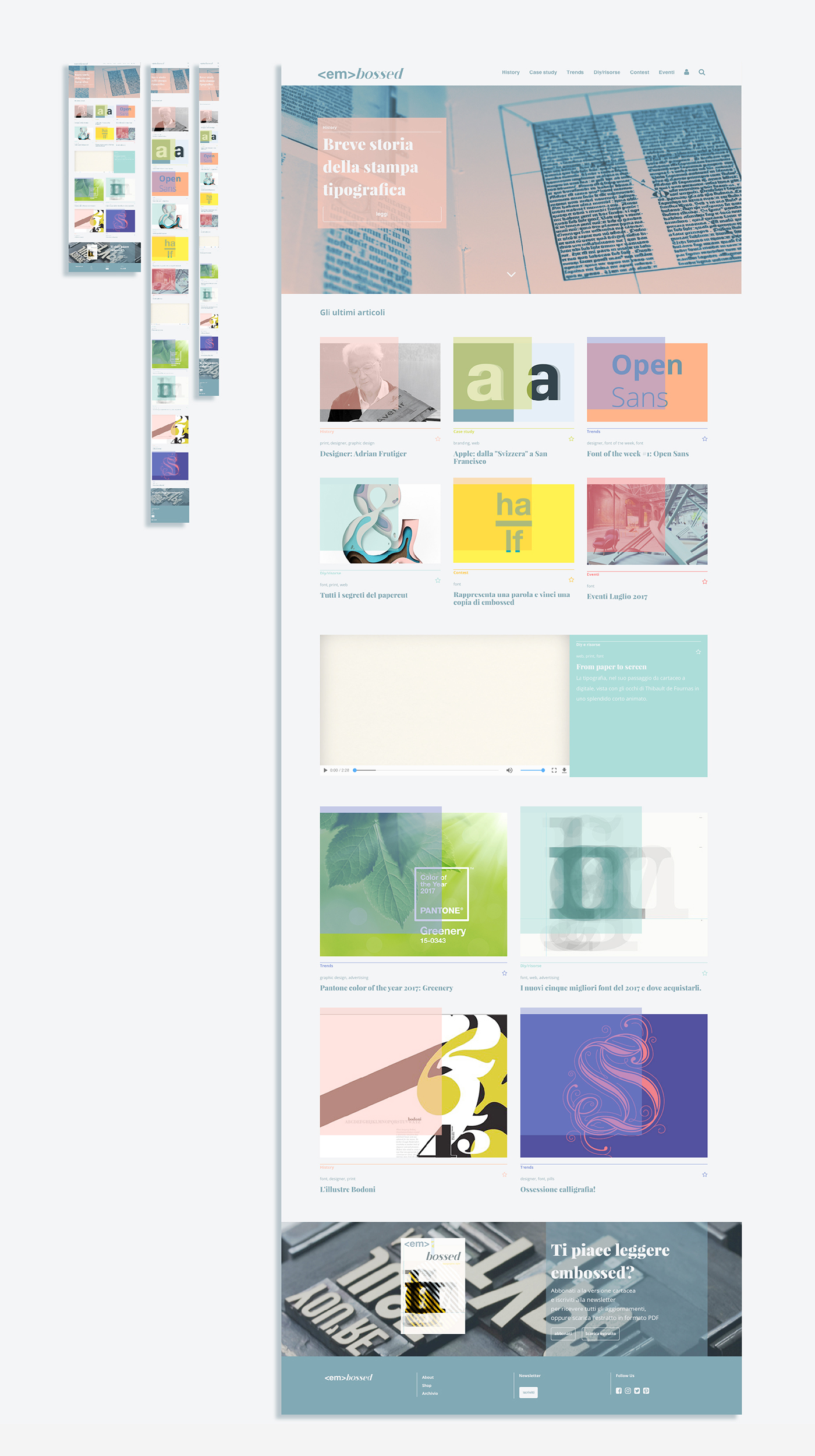
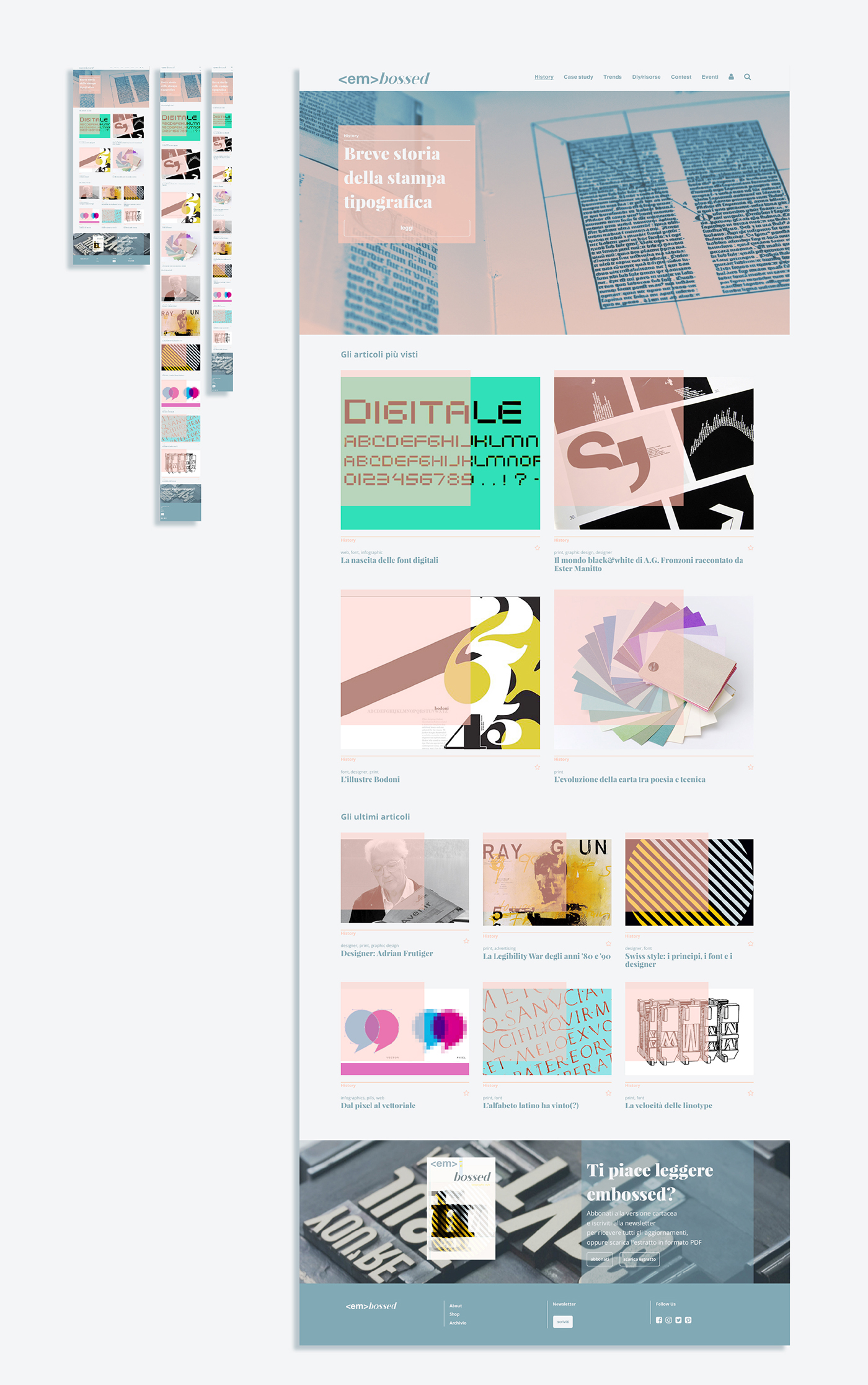
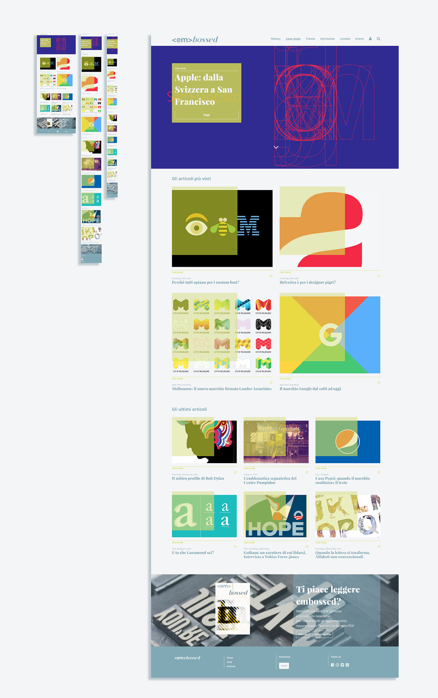
The typefaces are Playfair Display, designed by Claus Eggers Sørensen, and Open Sans, designed by Steve Matteson, the first, serif, will be used for titles, and the second, a humanistic sans with a x-height fairly high, for longer texts. The typographical scale was subsequently defined in order to create a hierarchy that allows the reader to orient himself. For the same purpose, each category has been identified by the use of bright colors that contrast the neutral and monochrome tones of the rest of the layout.

The grid
A twelve-columns grid was employed to build the layout on which the elements, currently represented by rectangles and placemark text, were arranged to balance the visual weight of the web page.
Flowchart
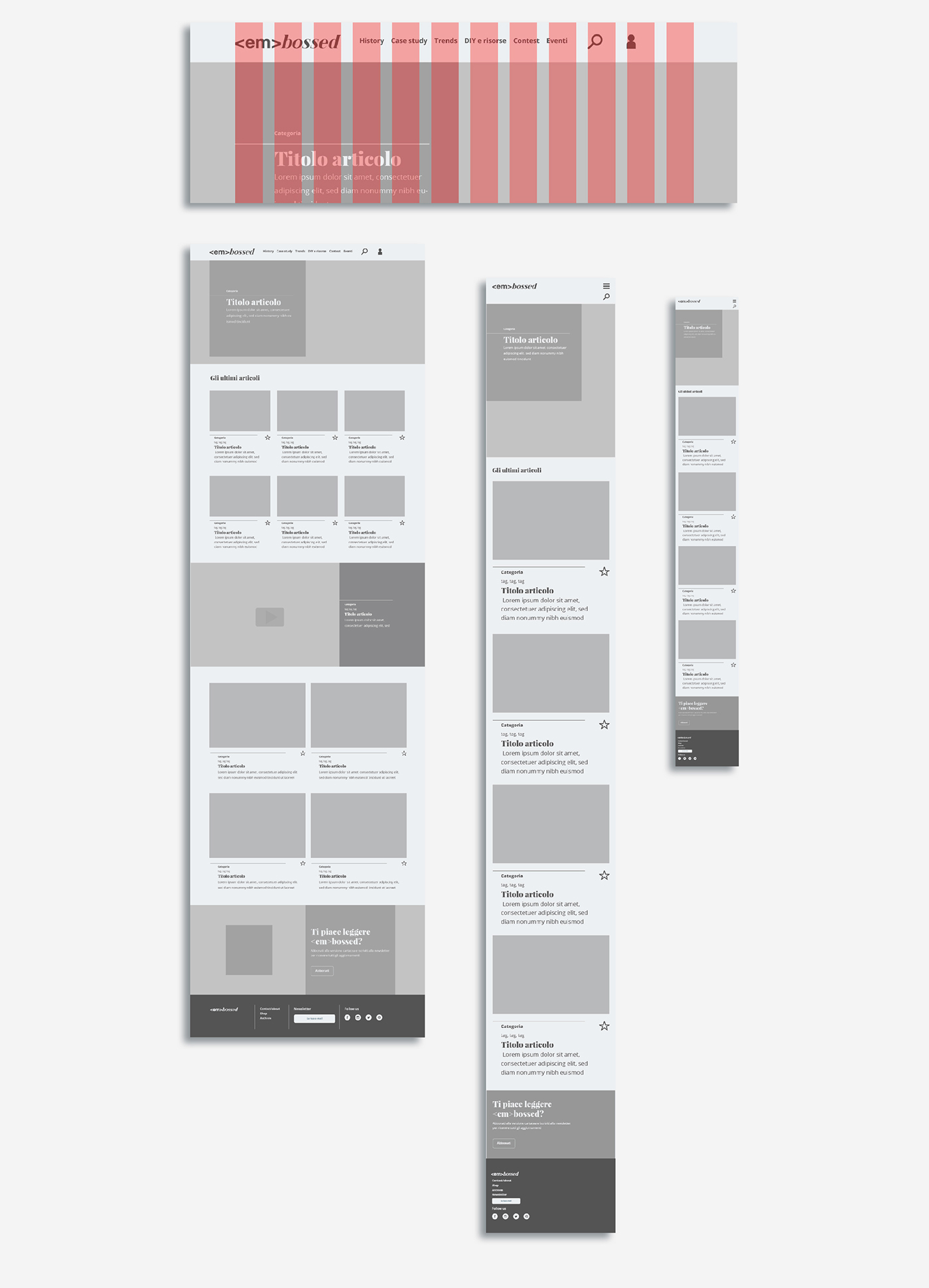
Below it is shown the header of the magazine, its navigation, and one of the possible navigation flows.

Prototype
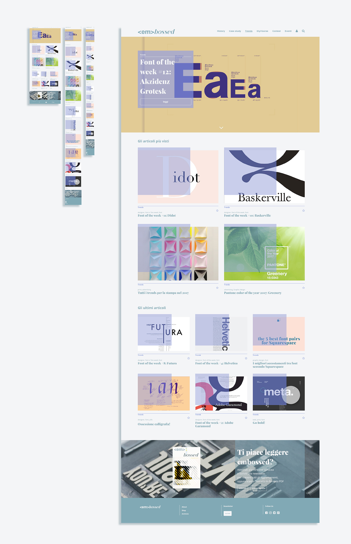
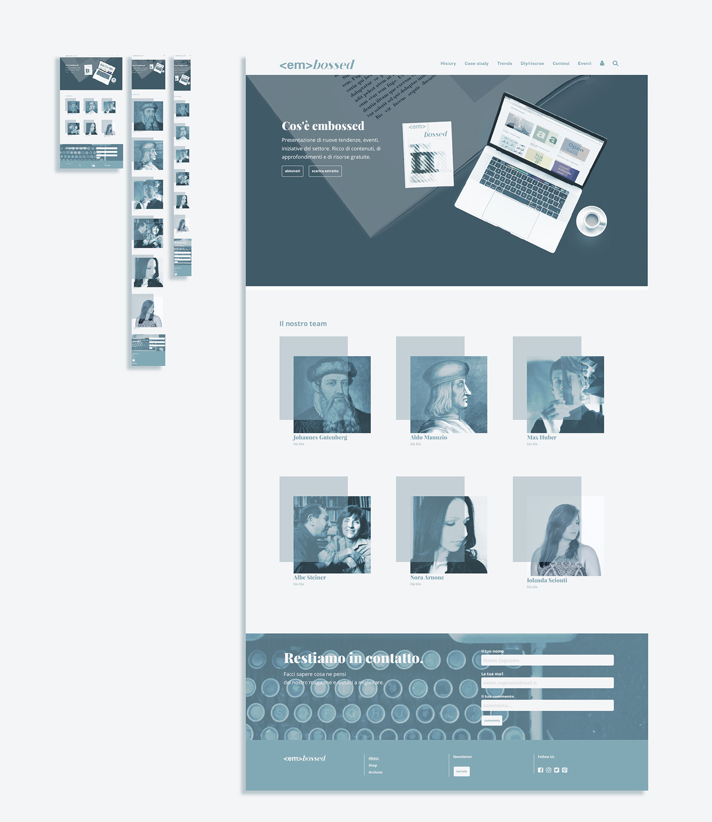
Below are shown the final layouts of the homepage, the case study category and an article. The characterizing element is represented by transparent color blocks over the articles, which identify the category and provide feedback to the user by enlarging at the mouse hover. The homepage structure, similar to the one of the category page, consists of an article in the foreground, the last articles for each category, an article containing a video or photo gallery, the most viewed articles of the week, and a call to purchase the paper version, which has a monthly basis.
Overview
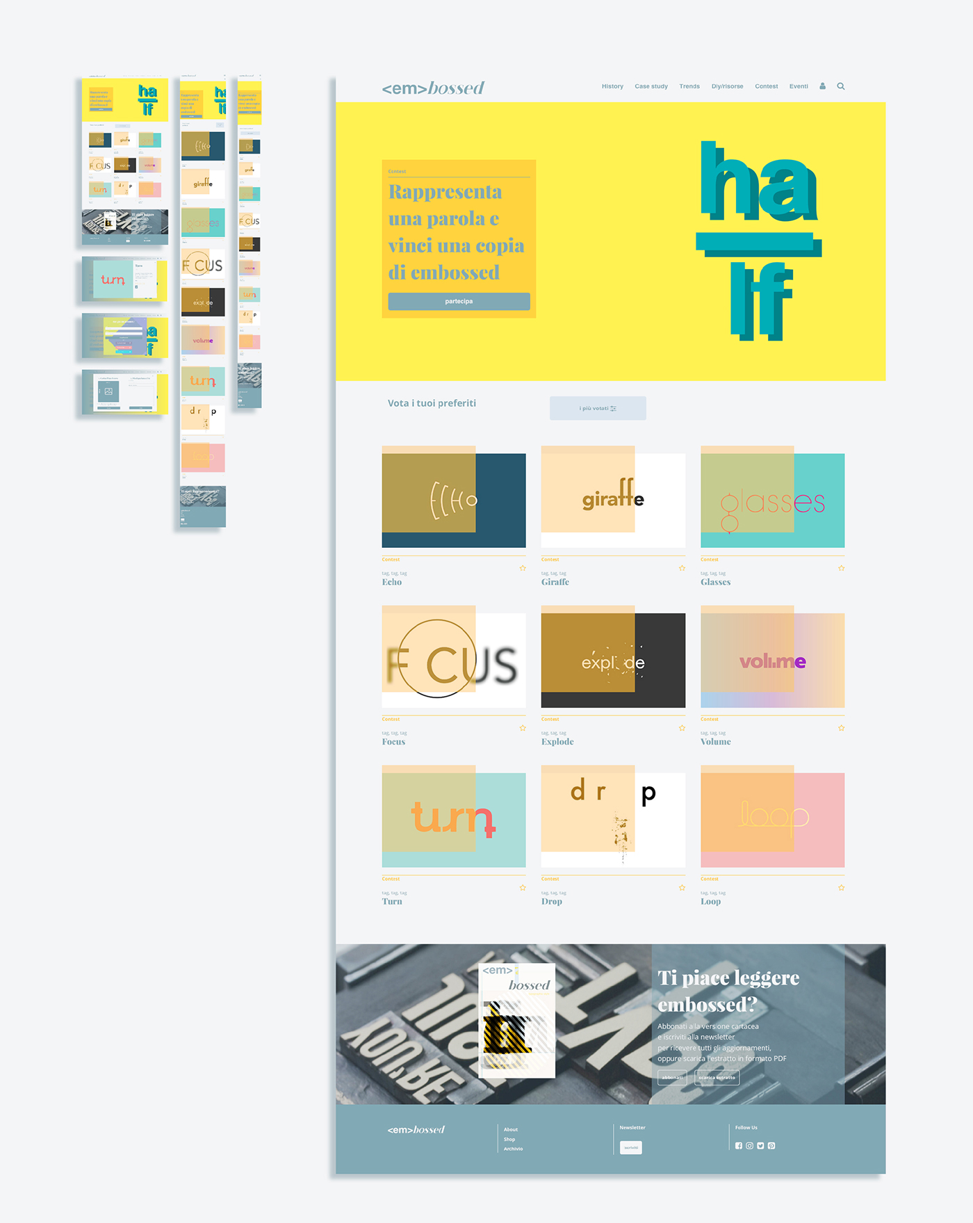
There are shown the layout of the homepage, the category and article pages, the about and the shop pages. A separate speech has to be made for the contest category, within which a contest will be launched once a month to allow users, after the registration, to play and / or vote on projects submitted by other users according the theme proposed by the editorial staff. The winner will get a free copy of the paper magazine.

Homepage
History category
Case study category
Trends category
Diy e risorse category

Contest category
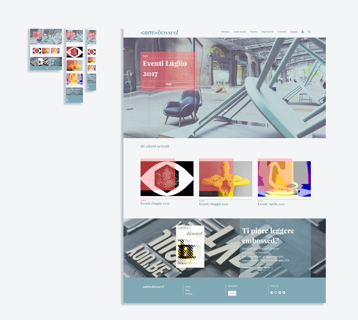
Eventi category
Article

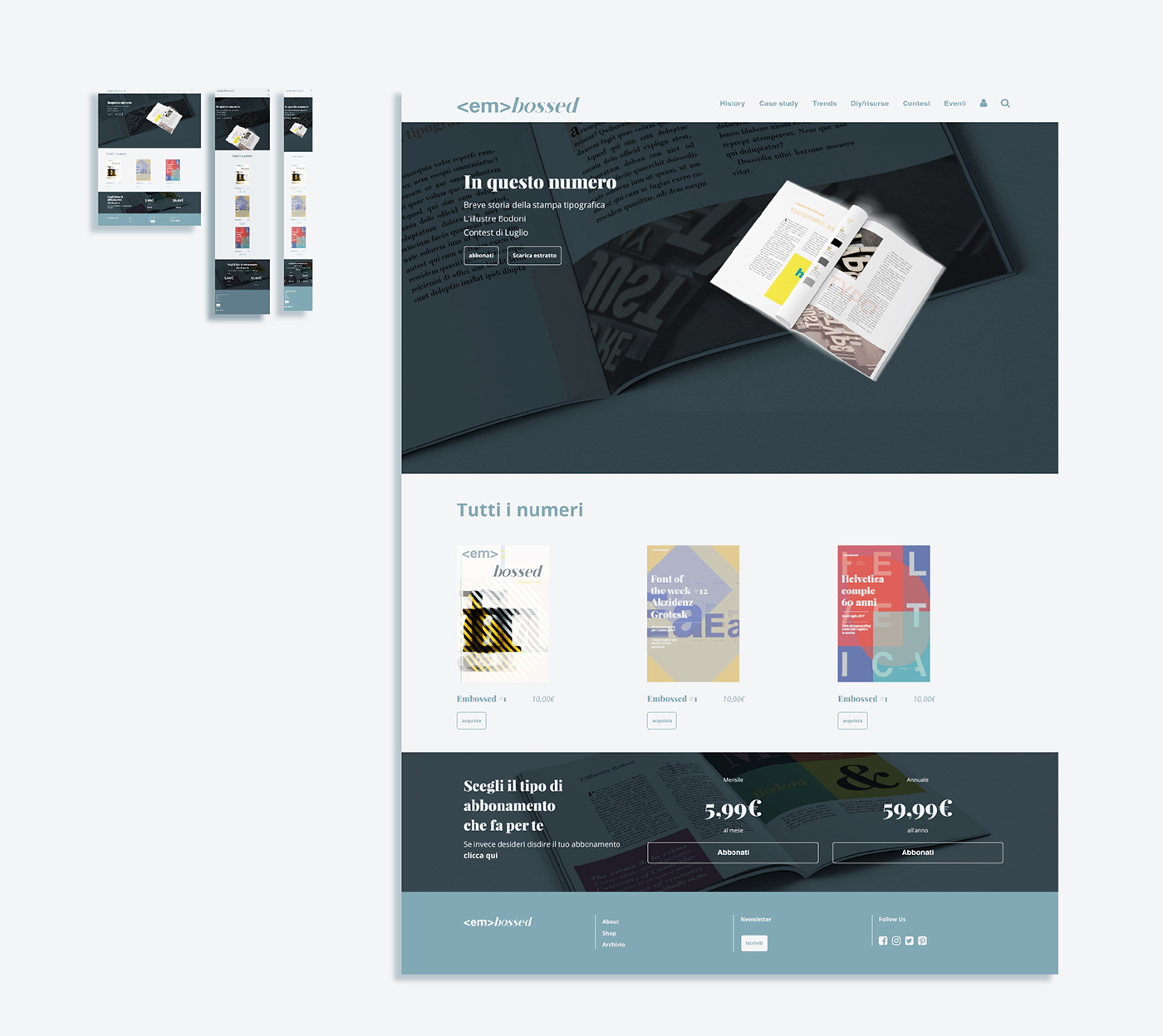
Shop page
About page
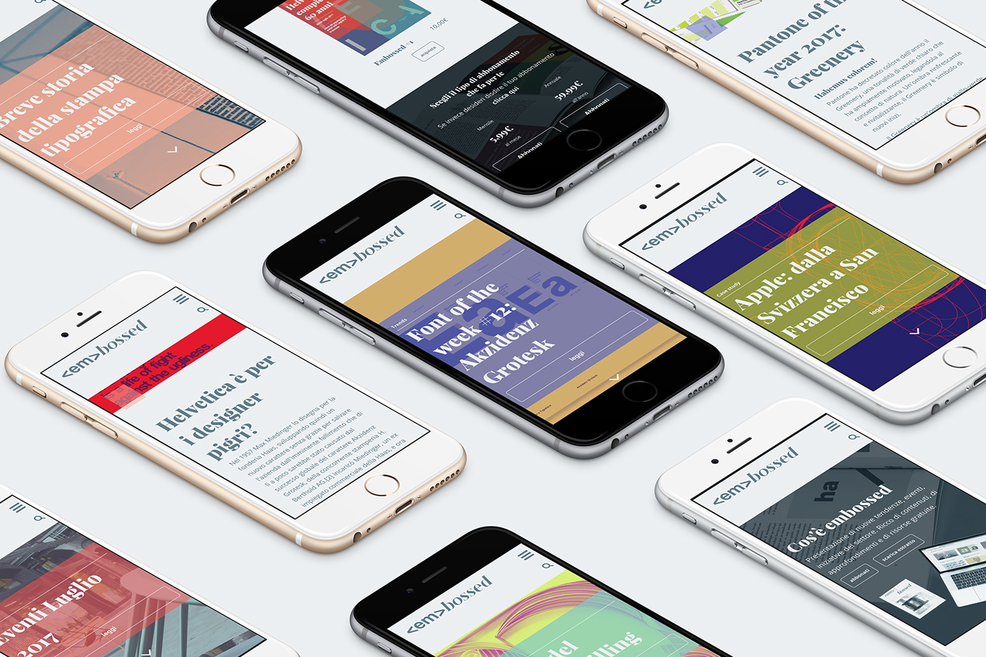
Responsive
In the smartphones era, it is necessary to consider the various ways in which the users finds and gets contents on the web, so the layout of the magazine has been designed to be fluid and adapt itself from time to time to the type of device used in order to enhance the user experience.
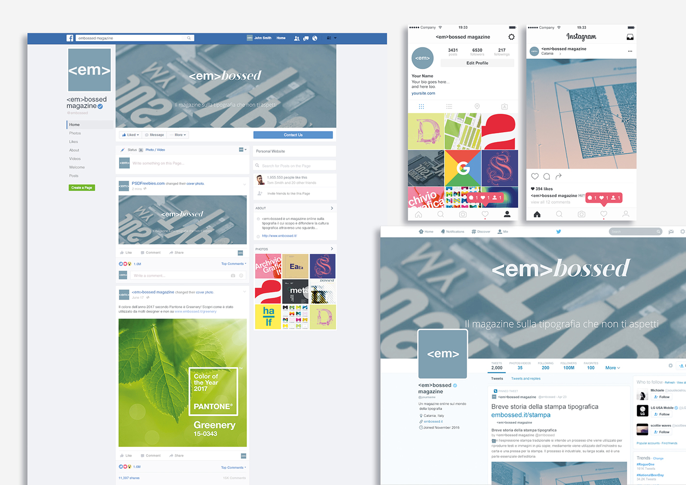
Social media
A good social media strategy is very important for spreading the information, this is how <em>bossed profile would look like on major social networks.