USA — hip-hop and rap music Mecca
The topic for Basic Identity Course final project in Projector School of Design & Development was development of identity for a music festival. I am a big fan of hip-hop and rap music: oldschool hip-hop, gangsta rap, jazzy hip-hop, southern rap, crunk, trap music — I'm all into it.
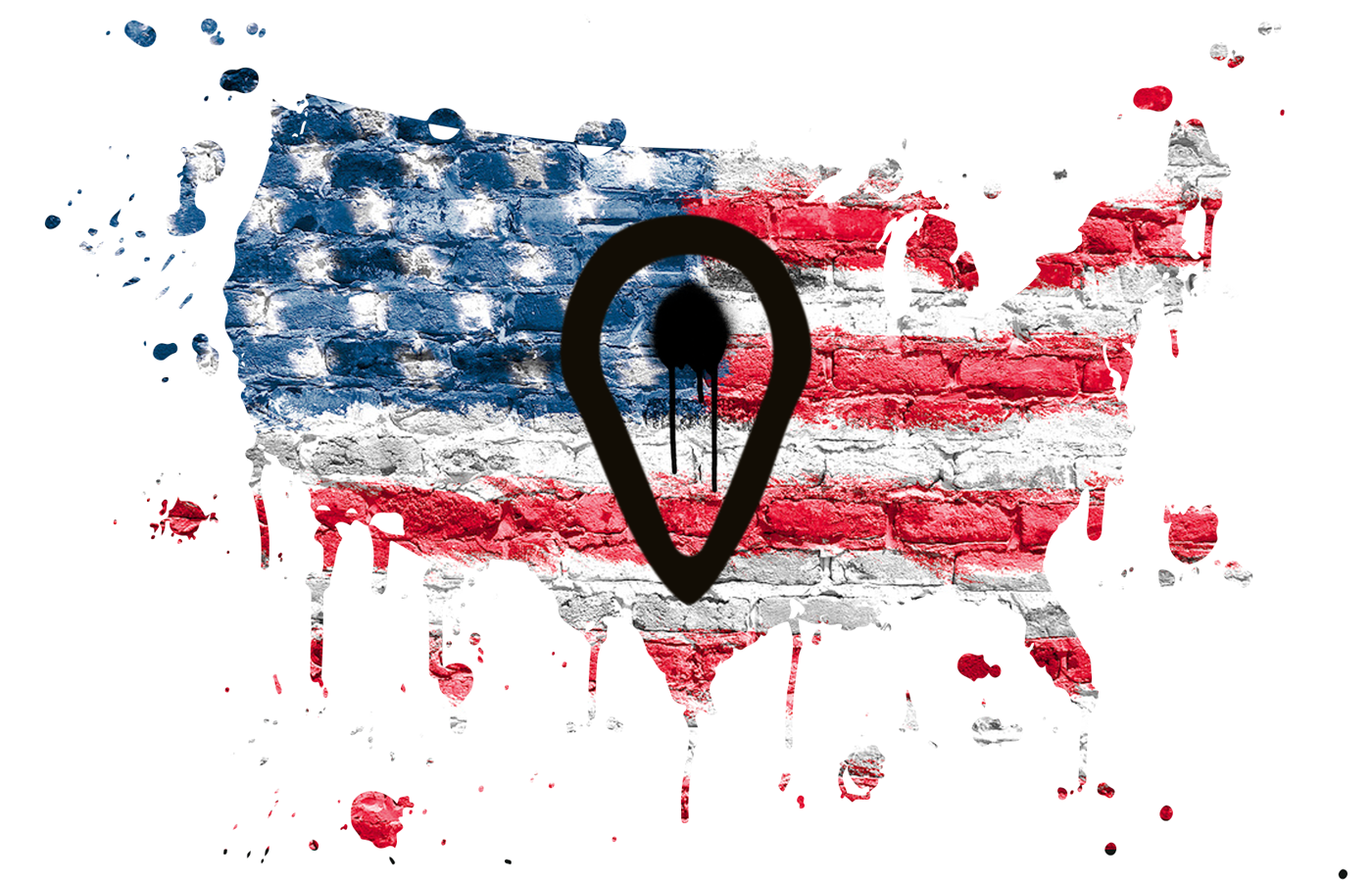
First step in completing the project was looking for the city where the festival would be able to gain popularity. USA — is somewhat Mecca for hip-hop and rap music. 99% of world-famous artists were born and raised in the US. As for me, I consider New York, Los Angeles and Atlanta as the 3 capitals of modern rap and hip-hop music. The city has been chosen on the basis of interviewing of 25 people. Most of them would like the festival to take place in Los Angeles.
The next stage was the naming. It's one of the most important parts in identity. Festival's future success depends on how easy the name and slogan are pronounced, are remembered and look graphically. I had plenty of ideas, but I stopped on AMPLIFIRE. Rap nowadays becomes more and more aggressive, overdriven and saturated. Amplifier — is an electronic device that can increase the power of a signal. It's a vital part of any music performance nowadays. I've only changed places of 2 last letters and set my naming on fire. This festival will definitely be the place where powerful music meets fire emotions. Slogan sounds like this: «Unique place where hip-hop & rap firestarters will meet at».
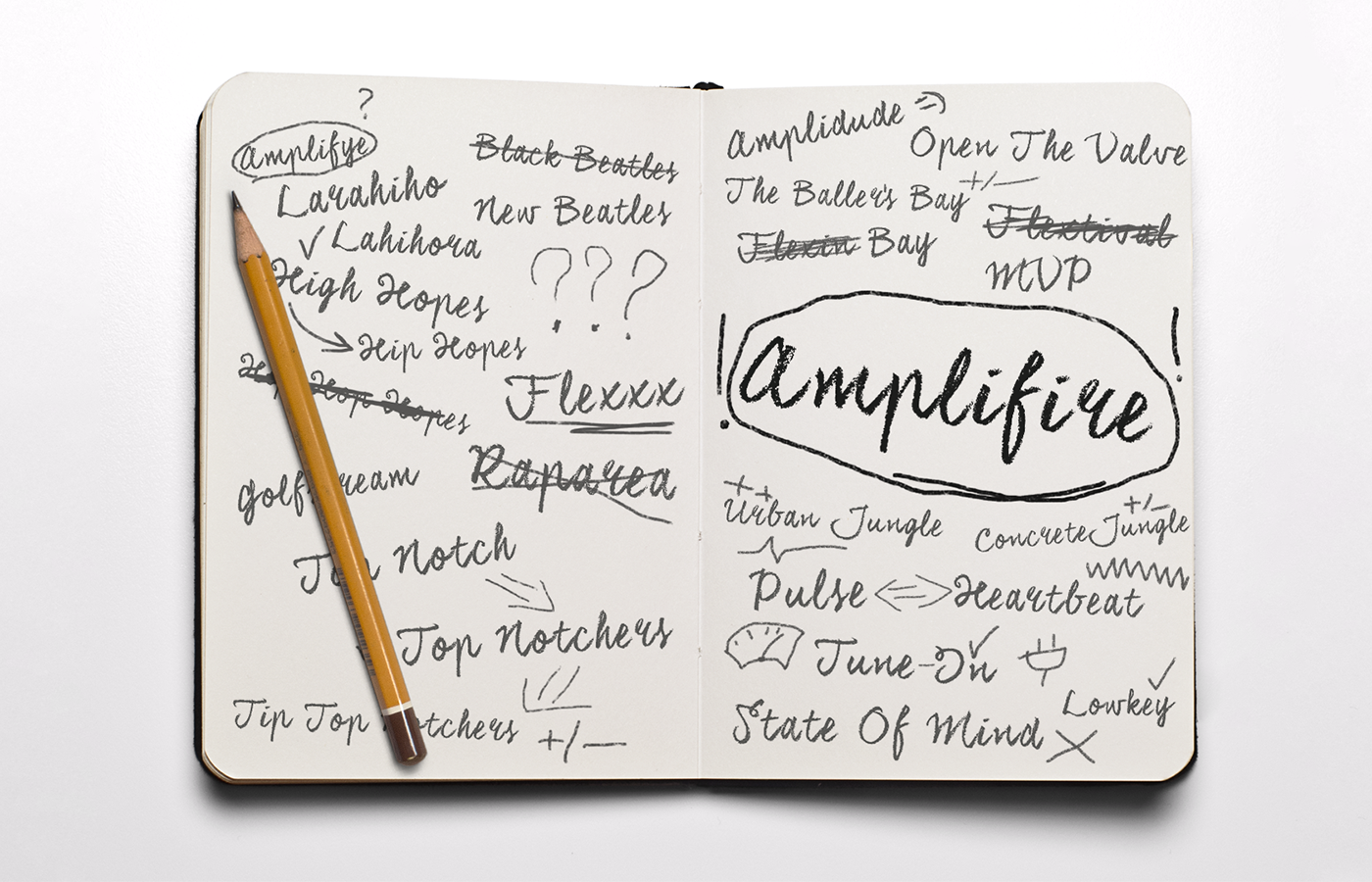
Searching the right name for the festival
If you ask a random person what comes to mind after hearing a word «hip-hop», I'm sure that among the list of named things will be «graffiti». That's why I've decided to show on festival's logo the fact that hip-hop isn't just about music. It's way more wider and bigger, than most of people may think. So, the idea for the logo looks like capital letter «A» with the dot. But the dot will not be simple by itself. It has the shape of Los Angeles area. The final result you will see soon.
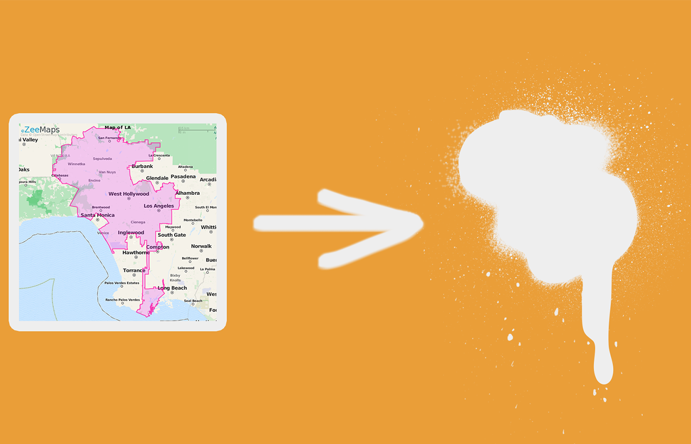
Vital part of the logo represents Los Angeles area in the shape of graffiti splash
We chose a city, we have a naming, we created a slogan and main part of a future logo. It's right about the time to choose a font, a color scheme and finish the logo. All of this you can see in the picture below. Used fonts perfectly represent the festival's temper. Black color stands for black music (rap & hip-hop), while gold color represent expensive jewelry rappers adore to shine with. Logo looks like capital letter «A» with a dot in the shape of Los Angeles as mentioned above.
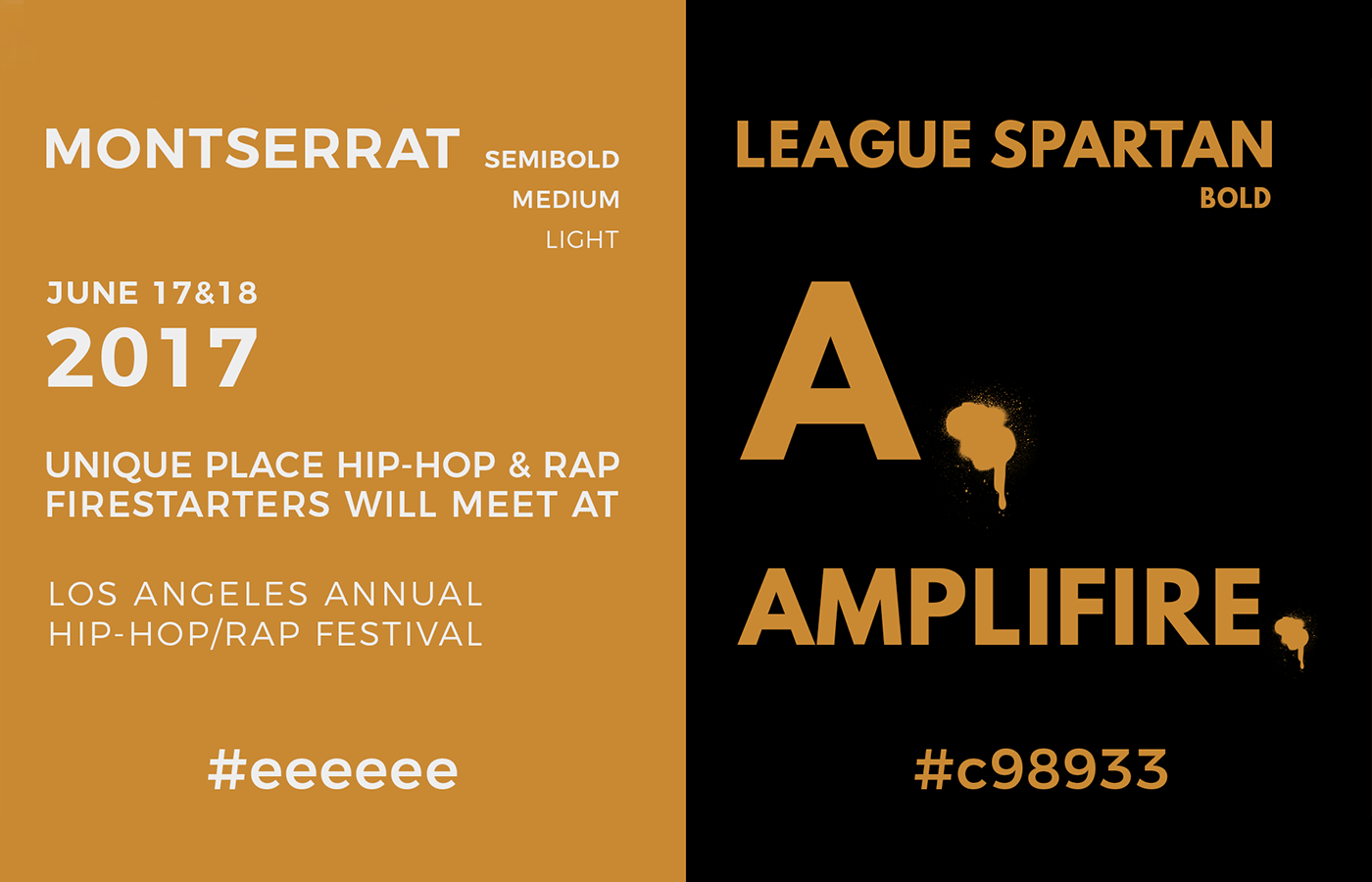
Used fonts and colors
Each festival has a list of necessary promo materials. AMPLIFIRE is not an exception — pictures you see below show festival's poster, enter ticket, artist pass, 2 designs of a t-shirt and 5 unique stickers.
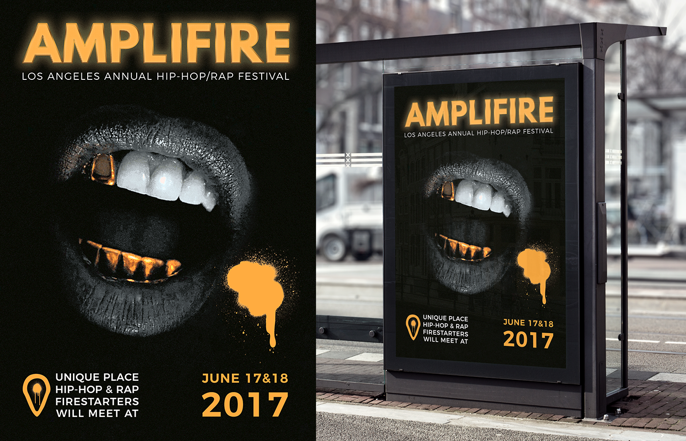
AMPLIFIRE Festival Poster

AMPLIFIRE Festival Enter Ticket
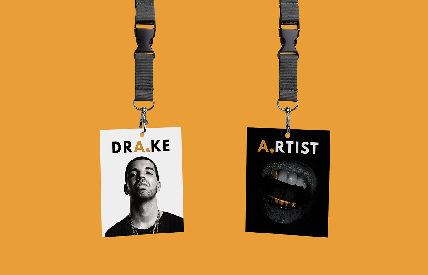
AMPLIFIRE Festival Artist Pass
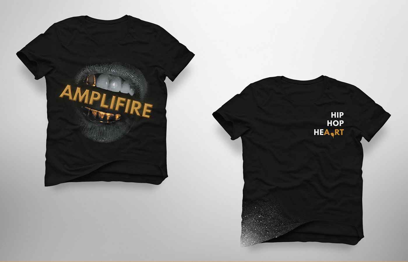
AMPLIFIRE Festival Merch
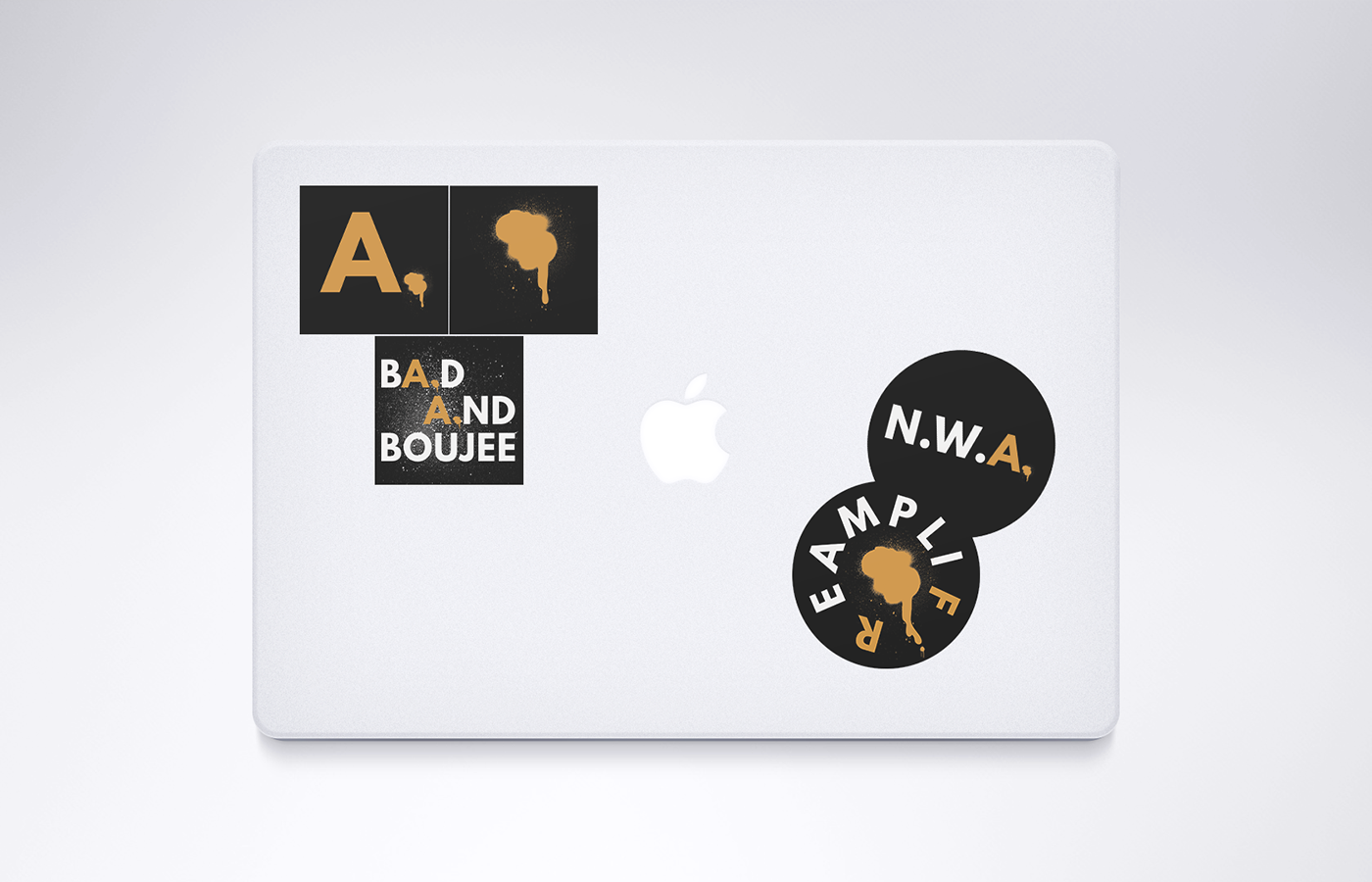
AMPLIFIRE Festival Stickers
The project is successfully completed and the information looks like this:
Event name: AMPLIFIRE
Event type: Annual Hip-Hop/Rap Festival
City: Los Angeles, California, USA
Venue: Los Angeles Memorial Coliseum
Date: June 17 & 18, 2017
Enter fee: TBA
Website: www.amplifirefestival.com
Slogan: Unique place all hip-hop & rap firestarters will meet at
