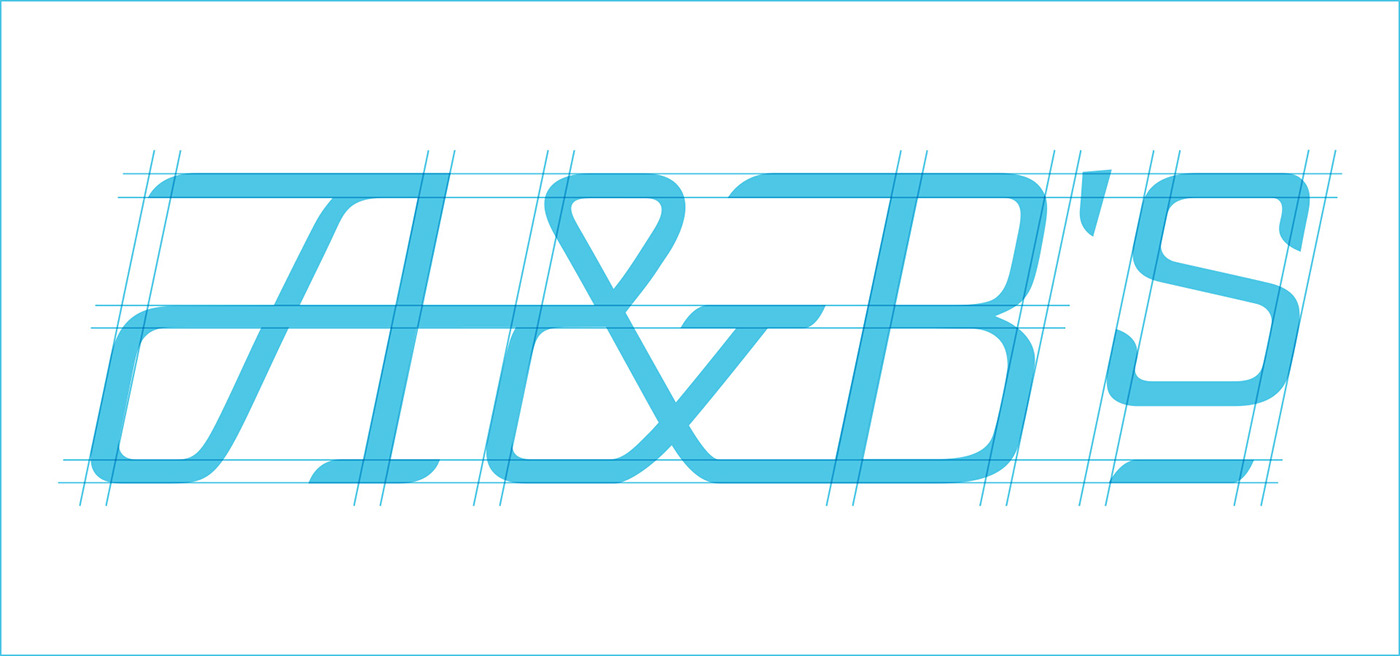
An over-caffeinated chef and a classic American lunch counter. In retrospect, the speed lettering seems obvious. Speed lettering is a style characterized by horizontal connections between letters. That feature, along with vertical stems that often lean forward, gives a feeling of energy and motion. This style of lettering was common on old railway cars, which speaks to the Americana side of the restaurant. It’s also common on espresso machines, which brings us back to the chef.
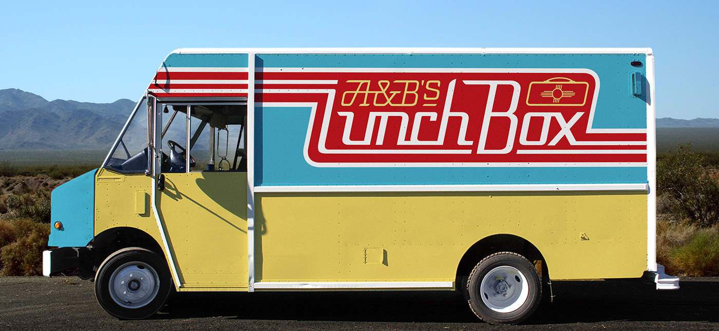
Originally, Alicia and Ben (A & B) thought their restaurant was going to be a food truck. I wanted to create a look that blended the world of food trucks with the world of 1950s railroad dining cars. We chose a color palette that strikes a balance between the red, white and blue of the American flag and the turquoise, rust and gold of Albuquerque NM, where the restaurant is based. The sun-like symbol on the lunchbox is called a Zia; it’s New Mexico’s state symbol.
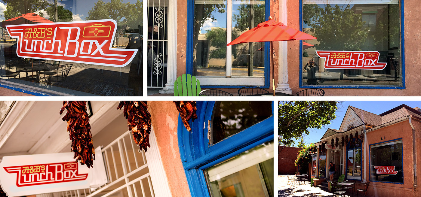
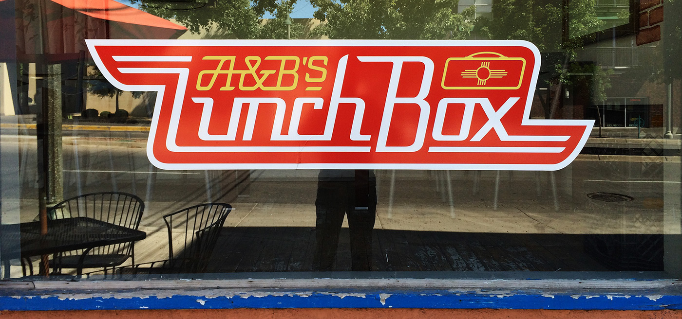
A&B’s is very much a neighborhood restaurant. We needed a logo that local residents would be proud to wear. Building a crest shape around the logo helped it feel at home in the center of a t-shirt. The Superman color scheme didn’t hurt either.
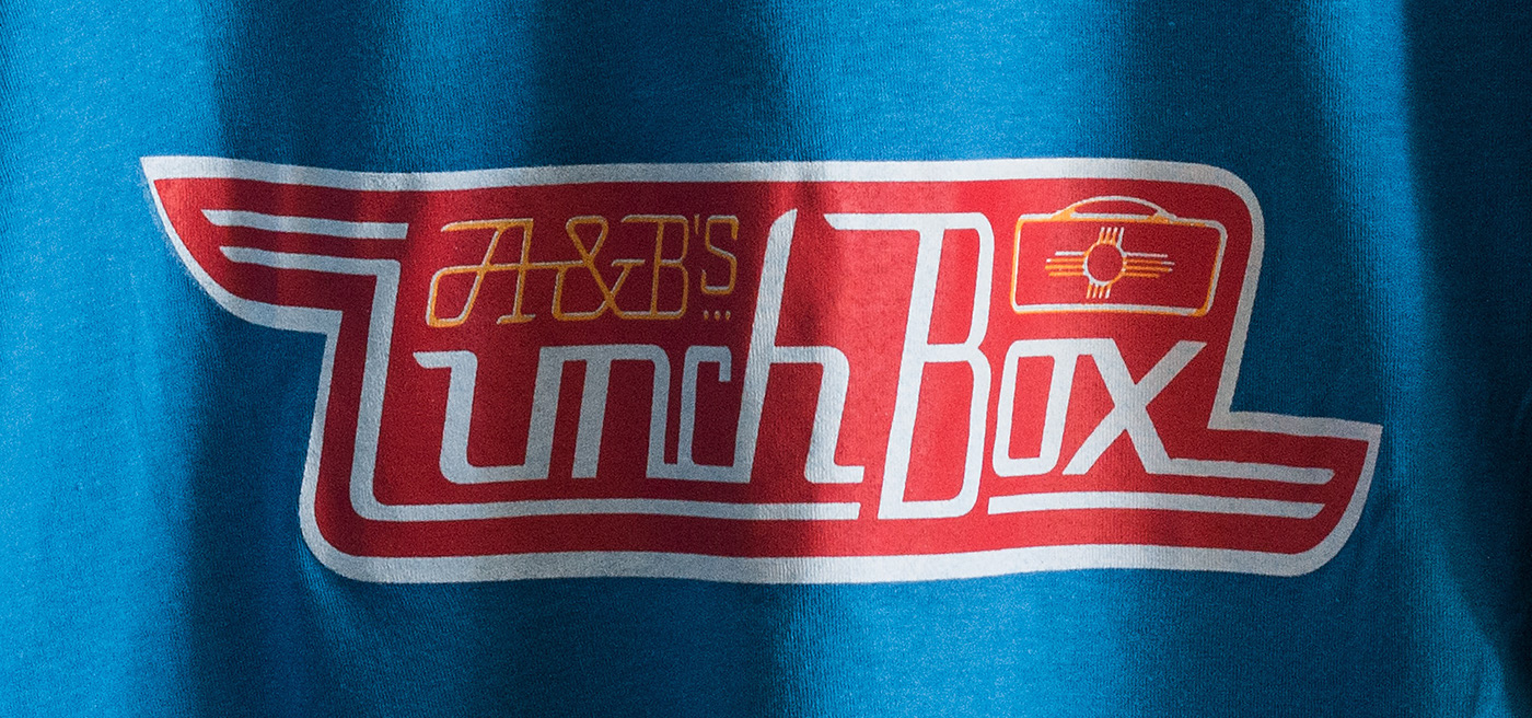
Speed lettering is typically rendered in an oblique (slanted) style, but I wanted to try a script style with this logo to add some contrast between the two phrases. The flourish on the A does a nice job of occupying negative space while adding some character at the same time. And, for anyone who has an ampersand fetish (which is all of us, I know) this one is really fun.