These are a selection of logos that I created for different clients, varying from an events company, a cleaning company, a gym, a beauty salon and an art business. All my clients were thrilled with the final logo, I would always give options and developed it until each client was 100% happy. Most were created from sketch first, I liked to sketch out ideas on paper before applying it on Adobe, I find this method very effective as you can see what works straight away.
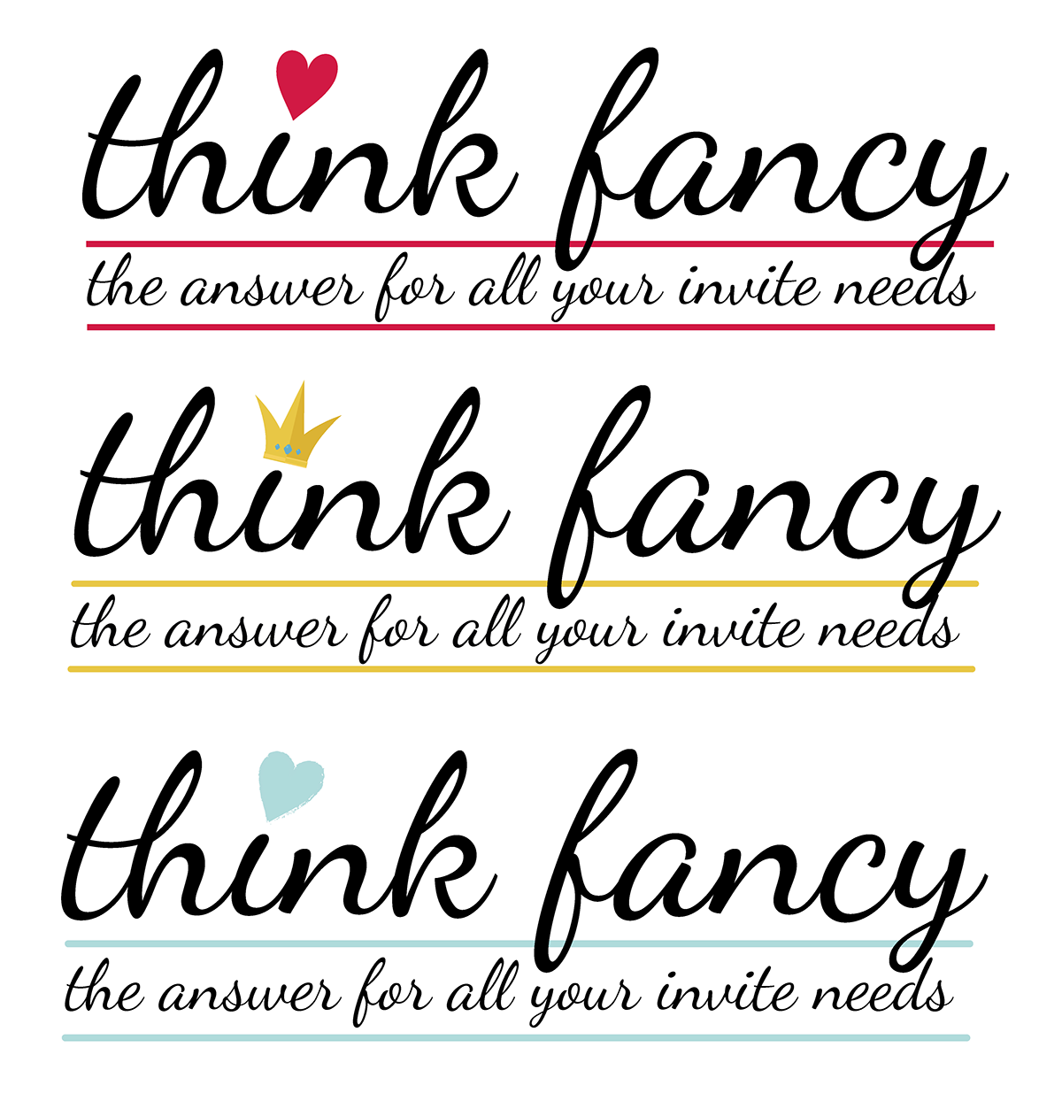
This is a logo I designed for an invitation / crafts company, I wanted it to be classy to appeal to their high end market. I thought swirly writing was the best type for the industry, I still wanted it to be readable and bold which is why I settled on this font, a lot of swirly fonts are very hard to read. I thought a heart would go well with the craft theme and the crown would go well with the theme of 'fancy'. I also feel the colours chosen are classy and elegant. I wanted the strapline to look integrated within the logo so I used the same font just a lot smaller, I put in the lines to break it up with colour and tie it into the icon nicely.

This was the final logo chosen, they really liked all designs but preferred the crown design best
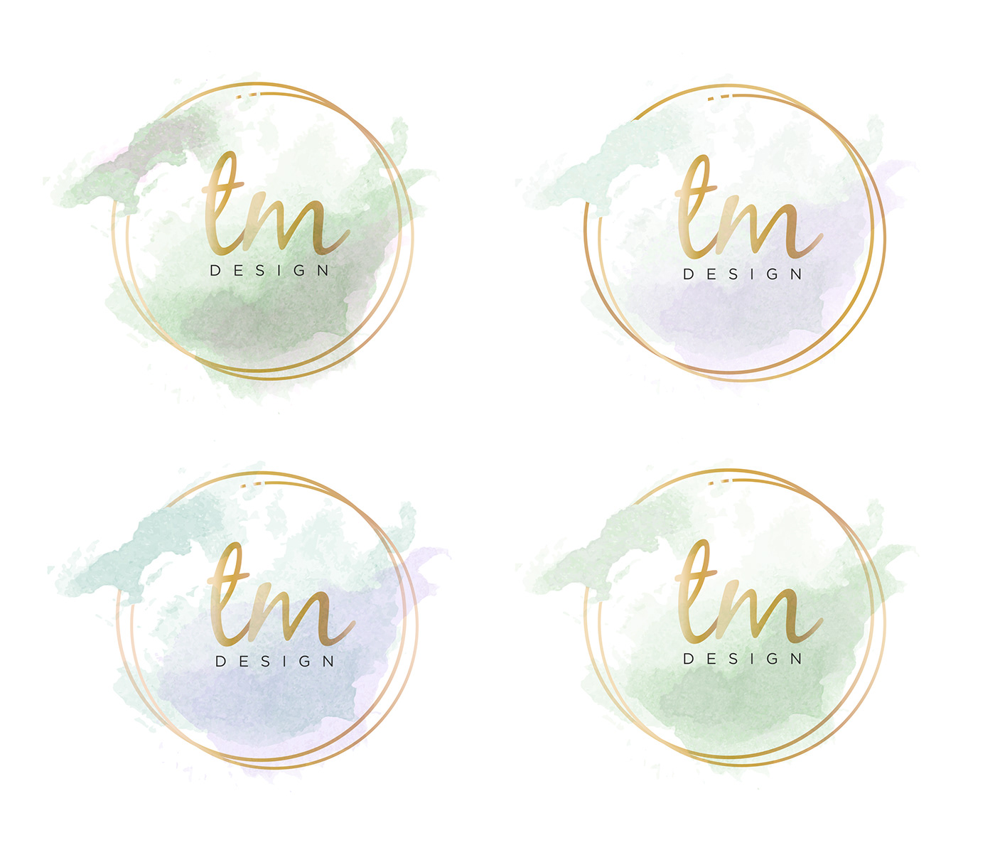
Logo for TM Design - for my freelance work. I wanted to reflect my personality, so I used a messy watercolour effect to show my creativity and love for painting, I blended my two favourite colours together and added a gold touch to keep it modern and high class. I went for the top right as the final logo.
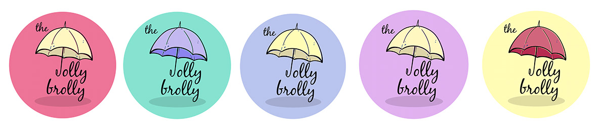
I designed this logo for a positivity page on Instagram, I felt the middle one worked the best, due to the bright coloured umbrella on the 'gloomy' background.

This was for a balloon/party business. It was my first attempt and they were happy with the logo, they were very specific with instructions and were pleased with the results.
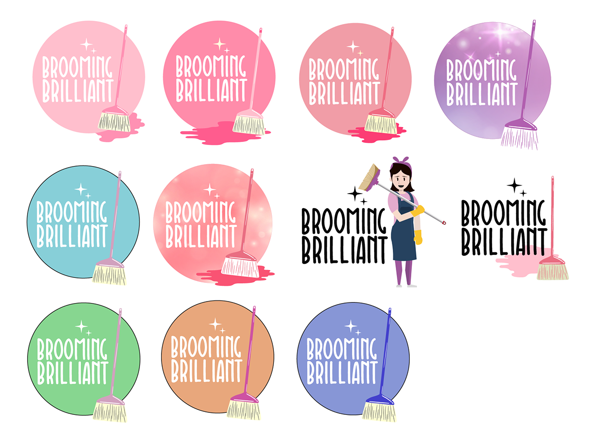
For this logo I was approached by someone who was starting up their own cleaning company, they didn't even have a name and wanted me to come up with some ideas, so I came up with 'Brooming Brilliant' which they loved. So I put together some ideas based on her instructions of wanting it to be female focused, simple and clear. I only did one round of logos and she absolutely loved the 4th one on the top row. I also created a cover image for her Facebook page using the image cartoon image I based on her (3rd one along on the middle row). She has been recommending friends to me ever since and I'm pleased to say her business is a roaring success.

This logo was for a beauty salon, the client was very specific in their instructions in terms of it being pink, with black curly writing. I did want to show another colour (I picked the trendy mint green) just to show a contrast and I thought it worked really well. the ivy on the circle added a nice touch and I thought adding the simple gold ring would make it look a bit more classy. The client absolutely loved the choices and wanted to go with the 2nd bottom logo as the final one.

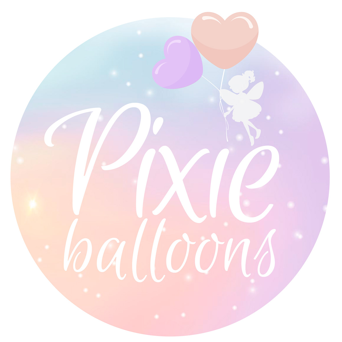
This client started up their own balloon business, this was another client who didn't know what to call her company, we discussed a few names but finally settled on my option of Pixie Balloons. She wasn't sure about what she wanted in terms of style so I did some diverse options and colours, as my client was Irish I tried to get the Irish colours within the options, but also went for a more feminine touch to appeal to her target audience. In the end the client settled for a mix of the first one on the 2nd row and the front of the last one shown. Final logo can be seen below. My client has contacted me since to create a cover photo and t-shirt prints for her business.