PURRFECT PORTAL
OVERVIEW
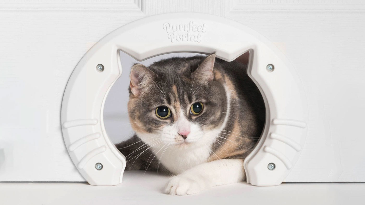
It’s as simple as this: Purrfect Portal is just a device.
It’s an interior cat door that you install when you want your cat to have unlimited access through the house. The product is as straightforward as it could be, the design is fun and installation is easy.
The product is great and the name is inspired, it only needed a adequate logo.
RESEARCH
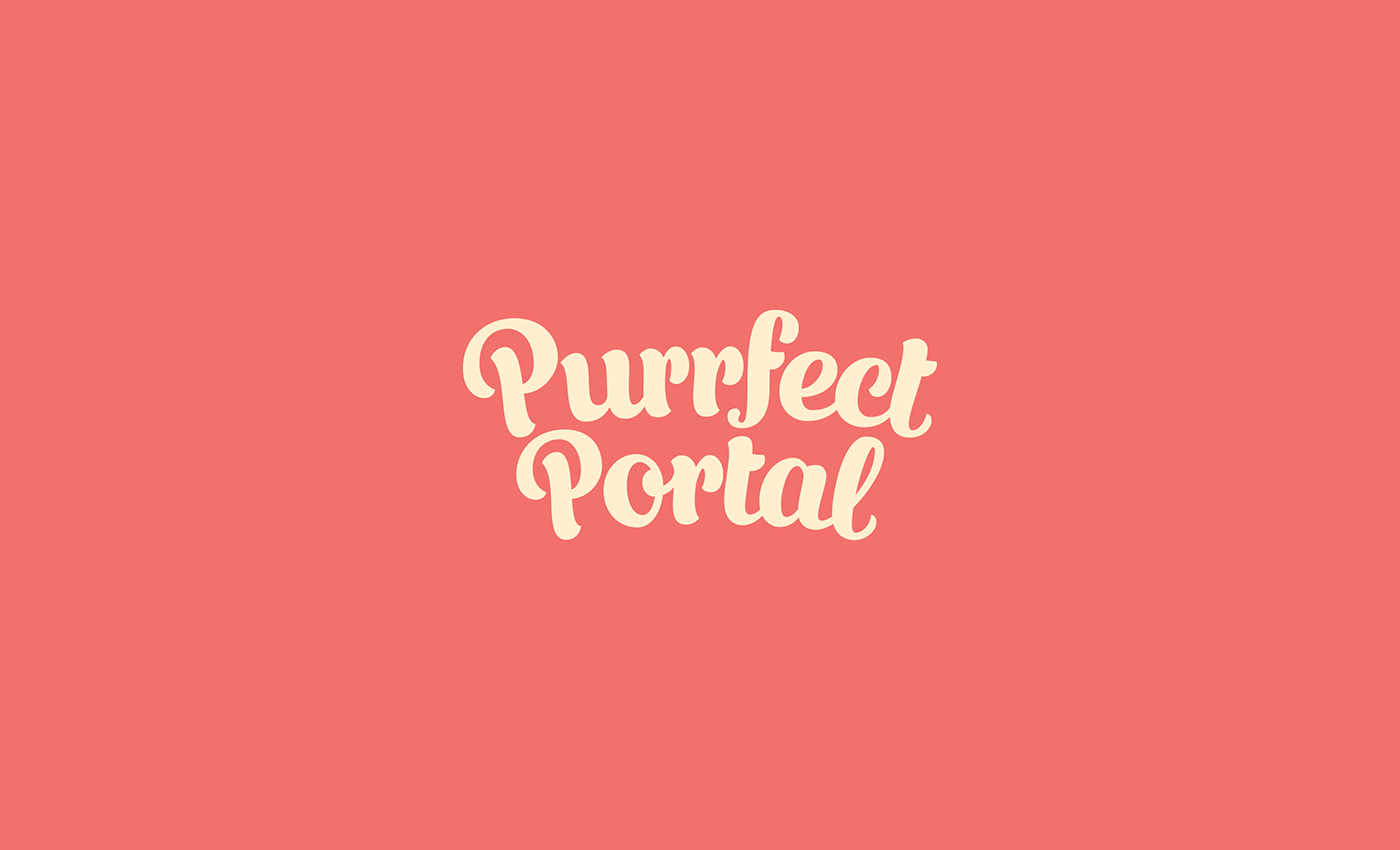
After the research part, the road was pretty much clear – we needed a logo that would look good on the product, readability being a very important factor. The new logo needs to be able to convey easily the most important brand attributes: fun, easy, cute, helpful, practical.


THE SOLUTION
The logo needs to be placed on the product and the visibility has to be optimal, so following the products curvature was the best way to achieve this goal.
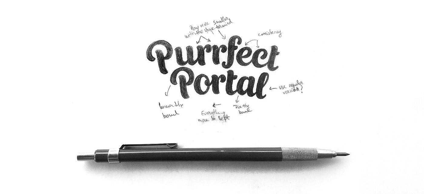
TYPOGRAPHY AND COLOR
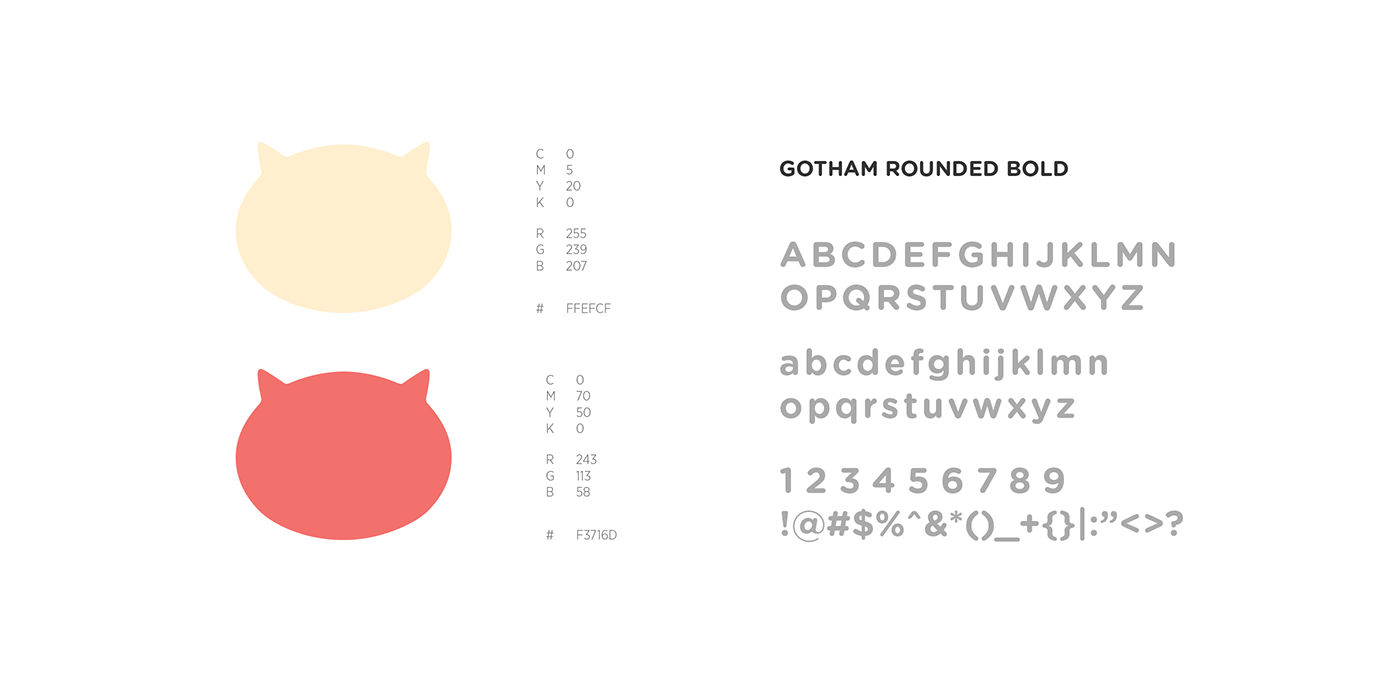
Gotham Rounded Bold with it’s friendly and inviting shapes was selected to work on various materials alongside our custom-script solution. A slightly retro color combination was opted for, featuring a playful red hue -
Geraldine in association with varden - the fancy name for this cream hue.


I’ve worked on two branding project with Florin and I love the way he approaches his projects. When you’re looking at the finished project (or a few different concepts) you’re crystal clear on why he took the direction he did.
Lisa Harrington - CEO Purrfect Portal


Thanks for watching
See more work on our website >


