

Redesigning the Craigslist UI

Homepage. Front and center search bar. Underneath the search are common categories that can filter down search options. At the bottom are recommended listings. Change city is no longer hidden away at the top, and is instead directly below the search bar.
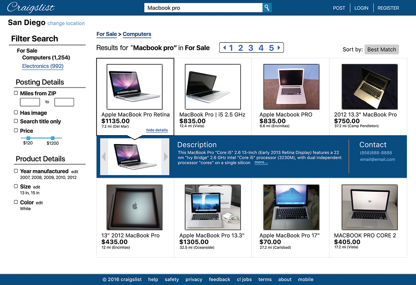
Search results page. Filtering options on the left side. Breadcrumbs above the results. Sort by option should be included as well. Clicking each results brings down a dropdown menu shows a quick preview of the listing details.
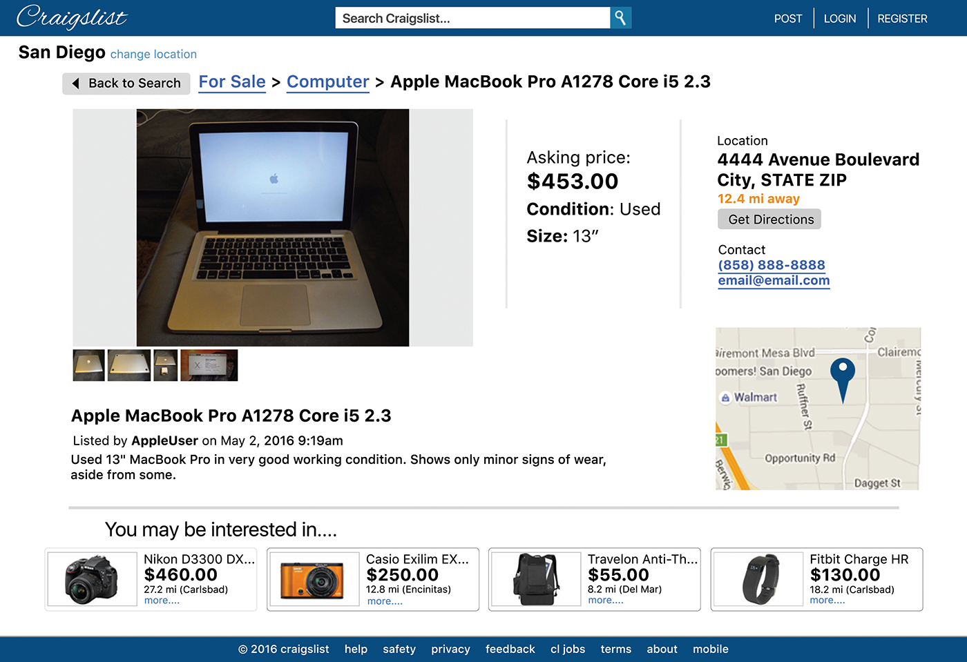
Listing page. Each product may offer more standardized specifics, like condition and size, that are helpful to objectively categorize listing searches. A Get Directions button is placed above the map on the right, which is intended to link to a route navigation page like Google Maps. At the bottom is another set of recommended listings (hopefully they'll be better than the ones here).
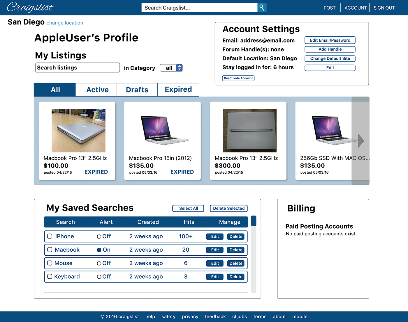
Profile page. Each account has better visualizations for the profile's current listings (and each listing card has details such as price, post date, and status), as well as saved searches. One thing to explore is having stored billing information.

Make-a-listing page. The entire process is made on one scrollable page (as opposed to 3 or 4) to make it appear less tedious and exhausting. It's a streamlined approach involving 3 steps with large buttons to nudge the user in the right direction.


