Empório Frutaria
Empório Frutaria is an emporium specialised in natural juices and sandwiches.
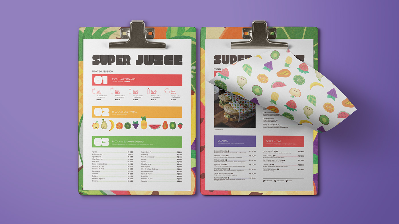
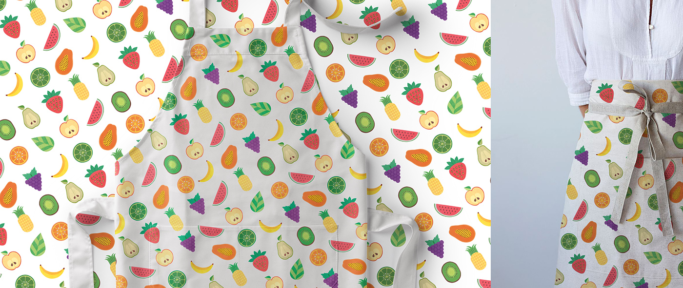
A place to find healthy food in a cool, fun and young ambient.
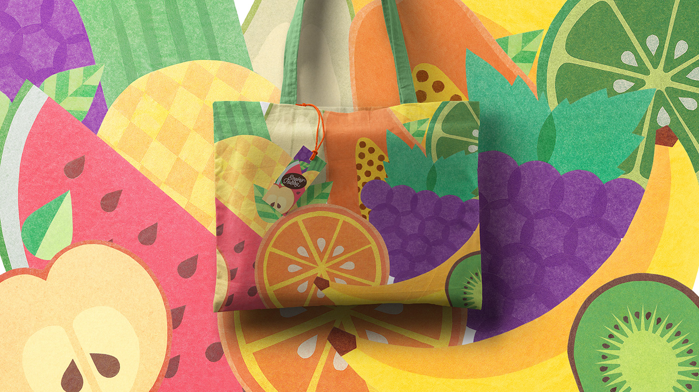
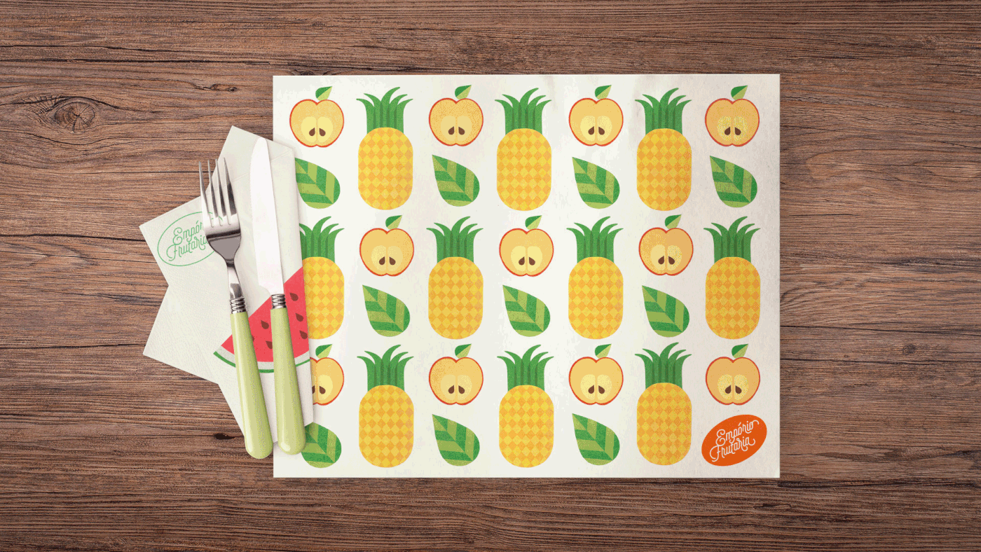
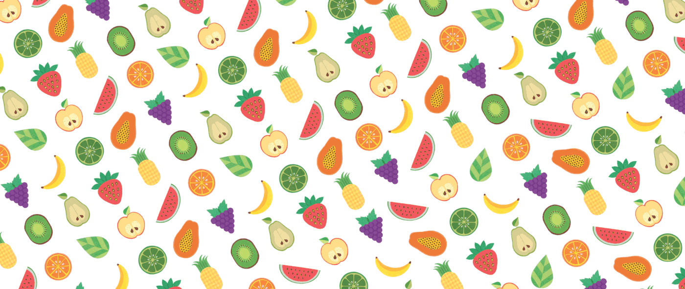
To bring out this atmosphere the graphic identity reflects the colourful and tasteful
mood of the fruits, also exploring its shapes and textures.
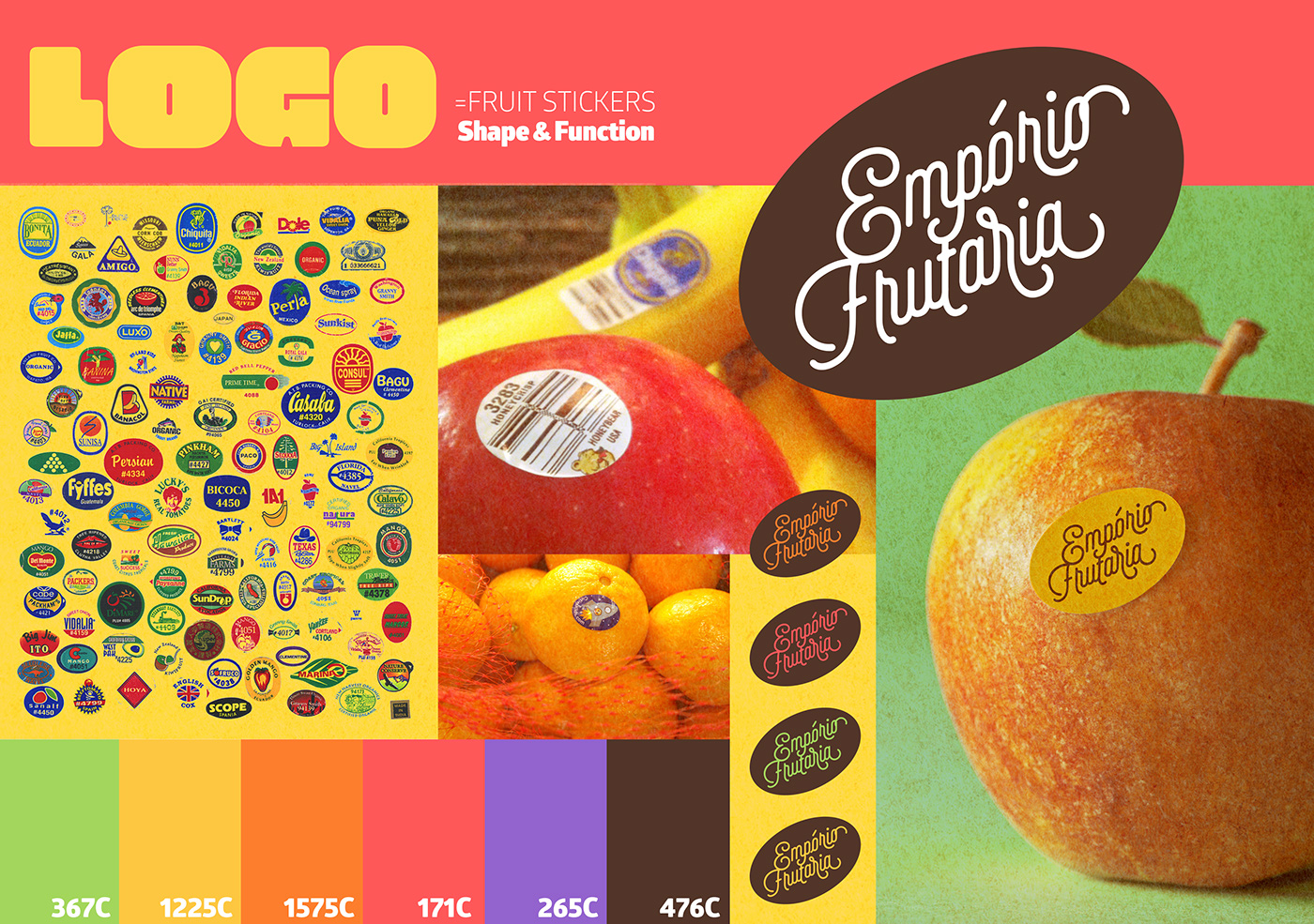
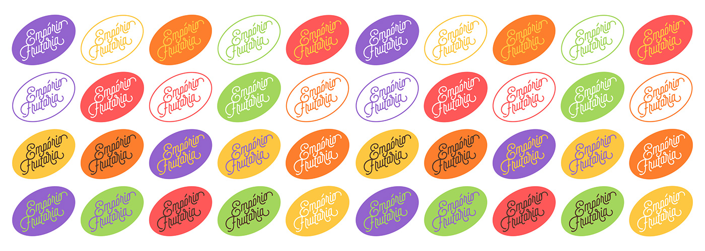
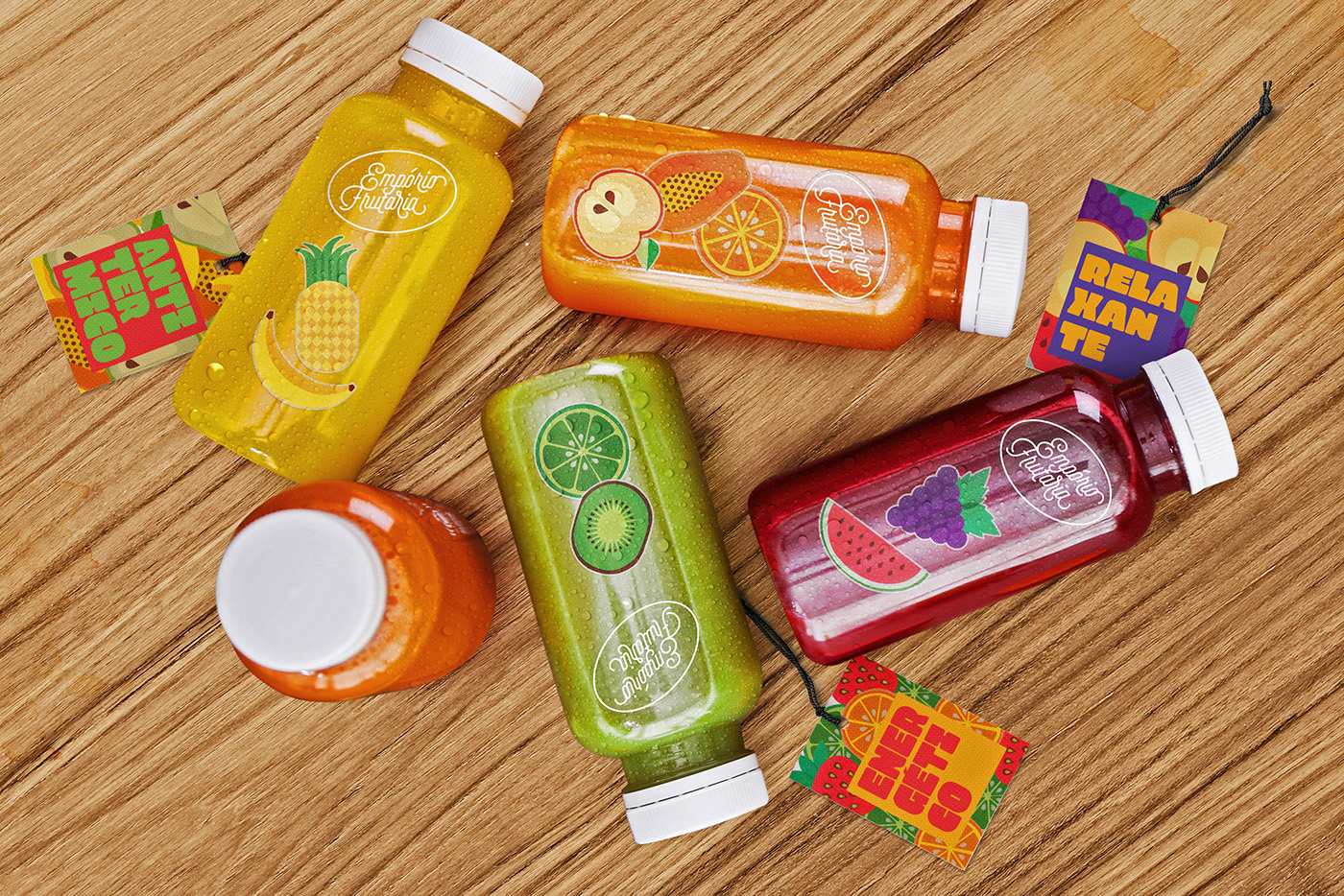
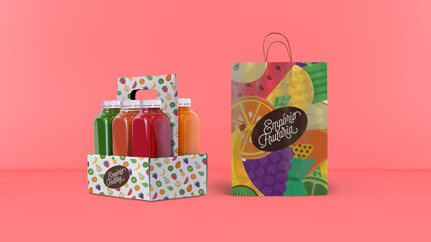
The logo’s format refers to it’s main function: a reference to the ubiquitous fruit seals – with a large palette application to set a bright contrast between the colours of the fruits and seals.
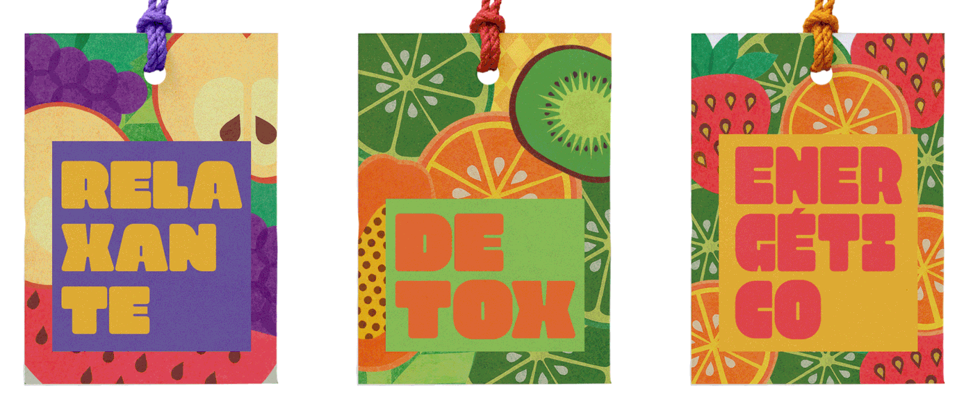
The “Selfie” typeface, by Lián Types, was chosen for reference due its sloping shapes – the characters witch sits inside the seal are like branches that curl up in a dynamic relationship between positive and negative space.
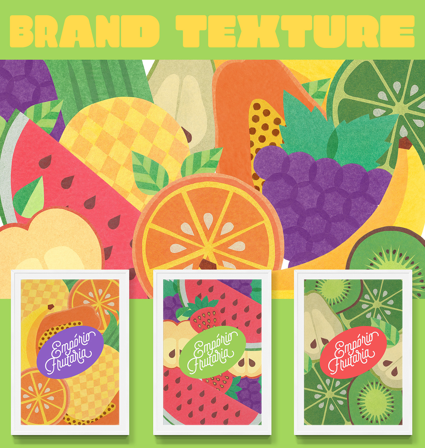
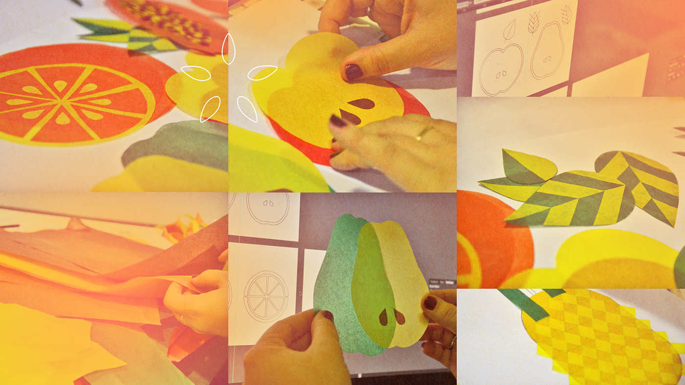
To make the brand speak out loud, a texture and patterns were developed trough a handmade interpretation of many fruits. It brings a warm feel about food – revealing the paper texture and the imperfections of cutting and collage.