


METRO GRAFFITI
Metro Graffiti is a project whose goal is the continuing education of residents and tourists. Today, it is impossible to imagine Kharkov city without the metro system and its all-encompassing influence.
In 2014, Kharkov region was visited by almost 72 000 tourists. Given this, the essential idea is to familiarize people with the "multilayered" information. Raise cultural and historical values, love for your city and its inhabitants, if possible, develop the desire to get more information.

ANALYSIS
During the investigation, carried out during the transition to the design concept development, gave several strategic conclusions.
One of the elements of a marketing campaign is advertising. The larger the city, the more efficient it is in any advertising company. For metropolitan areas, where there are underground highways, their availability is not only a way for residents and visitors to quickly reach their destination, but also to combine useful information.
CONCEPTUALIZATION
The concept of change needed to come from the new role of art as a motor for change in society. Innovation and creativity are values in high demand in today’s world.
The idea of developing a visual identity for the transition of the Kharkiv metro stations is based on the stylistic solutions of street art and graffiti.
Every city, like a person, has its own face. Public art is a form of existence of contemporary art outside of artistic infrastructure, in a public space, intended for communicating with the viewer, including unprepared, and problematizing various issues of contemporary art as well as of the space in which it is presented.


Composition of the project
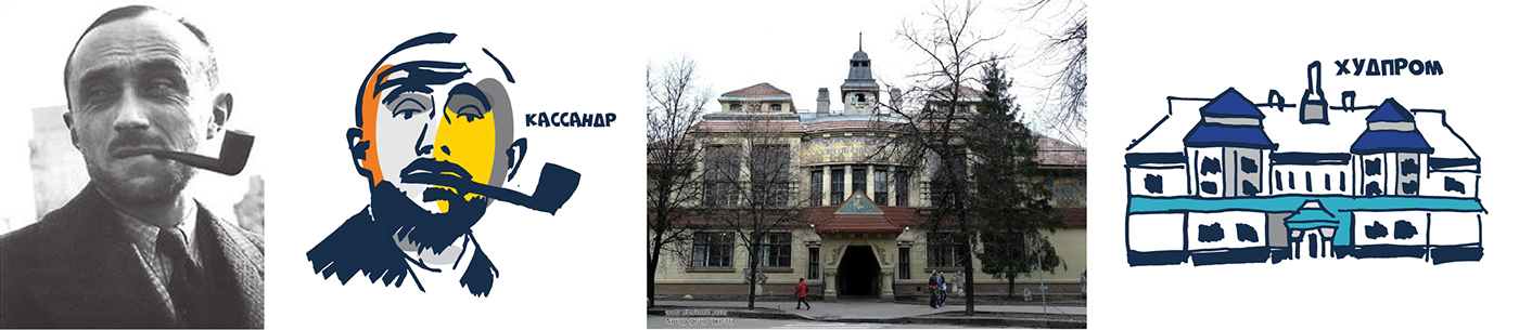
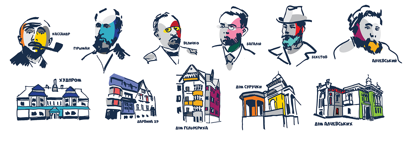
My project was in the visual identification of the metro station named after architect Beketov. The work was carried out from a historical point of view, information was gathered about the area where the metro is located. This is helped create a branding of the territory, which will serve for the further development of the city.

LOGO
The logo was built by a font in the style of graffiti and an unlocked linear figure, a square that repeats the concept of constant dialogue.
The concept "Metro - Like Underground Streets."
The works laid the idea of graffiti, as a reflection of the street, the constant movement of the city. Each city has its street art; it is like a mirror - reflects the face and identifies the features of the city and the area. The concept transmits the relationship between man and the present. Graffiti can be anywhere and in a rather different stylistic solution - a reflection of personality among gray buildings and everyday life.

how it now


how it can be


Color
The brand also needed to be expressive, and the use of color was essential to this project. This project was imagined as a journey that travels through a circle of colors, in such a way that, during the duration of their movement, they move through the bright color, ready to form part of the historical city.

TYPE
For the logo and the captioned one was used the font NeSkid (Comic BD) ID120055769 capitalization and font Gill Sans. Font readable and harmoniously suited for a large block of text.

VISUAL IDENTITY
In addition to creating the images themselves, the project also included:
- brand book,
- brochure,
- 3D model 1: 1,
- an explanatory note,
- and souvenir products.


Protection of work
Work on the project was conducted for five months in parallel with the main study. This project is a real order, with the constant participation and cooperation of the customer.
Shortly, its implementation is expected, which I very much hope for.
And now, I have a Bachelor's Degree)


Thank you for watching and well-spent your time!


