
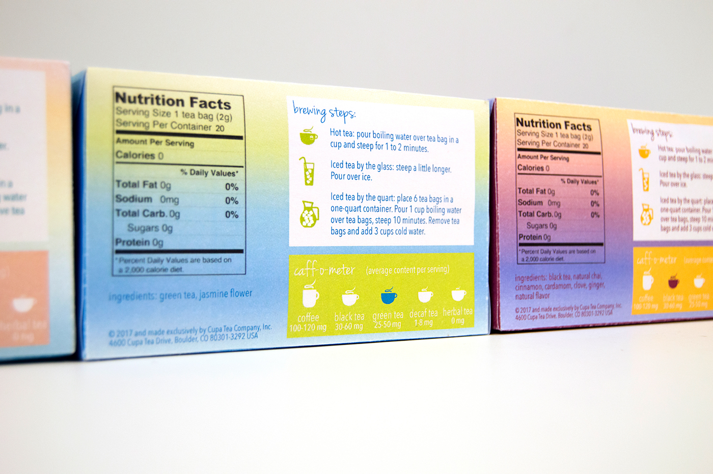
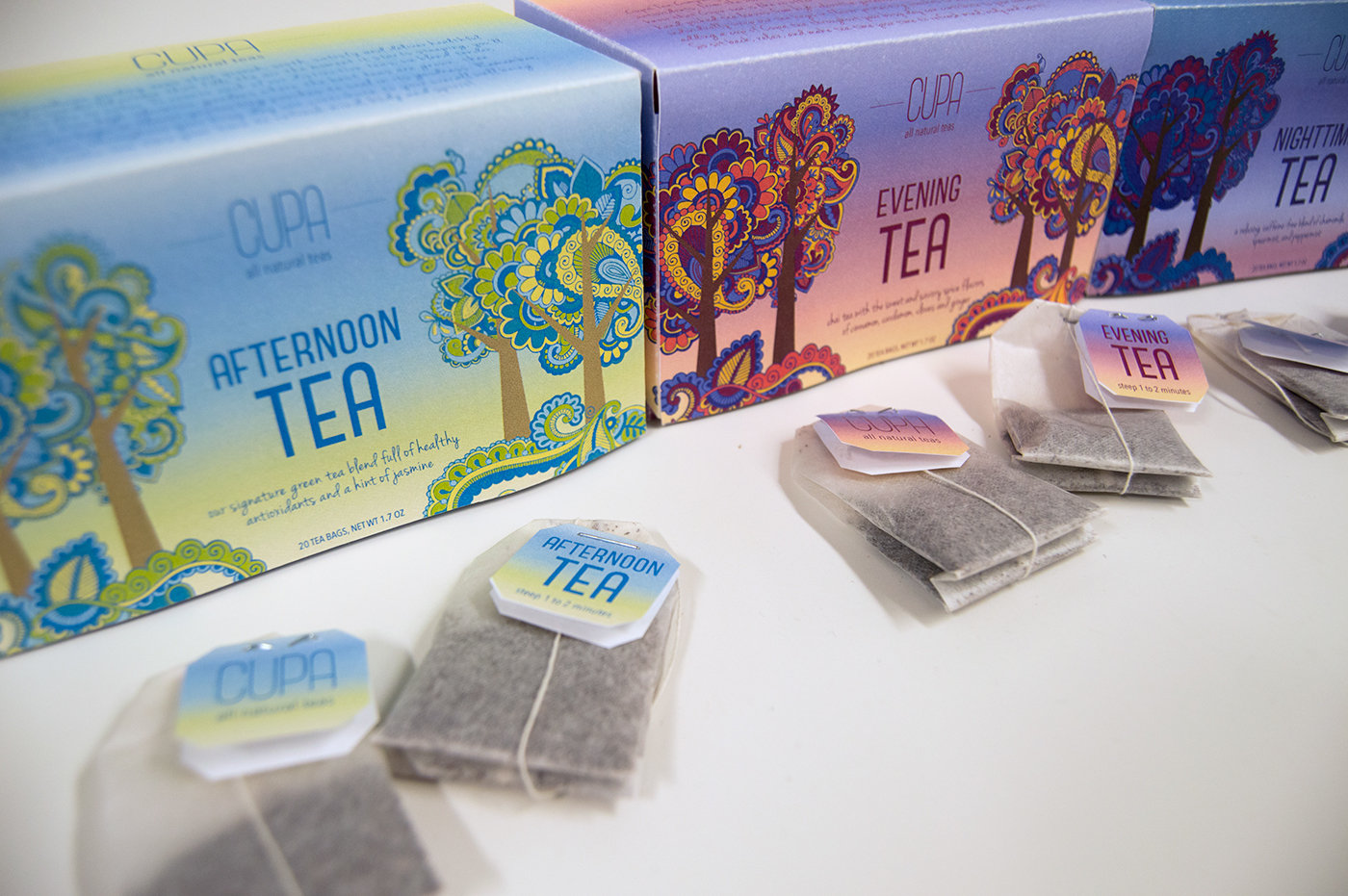
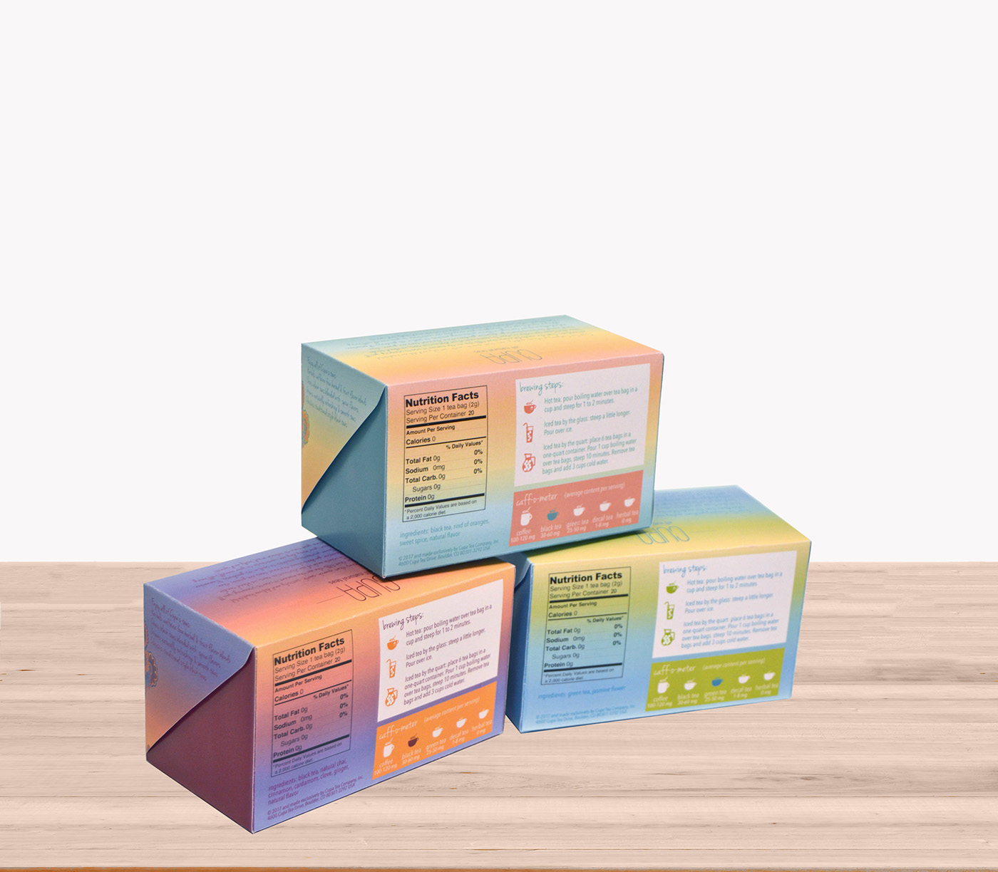
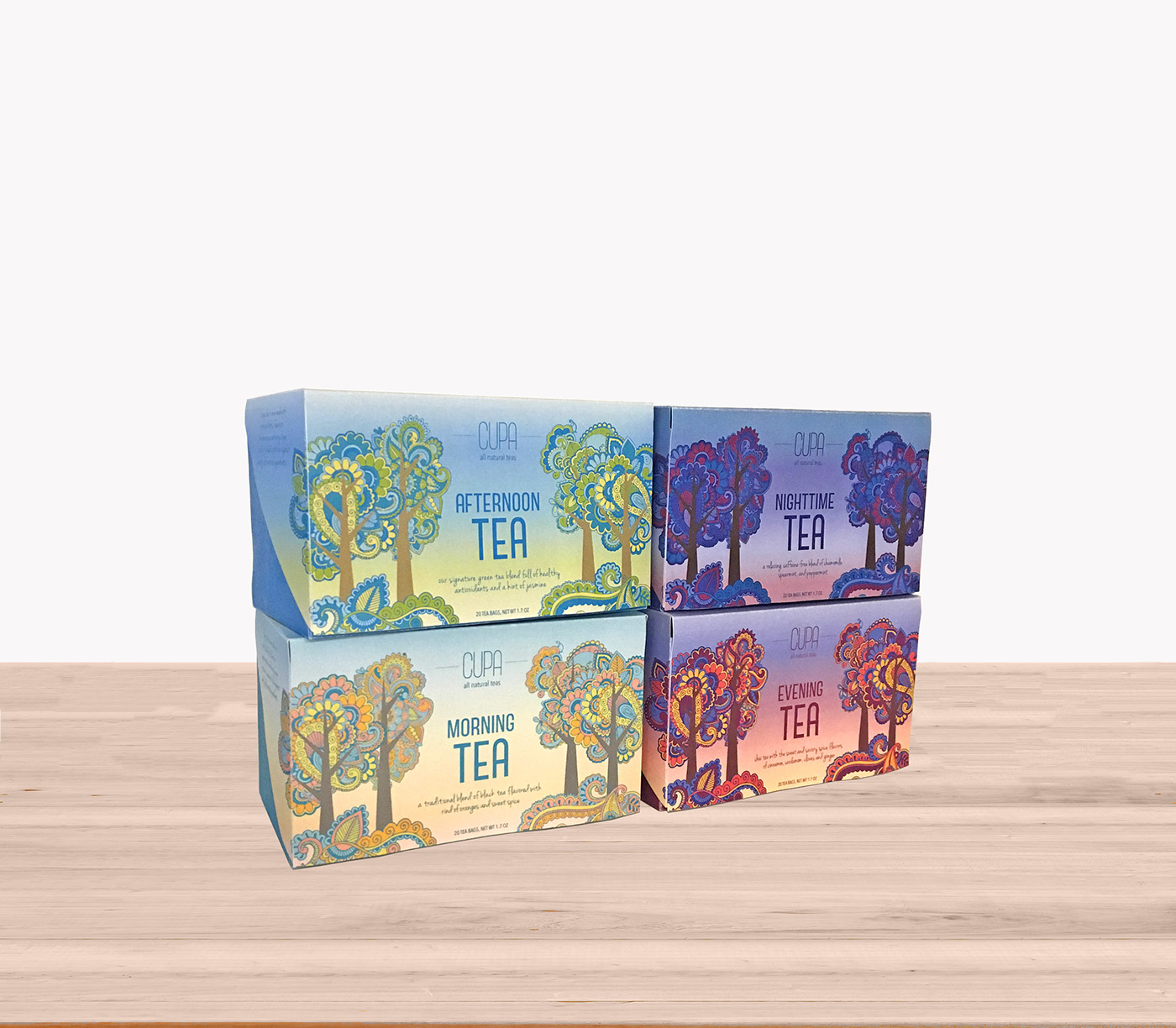
This was a project in my Professional Practice course to create a tea brand and create packaging for four variations of tea. I decided on "Cupa Tea" as my brand, and used photos of the sky from the four times of day to create the color palettes I used for each package. I used the floral paisley patterns to make tree shapes to emphasize the healthy aspect of this tea brand with natural imagery. I chose to make the colors very bold in order to draw attention to these packages on the store shelf.


