ThirtyUI.com is a website created to challenge designers to create a user interface design based on a company's existing UI every day for thirty days. This portfolio entry includes all of my UI designs throughout the course of the challenge.
------------------------------------------------------------------------------------------------------------------------

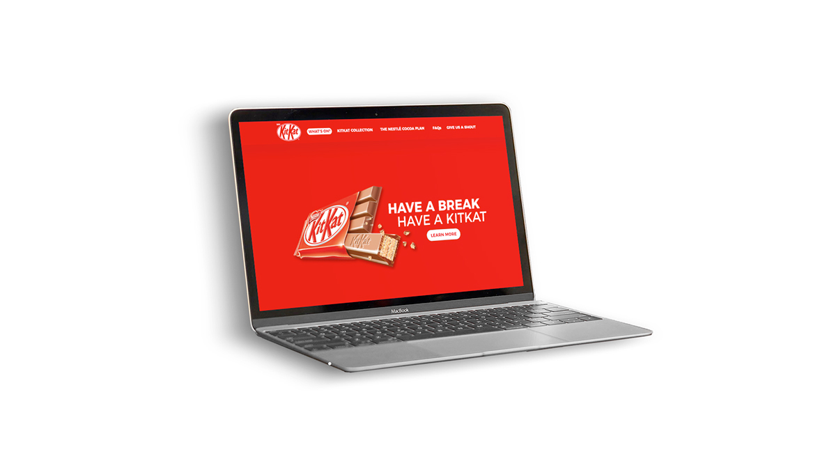
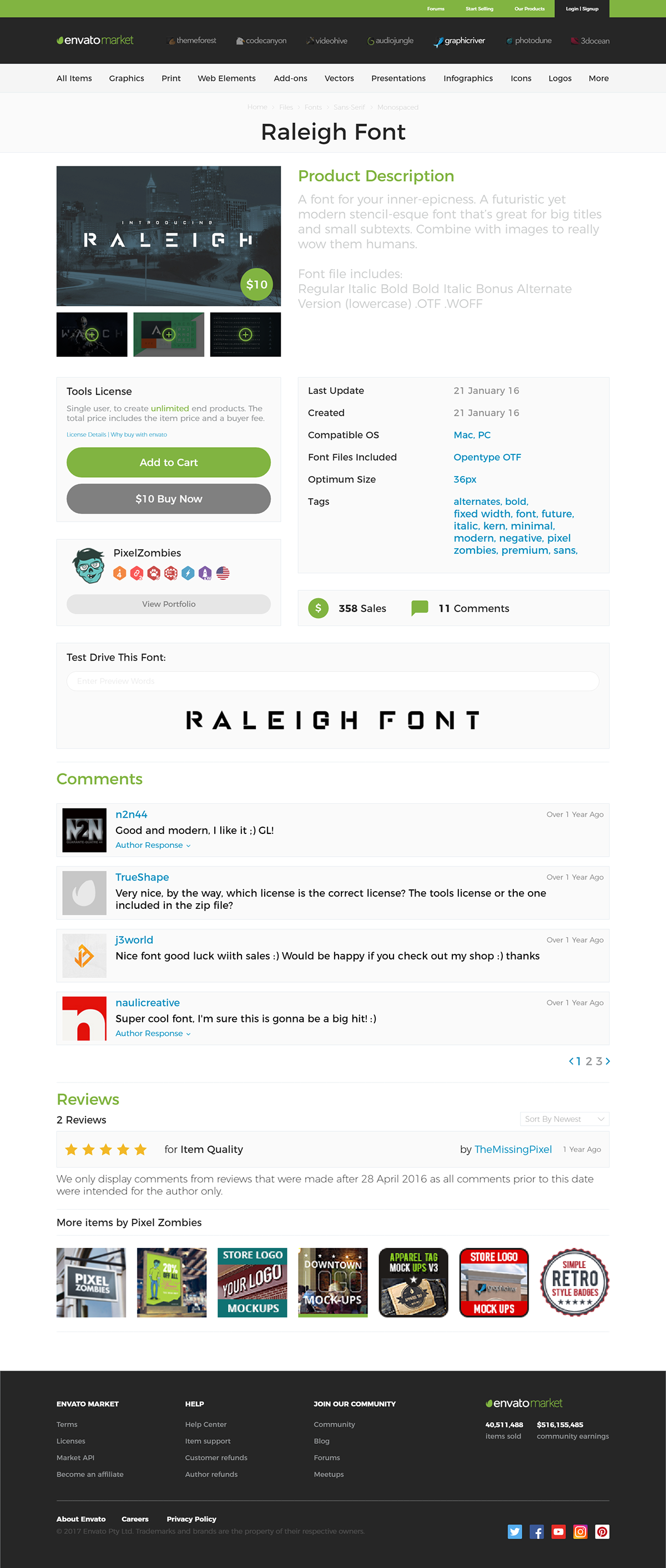
Day 1: Website Redesign, Company: KitKat
The Brief:
"Hey there!
Thanks for taking on this challenge, we're looking forward to working with you. KitKat™ is a candy bar that the world is familiar with and loves, but our homepage doesn't capture that passion.
We would like you to redesign the KitKat™ homepage to accomplish the following goals:
We would like you to redesign the KitKat™ homepage to accomplish the following goals:
Feature more appealing product photography.
The site needs to look more modern, clean, easy to navigate.
We should feature some of our other KitKat™ products on the homepage.
If you do a google search for "kit kat" you should be able to find plenty of other images to use in the design. The rest of the content on our current homepage can stay or feel free to change it up some. Our main goal here is to make the user hungry and to modernize the look & feel of the site!
Click Here to download our current website that needs redesigned. (see notes below email regarding downloading/opening a saved website)"
Click Here to download our current website that needs redesigned. (see notes below email regarding downloading/opening a saved website)"
------------------------------------------------------------------------------------------------------------------------
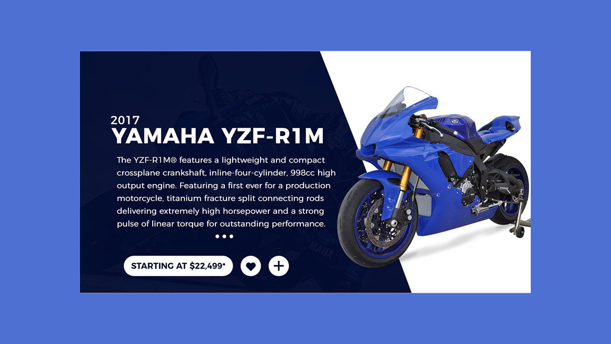
Day 2: Product Card Design, Company: Yamaha
The Brief:
"Hey!
We need to improve the Yamaha website a lot, but we'd like to see what you can do first with a product card of the 2017 Yamaha YZF-R1M bike. This can be a simple snapshot of the bike, some photos, short summary of the bike, specs, etc.
Here is a link to the bike where you can plenty of product photos and information on the newest model. We'd like to see what you can do and then go from there with more website overhauls."
Here is a link to the bike where you can plenty of product photos and information on the newest model. We'd like to see what you can do and then go from there with more website overhauls."
------------------------------------------------------------------------------------------------------------------------

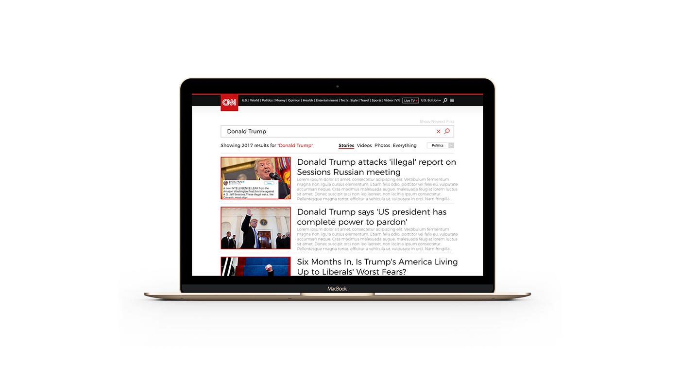

Day 3: Search Page Design, Company: CNN
The Brief:
"Hello there,
We are really impressed with your previous work and look forward to working with you to update our Search Results system. Currently at CNN, our search results are not getting great clicks. We believe this is due to a poor layout and it's not easy to navigate through the results.
Here is what our current search results page looks like.
As you can see, we can improve on the layout of the results with a goal of getting more users to actually click on articles based on their results. Feel free to improve the filtering system as well, as that could also use some improvements. Also feel free to use a new font, we're open to updating our site typography."
------------------------------------------------------------------------------------------------------------------------
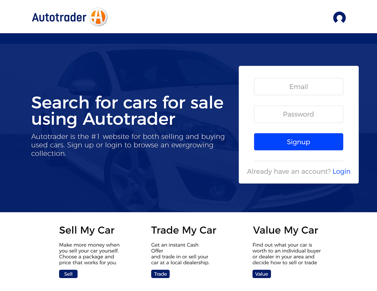
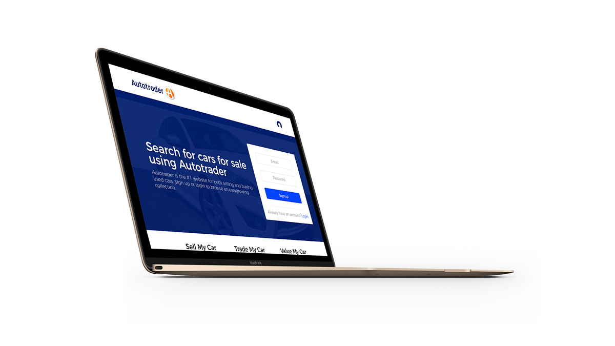
Day 4: Login Page Design, Company: Autotrader
The Brief:
"Good day,
Thanks for taking the time to chat today. As we mentioned, we're looking to revamp our login and create account screens, as well as the links to access the forms on Autotrader.
Here is our current homepage and the two forms.
The problem we have now is that users are not seeing the Login / Create Account links, so we need you to redesign that top portion of the website to increase account creation and logged in users. Additionally, we'd like you to explore some form options for said login / create account. We are open to keeping modals, hovers, a tab system. a slide down style login/create account, or even have them on their own pages. Whatever you think would increase users clicking on Create Account and going through the account creation process."
------------------------------------------------------------------------------------------------------------------------


Day 5: Website Redesign, Company: Rotten Tomatoes
The Brief:
"Hello,
We've got a really exciting project for you today! You're most likely familiar with Rotten Tomatoes, a website that rates movies and shows. We have had the same websites design for several years, and it's time to modernize it.
To start, we'd like to focus on a single movie page. You can download the current design and some of our icons here.
You'll notice our current design has a fixed width, and we'd like to explore a full width header and site. Content can still be within a fixed width but we'd like our site to look much more modern.
Additionally, we'd like to feature the movie itself instead of our left sidebar which has other movie information. We still want to include this sidebar info, but feature the movie content first before any other information.
For the main menu, feel free to change colors as we would like to get away from this green color. We'd also like to increase our search numbers, so making the search box more prominent for users would be awesome.
Overall, we're looking to make this new Rotten Tomatoes website an exciting, bold, and clean modern experience for our users. Thank you!"
------------------------------------------------------------------------------------------------------------------------
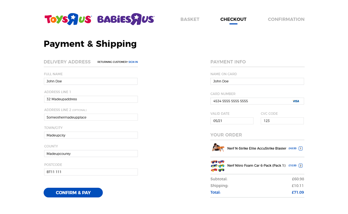


Day 6: Checkout UI, Company: ToysRUs
The Brief:
"Hey there,
We're looking to update our current eCommerce checkout flow for Toys"R"Us and Babies"R"Us. They use the same checkout system, so showing both logos at the top as we have currently is fine.
Here is our current checkout process, page by page.
As you may see, there is so much information on the screen, that we're finding many users are abandoning their cart when they make to this checkout process. We believe this is due to being overwhelmed with information and forms, and we'd like to make this look much cleaner.
We would like to keep the process of steps, which you can see at the top of each screen (Address, Shipping and Gift Options, etc.), but each page needs to be much cleaner and easier to digest.
We like the look of Best Buy's checkout screen, in that it's easier to read information and fill out the checkout fields.
Please feel free to strip away areas that you feel are not needed in order to increase our checkout conversion rate!"
------------------------------------------------------------------------------------------------------------------------
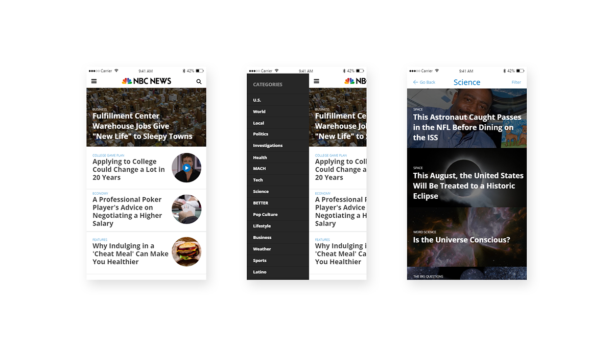

Day 7: Phone App Redesign, Company: NBC News
The Brief:
"Hello!
We're very happy to be working with you on our updated NBC News app. The core focus of the update is how our users navigate within our app. Currently, we use the bottom bar that most iOS users may be familiar with. However, we would like to try something that both Android and iOS users are used to.
Our current problem is that once a user navigates to an article they want to read, they find it hard to return back to the news listing. You can see our current app flow here.
We would like you to come up with a navigation and updated layout so that we can achieve the following goals:
1. Users can easily understand where they are in the app
2. Can easily get back to the homepage (all news)
3. Create a navigation system that works for both iOS and Android users.
We are open to a traditional hamburger menu or something more unique, as long as you can show us what the menu looks like and how it relates once a user is inside a single article page. Thank you!"
------------------------------------------------------------------------------------------------------------------------

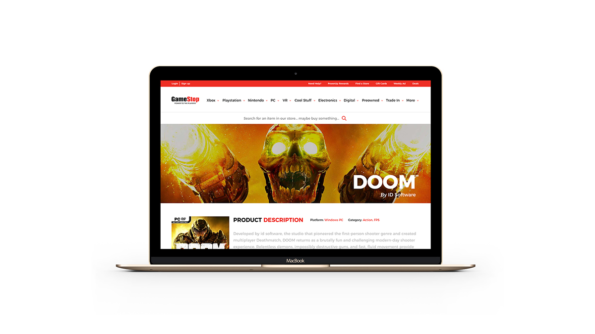

Day 8: Website Redesign, Company: Gamestop
The Brief:
"Hi
Thanks for taking on our project! As you know, GameStop has been around for a long time and with that, it's been a long time since we have updated our website. If we are going to compete with other online retailers, we will need a fresh and modern design that can last at least the next 5 years.
Here is our current single product page.
We'd like you to focus on this first for this project. We have a lot of updates required, but please feel free to design this page as best as you see fit:
As you can see, the width of our website is only 960px and we'd like to update that to something wider, around 1200px.
Our current product page has a lot of old web styles and buttons. We'd like something more flat and modern.
We want to get rid of that left sidebar and utilize the full page width for the product page.
There is a LOT of information on the product page. We'd like to consolidate what is not needed. Perhaps reviews can be in a slider?
We would like to combine the "Customers Who Bought This Item Also Bought" and the "Recommended For You" into one section instead of two.
We know you'll do an awesome job modernize our page!"
------------------------------------------------------------------------------------------------------------------------

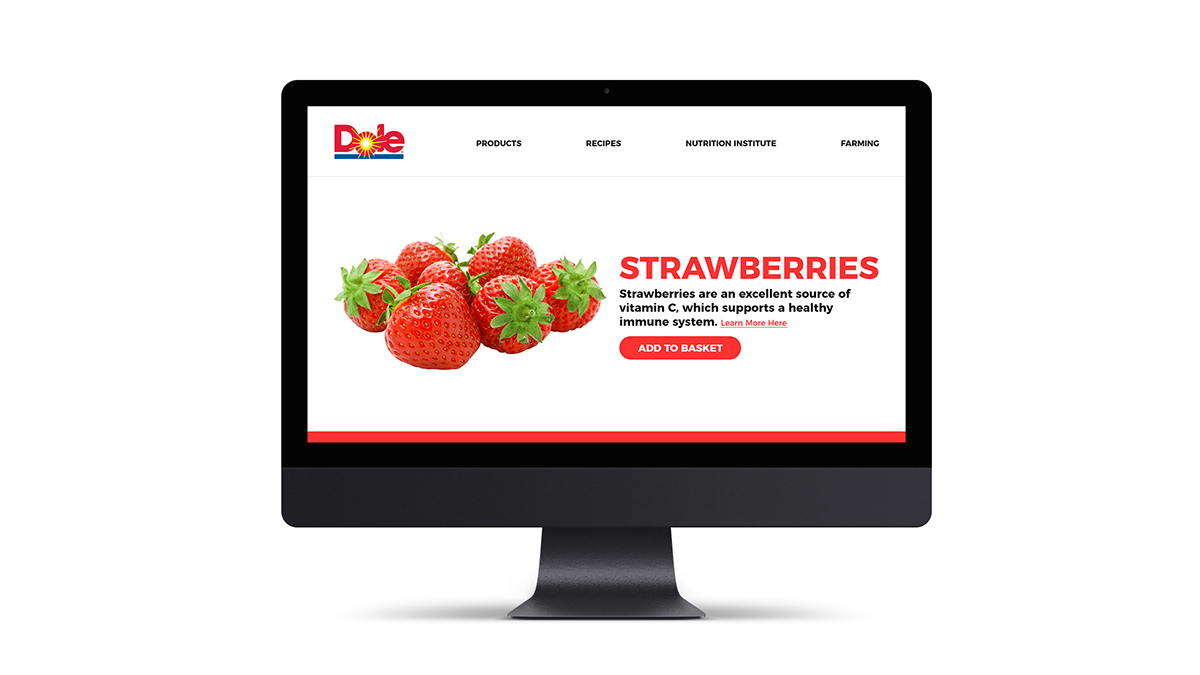
Day 9: Website Redesign, Company: Dole
The Brief:
"Hey!
So happy to work with you on this project. Dole is one of the leading fresh food brands out there, and we want our updated website to reflect the bright colors and energy that our products represent.
Here are two screenshots of two of our fruit pages.
Honestly, they are pretty dull. They don't really capture the bright energy that grapes or strawberries have. We want our customers to come to these pages and be hit with some bright and bold colors. Additionally, can you rethink our main navigation?We are considering getting rid of the sidebar nav, but feel free to recreate the sidebar or create a more traditional top menu.
To start, can you please mock up a page for a fruit of your choice? We'd like to include all the current info plus more if you can find any other ideas like maybe a "Where to find" section and additional info on the fruit. Regarding the design, we want big images and text, something that makes the user excited. For example, strawberries could have bright red backgrounds and patterns, big bold white text and images!
Again, feel free to choose any of our fruits which include Blackberries, Pineapple, Bananas, Grapes, Coconuts, Cherries, Apricots, Red Raspberries, Avocados, Apples, Strawberries, Plantains, and Blueberries.
We can't wait to see your splash of color! Thanks!"
------------------------------------------------------------------------------------------------------------------------


Day 10: Touchscreen Drive-thru Menu, Company: TouchSolutions
The Brief:
"Hello,
Our company is about to pitch new software that we've created which allows drive-thru restaurants to install a touchscreen order station. Our event can feature the drive-thru restaurant of your choice, such as McDonalds, Wendy's, Taco Bell, etc., as this is to showcase our technology to a potential buyer.
We require two screen for this. The screens are as follows:
Start Screen (where you choose for example "Burgers" or "Drinks")
Single Item Screen (single item such as a "Jr. Bacon Cheeseburger" with photos, info, nutrition, and of course a way to add to order and customize.)
We very much look forward to seeing what you design. Thank you."
------------------------------------------------------------------------------------------------------------------------

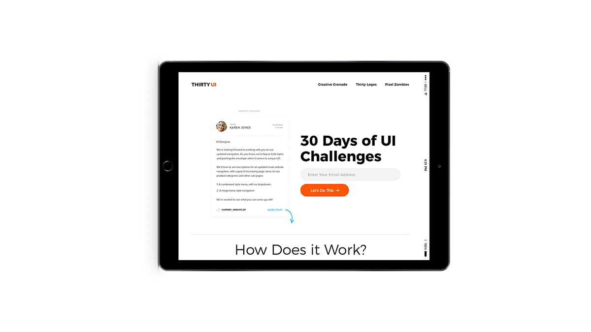

Day 11: Website Redesign, Company: ThirtyUI
The Brief:
"Hey,
It's me, Travis! For this challenge, let's shake things up a bit. I'd like you to redesign the ThirtyUI.com website! What could make it better? Who knows, if I see your design and really dig it, maybe in the future we can make it a reality."
It's me, Travis! For this challenge, let's shake things up a bit. I'd like you to redesign the ThirtyUI.com website! What could make it better? Who knows, if I see your design and really dig it, maybe in the future we can make it a reality."
------------------------------------------------------------------------------------------------------------------------


Day 12: Email Receipt, Company: Nike
The Brief:
"Hi,
We would like for to create a design for our email receipts at Nike. This is the email that users will receive once they have finalized a purchase online. You can use any of our products for the mockup.
We would like to improve on a few things:
We would like for to create a design for our email receipts at Nike. This is the email that users will receive once they have finalized a purchase online. You can use any of our products for the mockup.
We would like to improve on a few things:
Make it very clear what the user has purchased
Have an easy to see link to track their order/status
Include a coupon code at the bottom of the email they can use on their next online purchase
Feel free to use our website look & feel for the email, but keep in mind the limitations of email design."
------------------------------------------------------------------------------------------------------------------------
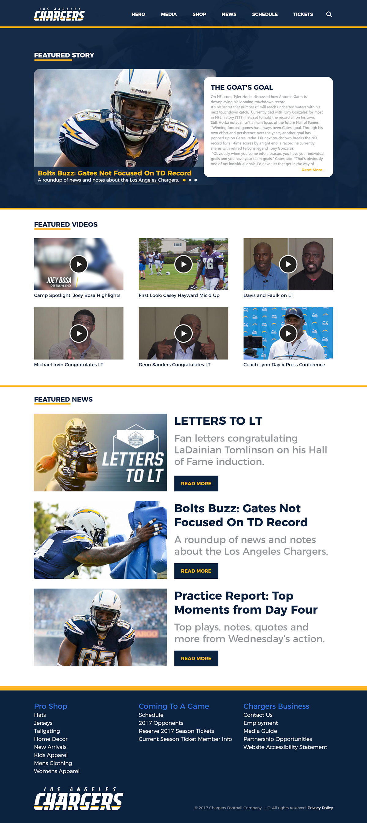
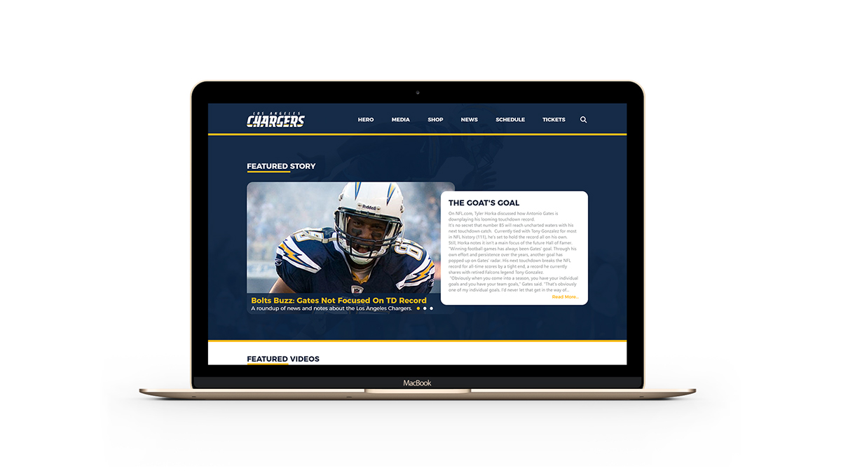
Day 13: Website Redesign, Company: NFL/Chargers
The Brief:
"Hello there,
At NFL Online, we run all of the official websites for each team. We use a template system, but it's quite dated. Click here to see three examples of our websites.
You'll notice that each template contains a similar layout, and we need to be sure that with this new design, each team can use the template where we only need to change colors, fonts, etc.
For this new design, please mock up the homepage of the NFL team of your choice. The template will need to contain the following:
Header with navigation and team logo
Hero section (latest news)
Media section (photos, videos, podcast)
Shop section (buy jerseys, hats, etc.)
Latest news section (we should show much less news than current)
Schedule section
These can be in any order you think makes the most sense and the design is not limited to the above list! The most important thing here is to modernize our website template in both width and style."
------------------------------------------------------------------------------------------------------------------------
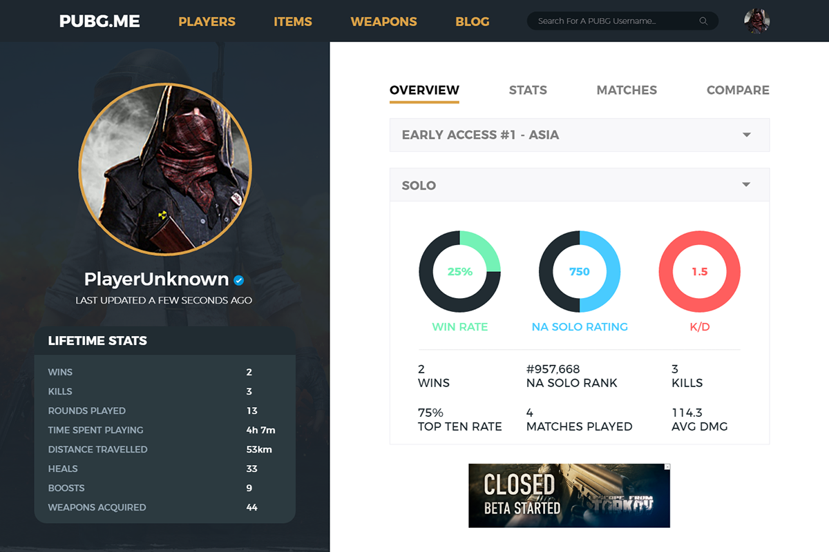
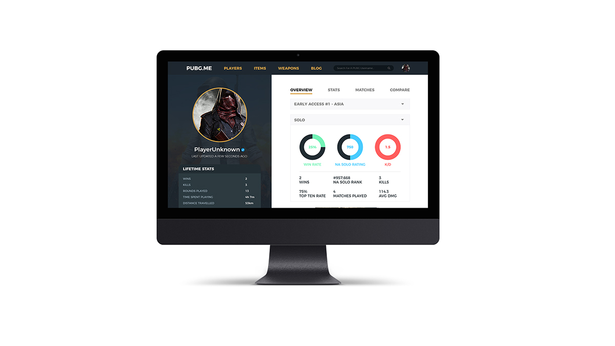

Day 14: Game Stats Website, Company: PUBG.ME
The Brief:
"Hi,
PLAYERUNKNOWN'S BATTLEGROUNDS is one of the most popular games at the moment, and we run a website that tracks the stats of each player.
Here is what our current stats page looks like.
Overall, we're happy with the stats that are shown, but would love a fresh updated look and feel. We are open to either dark OR light UI. We would like you to explore some other types of graphs, progress bars, etc., and would like the stats to be easier to read.
Additionally, we'd like to add in some percentile information. For example, if you are ranked #877 in Duo like the example shows, you are in the Top 3% of all players.
We also do require that you include at least one leaderboard and one medium rectangle Google ad in the layout."
------------------------------------------------------------------------------------------------------------------------
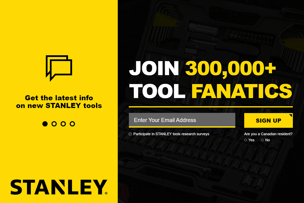

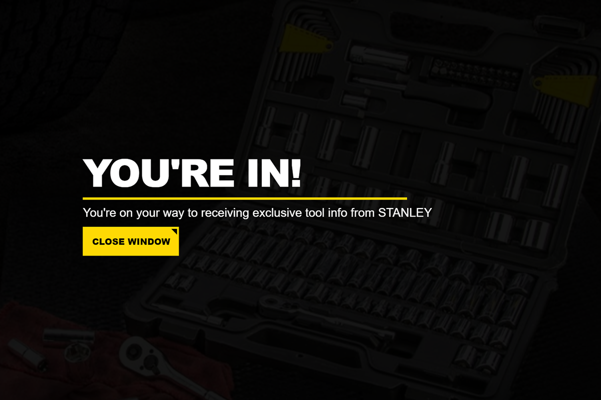
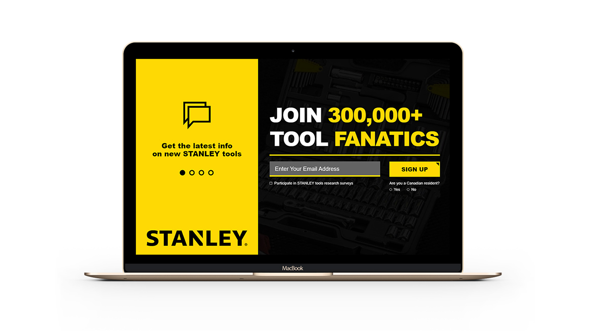
Day 15: Mail Sign Up, Company: STANLEY Tools
The Brief:
"hello,
Our website currently has a modal that pops up when a new visitor arrives. This modal serves as a way for us to gain newsletter subscribers as well as increase sells as we send discounts to those who sign up.
Here is the current design and steps.
We'd like to improve our conversion rate on this, and believe the design can be updated to incentivize more users to sign up. Currently there is a lot of text on each step, which we must keep, but maybe it can be designed in a way to be less daunting to the user. We are open to you changing the wording and order of the content, as well as the design.
We only require you use the Stanley yellow for any color, which is #fbd50"
------------------------------------------------------------------------------------------------------------------------
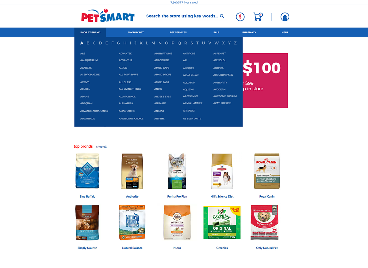


Day 16: Megalist Redesign, Company: PetSmart
The Brief:
"Hello,
Thank you for taking on this project! We'd like to update our main navigation for PetSmart.
Here is our current main navigation and two mega menu drop-downs.
We want to redesign our main navigation area including:
Thank you for taking on this project! We'd like to update our main navigation for PetSmart.
Here is our current main navigation and two mega menu drop-downs.
We want to redesign our main navigation area including:
Number of pets saved
Logo
Search Bar
Cart and User Login/Create Account
Main Navigation
One Mega Menu dropdown
In the link above, you can see our mega menu is a little basic, and we want it to look better."
------------------------------------------------------------------------------------------------------------------------


Day 17: Product Card, Company: Crabfest
The Brief:
"Good day,
We're happy to be working with you! Below is the Red Lobster "Crabfest" page that we'd like you to update!
Download and unzip this page. You can open it in your browser and check the folder for all image files.
We would like the page to feature a "card" style UI instead of the current setup. So each item would be it's own card with photo, title, description, and calorie count. Here is an example of a UI card we like.
We of course need this in the Red Lobster design style which you can find online. You don't need to update the whole page, we just need to see a few of the cards, but you are welcome to do so if you have the time."
------------------------------------------------------------------------------------------------------------------------
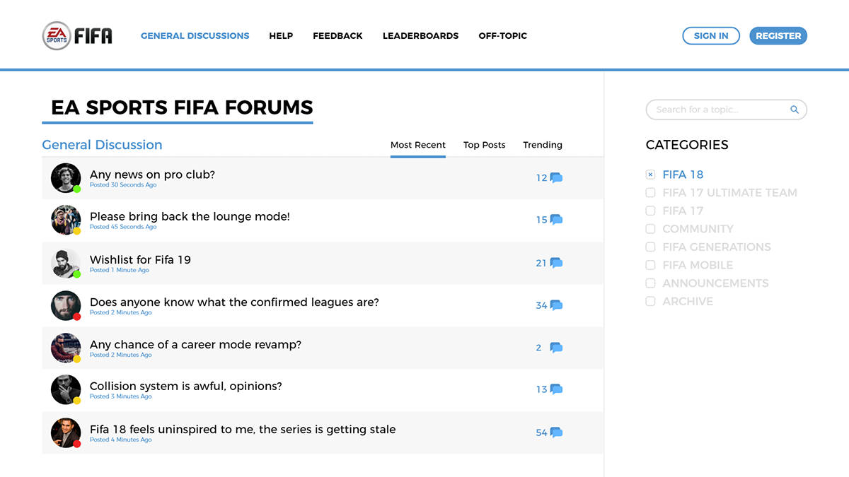


Day 18: Forums, Company: FIFA/EA
The Brief:
"Hey there,
Cameron here and we're looking to update our official FIFA forum design.
Here's the current design of the forum.
It's very basic right now, but we do like the light UI so we'd like to keep it light. Other than that, it just needs to be wider, more modern, better typography, and better layout. We're fans of how the GameSpot forum looks, clean and wide.
Can't wait to see your design!"
------------------------------------------------------------------------------------------------------------------------


Day 19: Steam App Redesign, Company: Valve
The Brief:
"Hey!
Really pumped to have you on board for redesigning the Steam app. Steam is the most popular video game desktop app that allows users to download thousands of games and play them.
We haven't updated the style of our app in years, and we're finally now able to dedicate the resources to a fresh new look.
Here's the current app layout, showing a game screen.
For this project, we'd like you to focus on just this screen, showing the game of your choice. However, we do want to see a new main menu, sidebar, etc. using the information shown in the screenshot. We would love to see how the friends list would look as a right sidebar instead of hidden like it is now in the bottom right."
------------------------------------------------------------------------------------------------------------------------


Day 20: Personal Portfolio Site, Company: CreativeGrenade
The Brief:
"Hey everyone!
Travis here, the owner of Thirty UI. I hope you've been enjoying the challenges so far and I am thrilled to see all of your work on Dribbble, Behance, and Twitter!
For this challenge, I'd like you to take what you have designed so far, which should be about 19 different projects, and choose your favorites to mock up your own personal online portfolio. You can mock up either the homepage of your portfolio or the "my work" or "portfolio" page that most call it. This is the page that shows all your awesome stuff!
I am sure you've seen plenty of online portfolios at this point so for this challenge, I want you to try something different! Break outside of the normal portfolio designs you see and try something unique. Good luck!"
------------------------------------------------------------------------------------------------------------------------


Day 21: Game UI, Company: Valve
The Brief:
"Hey everyone,
It's me again! I want you all to have a lot of fun with some of these challenges so rather than modeling them all after specific UI, I want to throw in a few of these that allow you to make some choices of your own!
So, for this one, I want you to redesign the UI of a game you choose! This can be any one screen you want for any game out there. For example, you could redesign the pre-game lobby of Call of Duty, or you could redesign the UI of League of Legends in-game.
When most people think about UI, they think websites or apps. But User Interface Design includes all types of things including video game UI!
When you design this, think about the platform you are designing for. If you're designing for a PC game, the user has a mouse and keyboard. But if designing for Xbox or PlayStation or even mobile games, the controls they have are different so think through the actions they can take and how they could make those actions."
------------------------------------------------------------------------------------------------------------------------

Day 22: Website Redesign, Company: Envato
The Brief:
"Good day,
We're looking to update our single product pages at Graphic River! Below is a screenshot of the current layout, and we'd like to update with the list below.
Our current layout for single digital products
We would like to address the following with a new layout:
We're looking to update our single product pages at Graphic River! Below is a screenshot of the current layout, and we'd like to update with the list below.
Our current layout for single digital products
We would like to address the following with a new layout:
We want to update to 1140px wide for the content.
Move the description of the product higher on the page (currently lives below all the screenshots).
Make the price more noticeable.
Remove the tabs for "Reviews" and "Comments" and include them on the page itself.
Feel free to make any other updates you think can work for us to increase sales. Thanks!"
------------------------------------------------------------------------------------------------------------------------

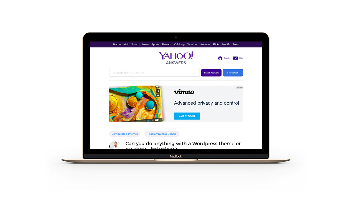
Day 23: Website Redesign, Company: Yahoo Answers
The Brief:
"Hey,
Thanks for agreeing to work on this page design for us! At Yahoo! Answers, we're looking to update our individual question/answer pages with a fresh layout and design. As you'll see below, our site is left-aligned which is super old style, and we also need to work on the overall flow of the page.
Here's the current Yahoo Answers page layout.
In order of importance, we'd like to address the following:
Centered website with 1200px wide content.
Make out ads flow with the page layout better (be less intrusive).
Update the typography for better readability.
Of course any other changes and updates are welcome and we can't wait to see what you can do."
------------------------------------------------------------------------------------------------------------------------


Day 24: Onboard Design, Company: ThirtyUI / Discord
The Brief:
"Hey designers!
At this point in the series, you've designed a lot of different types of UI from websites to apps to drive-thru touch screens! You've got a lot of work done and I want to say congrats on making it this far.
With only 6 more challenges left including this one, I want you to start taking control over what you design! The next 6 challenges will have a general topic for the UI, but you will get to choose what site, app, etc. the design applies to.
For this one, I want you to design an onboarding process for the website or app of your choice.
You have seen these before. They are typically a few instructional screens when you first open an app or create a new account online. They are essentially a few screens that contain information that will educate you on actions and how to get the most out of a service.
This is an awesome website that has TONS of onboarding examples from real things.
The thing to remember with onboarding is that most people will want to skip it so making things clear and to the point is best. Pretty pictures/art helps!"
------------------------------------------------------------------------------------------------------------------------