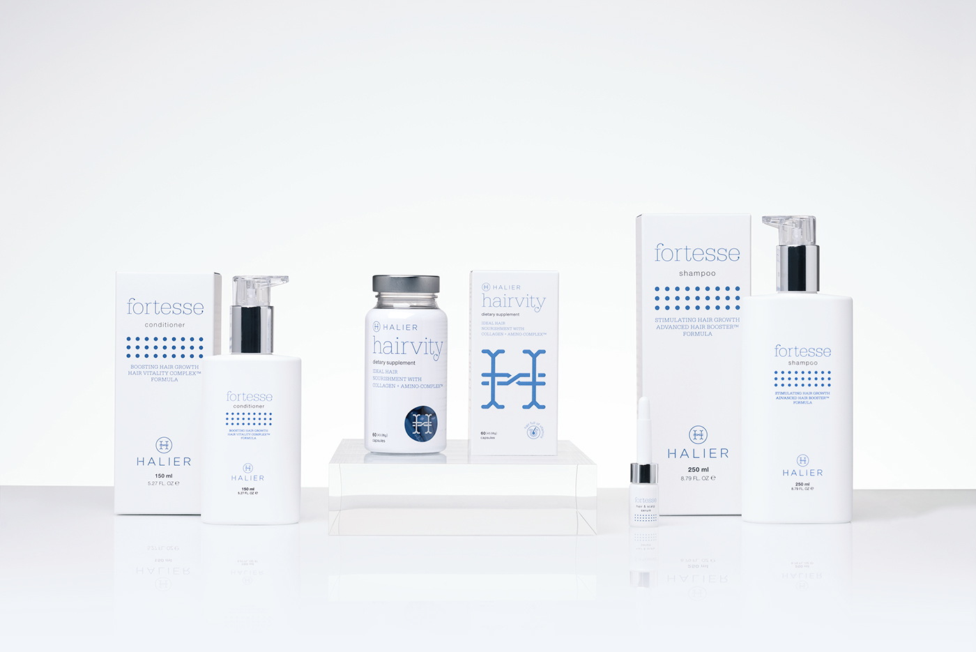
Halier
This is a brand combining the power of nature with the wisdom of scientific discovery and the latest hairdressing trends. Its products help to nourish, strengthen and enhance the hair's growth.
Naming / Branding & Identity / Typography / Packaging Design / Web design Product Photoshoot / Art direction of beauty photoshoot / 3D illustrations
Product photos: Przemyslaw Pochylski
Beauty shots: Robby Cyron
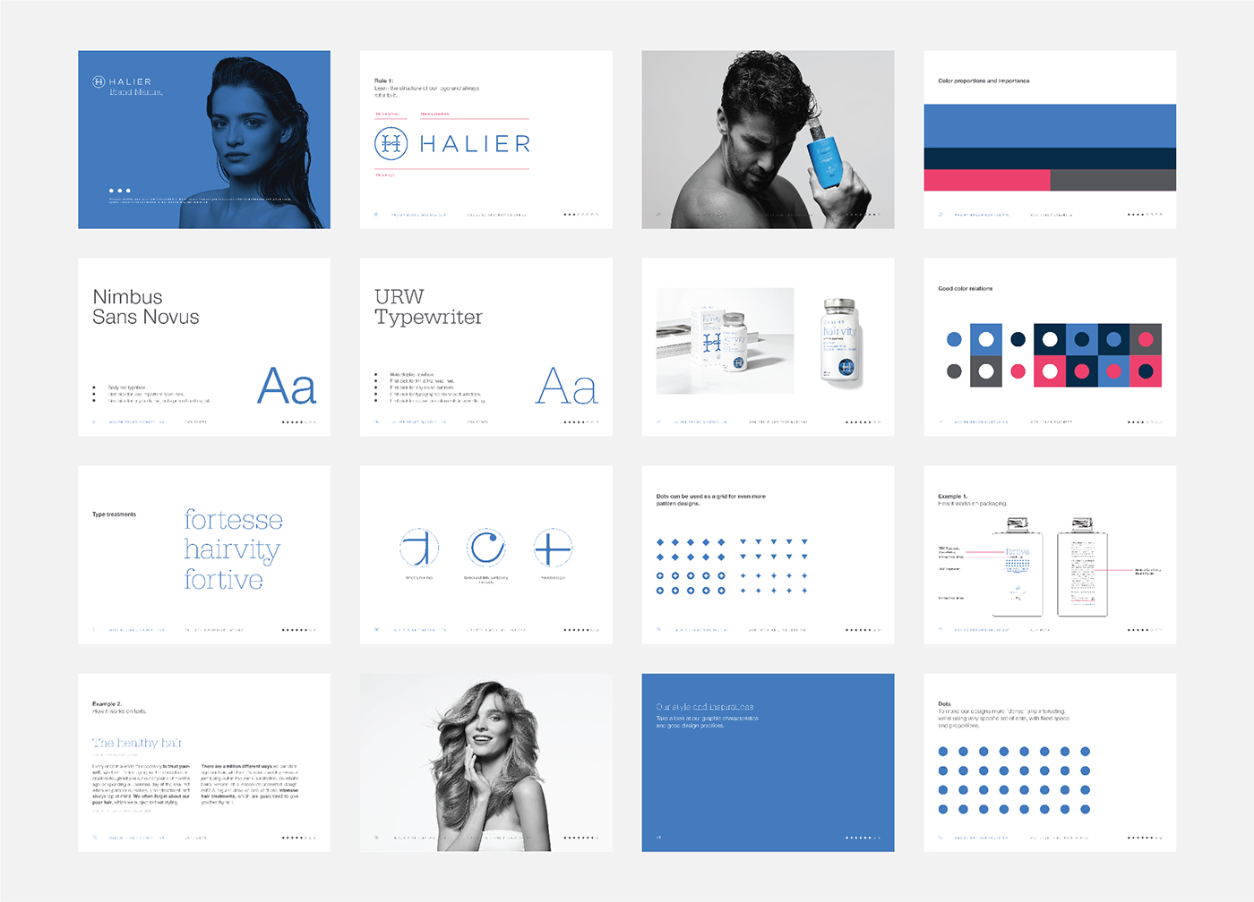

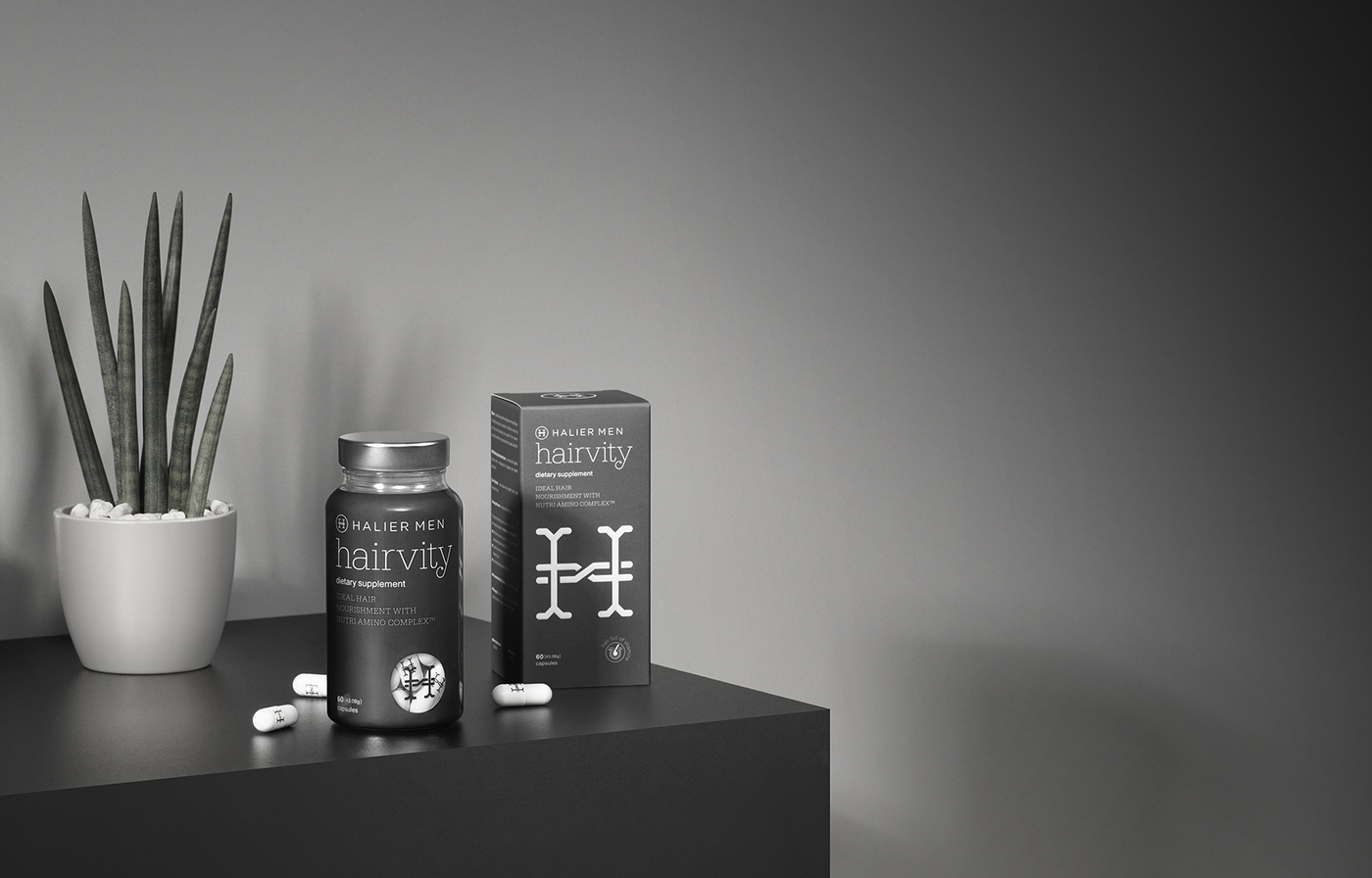


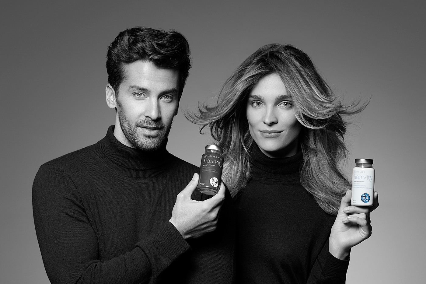
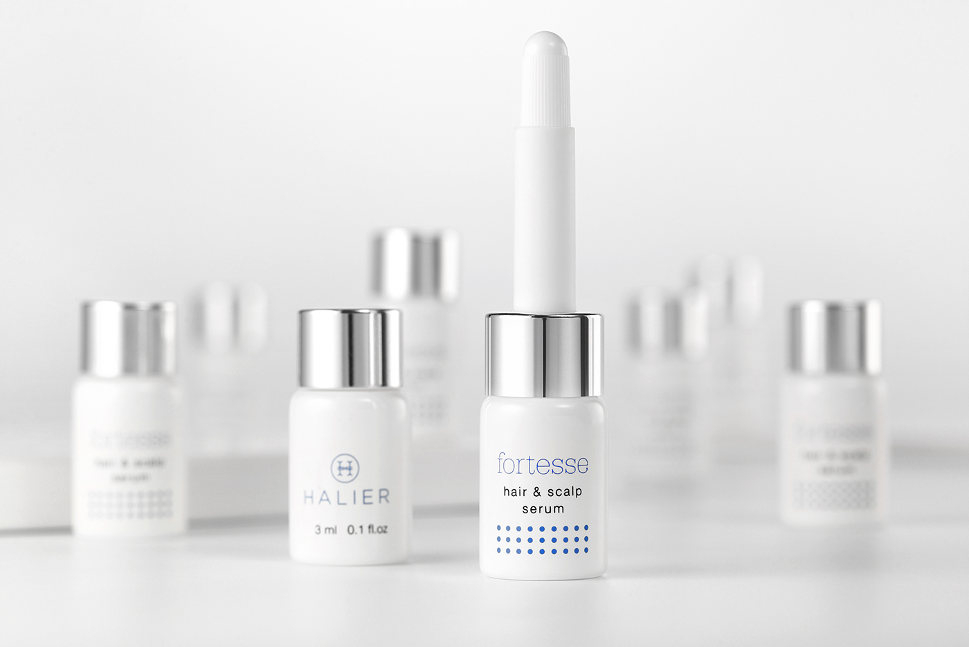
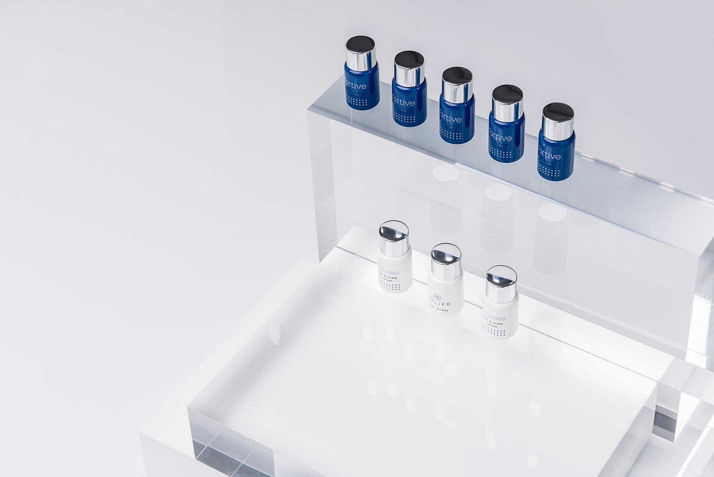
The main distinguishing feature between the collections are the symbols on the packaging and the products itself, being dots for women and triangles for men. The primary colors of the identity add a clean and medical touch.


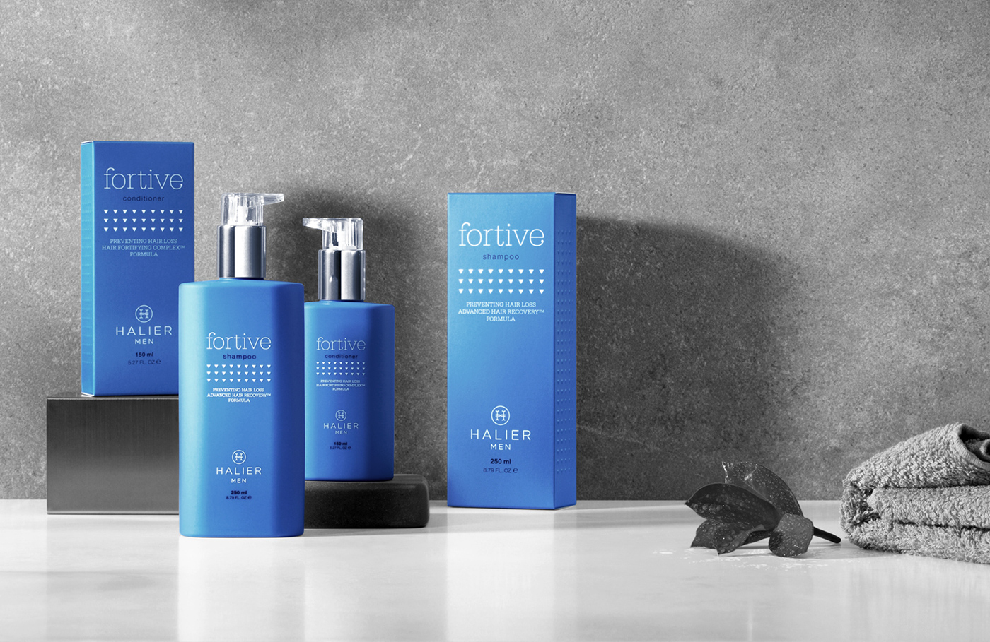
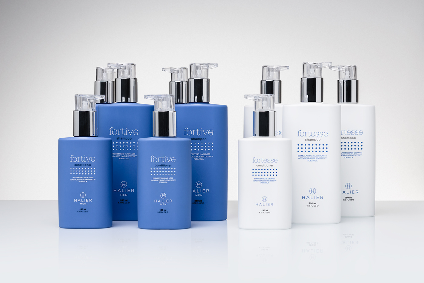


So far, it consists of three collections - Hairvity, Fortesse and Fortive.
Each collection has got its own code, but when put together they create
a coherent visual language.
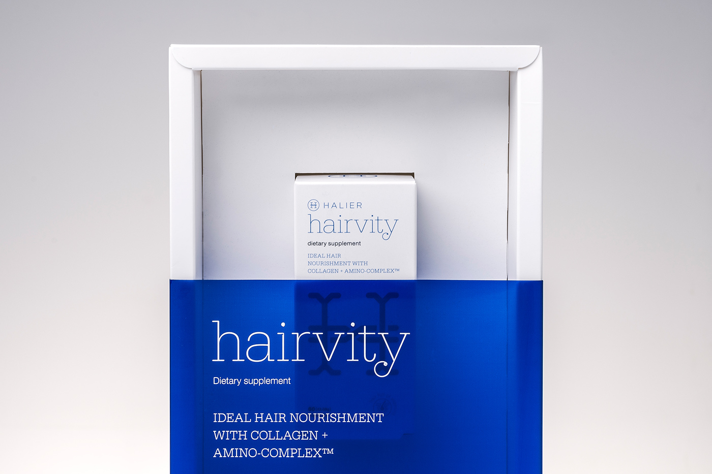
Hairvity pills are the first step to enhance the look of your hair.
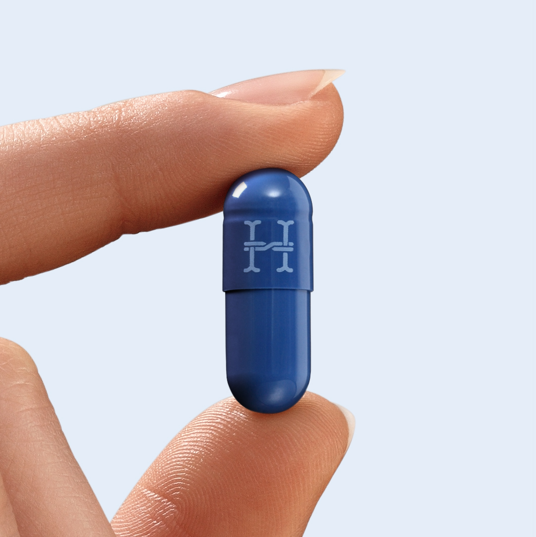
A small window enables you to see the blue pills inside the package.
Hairvity pills are the first step to enhance the look of your hair.
A small window enables you to see the blue pills inside the package.




We also focused on designing a unique customer packaging
experience by adjusting the packages to the purchase order.
experience by adjusting the packages to the purchase order.




Making off


