Colorado State Archives, two month user experience project
May and June, 2017: While working for the Colorado Department of Personnel & Administration, my main project was the Archives site. The website, like all Colorado State Agency websites, is provisioned by the Statewide Internet Portal Authority (SIPA) and is a very basic and limited installation of Drupal.
I discovered that the Archives team had wanted a new navigation structure for a long time because the current top navigation caused an excess of phone calls to the Archives help desk from users who couldn't find the information contained in the site. I conducted a competitive review, and wrote up a content audit kickoff document, which I presented to the Archivists. We did an informal card sorting exercise to determine the top navigation labels.
Step One: Navigation reorganization
Using the Slickplan site map creation tool, I created a proposed site map document to use while rearranging the navigation in Drupal.
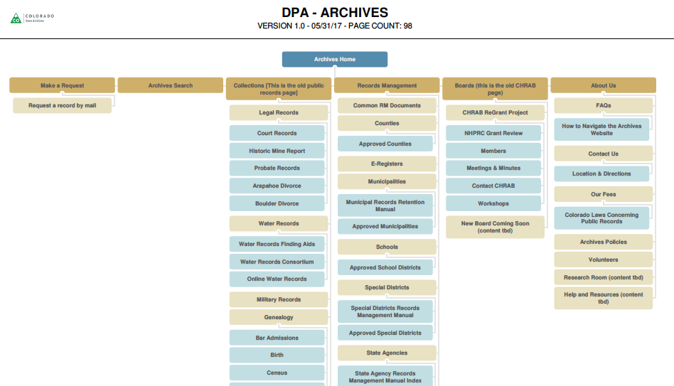
This is a screenshot of the Archives site with the new top navigation structure. I completed work in phases, based on urgency.

Step Two: Color Palette
I wanted my clients to have a good sense of what is possible and what is in use within this type of Drupal template. So I created a video as a visual aid to help clients compare color choices made throughout 20 different Colorado State Agency web sites.
The client chose within pre-defined color palettes provided by the governor's branding department. Purple was chosen for the utility bar header because it indicates non-partisanship. Neutral grey colors were chosen for the background, and buttons are teal.

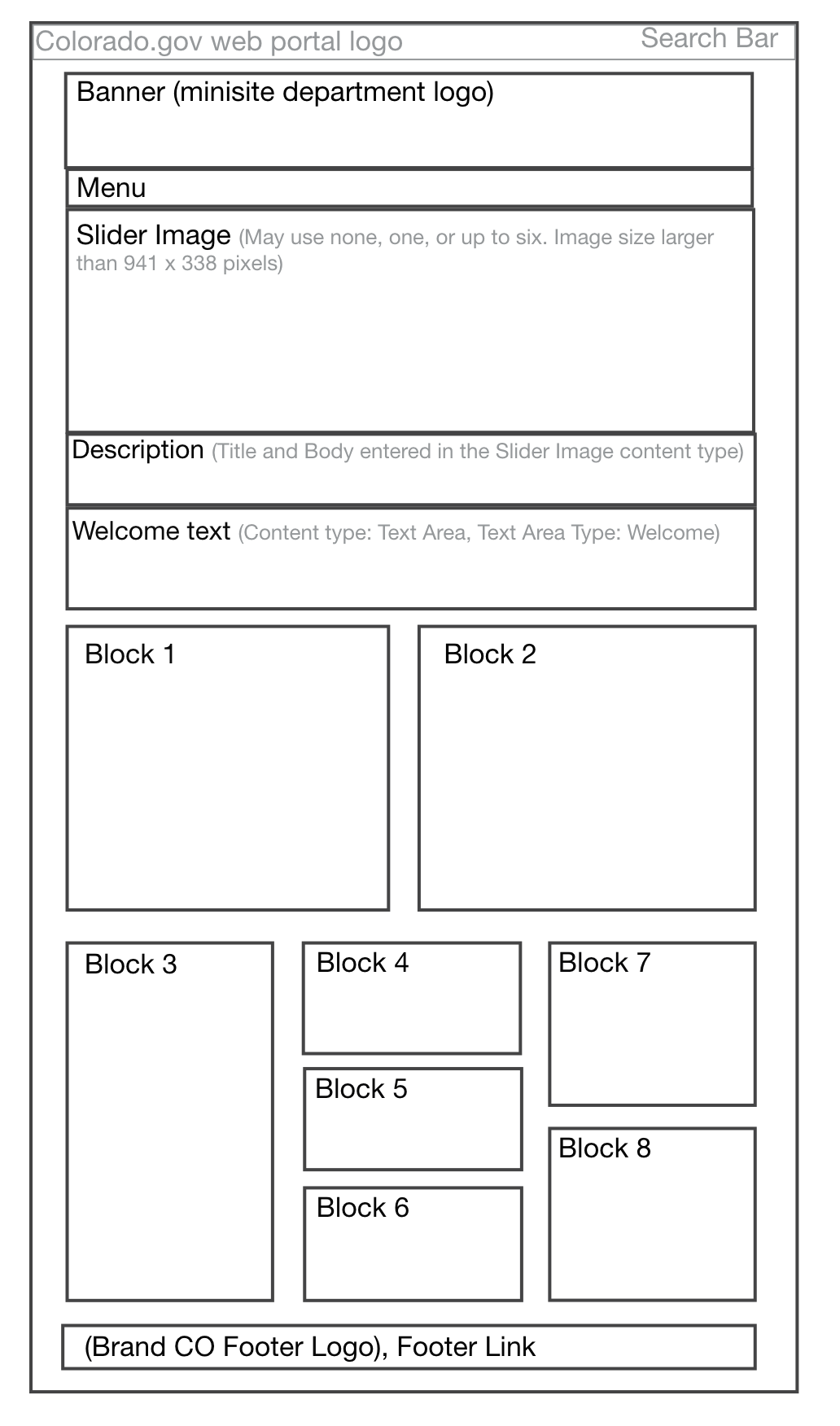
I created a visual aid wireframe in Adobe XD to help clients understand what can be done with their home pages. Since their site is created with structured content in a content management system, each bit of content has a specific name. I've clarified where users need to go to update text under a slider image, for example. I also created a supplemental spreadsheet (.xlsx) to provide further instruction and help plan home page changes.
Step 3: Clarify Written Instructions
I re-wrote the content on the Make a Request page, using web writing theory from Redish's Letting Go of the Words. I used a conversational tone, indicated by headings written in first-person, and paragraphs written in an answer format.
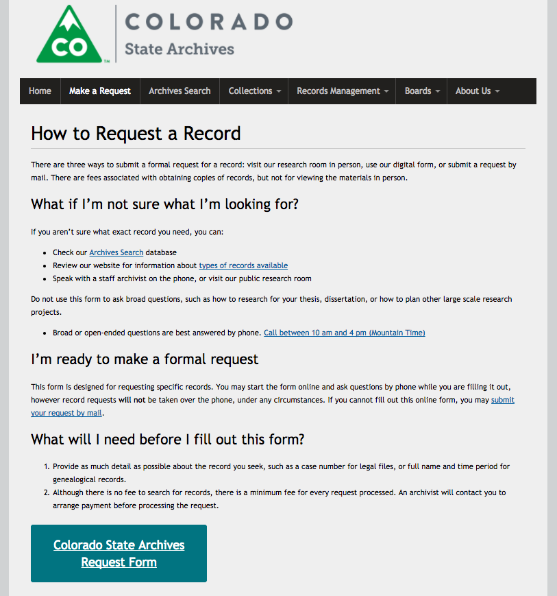
The results were immediate. The Archivists reported that the phone calls to the help desk from confused users were much less frequent.
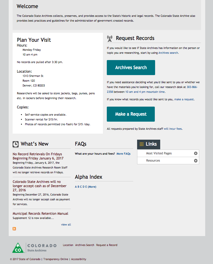
I rearranged the blocks on the lower half of the home page based on user top tasks. I created large call to action buttons for the top two tasks, searching and making requests. I highlighted the address and public research room hours right on the home page. I worked with the Governor's branding team designers to place an approved small Archives logo on the footer, and introduced a bottom navigation.
I re-coded scores of pages within the Archives site with these things in mind: adding alt text to images, ensuring images and tables are responsive, and ensuring internal links are coded with a relative path. I held training meetings with the Archivists to explain the changes I made and teach how they can carry on in the same style. I created a 10-page intranet training web site meant to be a toolbox of tutorials for working within the CMS. It was a successful project.
