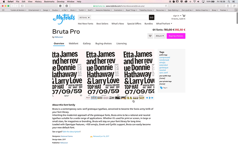
NDiscover Bruta Pro
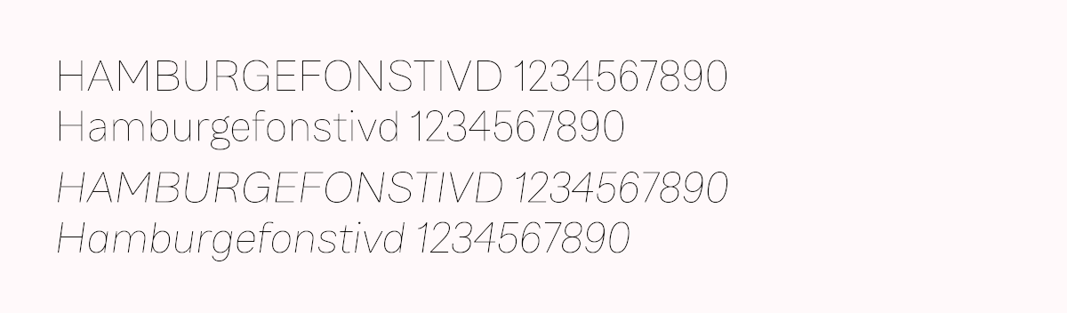
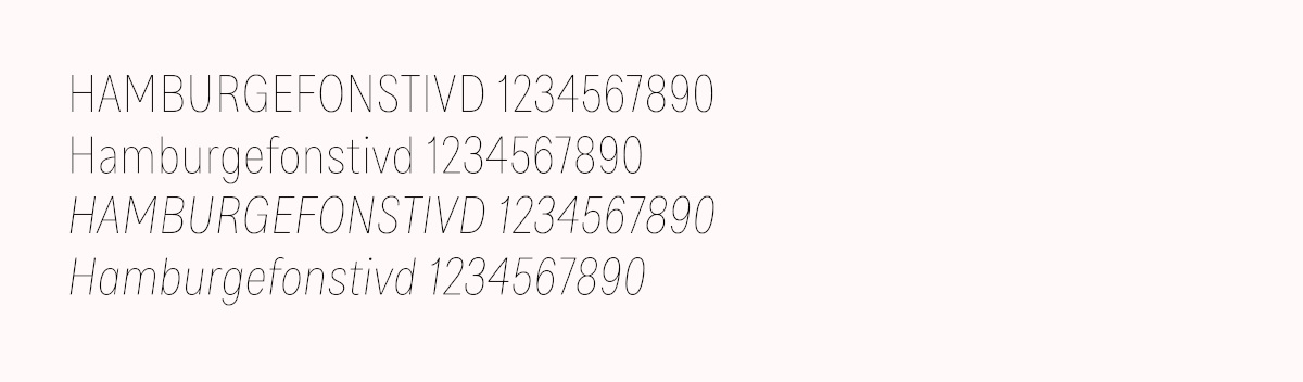
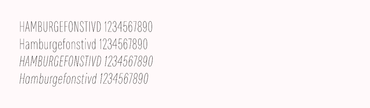
To showcase Bruta is a labor of historical awareness and contemporary practice. On one hand, it is a delicate sans-serif grotesk that might appear to be one more modernist Swiss player, on the other, it has a delicate and intriguing character that honors the mid-20th century with its clear nostalgic behavior on the most condensed weights.
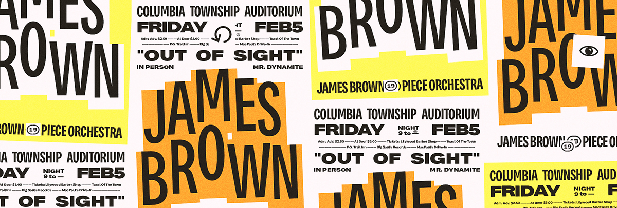
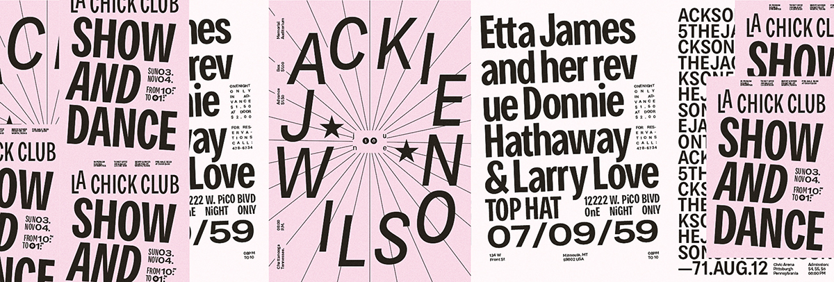
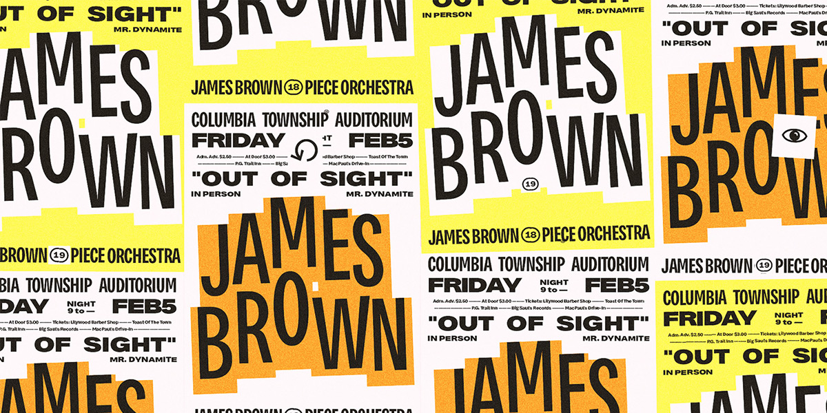
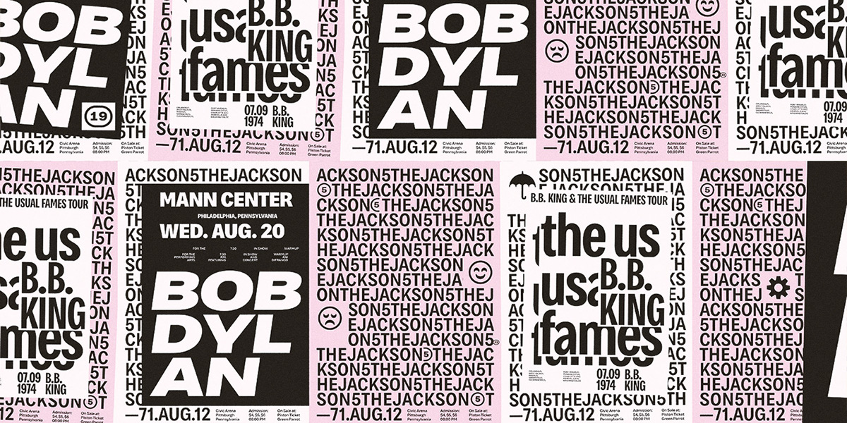
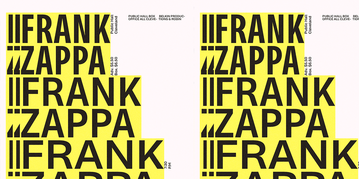
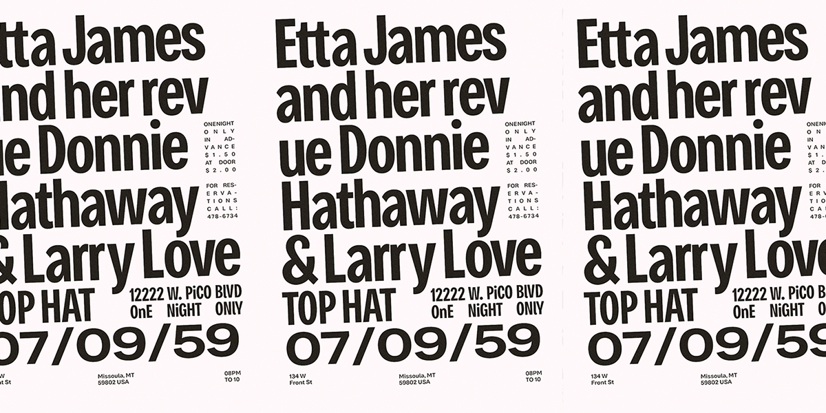
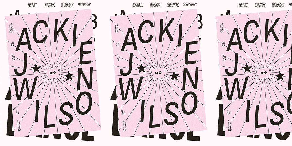
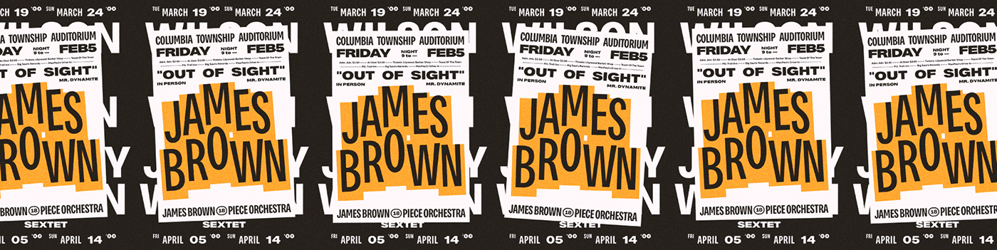
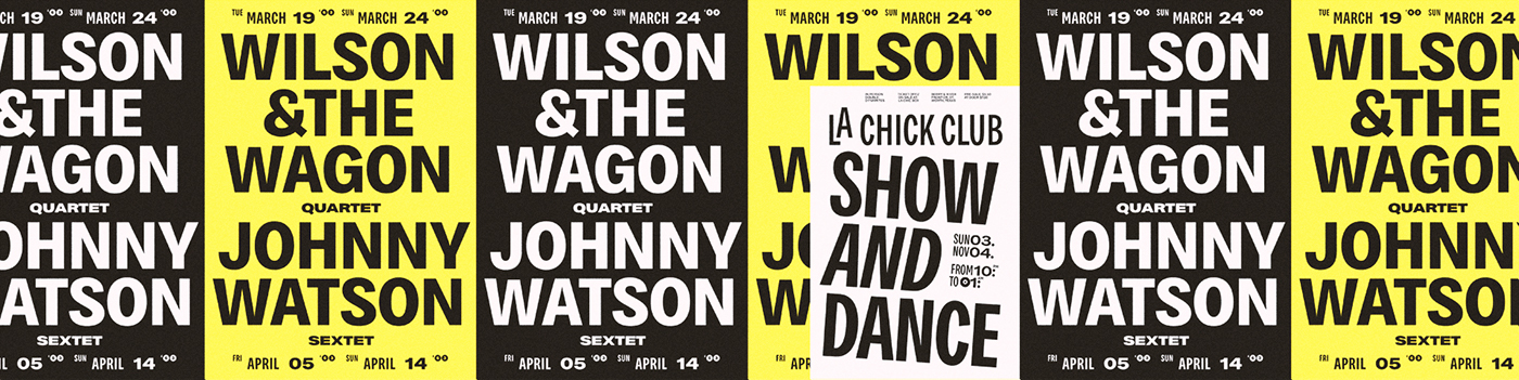
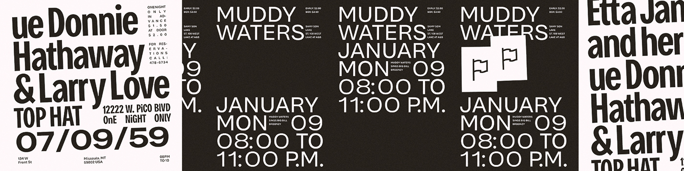
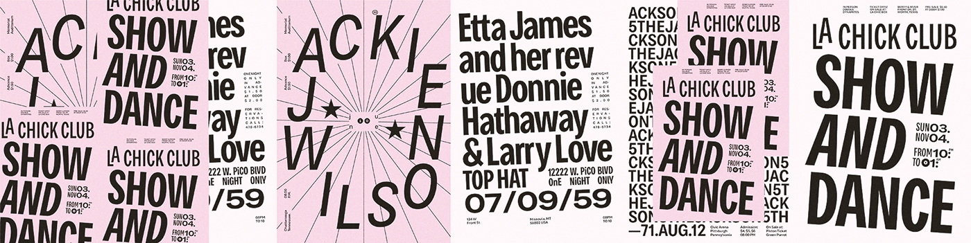
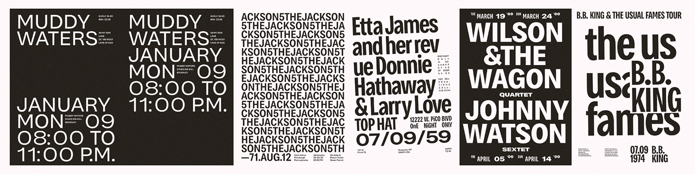
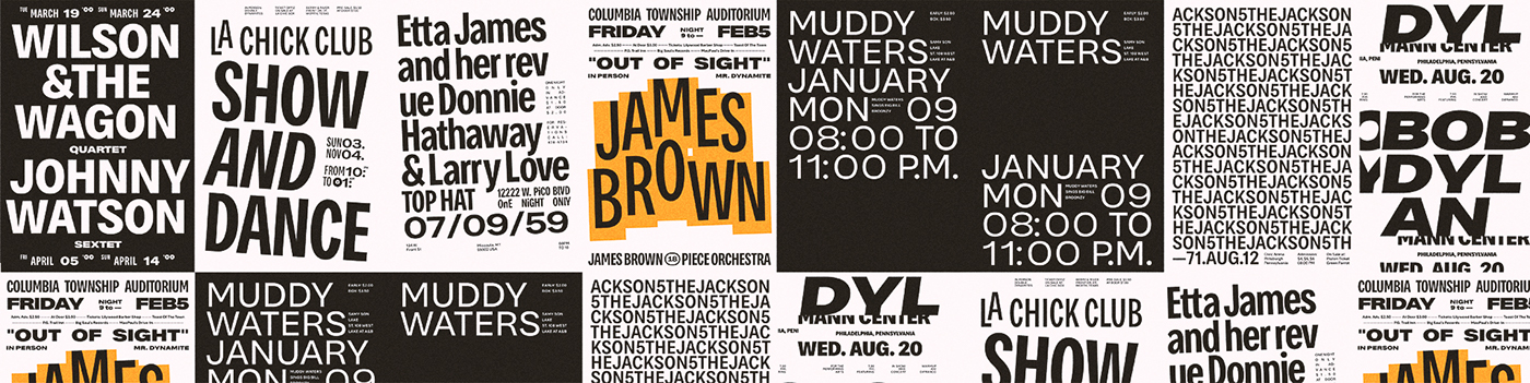
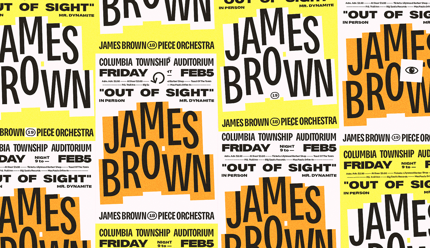
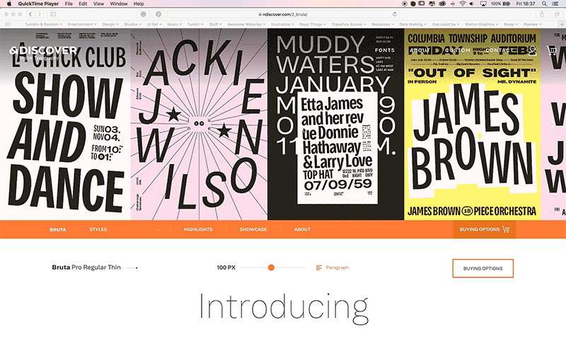
How could we honor the century and hit a clear "we-love-this-font-so-much-that-we-could-fall-in-romance" at the same time? — Via History, Fun, Dialogue, and Confrontation. All the display images were designed to be part of a system that, working with the total of 64 different weights, generates a visual scape that tells the tale of the city walls.
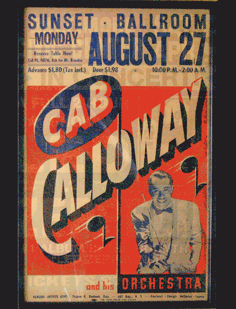
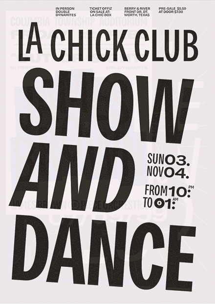
From a specific research of graphic objects designed for musical venues between 1962 and 1976, we've designed a set that frames the typeface in the cultural arena while being the center stage for strict editorial principles, playful type compositions, and clear information hierarchies.
To depict such a time frame while consistently showcasing the major details in Bruta is an act of delicate typesetting, nostalgic echoes to compose to, and one beloved chance to study, to design, to play and to listen to Ella Fitzgerald for 2 months.


Thank you NDiscover for building culture.
This typeface is instantaneously a classic
This typeface is instantaneously a classic


