鶯姿 HEROIC YINGGIE: 鶯歌青花瓷茶器包裝
Package Design / Jun.2017
設計理念
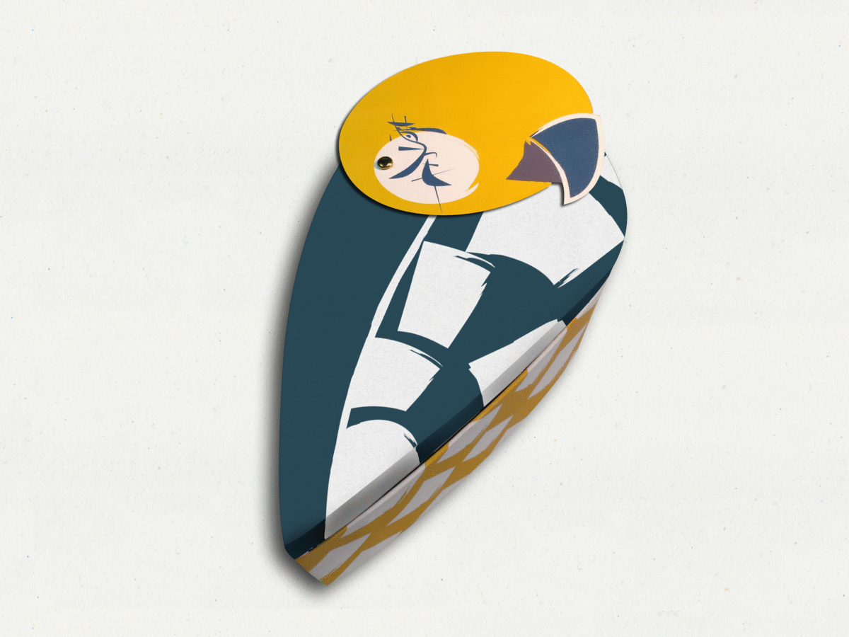
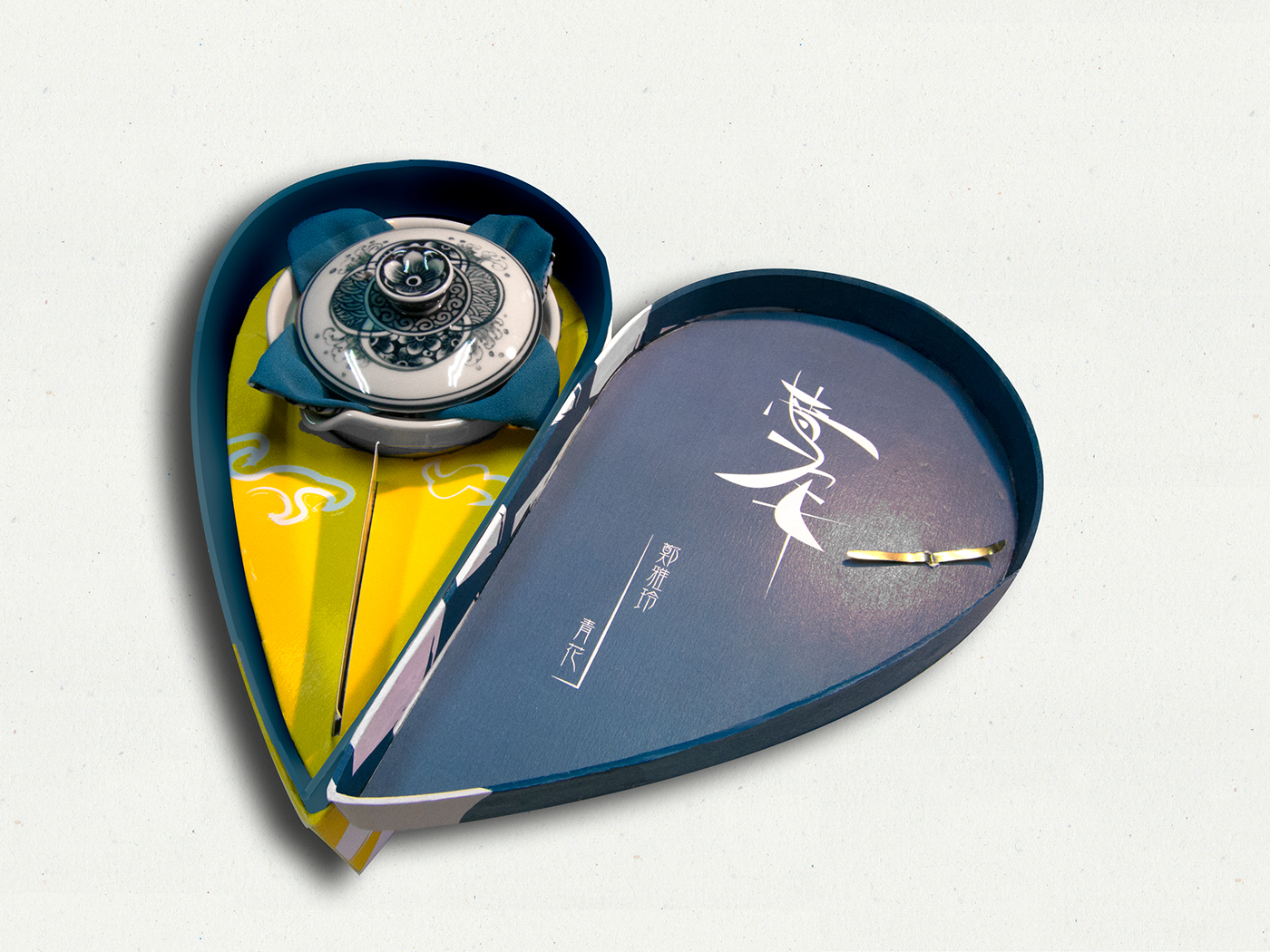
以鶯歌鳥作為整體型態,加上會轉動的鳥頭與消費者做互動增添趣味。視覺上鳥羽的部分結合了鶯歌的穴窯意象,顏色則採用產品上出現的青花色,白色以及黃色,形成強烈對比的,鮮明的顏色不僅能帶來愉悅感、驚喜感更能讓青花瓷走向年輕。包裝同時兼具保護及展示性,更設有名片放置處。
Description
The package presents in a bird form as “Yinggie Town” is named after a type of parrot which appeared in local legend. By rotating the bird’s head, customer can interact with the product. On the visual part, I use the pattern on pit kiln, a cave shape oven for baking clay,to draw out feathers. Then, it is the bright colors blue-and–white with yellow make the product eye-catching and surprising. The packaging of Heroic Yinggie has not only the features of protection and display but also with a business card placement.