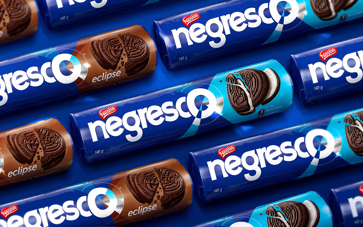
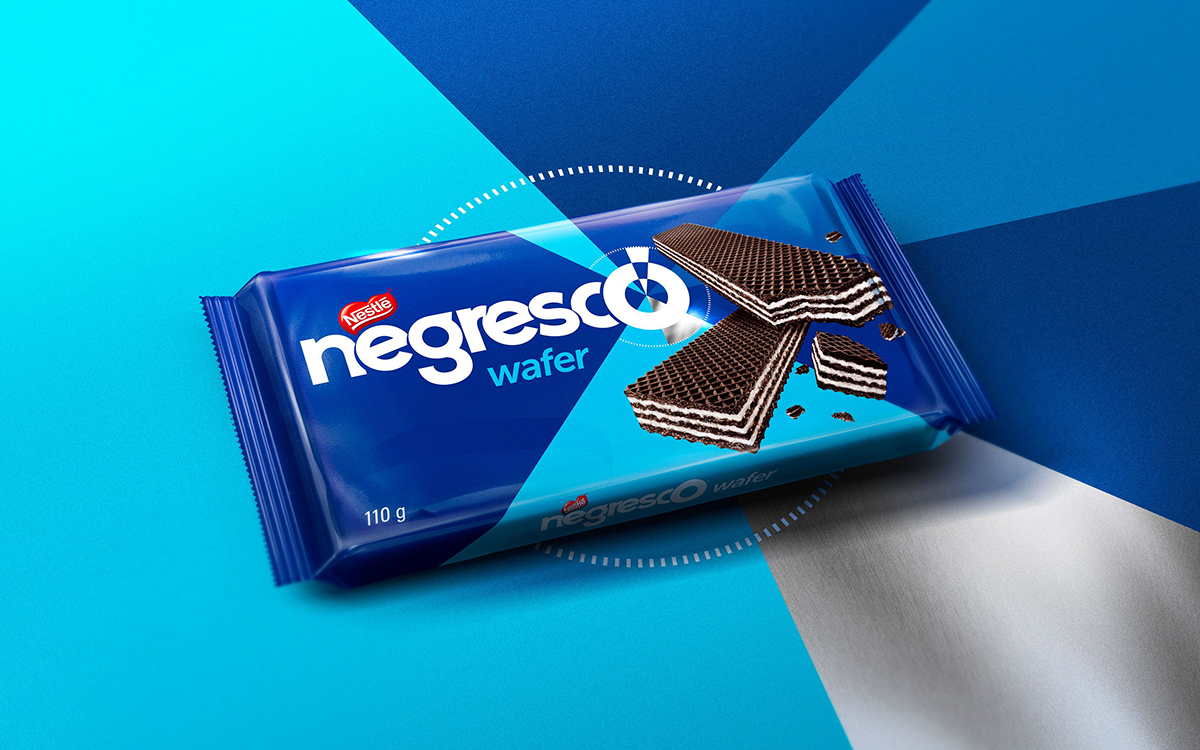
Nestlé’s Negresco is one of the most beloved biscuits in Brazil. Its identity needed a revamp to follow the new brand positioning and to strengthen the connection with the main consumers of the product: the centennials.
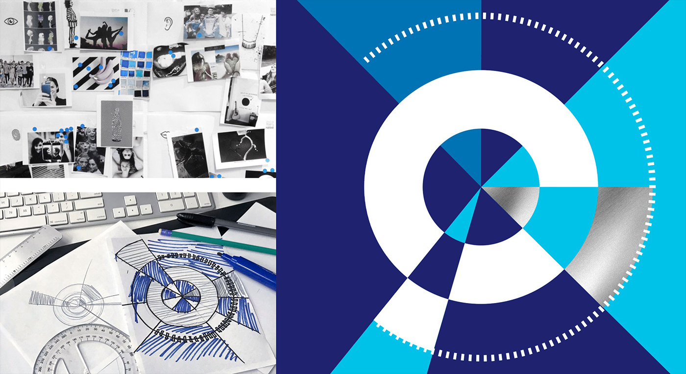
The well-recognized equities of the brand were maintained, but with a fresher look. The ‘O’ of the logo was turned into a radar icon, to suggest continuous movement and the constant search for new and cool stuff, just like the brand’s target audience.
@ CBA B+G
Creative Direction: Sam Profeta, Alex Diniz, Luis Gustavo Bartolomei
Client Management: Ana Biselli
Packaging Design: Gui Matos
Lettering: Luciano Semeria
2017 / All rights belong to Nestlé and CBA B+G.


Before and after


