A religious themed rebrand for the one true brew of Yorkshire
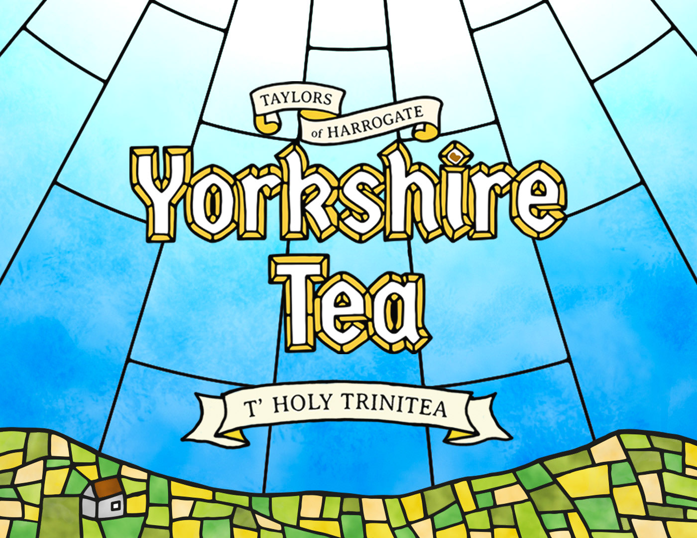
There is only one true brew for the people of God's County. Yorkshire tea is worshipped as the only brand of tea in this part of the country, which inspired this theme for the brand.
It is brought to life through the stained glass motif, iterating the religious following and acting as the vehicle for colour across the range of packaging. The glass is formed of squared shapes as Yorkshire Tea believe the shape of the teabag makes no difference to the quality of the brew and stick religiously to the tried and trusted square teabag.
The written language uses true Yorkshire dialect and also adds 'tea' in a playful manner to the end of certain words.

The 3 core products in the range show the capabilities of colour variation and the ease of changing the name for the particular product

Each side of the pack is decorated with the Yorkshire Dales along with the Ribblehead Viaduct


'Tin't in tin' - 'There is none left in the tin'

A tea themed prayer based on the format of the Lord's Prayer, including more Yorkshire dialect.
'By Gum' - 'My God'; 'b'aht' - 'without'; 'mashin'' - 'making tea'; 'flaggin'' - 'getting tired'; 't' teem' - 'to pour'
Brand extensions
The idea for the packaging lent itself for the brand to be strengthened across various touch points, considering advertising, POS, consumer engagement and merchandise


