


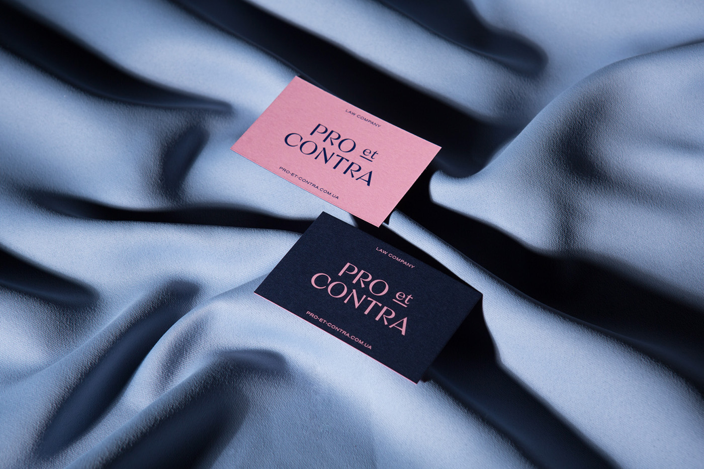
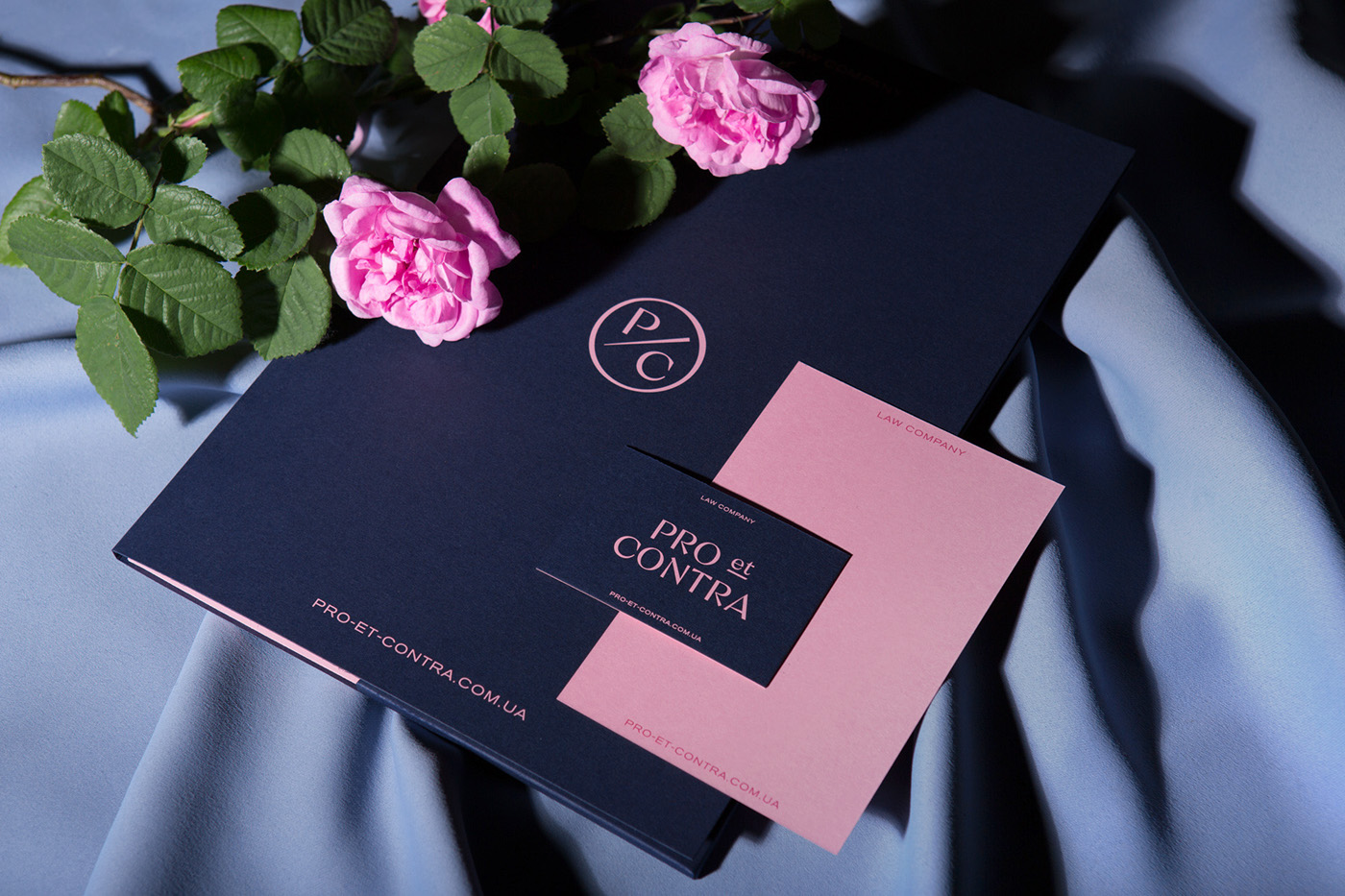
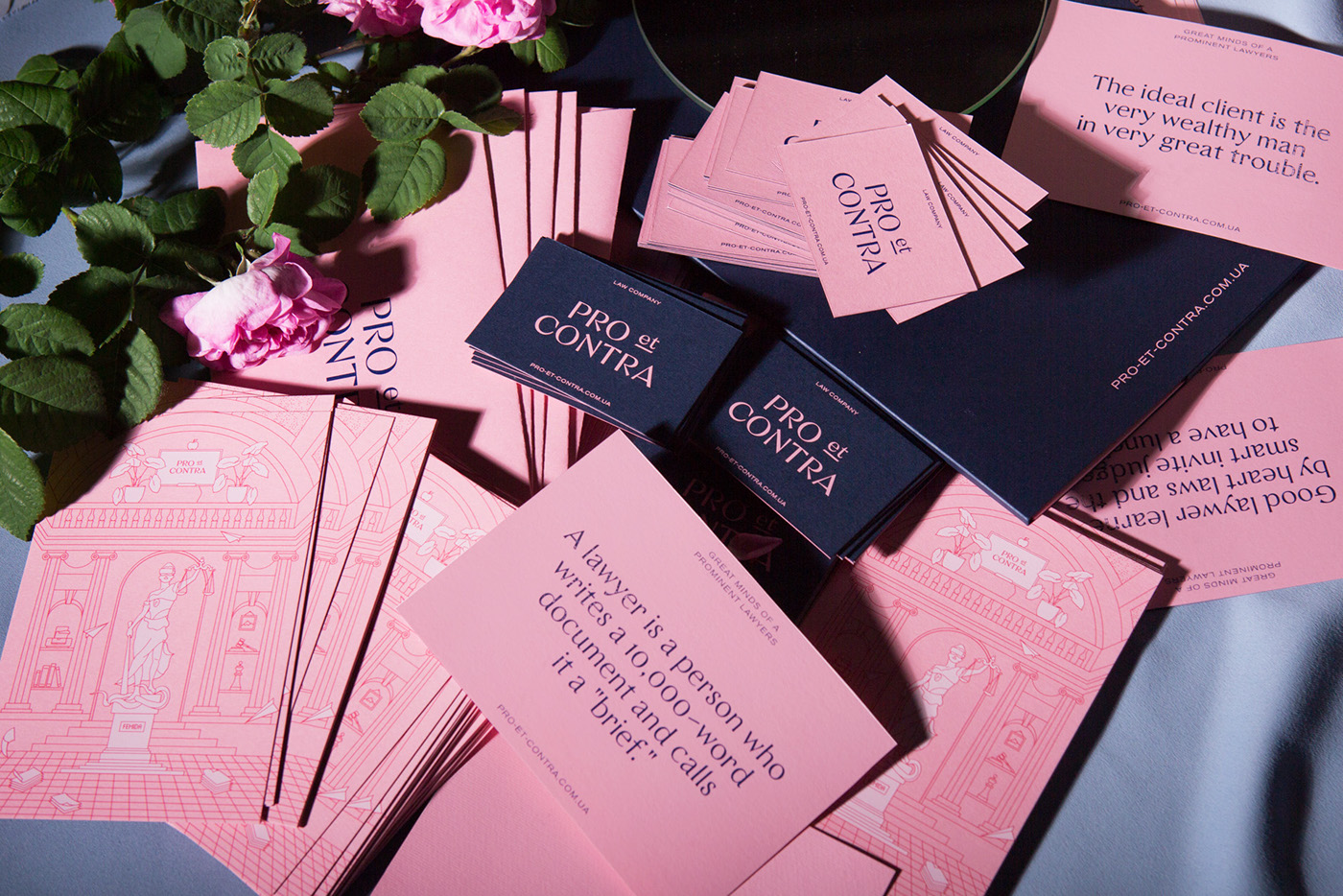
Pro et Contra
— lawyers with sense of
taste and humor.
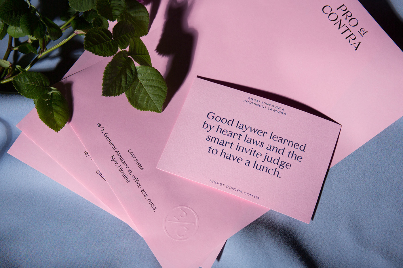
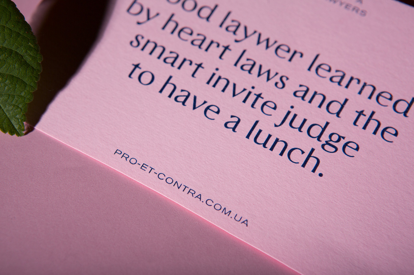
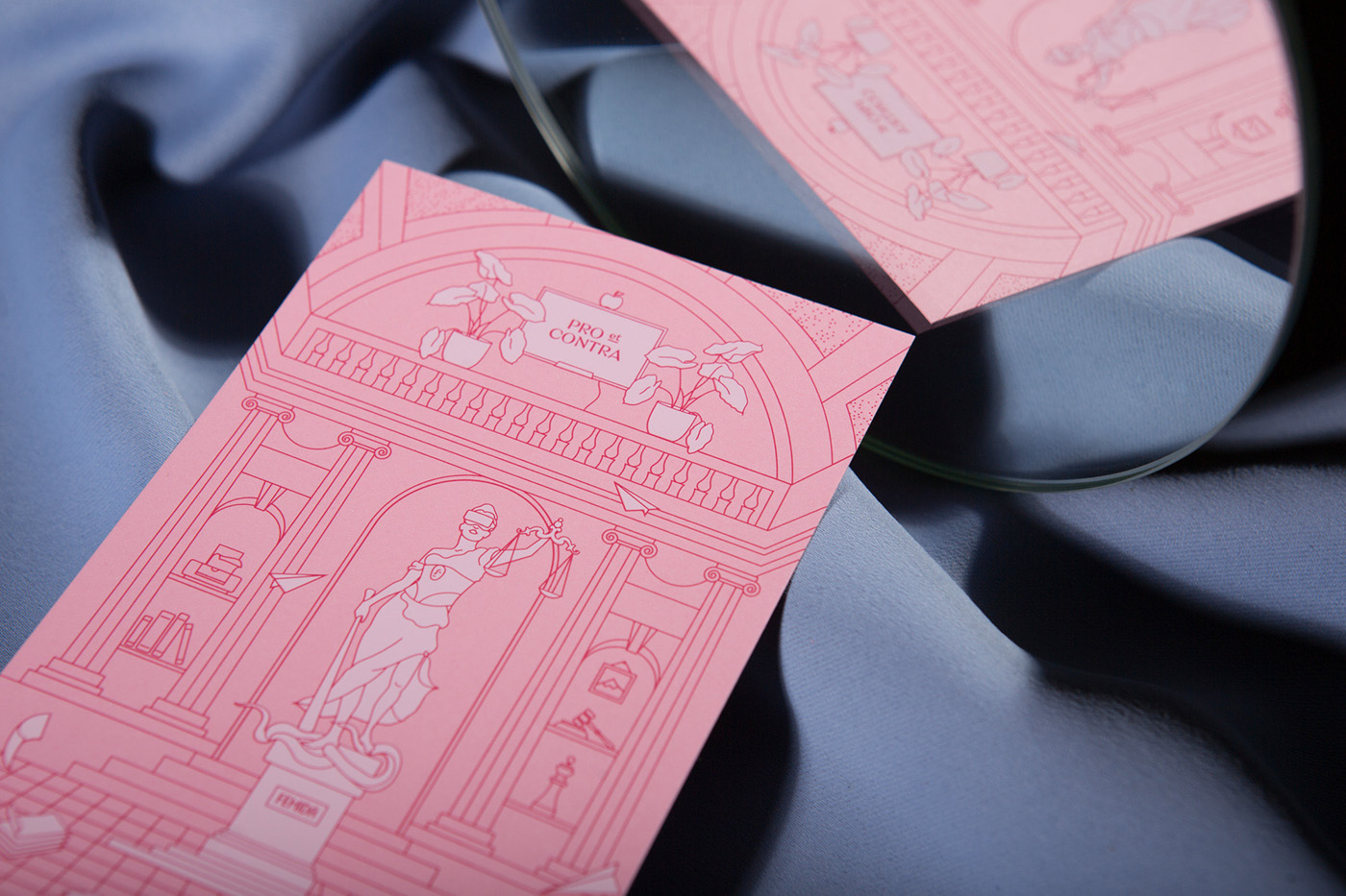
People have the opinion that lawyers are serious, cold and pragmatic personalities, who need to charge for each of the words they say. Therefore, this design is set out with the aim of creating the image of benevolent, open, easy-going, and yet, elegant lawyers.
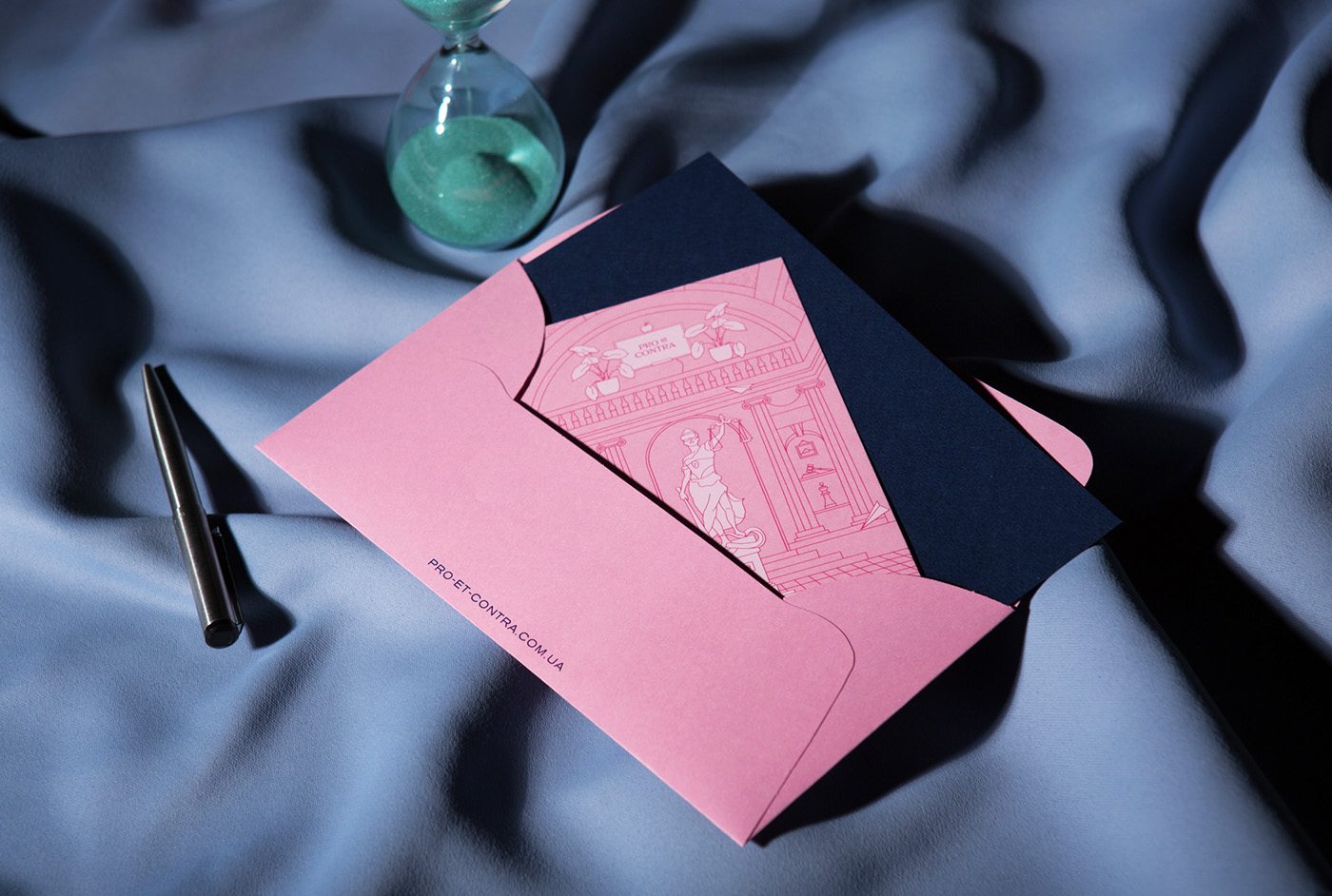
Latin "Pro et Contra" means "For and Against". The logic of the name is very simple: a good lawyer should weigh all sides of the case and choose only one correct decision. To emphasize the semantic meaning of the title, we placed two contrasting colours opposite each other, creating a live game of background and text.


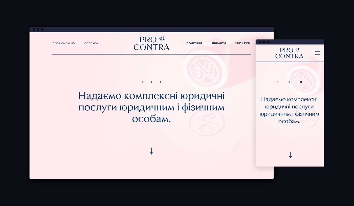
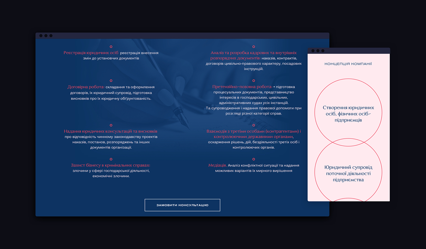
Web-site
— easy and informative.
The website design follows the same idea of "pros and cons"; that's why the blue and rose backgrounds change after scrolling - to make the illusion of two sides of a coin. All the navigation on the website is easy, which will especially be useful for elderly people. The website is easy to read, and all the complicated law terms were changed with the aid of the client to ensure the optimum user experience.
Year 2017
Brand design Lera Shaposhnikova
Web-site design Artem Ivanov