MoMA Exhibitions
— artists' gender visualization
Oriented by Professors Penousal Machado and Catarina Maçãs, we (Danie'Lopes and Joana Rua) worked together in the Information Visualization course of the Master's Degree in Design and Multimedia of UC, developing this project called MoMA Exhibitions — artists' gender visualization, which represents the gender imbalances in the artists’ exhibitions from The Museum of Modern Art’s (MoMA).
We used the data that was made freely available by MoMA in a public data-bank called data.world (originally available at Github). The availability of such data can reflect MoMA’s interest in working on this issue, alerting for gender inequalities.
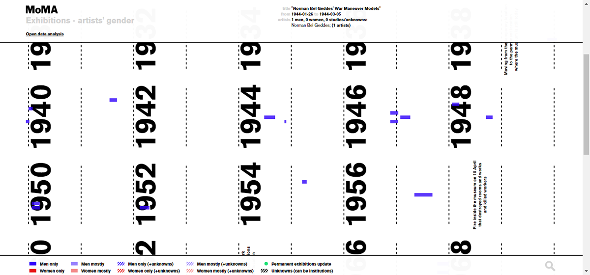
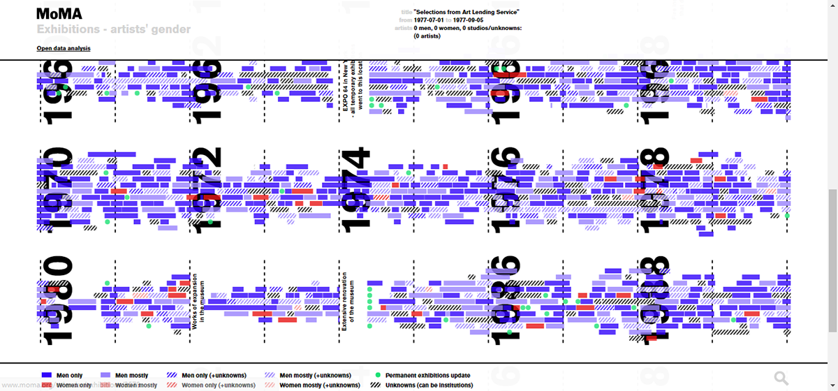
To facilitate its access by the general public, the project took form as a website. The data was dynamically taken (through a script) from data.world. This allows the website to automatically update the visualisation whenever MoMA updates the database in the data-bank. The data was then chronologically placed in a timeline that splits itself into several parallel lines arranged vertically. That allows the user to zoom-in and zoom-out, so he/she may adjust the visualisation in the most convenient way and, at the same time, keep all the data visually represented.
Each exhibition was represented by a horizontal bar which width represents the respective exhibition duration in the timeline. Since the exhibitions can overlap in time, an artificial intelligence algorithm was used to rearrange the bars, so they are placed in the respective time period without overlapping. Relevant historical facts were also included to explain some intriguing data events, such as periods with no open exhibitions caused by the New York’s EXPO 64, an extensive renovation of the museum, and a fire in the museum.
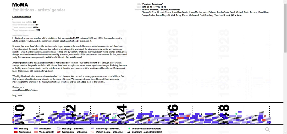
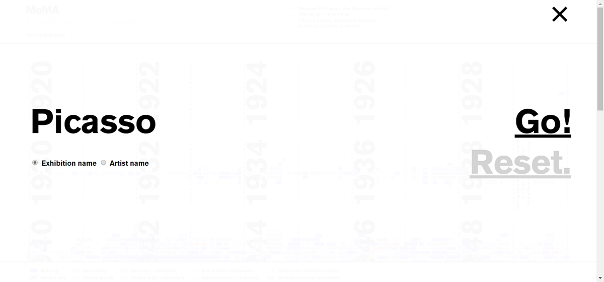
To enable the user to get more insights about the data, some interaction mechanisms were implemented. By hovering an exhibition, it is displayed the available information about it. By clicking on it, the user is redirected to the respective webpage of MoMA’s website. We also implemented a search engine for filtering exhibitions, as well as a section with more information about the project. In this section, we present a critical analysis of the available data, since it was incomplete and could lead to poor interpretations of the visualisation. For instance, some artists have no gender assigned and the time interval of the data ends in 1989. Therefore, although we can visualise the evolution of the exhibitions’ volume and the imbalances in the artists’ gender through time, recent data could reveal a more updated overview of such data.
Although this was an academic project, it was supposed to be developed like it was commissioned by MoMA. Therefore, the logotype (designed by Pentagram) and magnifier icon were taken straight from MoMA’s website.
MoMA Exhibitions — artists' gender visualization has received a bronze prize at the CREATIVITY INTERNATIONAL 49TH MEDIA & INTERACTIVE DESIGN AWARDS — Student in the category DATA VISUALIZATION, and it was nominated to the EUROPEAN DESIGN AWARDS 2019 in the category MISCELLANEOUS — STUDENT PROJECT.

Loading bar
Main view
Notes
Search
After search