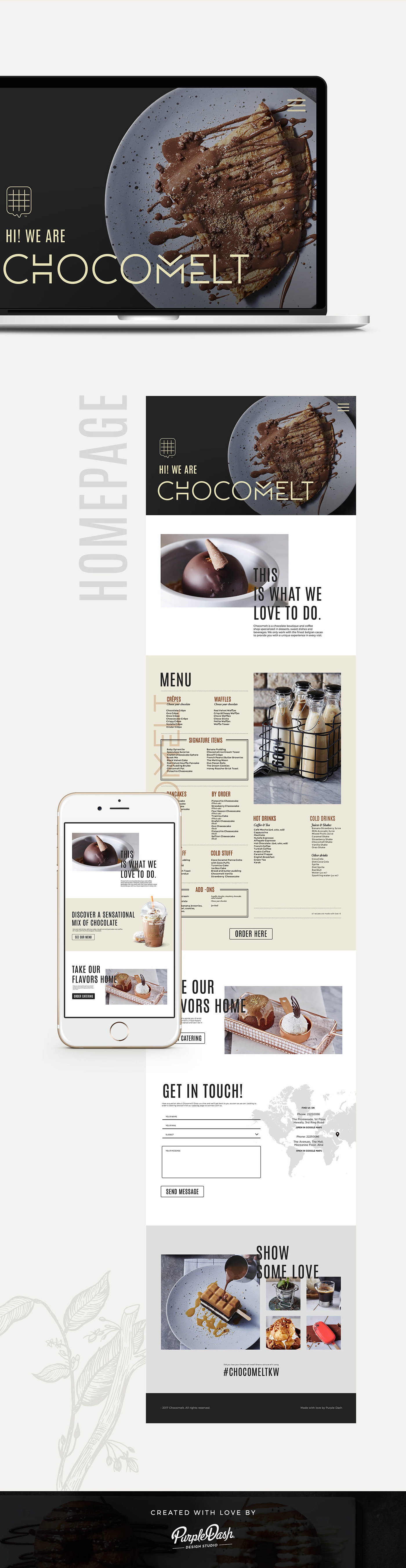
WHAT'S BEHIND THE BRAND
The brand is growing fast, new stores came along with that growth, and so the client requested a re-branding to match the new interior design and their branding.
Chocomelt Kuwait is now a trendy space were you can enjoy delicious desserts and mind-blowing chocolate experience!
---------------------
OUR MISSION
This new branding was crafted along with illustrations that join the elegance and style that the brand provides.
The brand is growing fast, new stores came along with that growth, and so the client requested a re-branding to match the new interior design and their branding.
Chocomelt Kuwait is now a trendy space were you can enjoy delicious desserts and mind-blowing chocolate experience!
---------------------
OUR MISSION
Minimalist and clean, the Chocomelt logo reflects elegance and premiumness.
The fonts used were sans serif to communicate boldness and simplicity. The treatment given to each of the letters in “Chocomelt” gives the brand a unique look and voice.
The fonts used were sans serif to communicate boldness and simplicity. The treatment given to each of the letters in “Chocomelt” gives the brand a unique look and voice.
The isologotype is a cookie dipped in melting chocolate, the main ingredient in Chocomelt’s dishes.
This new branding was crafted along with illustrations that join the elegance and style that the brand provides.