


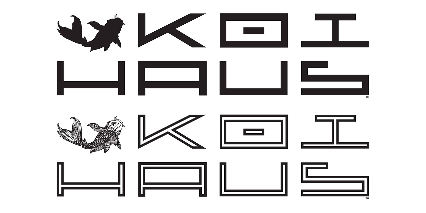


Koi Haus Property Management (2016)
Entrepreneur S. R. Coy needed an image for her rental property company that conveyed prosperity and stability.
Art Deco and Postwar typography, Feng Shui and Ms. Coy’s love of Koi fish were used as points of departure toward the desired eclectic aesthetic that was to be a reflection of her own.
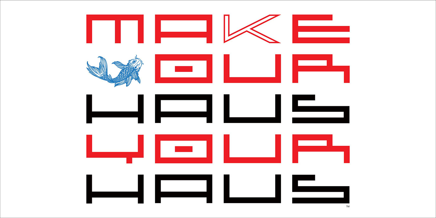
The stylized “K” is a variation of my "Glyphtek" typeface, with an open body suited to be overlays or filled with illustrations. The colour scheme of red for prosperity and blue for stability reinforce the placement of the Koi itself, showing resilience as it swims upstream.


