Positioning concept
Positioning was based on perception, on all the things that you see and feel while travelling along the famous French Riviera. The company deals with everything, from organising trips and tours to choosing the best routes and events. It instructs, shows and guides, doing everything to make your trip unforgettable. The clients need only to relax and enjoy the trip without a care in the world. The brand’s main task is to make you look forward to the trip and deliver on the expectations.
Naming
We started with defining the brand name specifications: it must be understandable to clients from all around the world, live up to the service level and cost, and bring across the impression of an ideal trip.
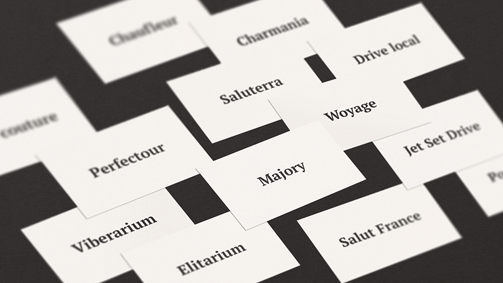
The company’s founders liked the name Majory. It’s simple, neat, and elegant. In English the word major can be defined as “primary” or “important”. This word, which has been subject to minor changes to make it easier to read and registrate, points to the client’s privileged state.
Identification Concept
Majory is not just a transfer service. It’s a key to enjoying the moment. To express an image of pure enjoyment and bliss, we set on a pleasant search. We studied French landscapes and recalled our Mediterranean travels. Soon we understood that mere visual images were not enough. We needed to create a participation effect by acting on all the perception levels at the same time.
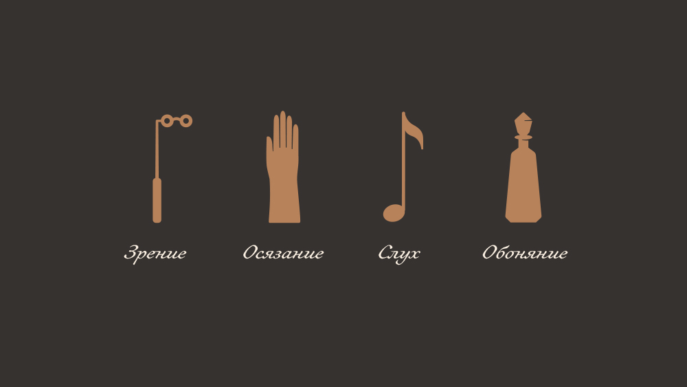
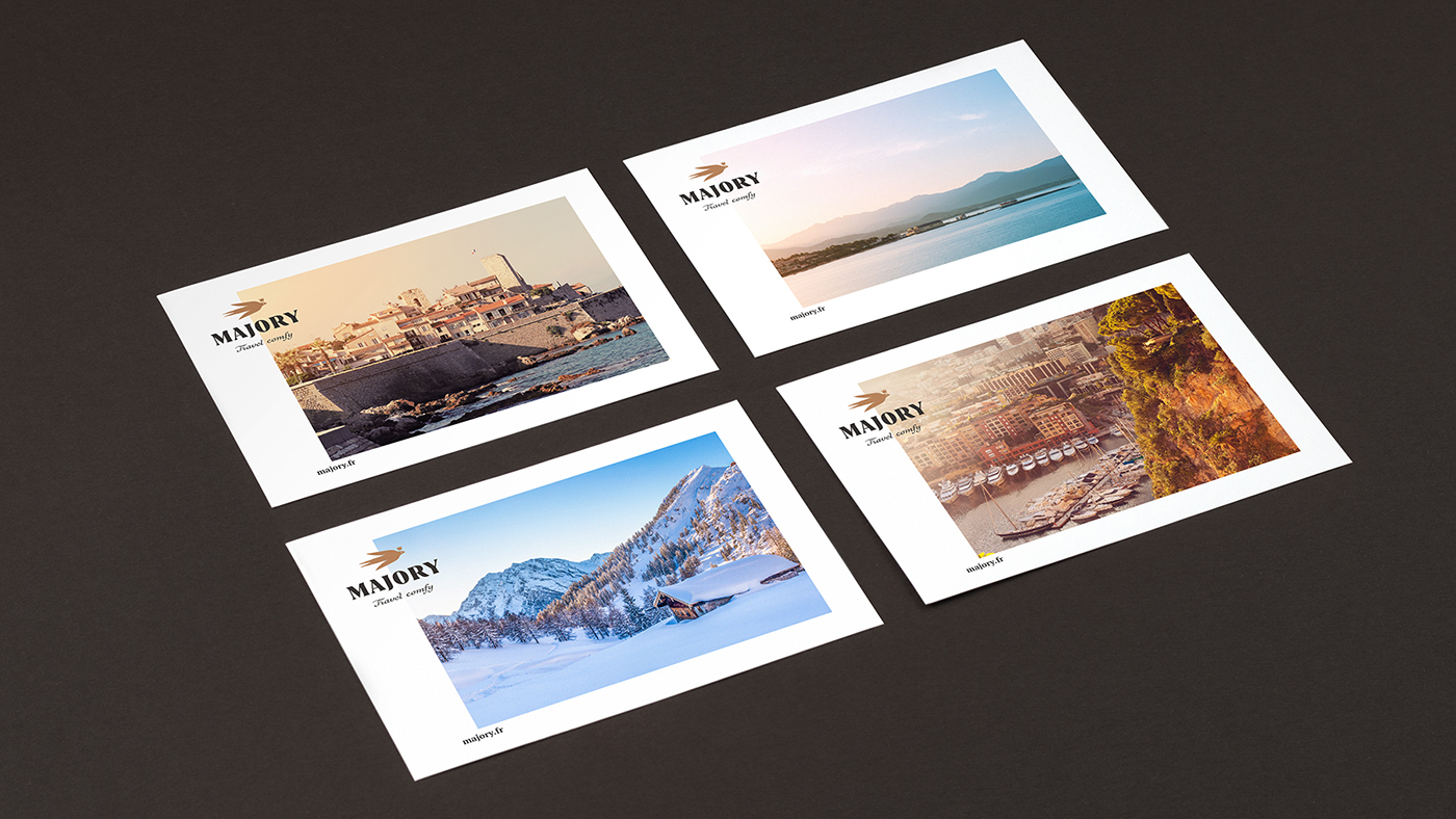
We handpicked the photographs with great care, giving preference to warm and soft shots that bring across the contemplative feeling of the ‘here and now’ moment. The obvious and unoriginal attributes of wealth such as yachts, villas, restaurants, beautiful people, and jewellery were all left behind. We decided to be more subtle and placed our bet on the play of light and shadow, bringing out the golden haze of sunset beams, glistening of pebbles on a sea shore, gleam of water surface, and soft light of street lamps.

Special attention was paid to the color scheme. Every color must trigger associations with high-class materials and evoke tactile memories of specific textures.
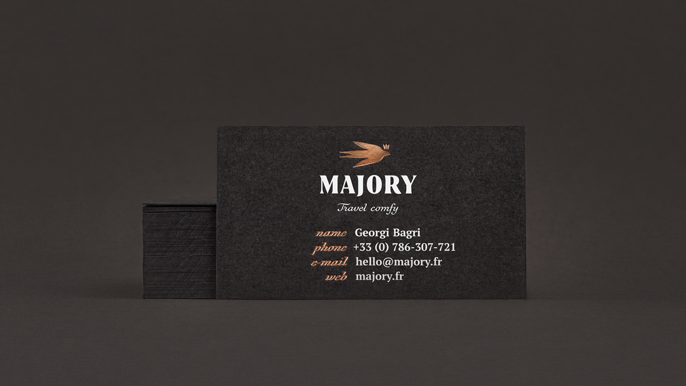
The dominant color we picked was deep brown which reminds of genuine leather and dark species of wood and stone. It is accentuated by the color of precious red gold. Modesty is a virtue, so we used the golden shade very carefully, only in details. The saturation of brown and golden is highlighted by ecru color reminiscent of ebony and marble. This color became the base for text-abundant corporate identity media.

The photographs were brought to life in video clips. We picked simple subjects, such as sunbeams striking through foliage, view from a moving car window, unhurried crawl of clouds across the sky, twinkling of champagne bubbles in a glass, battering waves. We used these shots to produce captivating video intros for the site’s main page and for co-branding video commercials.
The videos are accompanied by background music. We deliberately chose piano etudes by French composers Erik Satie, Claude Debussy, Maurice Ravel, and Gabriel Fauré. By the way, it was Satie who invented the concept of ‘furniture music’ — refined audio background for daily routine. In addition to music for video clips, we also put together day and evening playlists which could be played during a car trip.
We suggested to complete the background music with an elegant scent from a premium perfume house. Sublime perfume linger will remind clients of their trip and spark the desire to come back for another.

The fonts we chose were expressive and elegant. For headings we used a high contrast serif typeface in extra bold Boita Extra Bold. Subheadings and accent blocks were designed in a symbolic Voltaire font, which is based on the famous French writer’s handwriting. For text layout we used a neutral and clear PT Serif Regular. This seemingly random trio helped us bring typography to the foreground.

When designing the layout we used the principle of floating plates where text blocks and photographs overlap. Such format enabled us to bring a modern touch to a refined style by imitating the sensation of movement and a change of scenery behind a car window.

For voluminous texts we created pictograms that were in line with the logo style. Miniature pictograms add charm and help illustrate French sights or the company’s advantages.

They are also perfect for infographics; for example, for marking waypoints.

Logo
We chose the logo as you choose an expensive watch. As a result we got something with emphasis on status, moderate decorum, and historic background, as a brand with a rich lineage.

The status was expressed by a heraldic charge of a martlet which was symbolically used by reputable colleges and universities, as well as in family and urban heraldry. In addition to the bird’s heraldic ancestry, the clients’ privileged position is further accentuated by the crown above the martlet’s head.

The swift also helped to communicate the idea of simple travel. This bird’s little, almost invisible legs brought about a legend that it stays in continuous rapid flight and never lands.
Corporate Identity Media
We did our best to make corporate identity media elegant and high-class, as service in a Michelin star restaurant. We specifically focused on materials, paper, and means of print and production.