

“Form Society 合舍” is a space for gathering, interaction and co-operation, with the principle of “community building”, we named it as “Form Society” since “Form” is a pun for “Formation” and “Shape”.
At first glance the logo is in a form of a little house, but in detail it is a combination of the two Chinese characters“合”and“舍”, which also represent the Chinese name of Form Society, and the joining characters symbolize connections, sharing and co-working. The hidden initial“F”for Form Society is placed on the top left corner on the logo.
The logo is structured and built by open lines, it is a metaphor for possibilities and imaginations, while the negative spaces are the invisible trust and support among the community, giving effort to create things for good together.
Finally, soft and rounded lines of the logo are representations for humanity and harmony in the society, as well as pointing out Form Society is a space for art and cultural activities, they formed a contrast with the Chinese logotype for better legibility.
「合舍」是一個相聚互動、合作合力的地方;而「社區」是這個「小舍」的根本,因此結合及凝聚社區之義,取名為「合舍 Form Society」。英文的「Form」語帶雙關,指涉構成跟形態。
標誌驟眼看是一間小屋,內裡卻包含了「合舍」二字,兩字連在一起構成一個空間,代表「合舍」本身就是個相聚、分享和創造的地方。小屋的左上部份,有Form Society的最重要的字首「F」,這是一個以共享共有為主體的設計。
「合舍」標誌以最簡單的線條組成,線條之間都是開放的,這比喻「合舍」的可能性與想像空間,而實與虛的連結,正正就是彼此之間無形的信任與支持,為「For Good」而一起努力的關係。
最後,標誌與英文字體應用方面均採用了圓滑的線條,帶點溫暖和諧,並指出這是以社區人文為主的複合藝文創意空間。中文略帶方正,主要為與標誌造成對比以及方便辨識。
–
Identity and Naming by Milkxhake
Mobile Team:
Saki Ho (Tokyo)
Javin Mo (Hong Kong)
/
https://www.facebook.com/FormSocietyHK
Mobile Team:
Saki Ho (Tokyo)
Javin Mo (Hong Kong)
/
https://www.facebook.com/FormSocietyHK


Photo by FormSocietyHK

Photo by FormSocietyHK
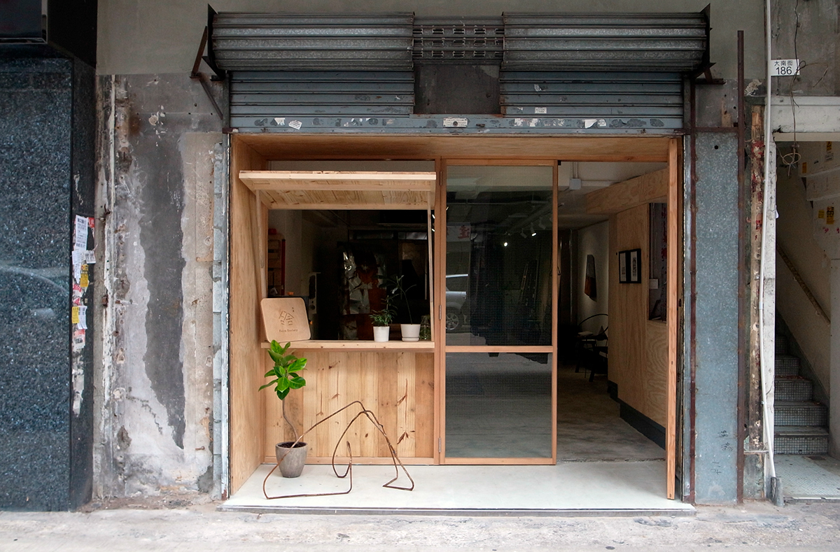
Photo by FormSocietyHK

Photo by FormSocietyHK

Photo by FormSocietyHK
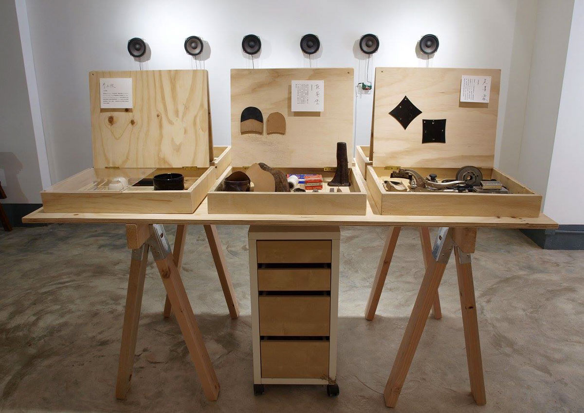
Photo by FormSocietyHK

Photo by FormSocietyHK

Photo by FormSocietyHK


