
What does the firm do:
Internet provider in Kirovograd. Internet access for the city and outskirts. Cable TV.
The task:
The old design was done a very long time ago, it lacks adaptability, and the usability left much to be desired.
The main task is to realize the most convenient and intuitively understandable functional. The user should easily select the necessary service and leave his address and telephone number. Access to services should always be at hand, and nothing should be distracting. It was also important to consider that the site can be used by different age groups of the population.
It was necessary to implement an interactive field with an address and a map. When a visitor dials in his home / work address, he is given a list of services available to him, and the dot marker is highlighted on the map by his marker. ( you can see how this all looks in the video presentation)
For customers who already use the service, you need the most detailed information about the news and promotions of the company, as well as simplifying the payment of the service online.

Solution
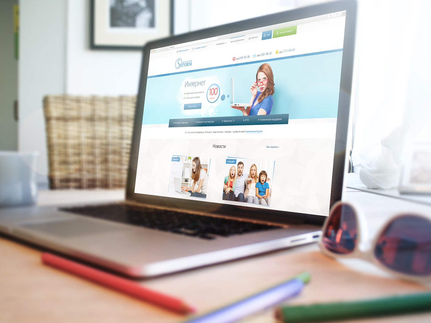
A very minimalist, versatile design was chosen, perfectly suited to the regional segment of visitors.
Minimized images, so that people with weak Internet, living in the suburbs did not feel any difficulty in working with the site. Also there is almost no animation, nothing flashes, it looks strictly and concisely.
The main color according to the corporate style is #1f82c8, for the buttons the bright one #f4e828 is used.
Since tariffs for private subscribers differ from tariffs for business, the site was divided into two parts.
For the convenience of the user, the interface was elaborated in details. All information pages, such as news, company and so on were combined in one section of the menu. This step allowed to facilitate access to any materials of interest immediately. And at hand, all available methods of payment and the choice of a settlement are available.

Each page has a form that allows you to leave your phone number so that the consultant can contact and help to resolve any issues.
As the customer wanted, an interactive map was implemented on the pages of the services, output of packages and additional information.
Almost all the navigation is duplicated in the footer.


Also, a cool page 404 was developed, and if some pages are lost when the site is updated, this will not affect the conversion.
During the making process, there was a constant connection with the programmer, as a result of which some questions were solved on the go. As a result, the new design was very responsive, perfectly optimized and 100% adaptive. Tested on a variety of devices with different screen resolutions.


Thanks for watching!


