

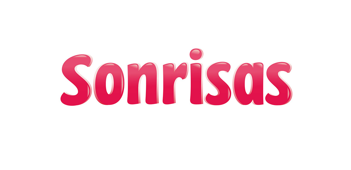
«Arcor» called us for a completely redesign of their well known Sonrisas cookies’ logotype.
The aim was to make it extremely legible, though still warm, childish and playful.
—
Fuimos convocados por «Arcor» para rediseñar el logotipo de su línea de galletitas Sonrisas.
El objetivo principal fue conseguir una notable legibilidad y al mismo tiempo representar calidez y diversión.
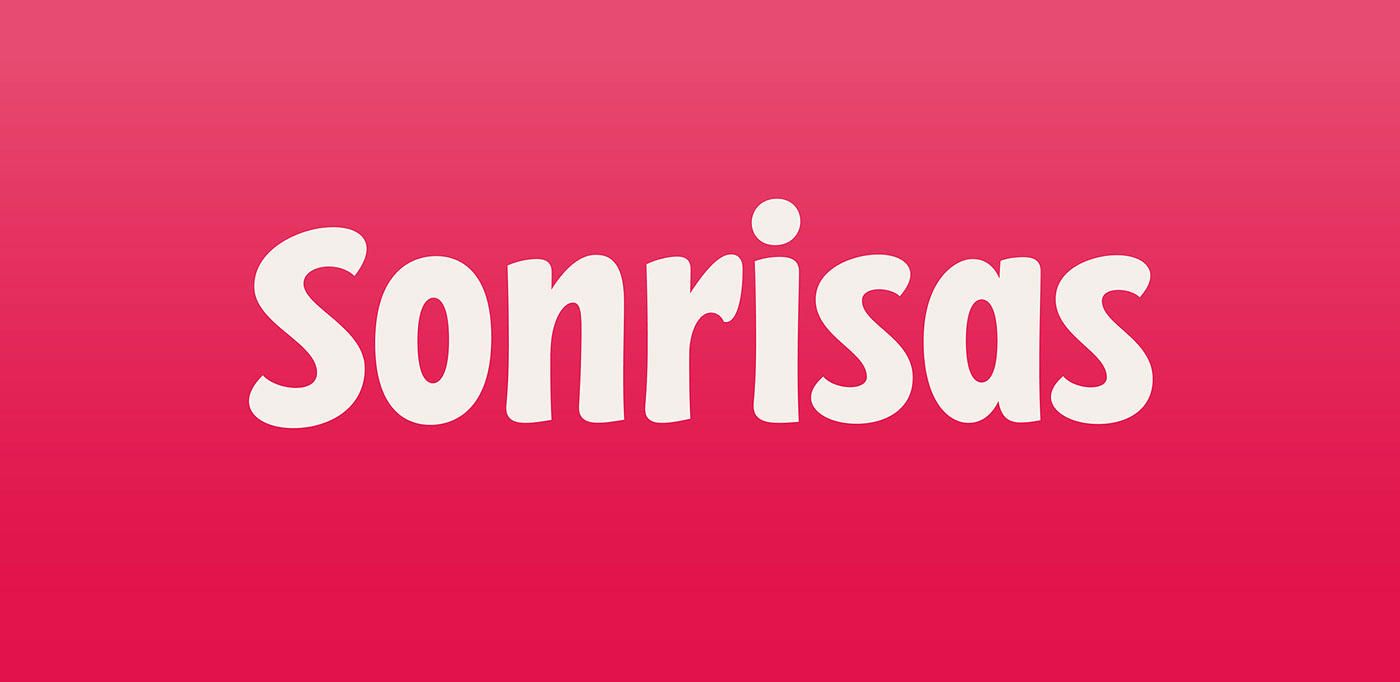
The aim was to make it extremely legible, though still warm, childish and playful.
—
Fuimos convocados por «Arcor» para rediseñar el logotipo de su línea de galletitas Sonrisas.
El objetivo principal fue conseguir una notable legibilidad y al mismo tiempo representar calidez y diversión.

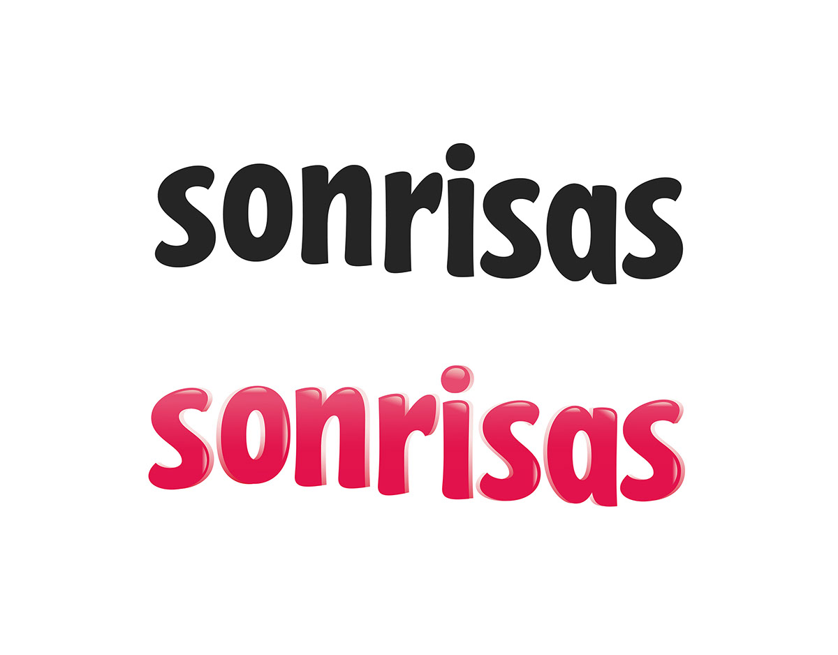
Some other exploration alternatives / Algunas alternativas durante el proceso de diseño

Credits
Company: Arcor
Creative Designer: Clara Elortondo / Nahuel Masini
Packaging design: In house Design Team (Manager/Director: Daniel Loewy)
Typographer: Yani & Guille
Commercial work/Produced
Packaging Substrate / Materials: Flexible packaging
Printing Process: Rotogravure
Company: Arcor
Creative Designer: Clara Elortondo / Nahuel Masini
Packaging design: In house Design Team (Manager/Director: Daniel Loewy)
Typographer: Yani & Guille
Commercial work/Produced
Packaging Substrate / Materials: Flexible packaging
Printing Process: Rotogravure


