


Biblioteaca is a modern tea parlour and patisserie set in a traditional English library-like setting in Muscat, Oman. Design brief covered building up the brand from scratch, including their branding, packaging, website, cutlery design, company profile, menu, etc. The concept was inspired from old English library and traditional English high tea practises.
The logo was inspired from vintage english monograms, where an owl sits on a book (both symbols of wisdom), set on a sheild that emcompasses the elements such as a teapot, tea leaves, fleur- de-lis (representing royalty). The words ‘Liquorem Sapientiae’, translate to The drink of wisdom, refering to Tea. The colors, Gold, Blue and Beige were used to depict oppulence, tradition and royalty.

Logo. Full color, two color and monotone versions

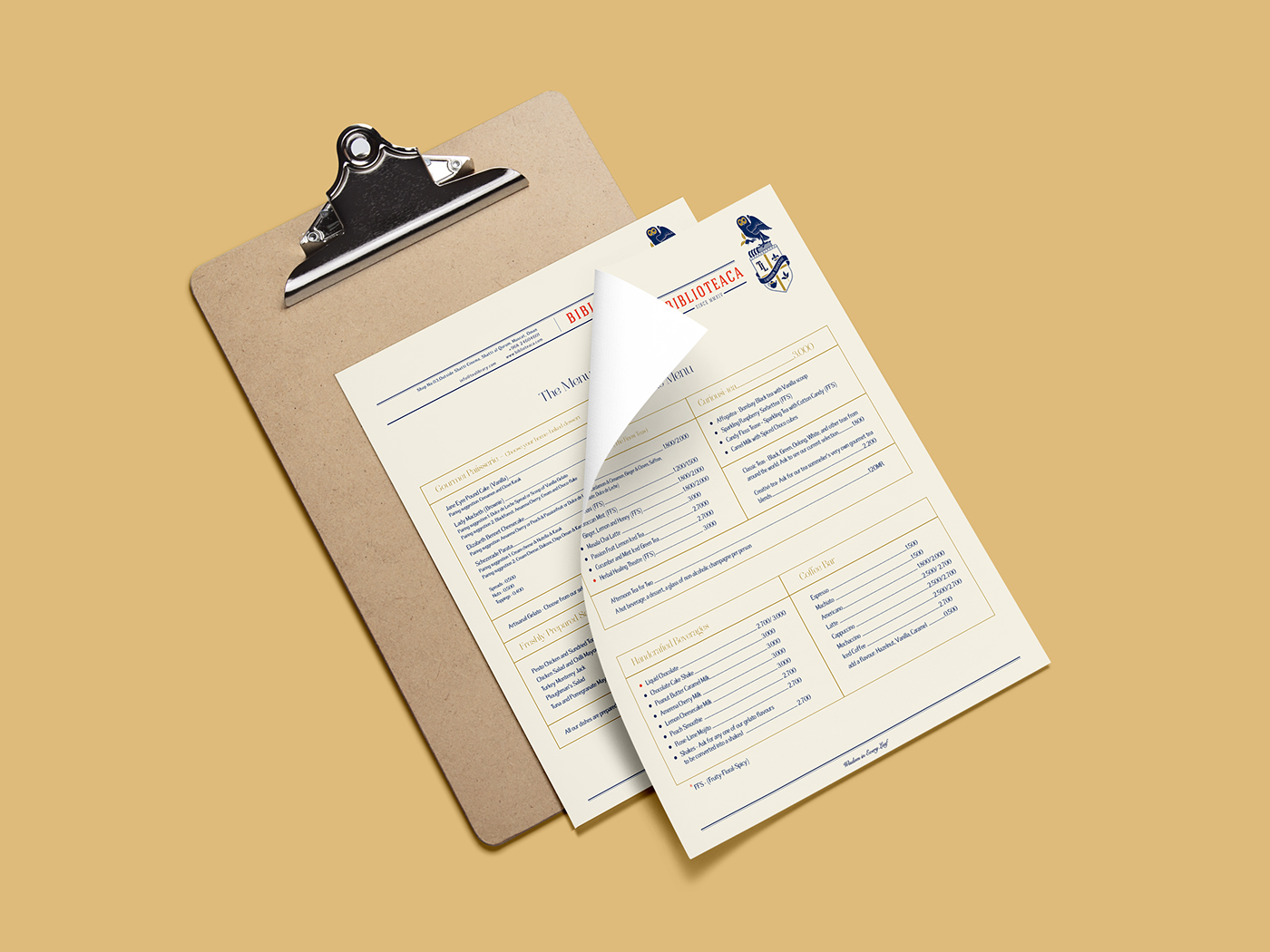
Menu cover. The menu is the form of a tabloid.

Menu design
Takeaway Menu

Cafe signage on the store front

Cafe window, outer facade

Business cards designed to look like a library card.

Other Stationery

Print design inspired from the karak tea flavours offered at the cafe.

Wax stamp seal used for sealing takeaway packages
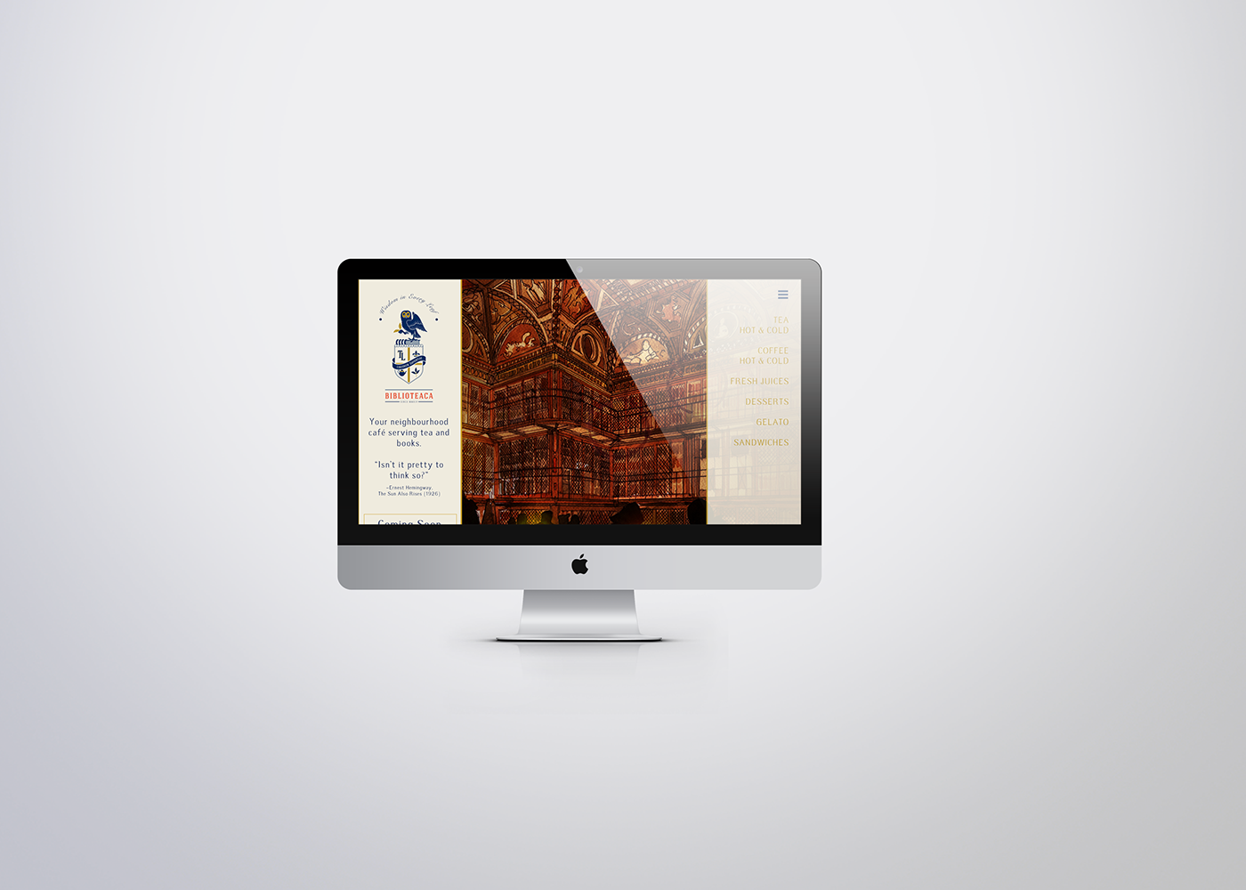
Website Landing page

Take away coffee cup, illustration inspired from words from Macbeth.

Cups and Saucer for serving tea, in-house.

Tea caddy labels for their in-house tea.


