


A New Visual Identity
Amaze was born 20 years ago inside the Learning Methods Unit at Liverpool John Moores University. The founders saw a social and technological revolution on the horizon and began to study the increasingly complex relationship between human behaviour and technology. Understanding that relationship has been our passion ever since, and we have transformed our vision into an enviable portfolio of digital marketing and commerce for some of the world’s biggest brands.
Combining the thinking of a creative agency with the rigour and scale of a global consultancy, you’ll find a fascination with human behaviour and technology at our core.
The new system
Leading a team of designers we created a new visual identity system to communicate our story. We reassessed our core values and considered how to translate them in all our communications.
Focussed on human behaviour and technology, the visual identity constantly evolves and changes to reflect our organisation.
Below is selection of assets we created on what was a journey of over 2 years, which has resulted in a truly unique and dynamic brand.


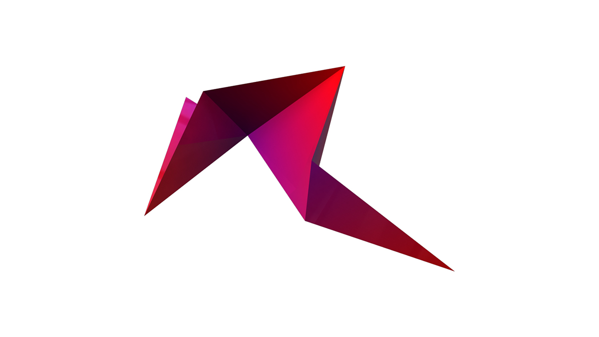
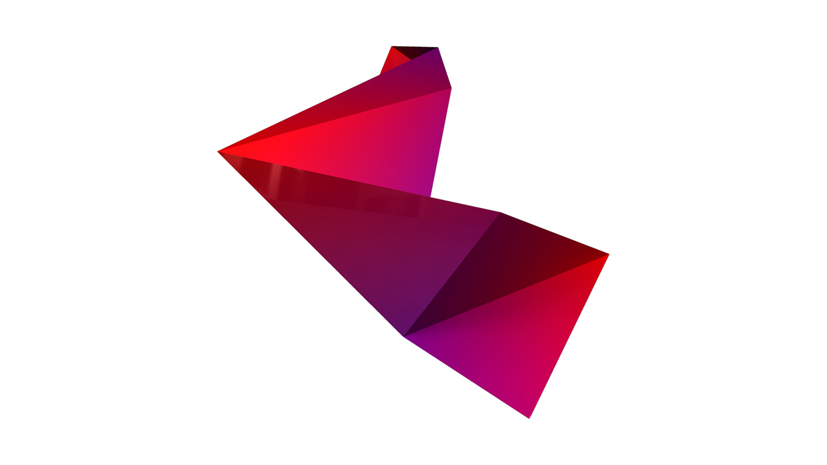
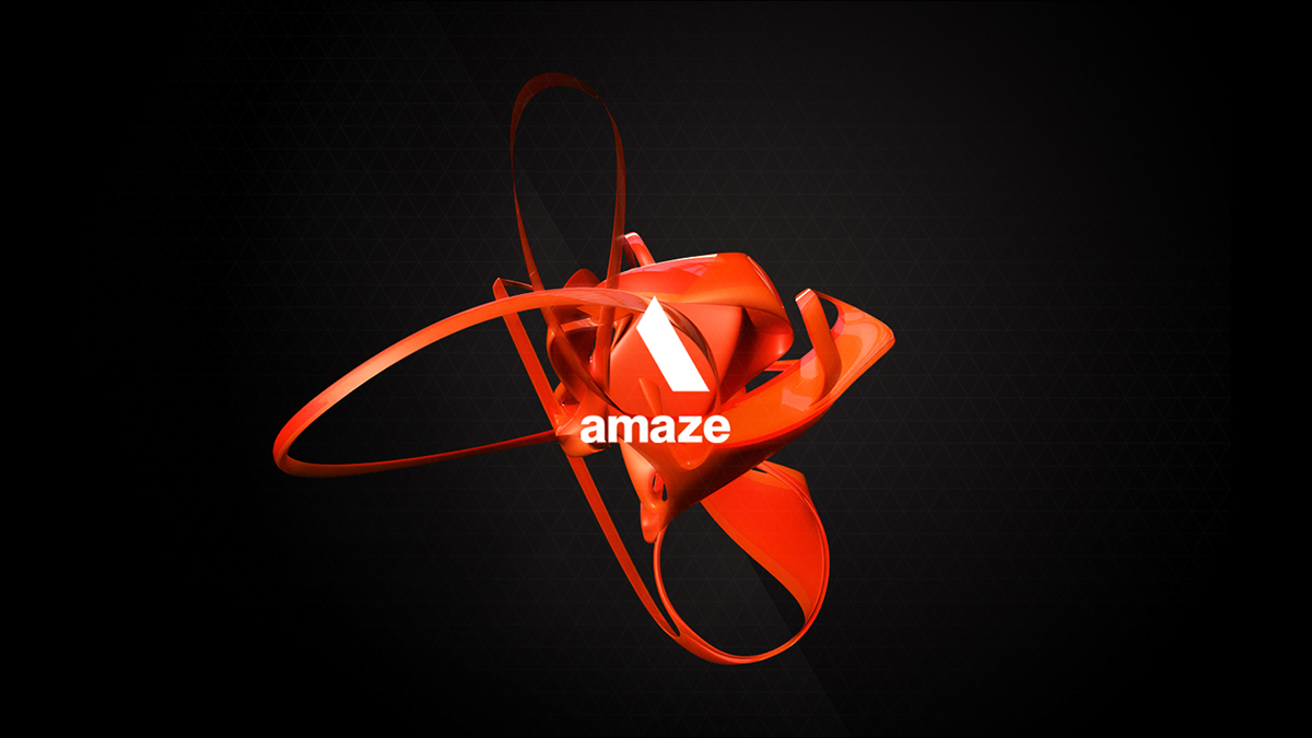
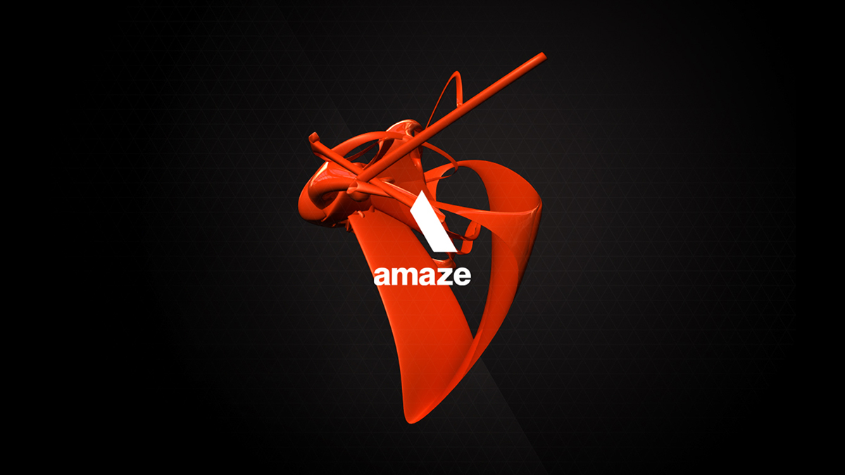
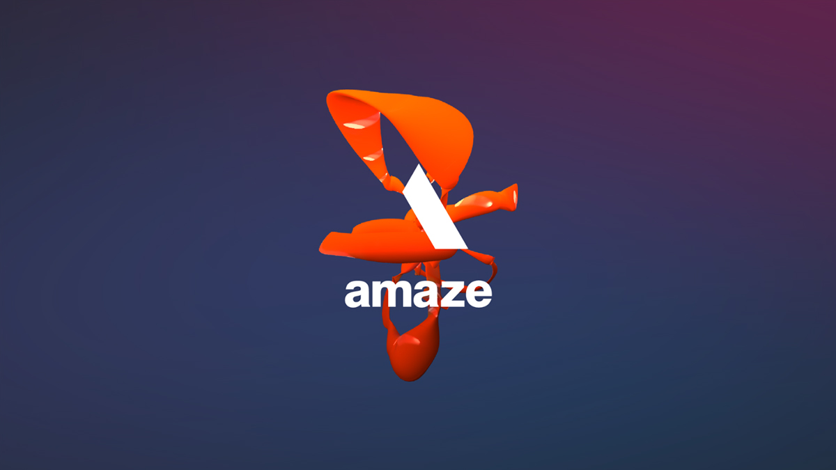
What we wanted was to create a system that was organic, constantly shifting growing and changing. A brandmark that evolved as we evolved, adapts as we adapt, sleeps when we slept. An identity born of technology, but fed by human nature


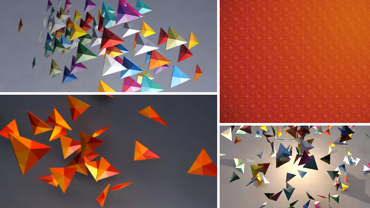
Data would be used to generate the brandmark, we would collect it from all aspects of our business and behaviour, tweets, conversations, data consumption, emails sent, movement around our offices. The brandmark itself would transform the data into a 3D form, creating an evolving visual manifestation of everything we do. Everytime someone prints a letter or sends and email, the mark is generated at that specific moment in time and applied.


We created a living organism, with digital DNA, The product of combining rigour and magic.

This idea of rigour and magic started us down a slightly different avenue of thought one where we had two separate elements, one fixed and one fluid to represent the rigour of traditional consulting and technology and the magic of creativity.
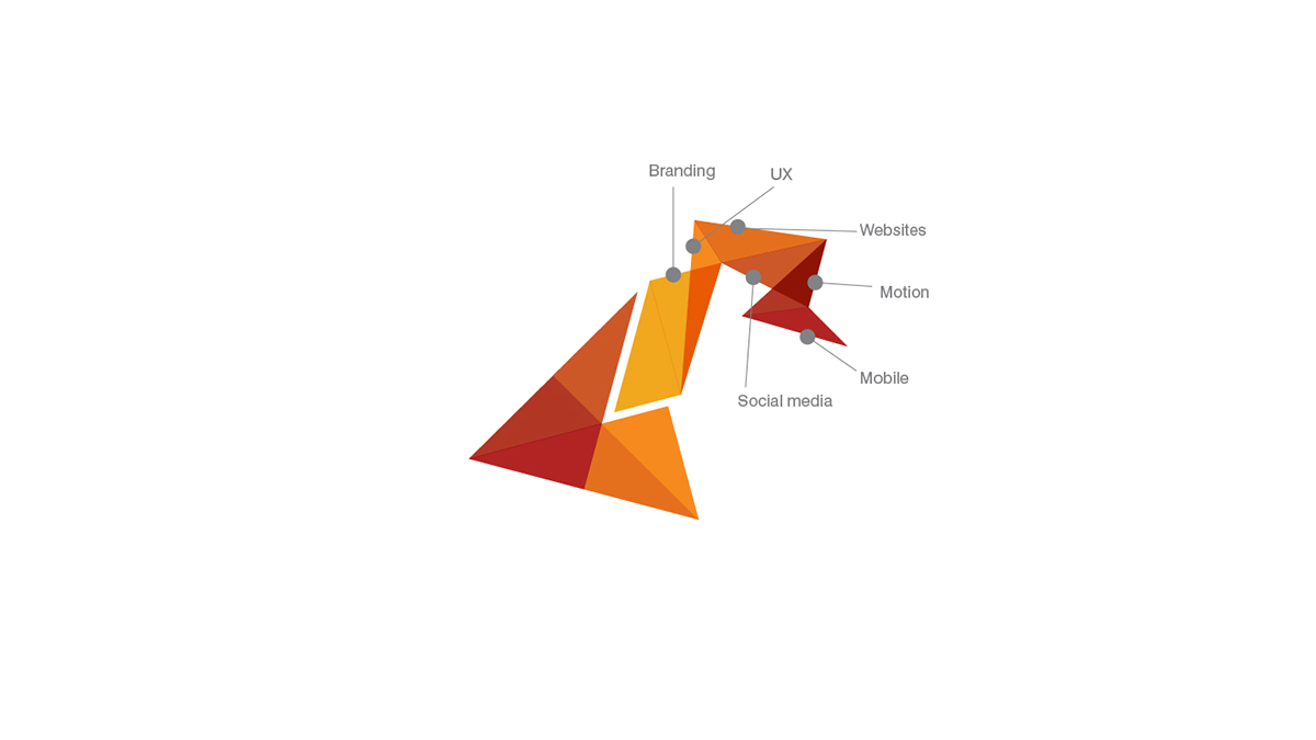
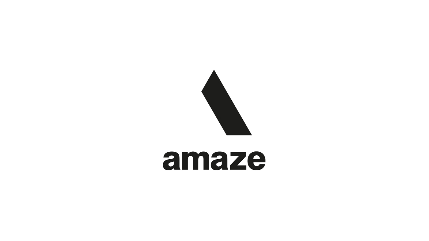
We created a grid system which underpins everything we did, one not based on the traditional pixel but on our triangular form, one we termed the trixel.


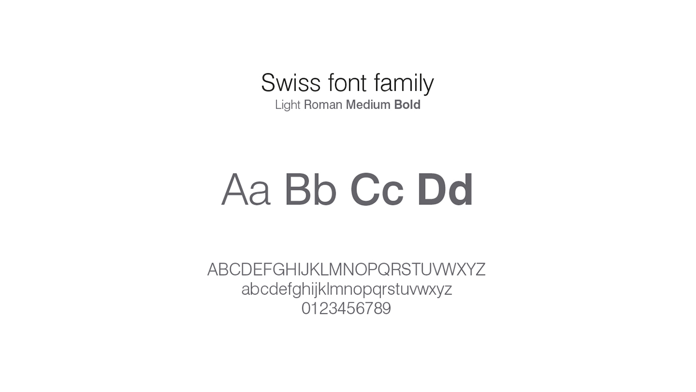
This gave us our rigour, our fixed foundation on which to build our framework of typography, colour, photography and moving image, we called this the slab

The potential for this to become a recognisable mark in its own right is our eventual aim - lofty aspirations perhaps, but aim high I say.
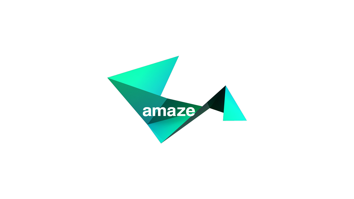
For the generative element of the brand we initially looked at using trixels to fill the negative space left by the slab and logotype, but we wanted something more fluid and organic, so we quickly moved away from the geometrics.


Once we had the master brand mark nailed down, we moved onto typography, fonts, colour and photography.


Our photography is cinematic in composition and treatment and always shot in a documentary style. Real people, captured moments in time, emotive and engaging


This was very much the beginning, the next phase was application of these guides to real world assets and projects, such as the website, stationary, the dreaded ppt deck, iconography and so on for use by the wider business teams. I will detail those as separate projects though as they deserve some detail and this is a pretty long project as is. This isn't by any means all the work, just a pretty thorough snapshot - hope you enjoyed!


