


Re-branding for Raff Designuke, a design festival in Bergen, Norway, which showcases different design genres; the only week-long design festival in Norway today.
Concept:
What is design? Saul Bass describes it as "thinking made visual".
To visualize something might be the easiest way to make someone understand; the simplest form of communication. And communication is, when you boil it down, what we see and what we hear.
The concept "Bergensbølger" (Norwegian for "Waves of Bergen") - a play on the term commonly used to describe the "sudden" wave of musical artists from Bergen accomplishing fame and recognition - entails the fact that Raff's identity should mirror the festival's showcasing of design, what it is and what it can be, and therefore show how design can be boiled down to it's core: Light- and soundwaves, what we see and what we hear: Communication.

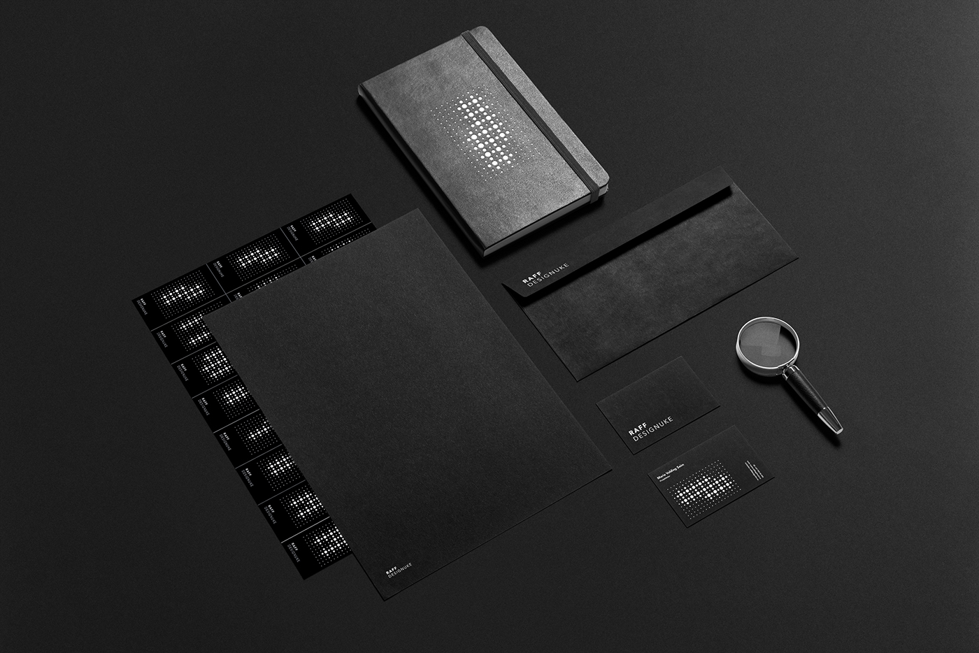
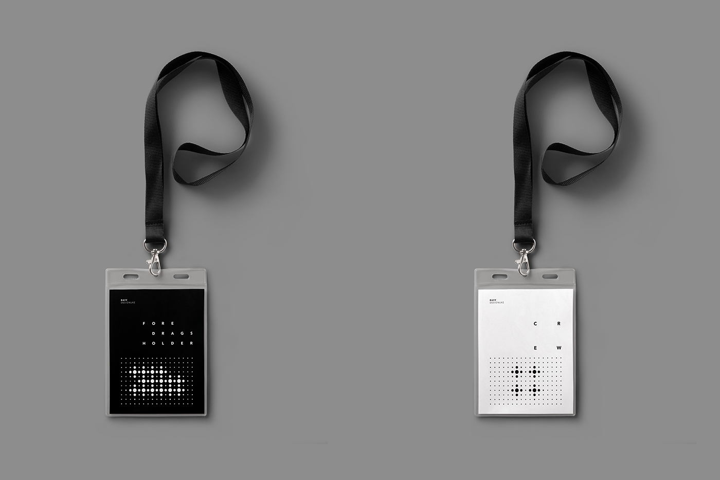
A grid was designed to create different patterns for various uses, be it to differentiate design genres (as shown), what affiliation one has to the festival - crew or lecturer, for example - what kind of drink you're drinking, or your name, amongst other uses. This pattern mimics the movement of the formerly mentioned light- and sound waves, how it ("it" being communication) starts from one source and then travels outwards.


To ensure the difference between crew and lecturers are easily spotted, their colors are inverted from one another.

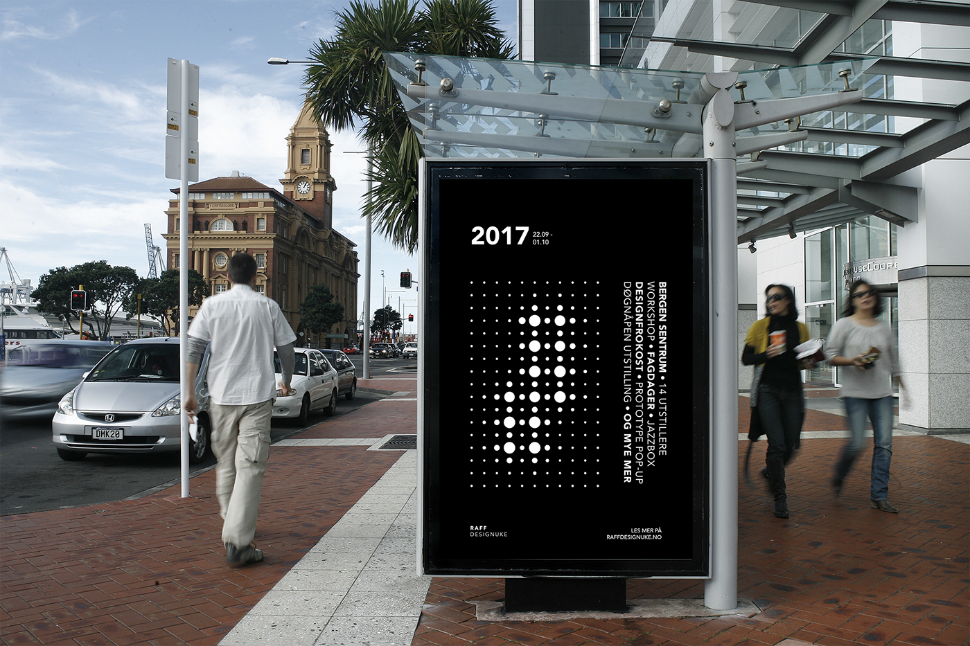
As an alternative ticket system, as this for the most part is a free festival, with the option to reserve a seat, I opted for stickers to be given out at the entrance of different events, as this festival would not need traditional tickets or festival wrist bands. Here shown with various patterns that would belong to different events.


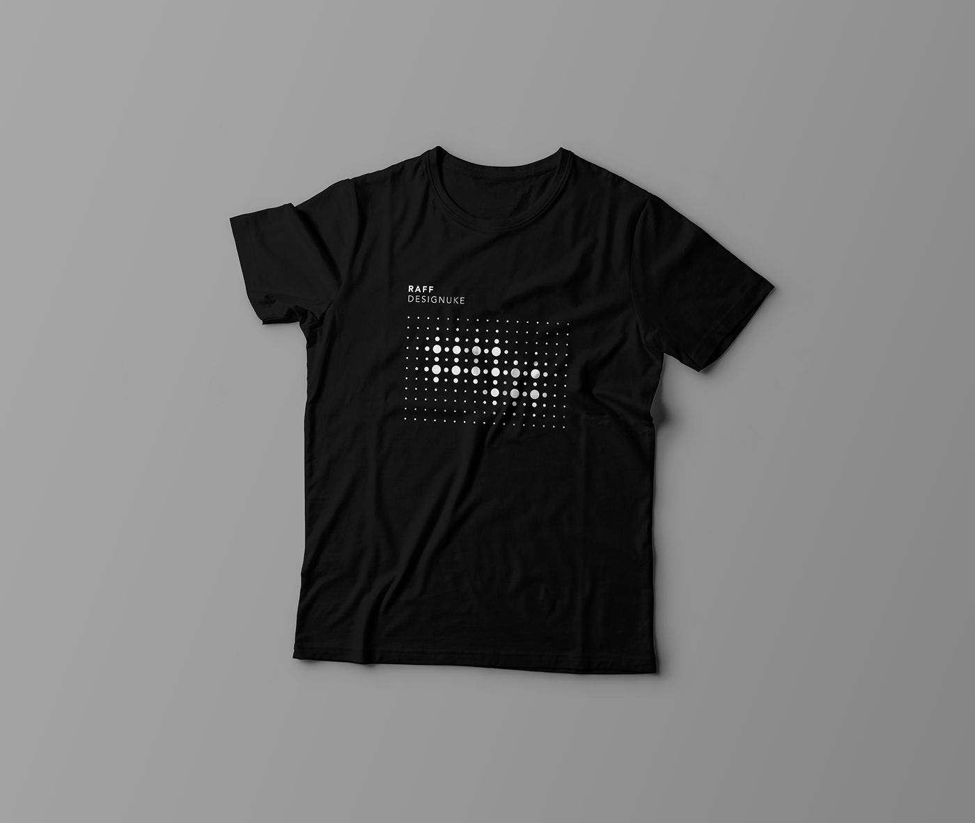
Merchandise could either be produced solely with the patterns pre-designed for the festival, but there could also be created a web shop where one could individualise a t-shirt or tote bag, with an online pattern-generator, based on your name, your design field of choice, or whatever else you would like to put on your merch.
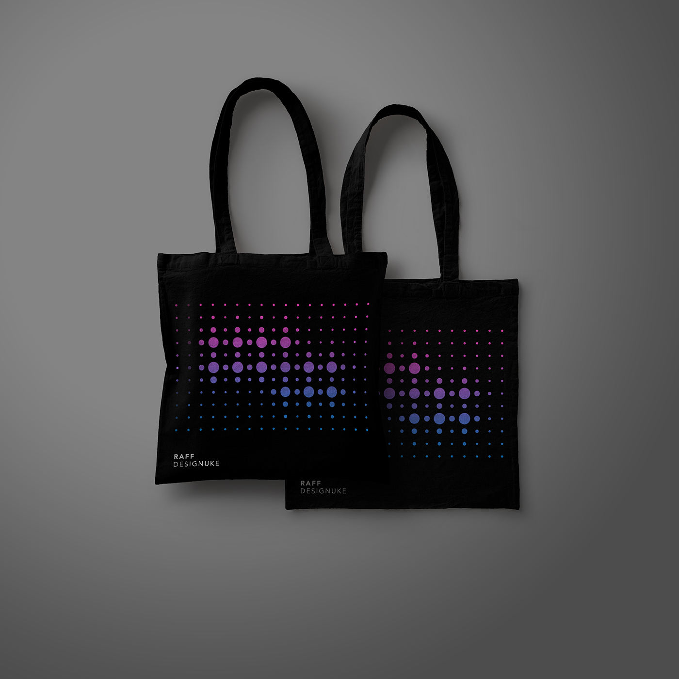
To ensure it's ability to stand the test of time, the pattern's color or effect could be changed to accommodate the design trends of the respective year as wished, as shown here by giving the pattern a gradient to replace the minimalistic black and white. This is a simple way to ensure that the brand will keep reinventing themselves, whilst still maintaining their established identity.


