


PROXEM
Identity, Corporate website
Proxem is the pioneer of semantic analysis of textual data for the company.
Since 2007, Proxem concentrate efforts on semantic analysis technologies
to offer the best possible understanding of the language for companies.
We work together to create a new identity and many communication media.
IDENTITY
We tried to create a robust and assertive identity.
The redesigned diamond, Proxem's emblematic symbol,
is associated with a geometrically reworked typography
to create the new Proxem identity.


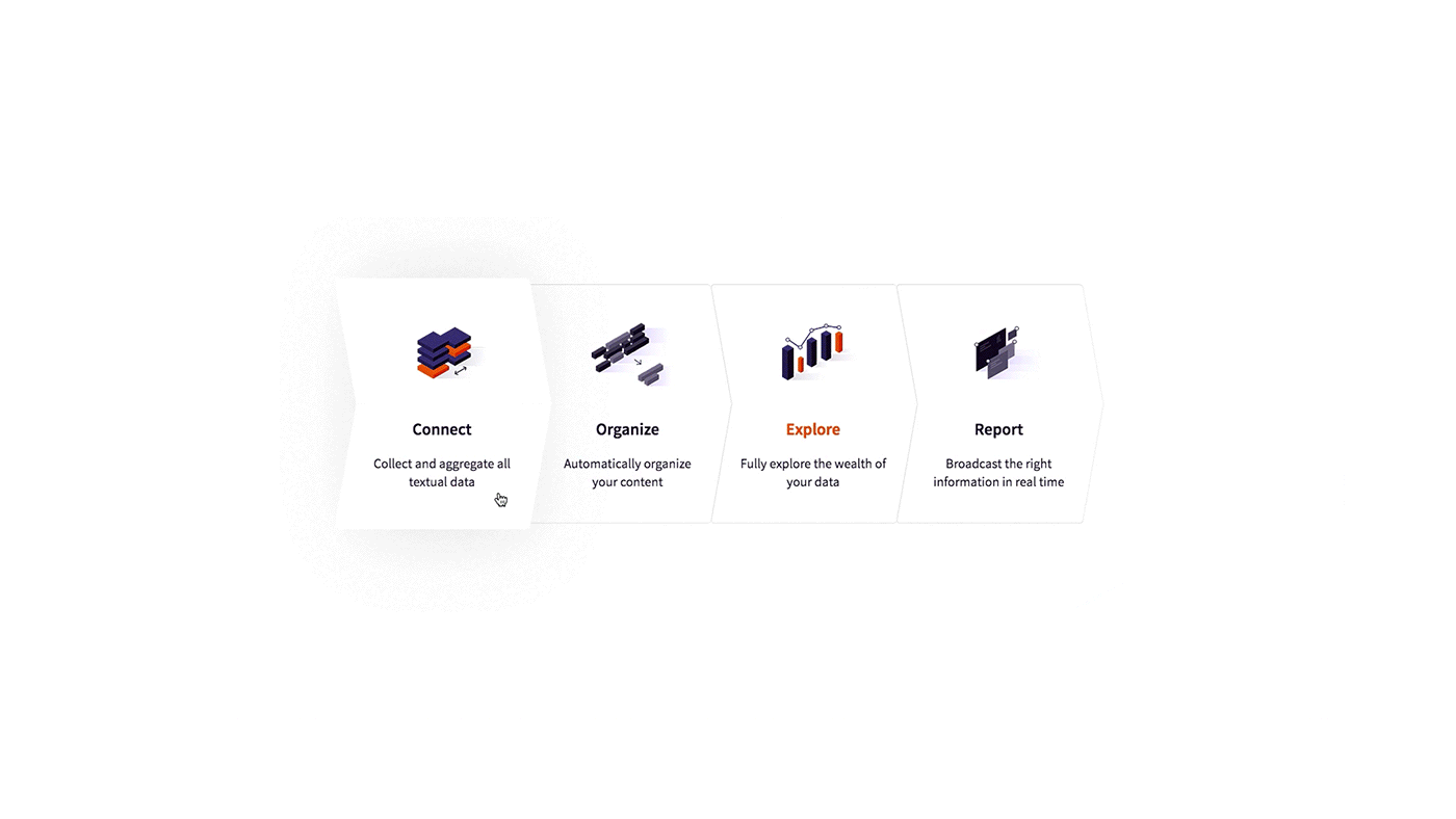
ICONS & ILLUSTRATIONS
We produced a whole series of illustrations and pictograms
to represent Proxem's expertises and to illustrate their purpose.
These use the color codes of the new Proxem identity.


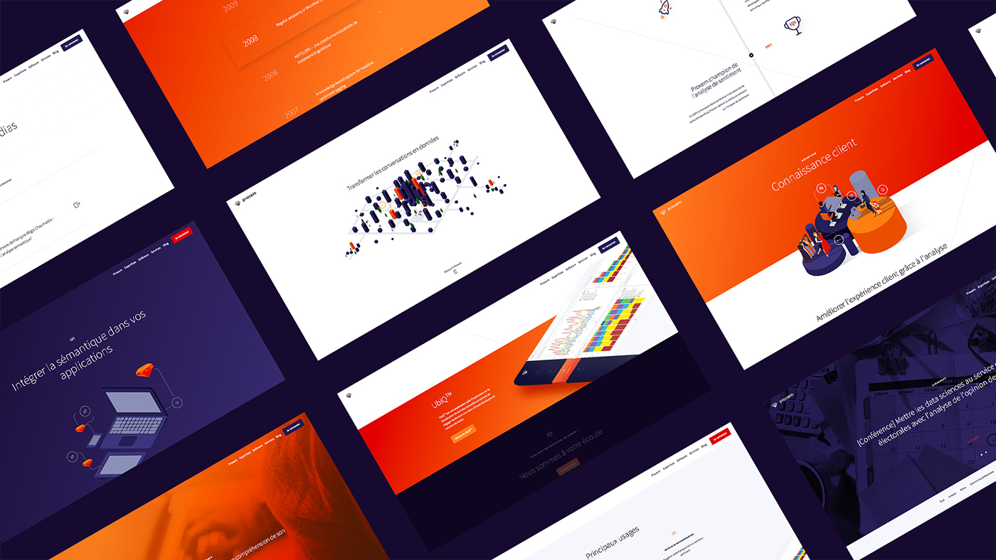
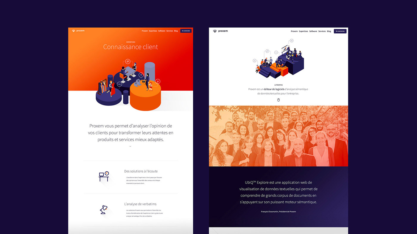
WEBSITE
Proxem redesign website is clean and simple.
A classical layout was used to establish a better hierarchy of Proxem's expertise.
The sobriety of animations create an intuitive presentation of the different contents.
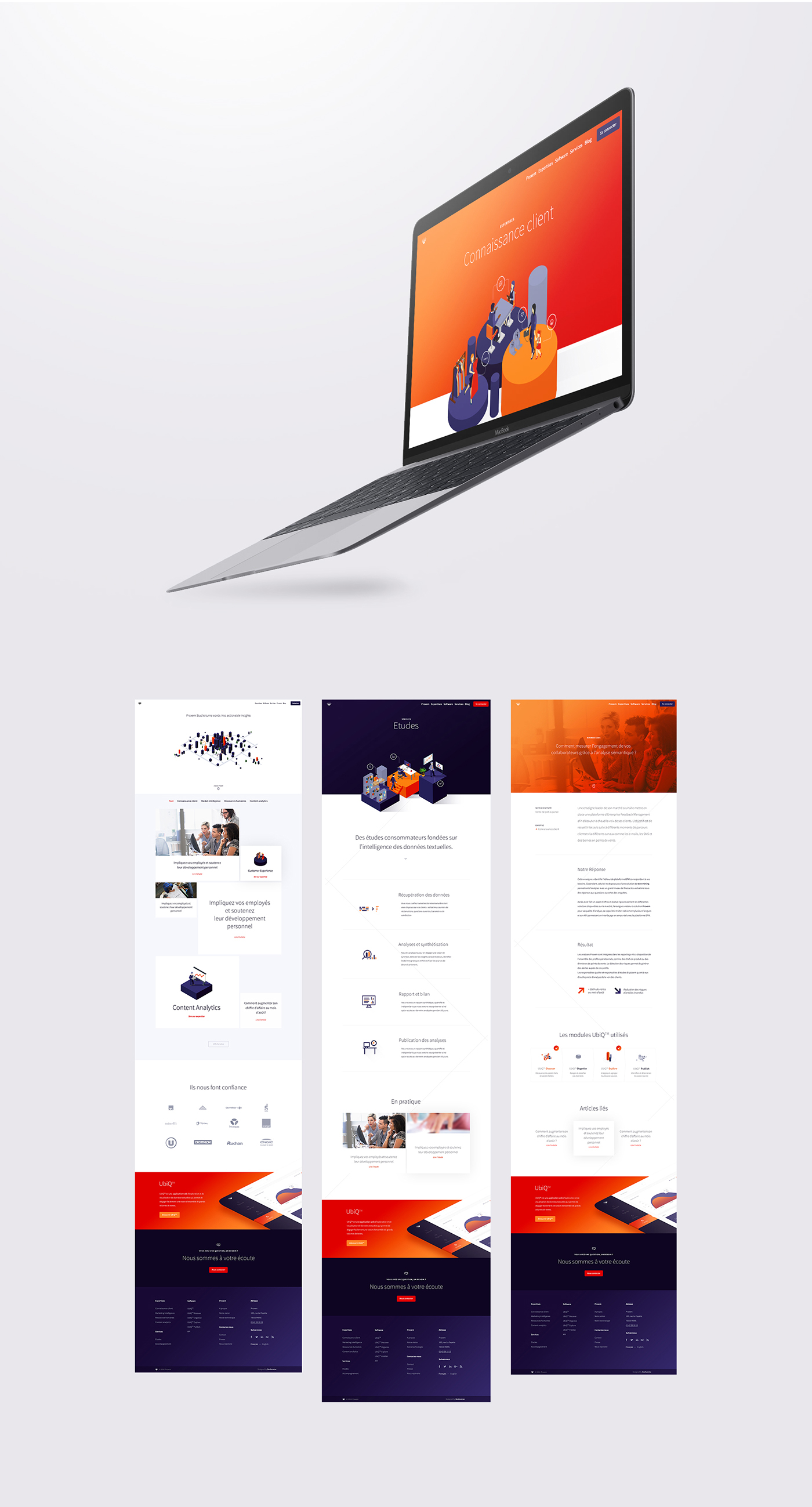
RESPONSIVE
Clear interfaces made with the new Proxem identity have been designed
for optimal reading on all devices, mobile or desktop.

"
Bonhomme did a remarkable job of creation and was force of proposal to make clear our offer. Putting humans at the heart of our artificial intelligence technology was a nice challenge that Bonhomme was able to take up with brilliance.
Thomas Cohu, Product Director


