For This project I was required to design a recipe that can be followed and understood without referring to text or type (excluding the title and key) and instead use symbols or pictograms.
Consider the tools, components and actions: this brief is about sequence and instruction over time — not simply depiction or illustration. As a designer you will invent and develop a fresh and innovative visual language for your symbols and pictograms.
For my project I have chosen to look at producing a recipe or better worded a guide to catching and cooking fish. This is a subject which I knew nothing about at the start of the project other than basic knowledge on equipment and having walked past others fishing. This is a past time which has always interested me as it is simple to do but is stereotypically the hobby of older people.
At the start of the project I aimed to produce a guide which shows the methods and stages involved in preparing to fish, catching a fish, preparing a fish to cook and cooking a fish. The subject of the project was decided after drawing out a range of different recipes and seeing what was both interesting visually and challenging. This subject I feel gives me a lot of area to work around and explore with my own visual language relevant to the subject and project. The brief was built around the subject and how the pictograms could best benefit a chosen audience.
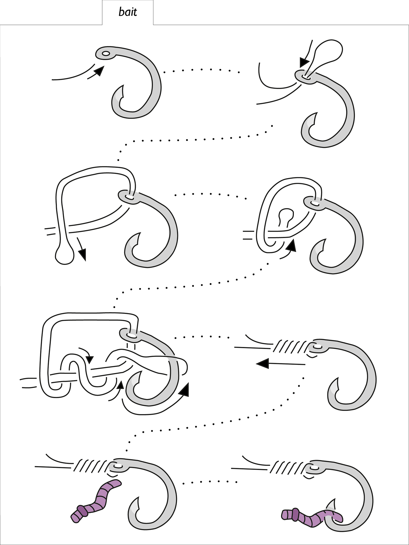
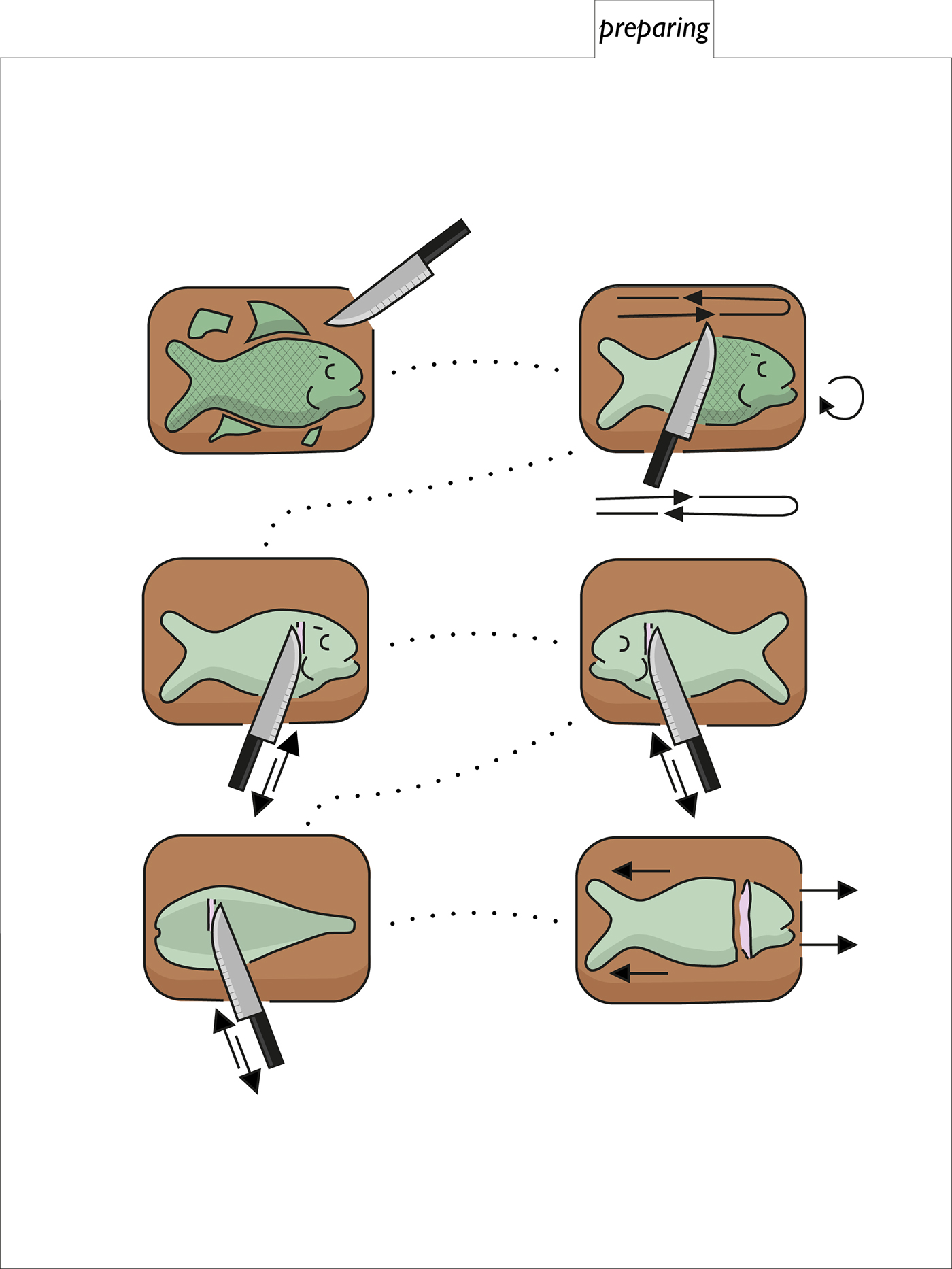
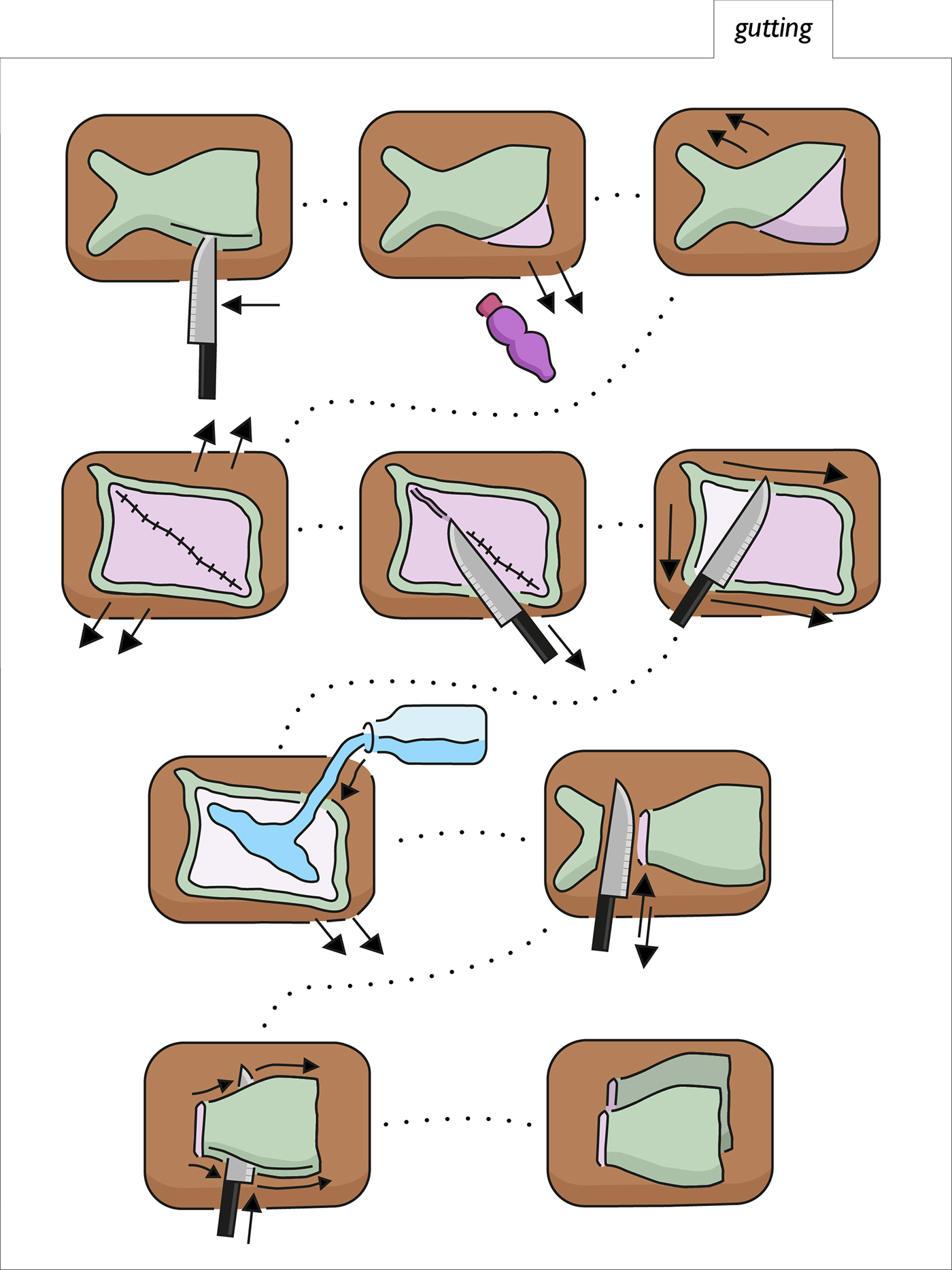
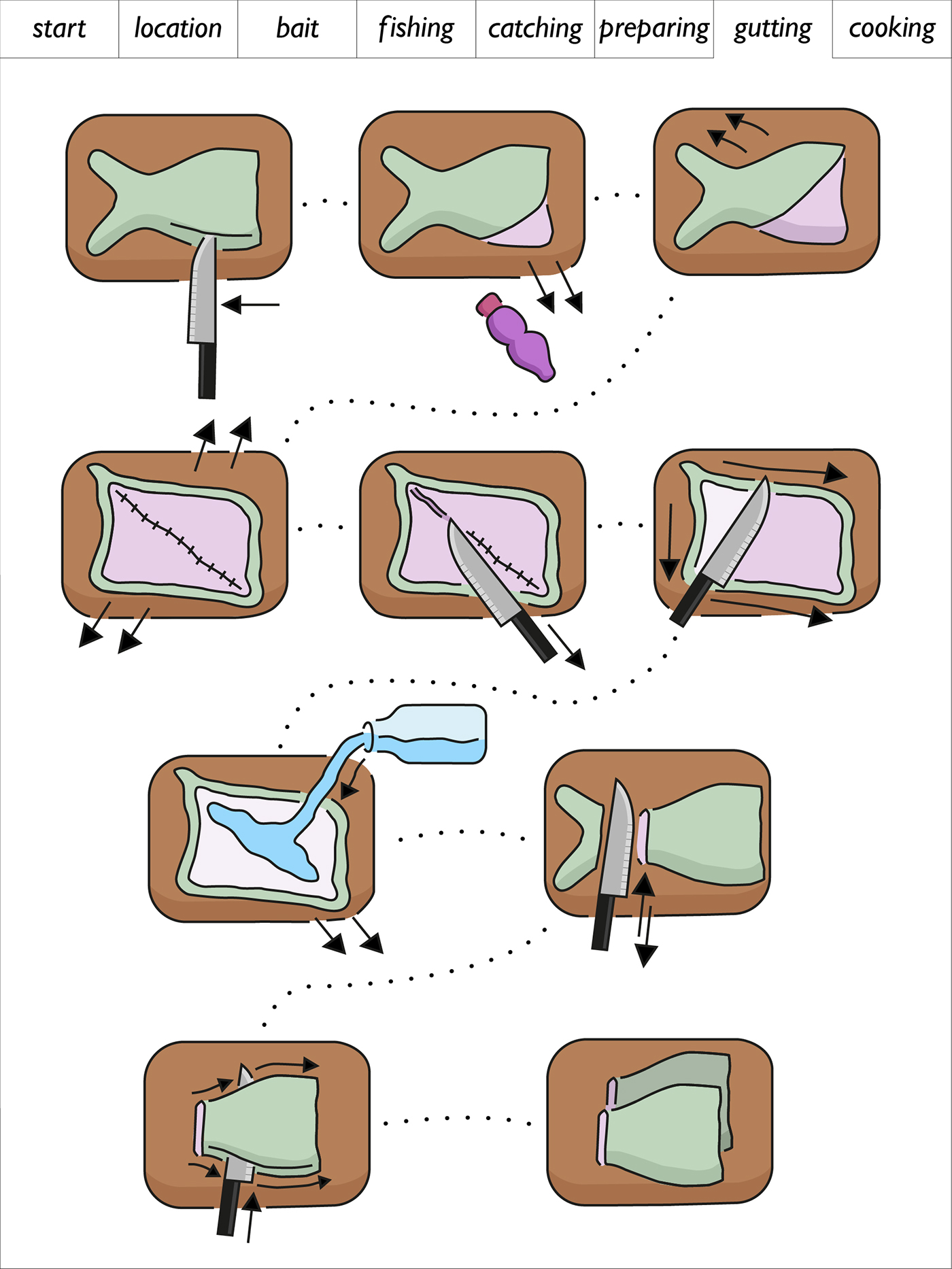
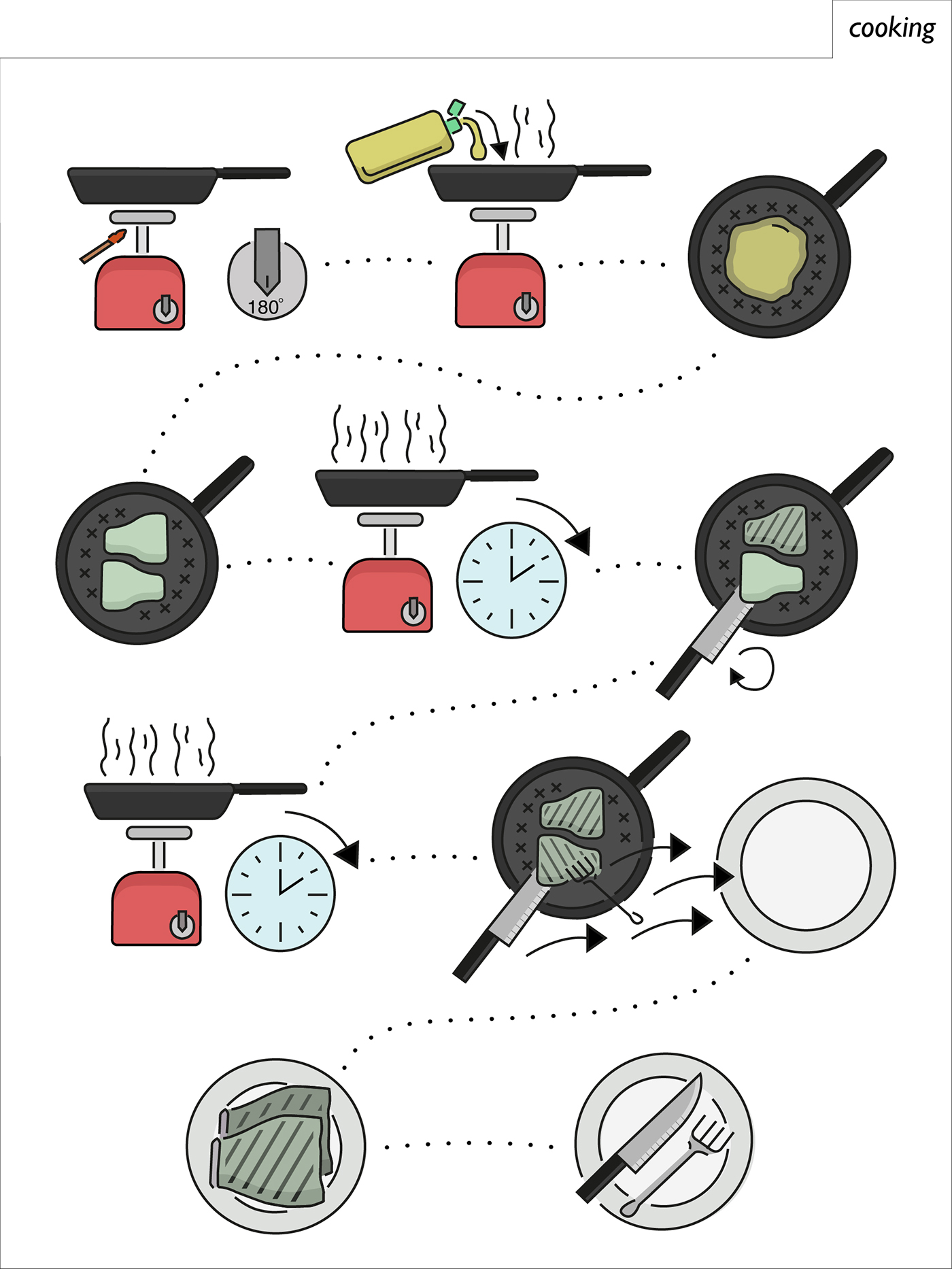
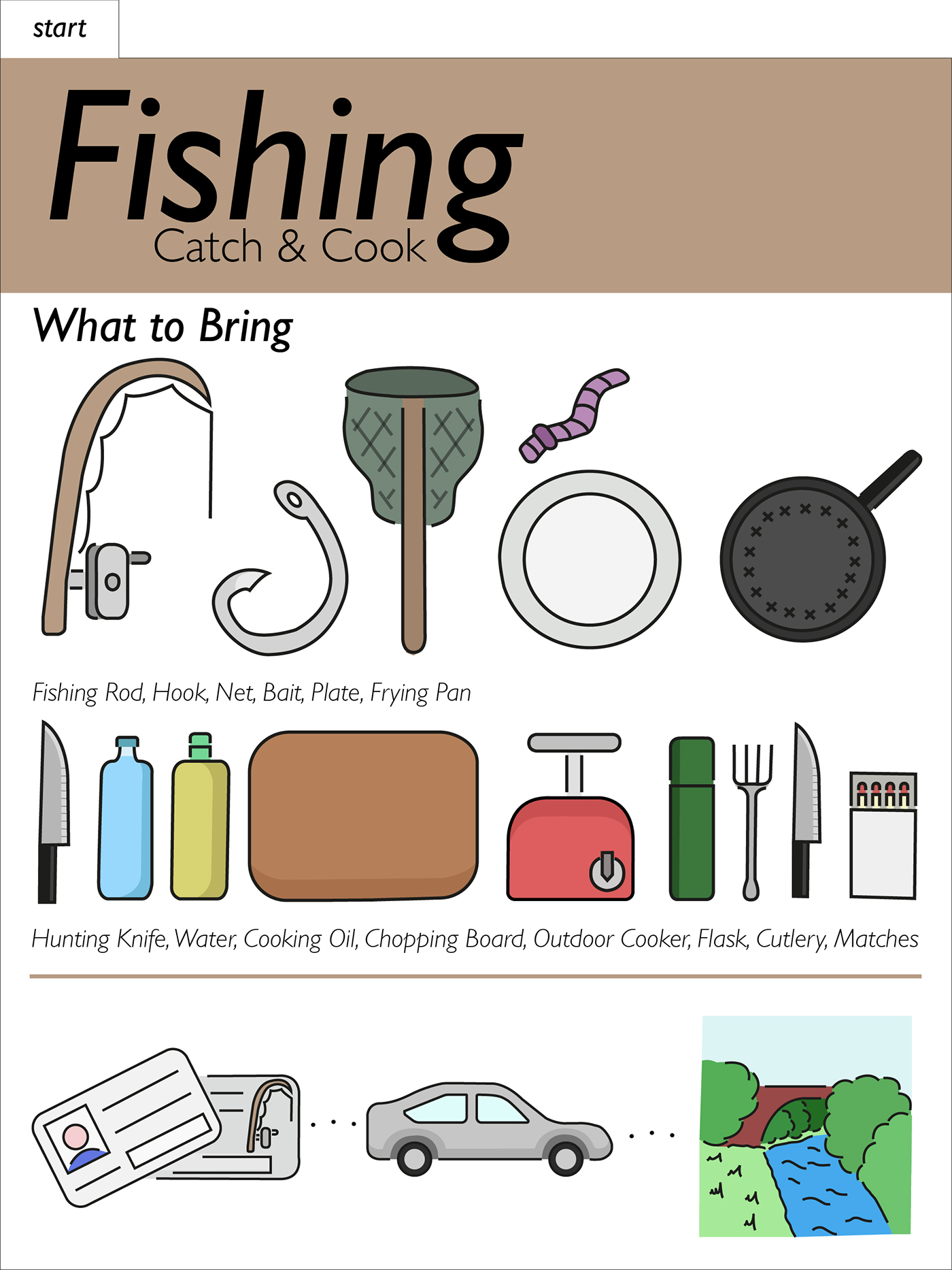
For the designs of my pictograms I choose to turn my initial pen drawings into vectors in Illustrator and experimented with different options in terms of the style of lines and various elements of the design. This allowed me to use the vectors to test different more developed designs with colour, texture and tone to see what best worked for the subject and towards the audience. I have chosen more soft colours as I want the design to feel welcoming and nurturing rather than as orders. The use of colour and tone instead of one colour silhouettes style is to make, the design easier to look over and read.
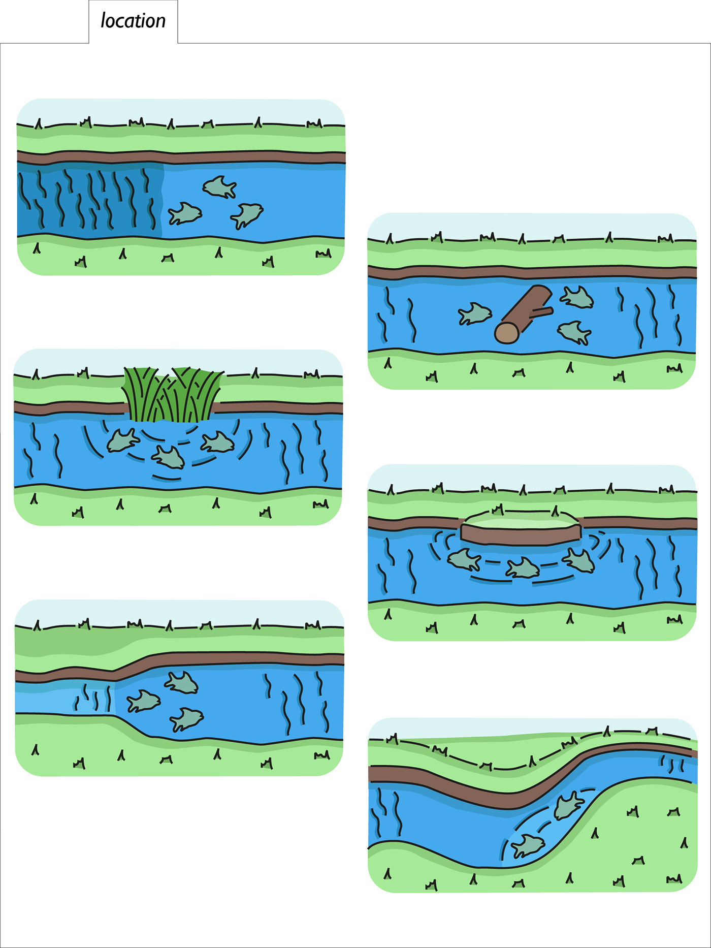
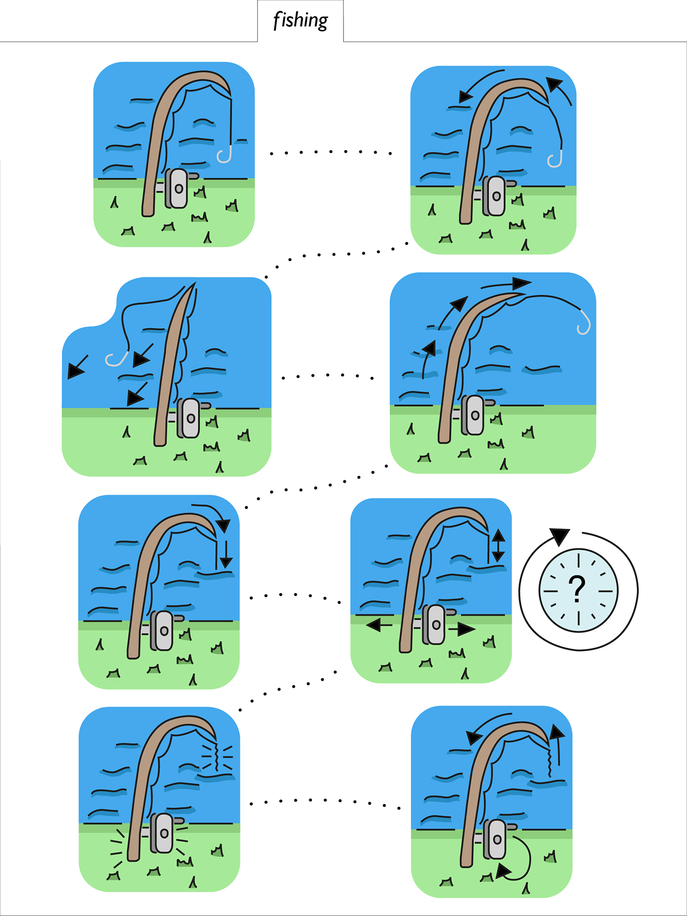
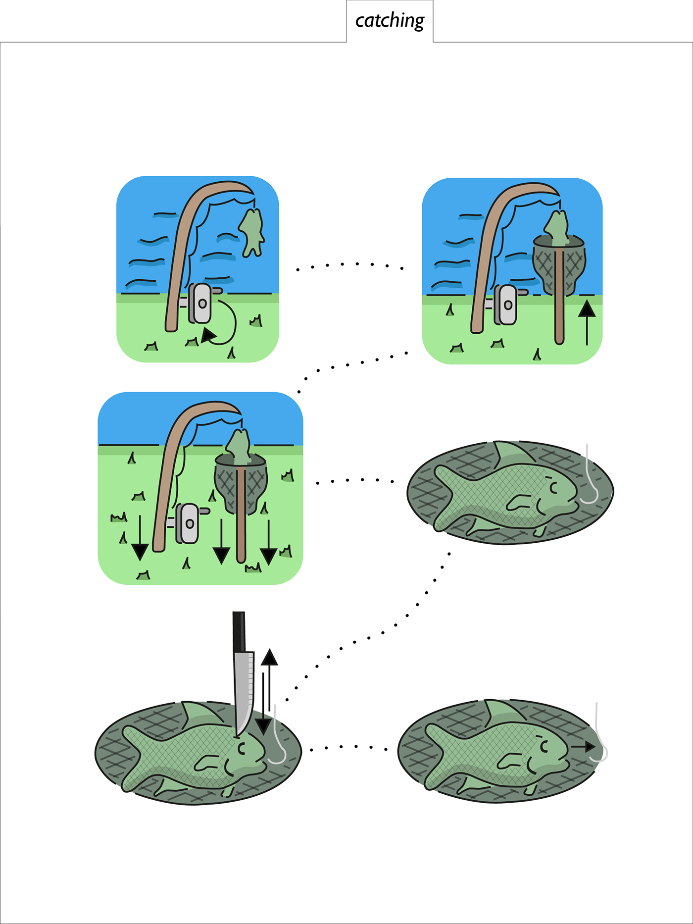
To keep a level of uniformity and make sure they don’t become illustrations, I have kept the style very similar to both my original drawings as well as each other and tried to not add any unnecessary elements. An area which I have felt strongly about which could make them potentially more illustrative in some people opinion is the backgrounds. It is important for the actions and steps that this is shown such as the chopping board and river. Without them it could become unclear what the action is and where it is taking place. This is a part of the recipe which could have been a potential issue as there are a range of settings and places the pictograms take place. So that this isn’t over used I have not applied backgrounds to all of the pictograms as for some it is unnecessary.
For the motions of the equipment and actions such as cutting I have used black arrows. This was kept from my original drawing of the recipe and works well against the design of the other elements of the pictograms. I have tried to replicate the actions such as cutting and flipping with the arrows to make it clear to the audience what is required. To stop there being to many arrows within the design I have used dotted lines to show the transition between each pictogram step of the recipe.
For the layout I have tried to make sure that there is a balance between clear information and a functioning design. By this I mean the ability of the user to go from step to step without having to continuously turn pages or go to another card. This would create problems especially outdoors.
The typeface I have use is Gill Sans, I have mainly used Italic. I have chosen this as I feel it puts across the subject without feeling to playful or formal. The typeface also matches up well with the outlines of the pictograms. For the title I have gone simply for “Fishing”, with various added sub titles across the project, originally I have used “An illustrated Guide”. This was not a reflection on the project content such as the pictograms, but more for ease of the audiences understanding. I would be difficult for the majority of people to know what a pictogram is so illustrated guide makes a quick connection with less knowledgeable people that they can relate to and understand. For my final subtitle I have gone for “Catch & Cook”, this is a better choice as it neatly summarizes the content and because of the alliteration reads very well.
For my final outcome I have gone for a series of one sided cards sized to fit in the A5 folder I had previously purchased for my original design, which has now become my Alternative Design. This was a last minute design after my preferred Design was rejected in the days before assessment.
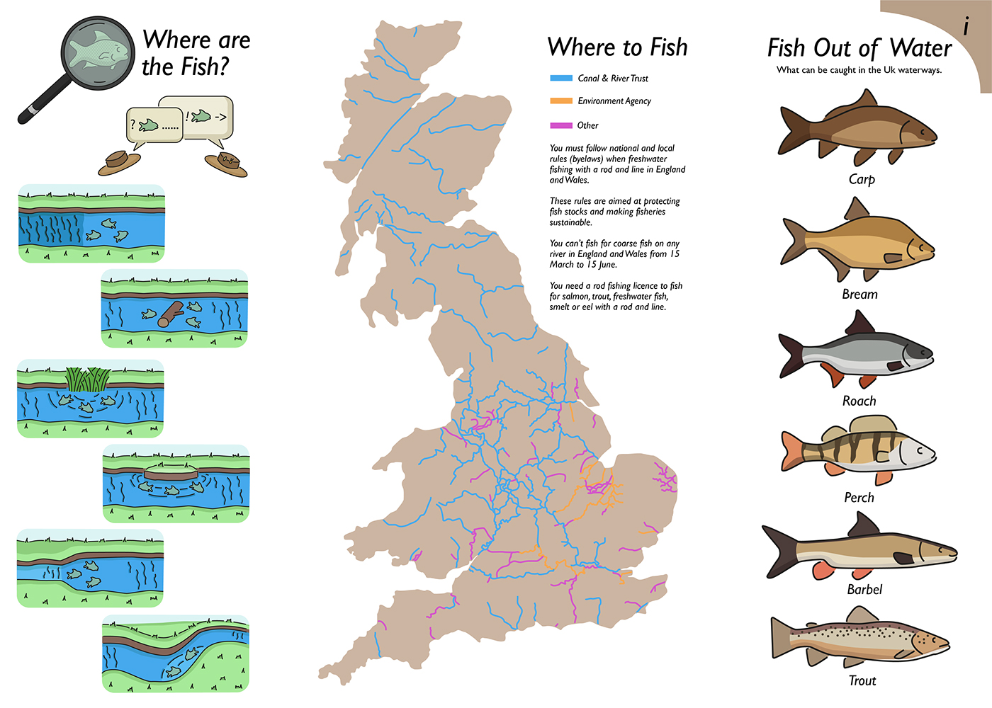
I had previously planned on using my Alternative design as I had spent more time on developing the various features to a quality I was happy with. The design is built around the compact one sheet zine. So that it is useable outside where the recipe takes place with little page turns and overall sturdiness. The design had a number of benefits including its size and the ability for the user to read from either a single page, double page or four pages at a time. The design of the zine also meant that I could design useful extra content for the user. This included seven pictograms to help identify along a river where the fish are more likely to be found. A map of the Uk’s waterways and the basic regulations. As well as a key of pictograms of the fish that can be caught in the UK.
For my final design I was encouraged to strip down all of the extra elements that I had developed. This resulted in just the pictograms and key being left. An option I had looked at previously in my initial ideas was using cards with tabs for the different sections of the recipe. I choose to revisit the design and was pleased by the outcome.
The design is a lot clearer than the alternative as the pages are both larger and at the same time have less pictograms. This has worked well as on several pages the pictograms benefit from the new layout. To make the design functioning and useable in the environment of the recipe I have added tabs along the top so that the relevant card can be pulled out of the folder by the user, this makes navigation clearer and more focused. To make the design more compact I have combined more elements for what was originally the cover. I have kept the typography from my Alternative design and enlarged it so that the hierarchy prioritizes the title. I have also kept the background colour so that this section is clearly highlighted.
I have also chosen to move the key to the cover, this makes it clearer and easier for the audience to understand what they need to go fishing within the first card of the recipe. To make sure that the other main cards are as clear as possible I have moved the first three pictograms also to the cover. Compared to the other pictograms these are more to do with the key than fishing so I have grouped these together. Doing this also means that there are less pictograms on the other page layouts making them less clear. An addition I have made from the previous designs is the listed labels to further identify what the ingredients are for the user, this is feedback that was given a number of times in the crit. This has made the key a lot easier to use for someone who might not be as familiar with the recipe or the subject of fishing. For the tabs I have continued with the use of the Gill Sans typeface but have used all lower case so that they don’t draw attention away from the main pictograms.