

Branding & Identity for Singapore Short Film Festival 2017
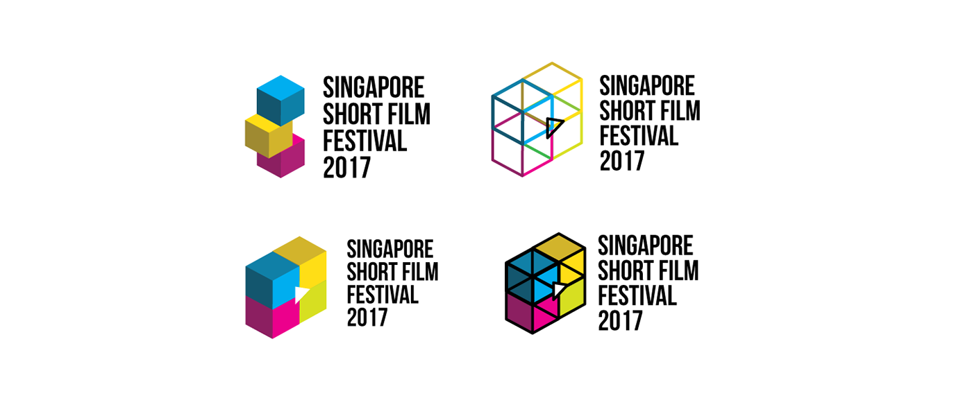
To me, film festivals and hawker centres are similar in a sense. Film festivals often showcases many different types of film genres. On the other hand, we can find many different kinds of food from each ethnic group in hawker centres. Thus, I feel that the keyword ‘variety’ can be used to represent both things. After much brainstorming, I have decided to make use of colourful origami boxes of different sizes to represent ‘variety’. The colourful boxes were also reflected in the festival’s branding logo. As a film festival branding, I have added a small white play icon to the logo in the middle of the boxes to hint that it has a video or film relation to it.
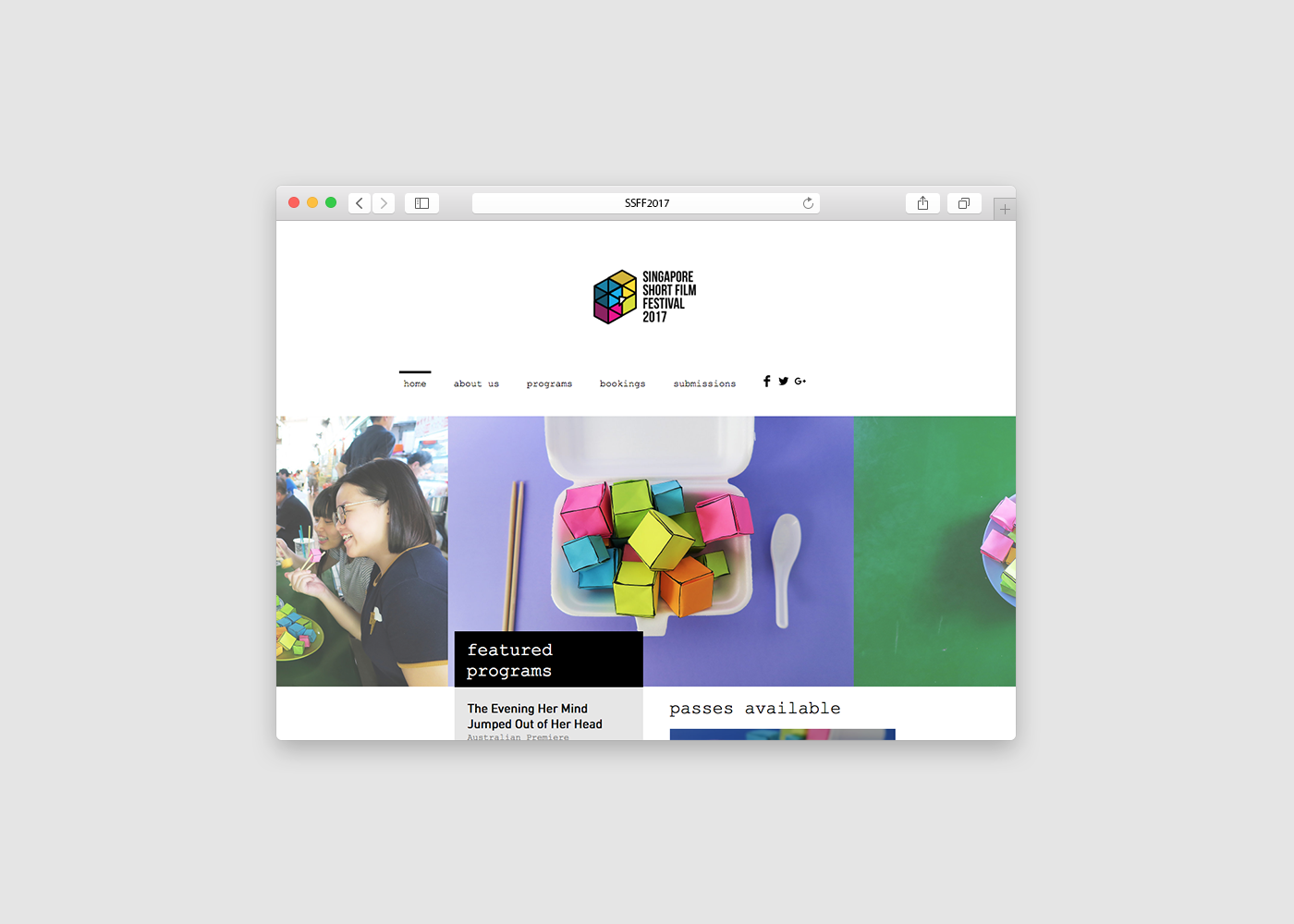
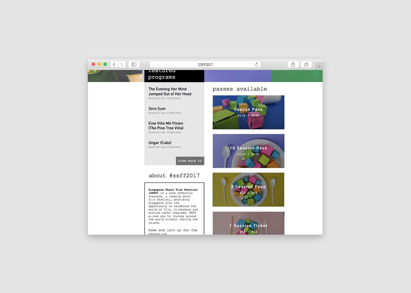
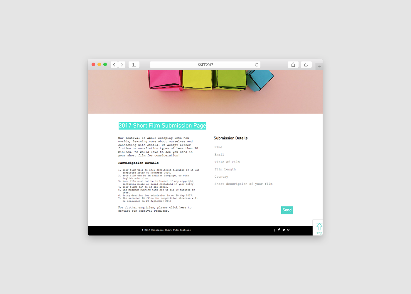
In order to bring out the ‘local-ness’ of the festival, I decided to utilise everyday items known only to Singaporeans, props such as takeaway boxes and containers, plastic drink bag, disposable wooden chopsticks and plastic spoons in my website photos. The teaser and photos were also shot at an actual hawker centre. Some of photos of the origami boxes were also a visual representation of actual words (venue, about us, submission etc.)
In all, I hope to intrigue the audience with the teaser to make them curious and interested enough to find out more about the short film festival.

Drafts of branding logo


Teaser Film


