Het Lijsternest
Het Lijsternest is the home of the Flemish writer Stijn Streuvels, pseudonym for Frank Lateur. The house was built in 1905. Streuvels lived and worked there till he passed away in 1969. He wrote his masterpieces here like ‘De Vlaschaard’, ‘Het leven en de dood in de ast’, ‘Prustke’ and ‘De teleurgang van de waterhoek’. The province of West Flanders has bought and restored the property after his wife had passed away in 1977. De building has been made into a museum.
The property is open for the public as a writers museum since March 1980 and it also serves as a writer residence now from October till March. From April till September the building is open for the public as a museum.
As an assignment for my final school project I had to completely redesign their branding. The first step was doing research about Het Lijsternest, in this I takl about the museum and Stijn Streuvels himself. The next step was analysing the existing branding and the target audience. As a final step I looked at the branding of a competitor and made a moodboard.
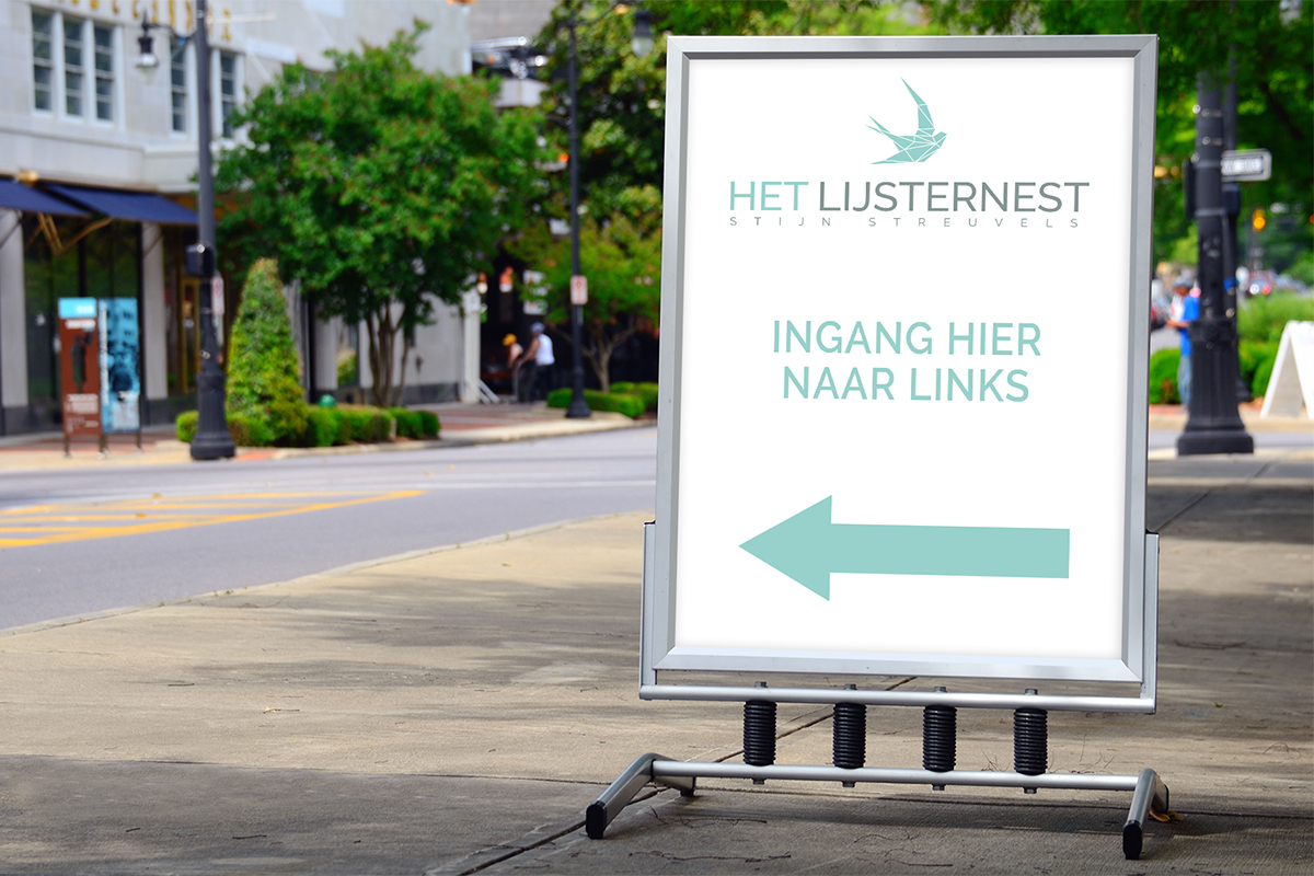
After the research I started redesigning the logo. That way I could base the rest of the branding on elements of the logo. I chose a minimalistic, modern style combined with a geometric bird because ‘lijster’ in Lijsternest is actually a snowbird.
Next up is the business card. I used an unusual front with with a geometric pattern as border. After that I designed a greetings card, writing paper, invoice and envelopes. Later I also designed a folder, brochures and so on.
A branding wouldn’t be a branding if there wasn’t a branding guide! In this guide I explained which fonts and colors should be used and how. I also show some do’s and don’ts for the logo usage so the branding will always look consistent.
I kept the folder as simple as possible, so I reused the colors of the branding combined with a lot of white to make it a bit lighter and make the logo stand out.
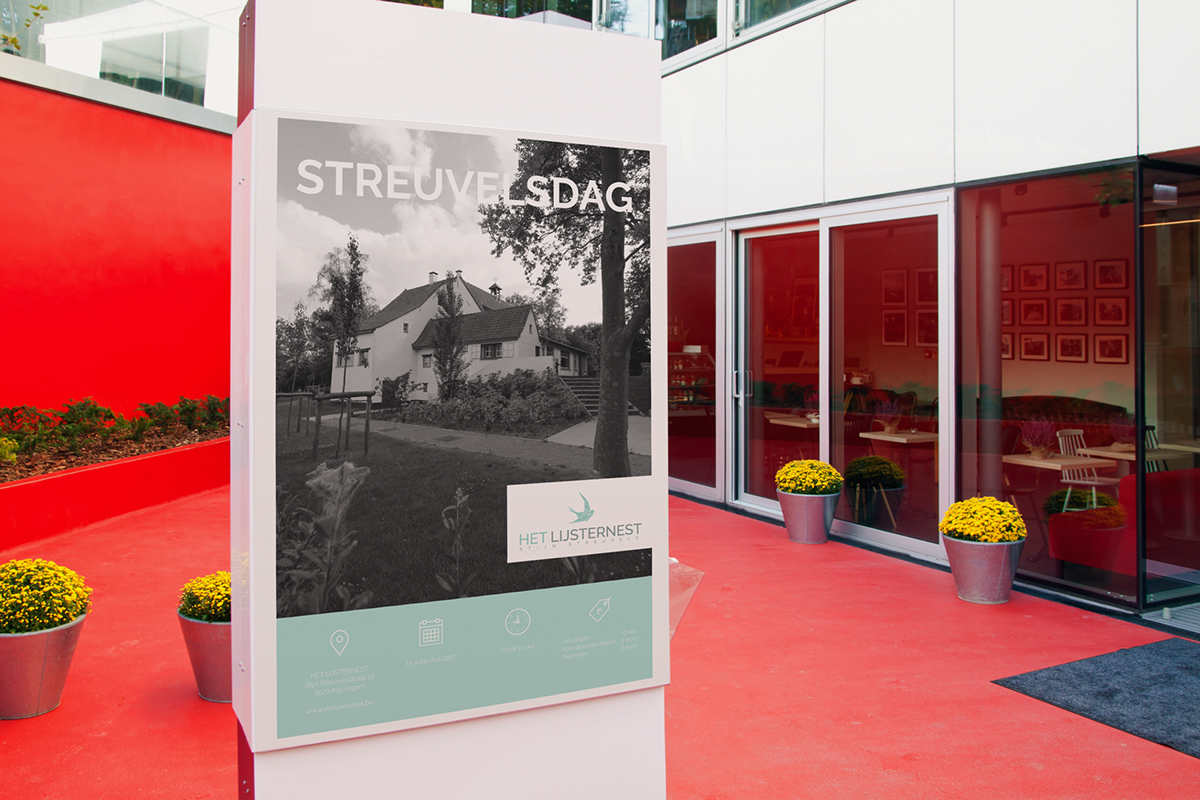
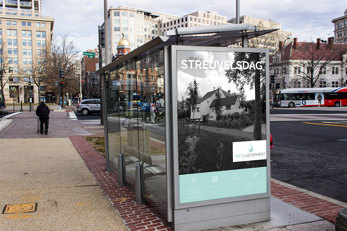
Another part of the assignment was an ad about an event in the museum.
After the rebranding I made an information brochure. The purpose of this brochure is convincing potential visitors to swing by the museum and inform them on what to expect and when they can visit. The design of the brochure is also as minimalistic and modern as possible. This brochure wasn’t only made to print, but there is also an interactive iPad version available!
Next up was an information sheet which shows the opening hours and prices. I felt the minimalistic look and feel fits in with the modern branding. The blue stands out and makes the design look light and fresh.
Click here to have a look at the branding guidelines that I made for Het Lijsternest.