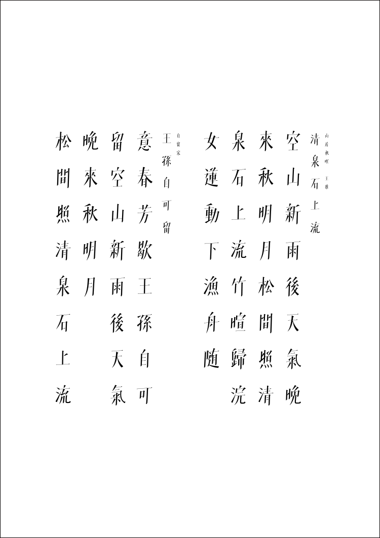
自留宋
-
字体类型众多,偏爱宋。
由内而外,方得始终。
自留宋结体修长,气势开阔挺拔;笔画内敛富有韧度。整体字态取法于中国传统书法艺术之险中求稳之体态,其中以收笔为代表,则取法于颜体收笔,含而不发。
起收转运对笔画连贯与呼应有很好的交代,既汲取了中国传统艺术的书写性,又赋予了其符合当下审美和使用趋势的结构和体饰;紧致凝炼而又内在饱满;气质清冷凛冽却也活力十足。
好的字体取决于是否有好的间架结构。就好比功夫,结构是内力,体饰则是招式。里子不足,空有面子,再多笔画细节也是花拳绣腿,不得其髓。由内而外,方得始终。
Zi Liu Song frame structure is slim but powerful and straight. Its strokes are implicit and full of toughness. The overall structure movements follows the example of traditional Chinese Calligraphy art,which is slant but stable.Such as the idea of its end strokes come from the Yan Zhenqing Script. It's unassuming.The start stroke ,end stroke,turn point and the writing path of each word show its coherence and correspondence.Zi Liu Song contains not only the writing characters of traditional Chinese Calligraphy art,but also the current aesthetics and trends. It is concise but thoughtful. With the refreshing style but full of energy.


