OkiDoki
Brand identity
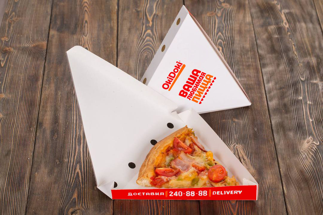
OkiDoki is a fast food chain in Vladivostok, specializing in cooking classic American pizza with lavish dough and plenty of stuffing. The net is distinguished by delicious, fresh food of high quality and very democratic prices. The main target audience for the brand are is students and young people who need fast, satisfying and cheap meals.
Mountteam was tasked to designed a new brand identity that would reflect the bright and modern character of the brand and convey the benefits of the network: accessibility and freshness.
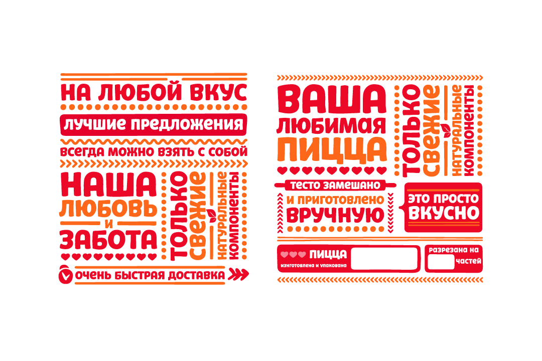
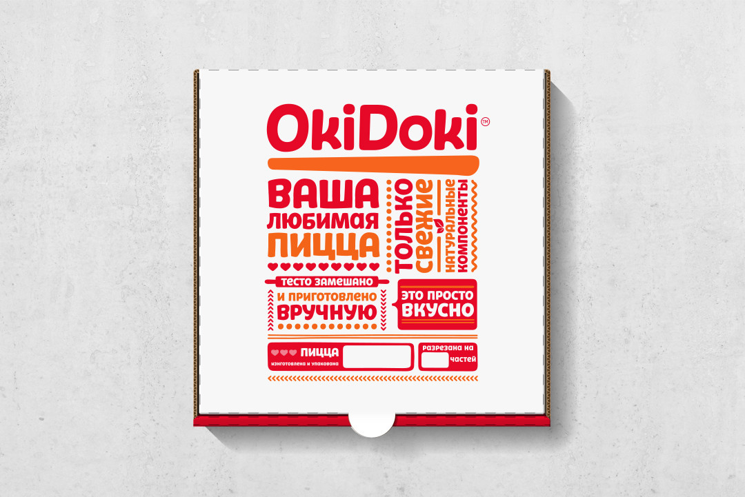
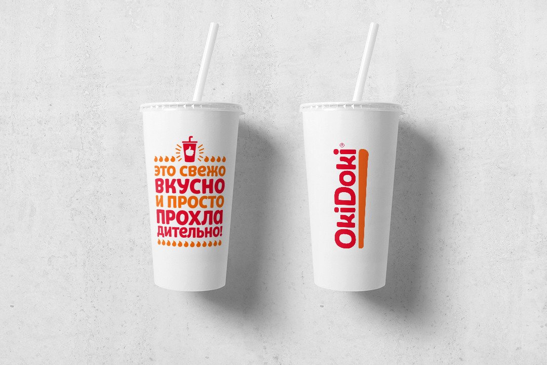
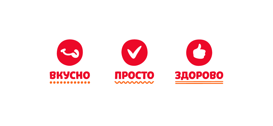
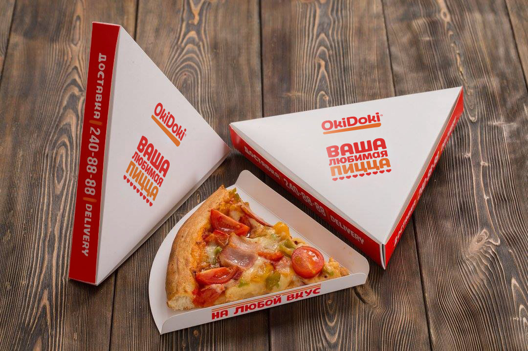
The basis for the new identity was a friendly corporate font with a handcrafted character, which was specially created for this project. Bright typography, together with icons and other style-building graphics, are shaping a unique brand language and easily adapt to any stuff. Simple, clear and unconstrained language is employed as a means of communication with the audience. Via the copyright, the brand speaks out its core advantages to the consumers. An important element of the style are natural textures, such as wood, stone, sand, which complement the character and convey the idea of naturalness and quality of the product.
Creative Director: Tigran Kazaryan
Design: Tigran Kazaryan
Typeface Design: Ivan Petrov
Copyrighting: Yuri Vedekhin, Tigran Kazaryan
Design: Tigran Kazaryan
Typeface Design: Ivan Petrov
Copyrighting: Yuri Vedekhin, Tigran Kazaryan
Before.

After.

