


Well, hello there. I’m Jordan Jackson. An enthusiastic, friendly, driven, and detail oriented graphic designer. I create beautiful and functional brand experiences that have a meaningful impact.
This is my personal identity project. Let's begin.
Every solution begins with a problem.
Each year, approximately 500 graphic design students graduate in Ontario. Many of those individuals will travel to Toronto (where I am currently located) to look for that coveted design job at a top agency. With so many people trying to attain so few spots, how am I going to stand out in a crowd of students whom generally have a similar level of skill?
My solution was to create a personal identity that truly speaks to my personality, and my work. Something that allows me to make a memorable first impression on potential employers, and display my skill of creating a complex visual system across many mediums.
This process began with sketching and defining my key message.
What is my personality? And how can I translate that personality into a visual language? Those are two questions that I don't normally ask myself much. But I knew that If I was going to create an identity that was unique, and one that would last me several years, it needed to be true to myself.
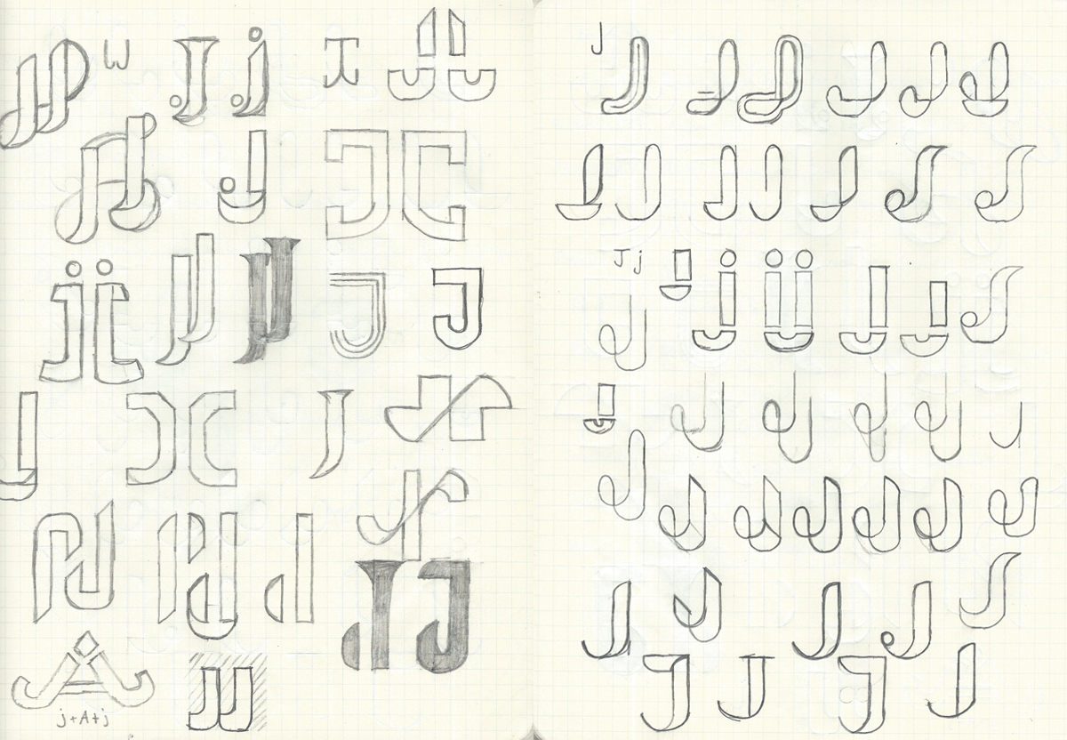
Friendly, approachable, yet still serious.
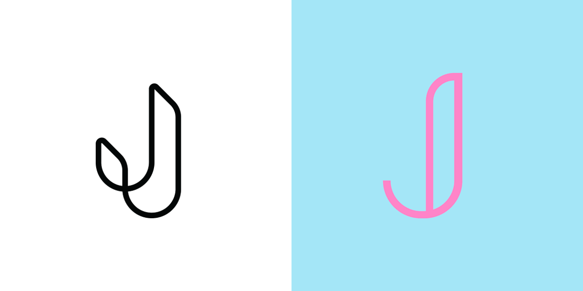
Anyone who knows me knows that I have somewhat of a dual personality. Not to scare you off, but I've been told I come off as intimidating. Weird. With that being said, I'm also known as a guy who laughs when he's not supposed to, makes really bad "dad jokes" and will willingly talk to almost anyone about almost any subject. With all of these things in mind, I began sketching (see above) different "J" and "JJ" combos which I felt could portray those traits. Below are some examples of how I translated these ideas into preliminary solutions in Illustrator.
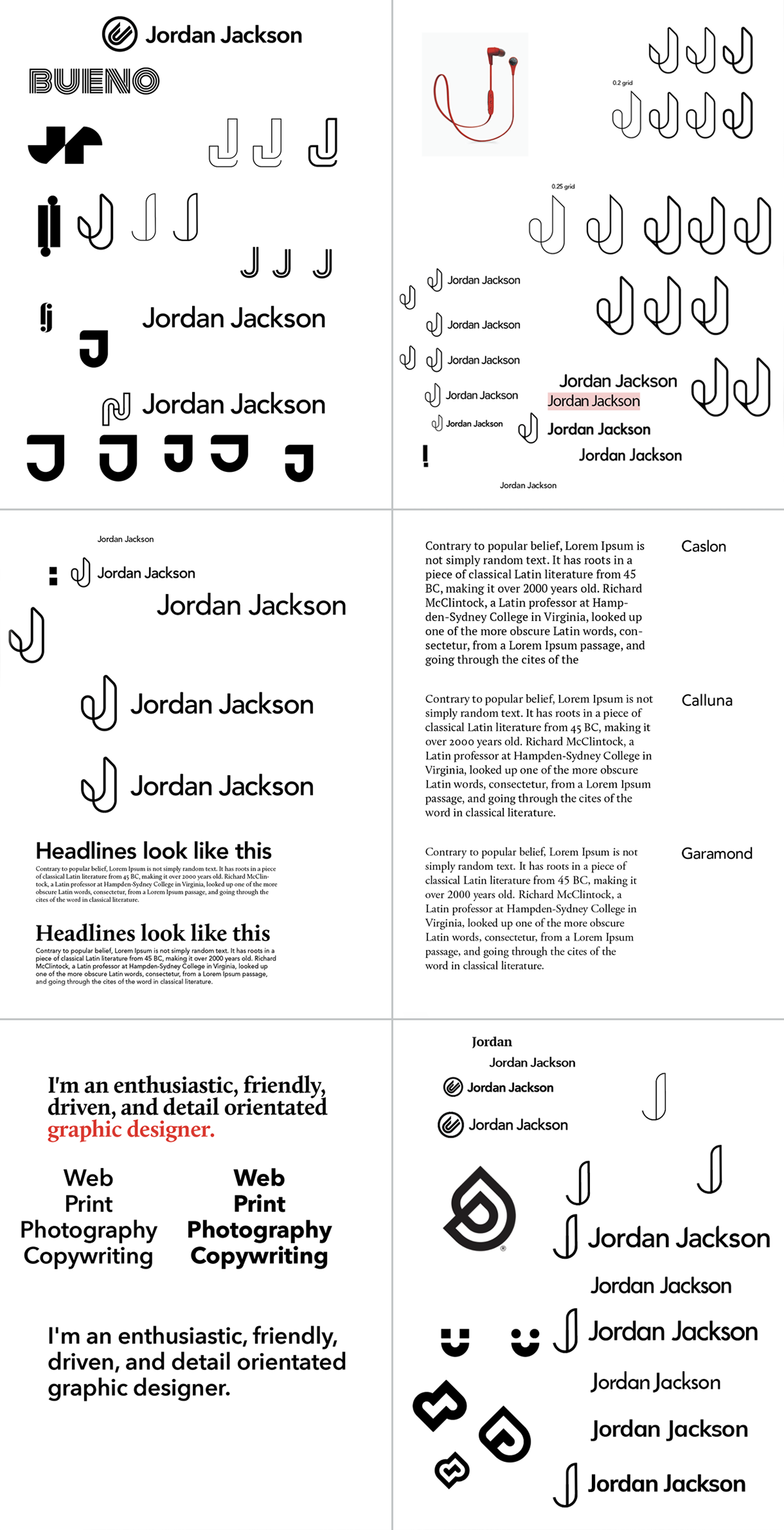
This led to the following solutions, which I posted on various social media networks for feedback. While both concepts were very well received, I was unable to pursue the left one due to its similarities to the new Udacity logo designed by Focus Lab (darn!).
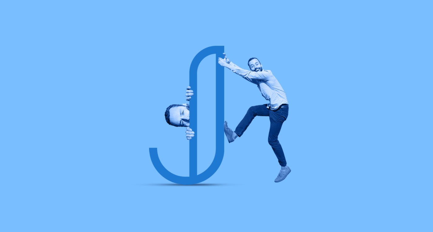
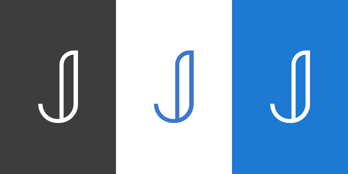
The Final Symbol
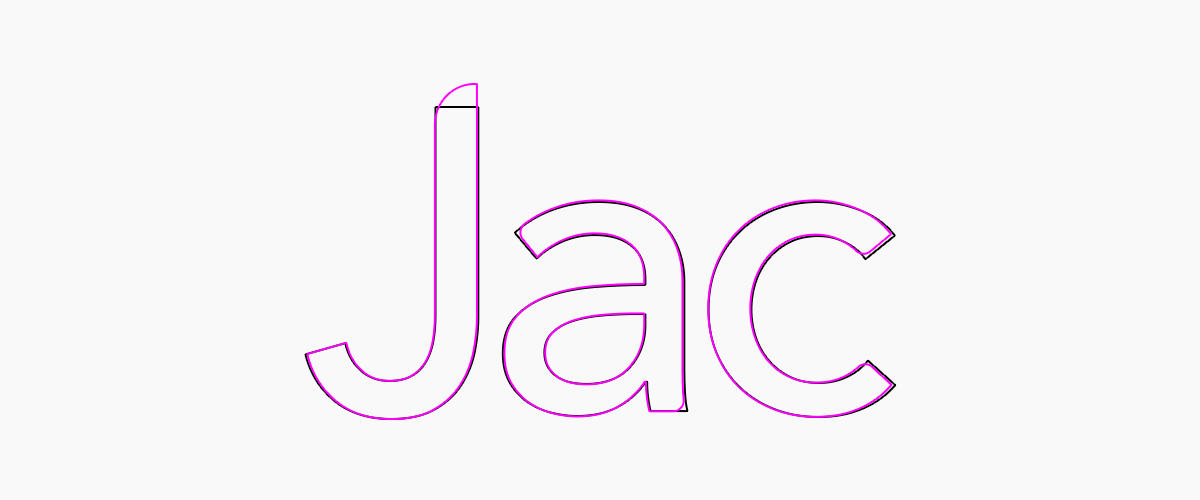
The Final Logotype
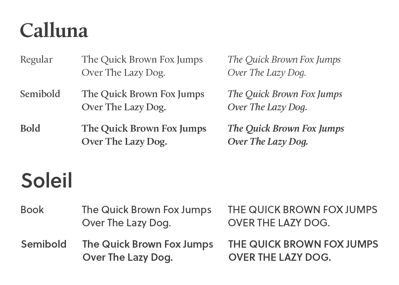
The final logotype is a modified version of Avenir Next Medium. Alterations include: extending ascender height of the "J" to match other characters, rounding off ascenders on the top left corner to match the symbol, and a slight rounding of corners on each character to provide a more approachable look and feel.

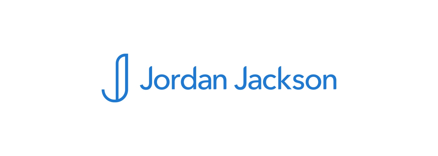
Logo Lockup
Type and Colours
As with everything in this project, I reverted back to my key traits to help guide my decisions. The typography needed to be versatile, provide an easy reading experience, yet have a small element of quirkiness to it. As with the colours, I chose a very specific hue of blue that I thought was the perfect combination of bold yet professional. It's difficult to find a blue that translates really well on screen and print, however, I felt that this colour holds up quite well for all of my necessary applications. I also made a distinct decision not to use black as my default text or graphic colour. I felt it overpowered the blue and created too much of a harsh contrast on a standard white background. Using various greys reduces the contrast & still provides me with a high degree of legibility for text.

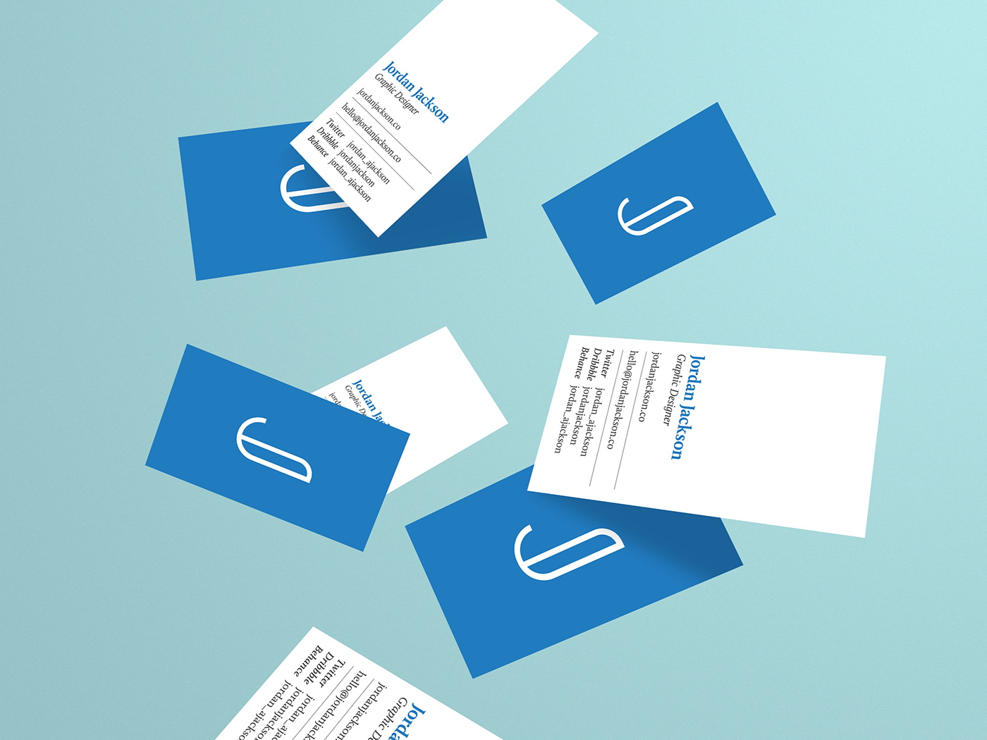
Applications
With a lot of basic elements completed, I designed necessary stationary once I began to apply for jobs and started to network. This included business cards, a resumé, and a cover letter template.

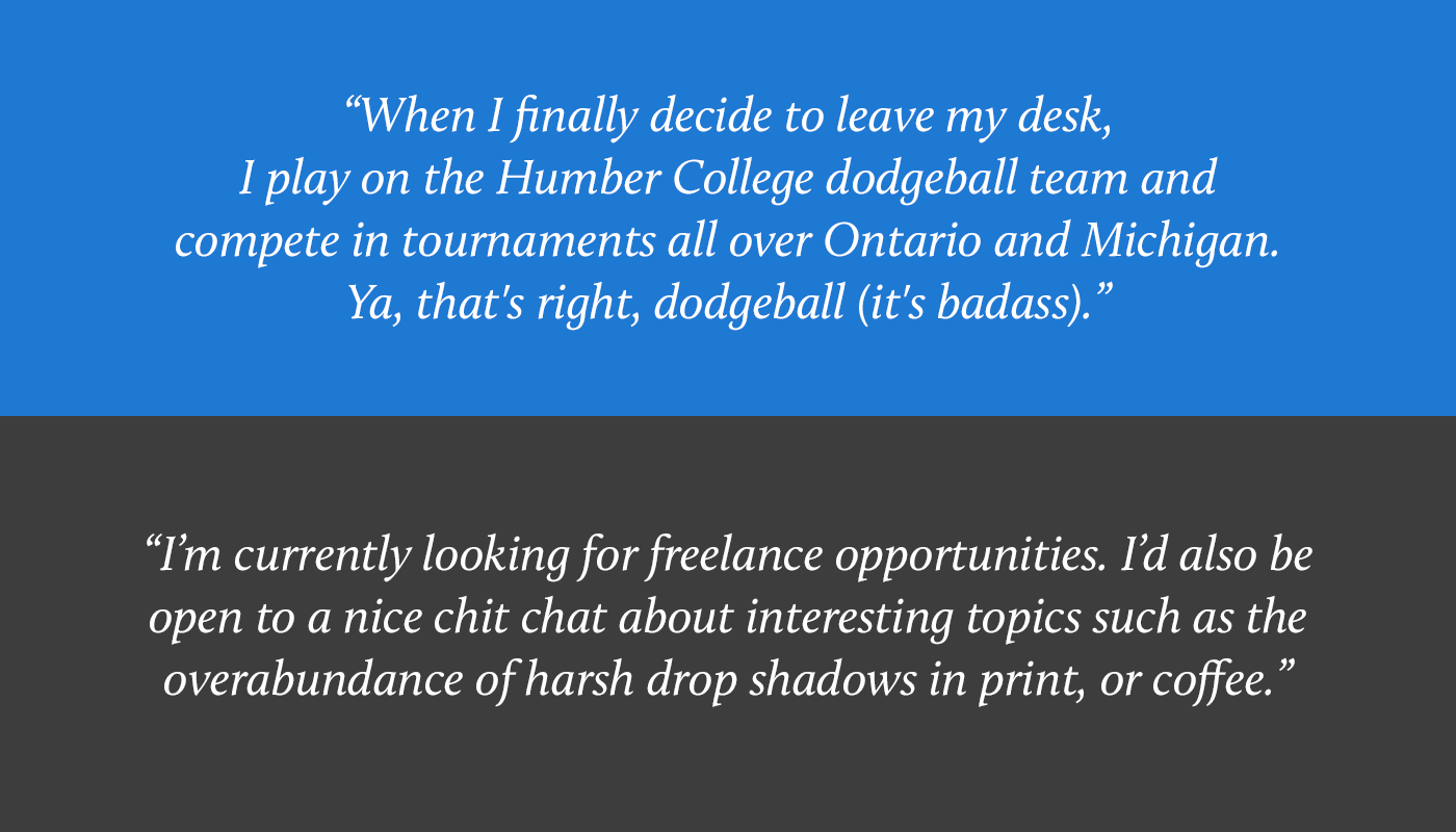
Tone of Voice/Copywriting
A lot of people try to put on a persona of incredible professionalism and decorum when on the internet. While I totally understand the reasoning behind this, I wanted to let my true personality shine. I tend to mix business with pleasure, so I'm not afraid to toss in some more casual and fun language when appropriate. This strategy translated into the copy on my website and to the kind of things I share on social media.
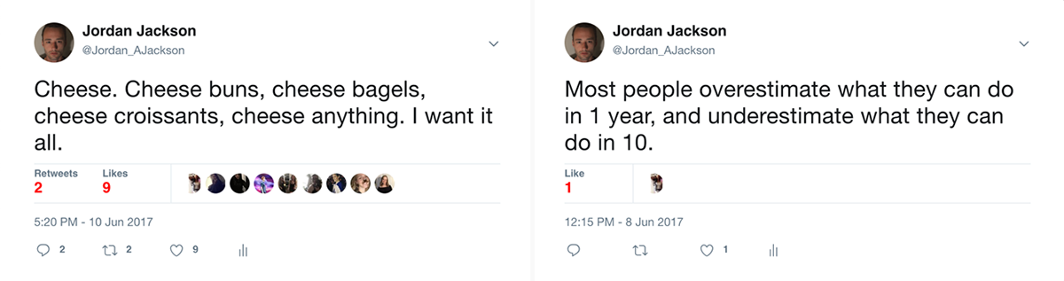
As you can see, my tweets tend to vary in both seriousness and popularity.
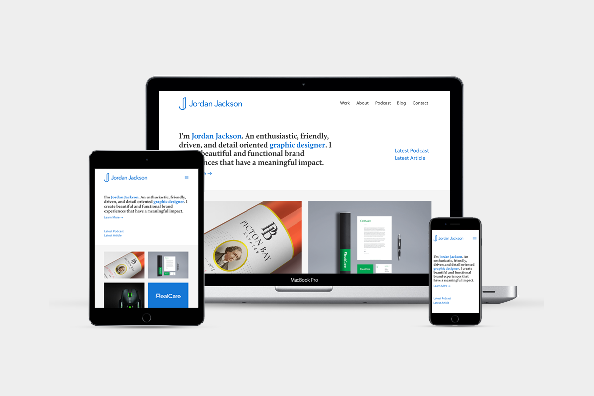
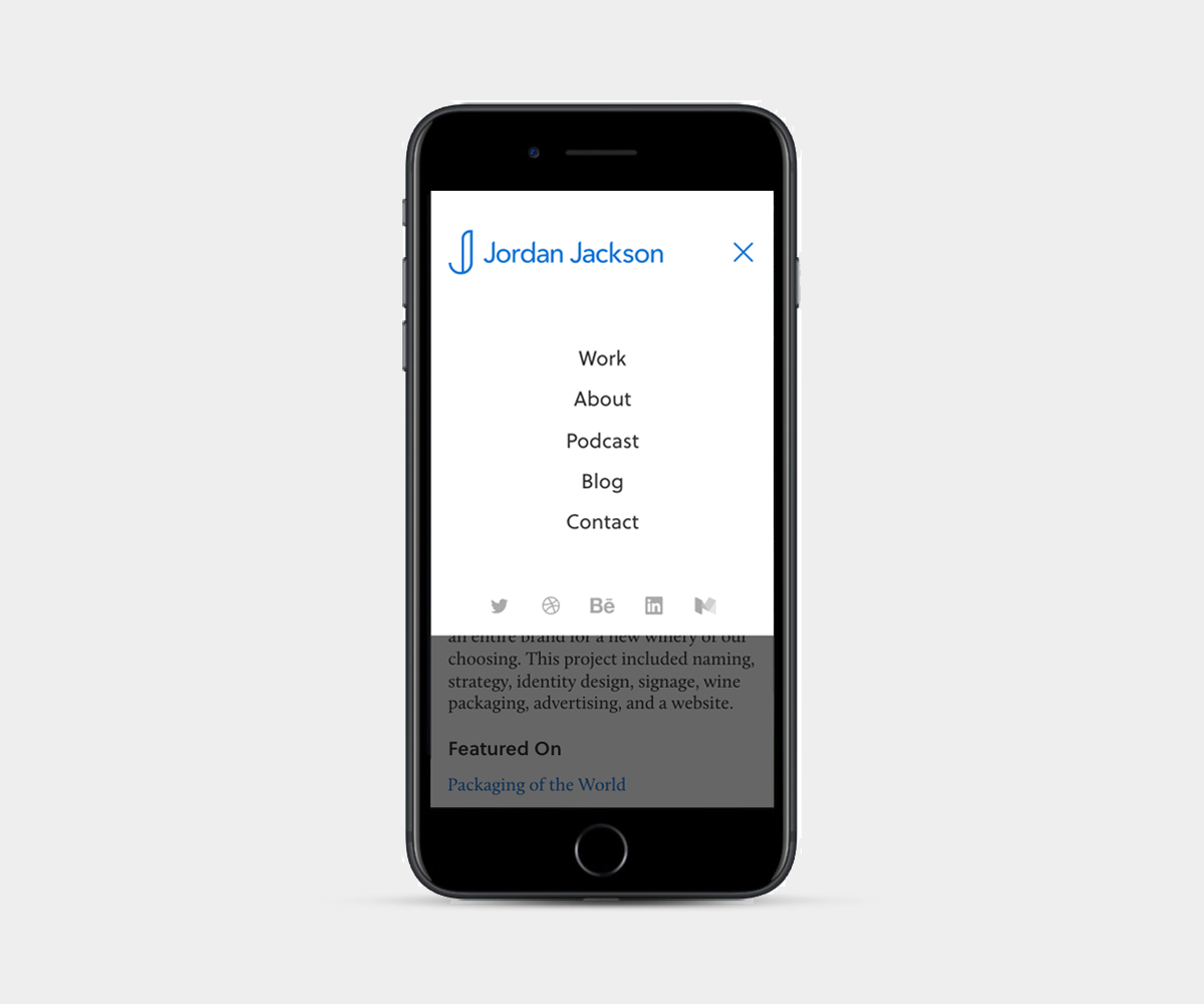
Website
As if this project wasn't long enough (props to you for staying this long 👊), here is my personal website! I designed everything from scratch in Sketch and then developed the site using Semplice Labs and Wordpress. I think it turned out pretty great, but pictures don't do it justice. View it here
I have received two national RGD Student Awards for my portfolio website! Please check out both myself, and the other winners here


