HAPPY HEALTHY STRONG
OOB is a brand with extensive experience in training professional athletes.
As a software solution OOB life has been evolving over the course of last five years.
As a software solution OOB life has been evolving over the course of last five years.


The Goal
At the point where I got engaged with the brand, stakeholders were looking to develop the mobile solution and also to refresh the visual identity while staying recognizable.
Main objective was to expand the user base and reach out to new users who will benefit from OOB method. Keeping the current user base was of crucial importance.
Login & Registration
A lot of effort has been devoted to create easy sign-up and registration workflow. The process included removing sufficient questions from the questionnaire. I figured that collecting data along the way will simplify the registration process.


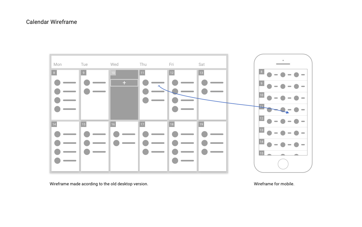
Calendar
With a very small team of dedicated developers I started conceptualizing mobile version of the user website. Starting point was the calendar feature since most user to coach communication starts there.
First I tried to determine which information are essential for the users. Then from the desktop wireframe I produced the mobile calendar wireframe.


Event Report
By opening an event, user can easily report on the completed activity and send message to the coach.

Navigation Bar Flow


Icon Set Problem and Solution
Communicating Events effectively was a priority task when we started working on the Calendar. Initial icon-set simply failed the user's test. Letter based system which I imagined will clearly distinct each event, turned out to be to confusing due to the total number of events (over 50). Feedback we got made us realize that it is more important to give users rough overview of the day, than to insist on each event’s unique icon.
I took event categories as the most important distinction units and further developed icon set consisting only of most used events on the platform. Other less used events were given generic icon that refers to the category they belong to.

Logo Redesign
Old logo was written in Helvetica Bold, I kept the colors and created a custom type with integrated Sign.


