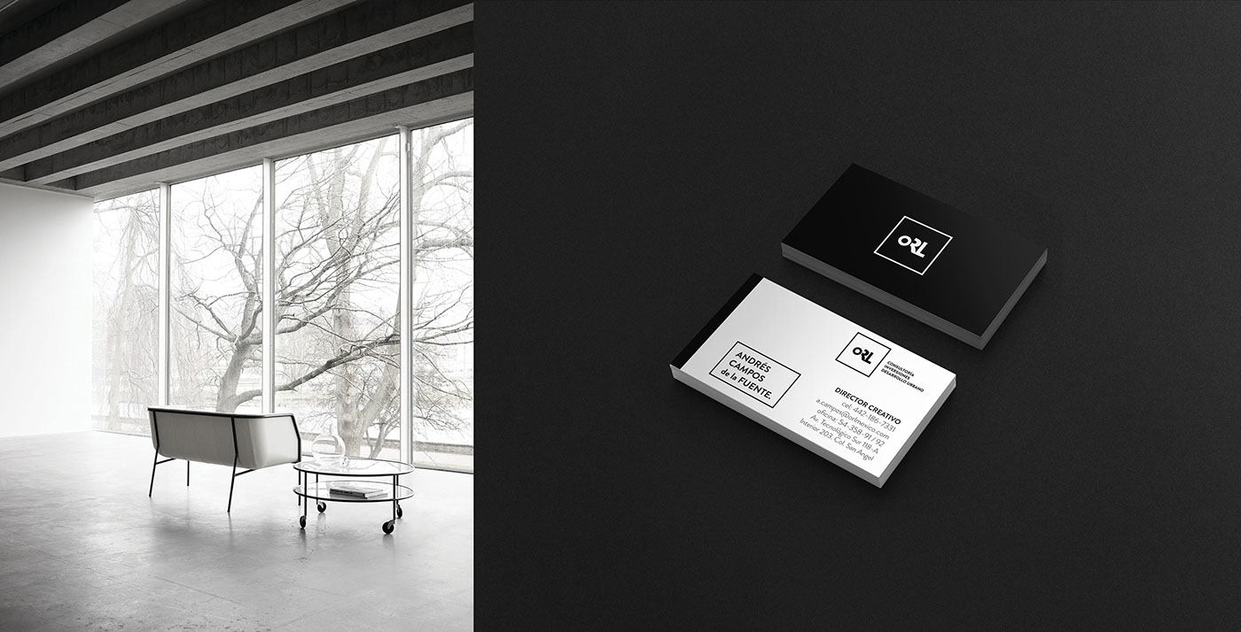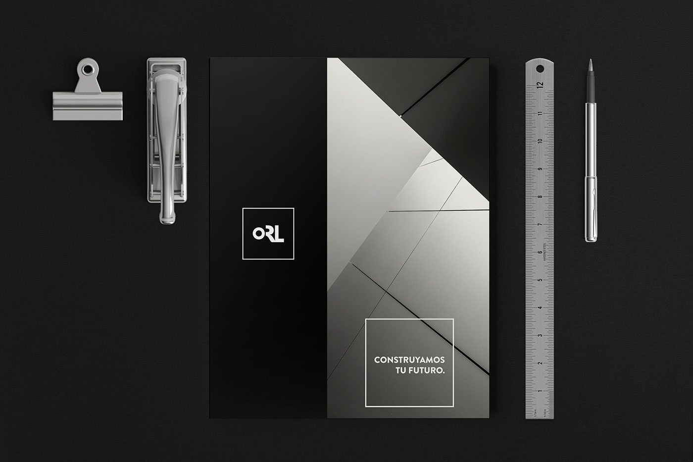
This was a typography adventure. ORL needed to resemble a process, a method, and a cycle, and thats why we approached a small ‘O’, an incomplete ‘R’, and a fully functional ‘L’, that together demonstrate that a process is made by some elements aligned together, just like the nature of ORL. With a black & white brand, we tried to accomplish both luxury and simplicity, to try to send a clear message to their customers: ORL is ahead of the market, and on the top of the pyramid. The typography selection for the brand family was made to complement that luxury, without overdoing it, and in the end the process helped us to understand not only the brand, but its ideal customers.