Chop Chop
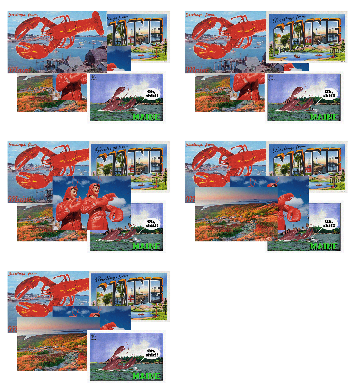
The lobster is a recognizable image that people all across the America associate with Maine.
It’s a symbol that has evolved over time but still always kept the same meaning of hard work, simplicity, and them way of life in Maine. The lobster portrays a strong image for the history of the Maine in the lobster industry. About half the catch of cold water lobster in North America comes from Maine.
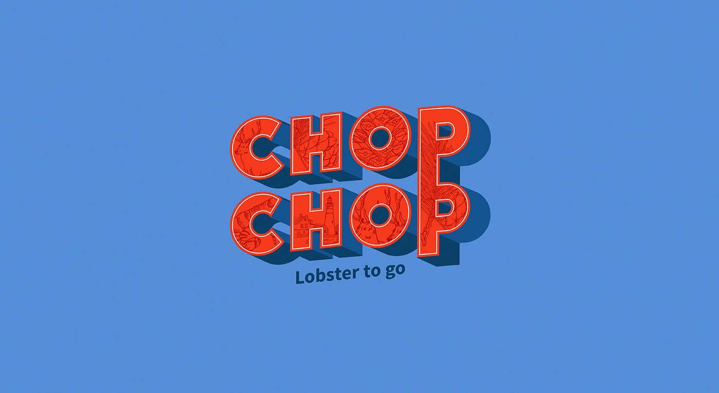
The name of our project "Chop chop" means "hurry, hurry" and suggests that something should be done now and without any delay. That’s why the name is so important for this concept because means something that you can eat quickly.
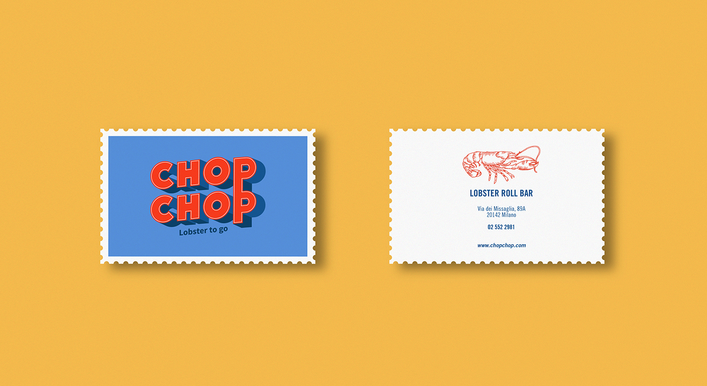
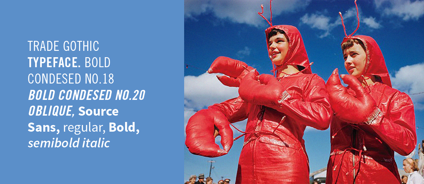
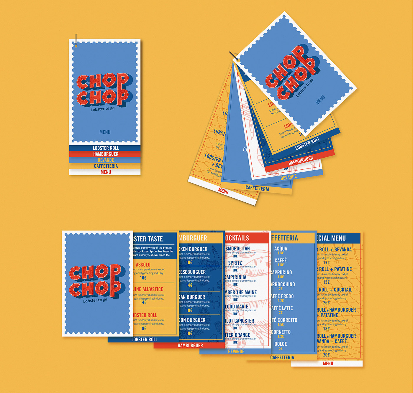
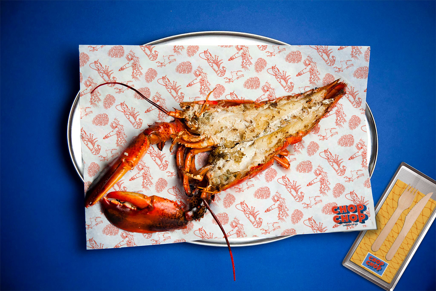
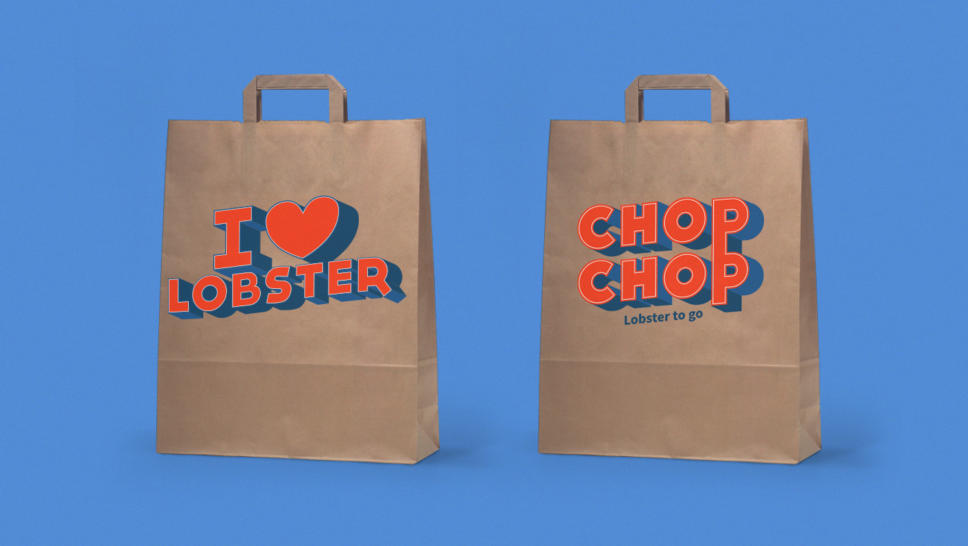
Our concept is all focused on the colors of the Maine landscape and of the most important icons from the Maine. The logotype is inspired to the tacky postcards from 50’s, with bold fonts and
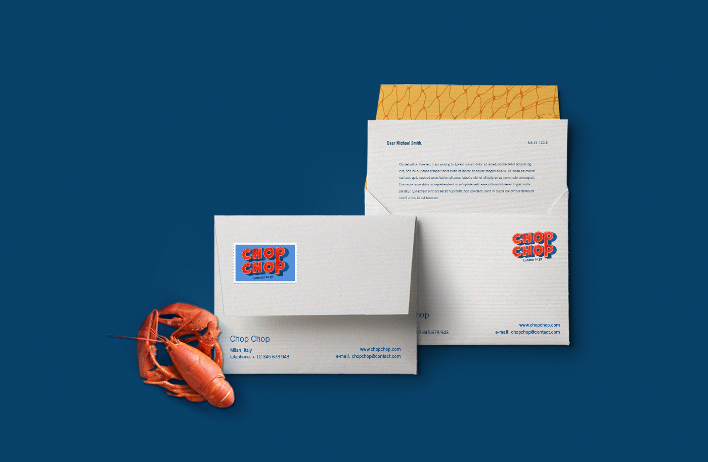
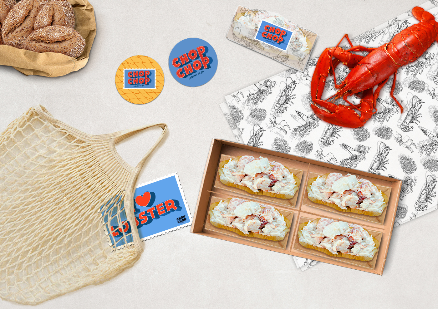
3D Effects. This is a proposal for a Lobster Street food Restaurant in Milan.
-




Creative Director // Fabio Mennella Graphic Designer and Art Director // Claudia Alexandrino

