


Third Year core paper project, Inform, 1 Day Design Conference.
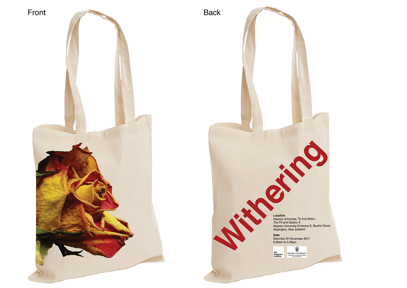
The brief for this was to create a 1 day design conference for people to attend, My design conference was on weather print was a dying media. I choose to use the beauty of a withering Rose because i think that this is something that was very attractive to the eye and held a strong visual rhetoric.
My visual rhetoric was following the word 'Withering' and using different but beautiful roses to portray this, i wanted to use the word withering because i thought that although it was another word for dying, i think it made the concept come alive and seem a lot more beautiful and gave me more room to play.
For this is choose bold but simple fonts and used bright colours, as i thought that there was something that appealed to the eye about using bold colours over the use of fancy type.
For this project i made a poster, booklet, two banners and a bag.


