
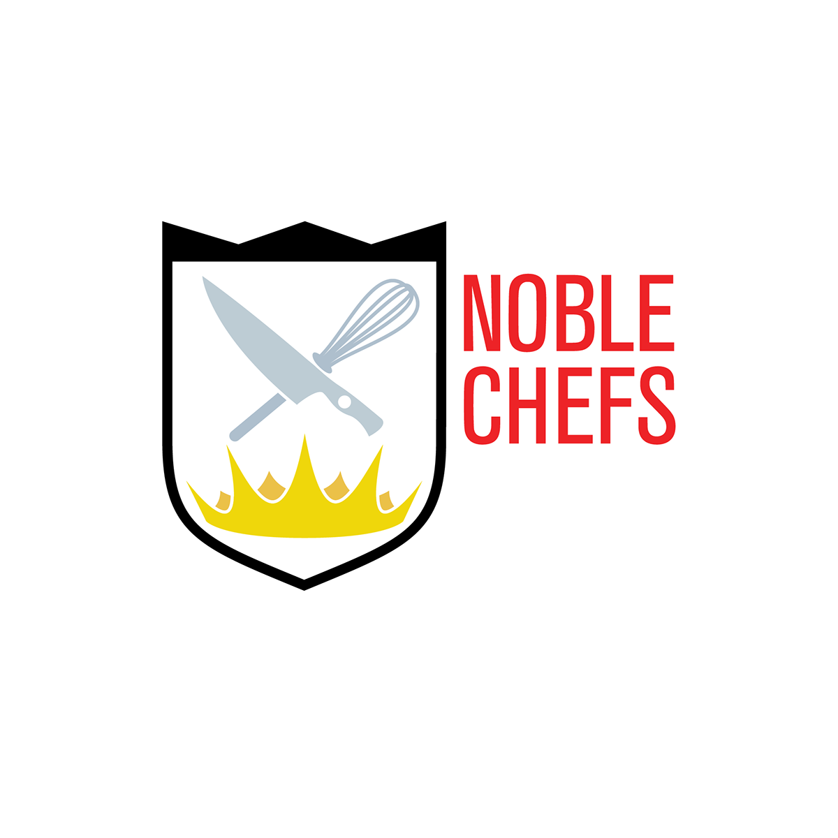
With this design, I wanted to capitalize on the client’s last name, which was included in his business name. I went with the typical western symbol of nobility, the crest. From there elements of being a chef and pastry chef were included such as the knife, spoon, fork, and whisk.
I also realized that, in a simplified illustration, the burners on a stove are visually similar to a crown, which directly represent nobility in cultures even outside of western tradition.
I tried a couple without the crest, in order to give the client options that were more simple and had a different visual volume. He went for the crest, so I continued along that line, pulling the “Noble” outside of the crest itself in order to make the icon itself more squat and equal horizontally and vertically, which would improve it’s applicability.
Lastly, I went with the knife because it has similar connotations to a sword, which is present in many idealistic crests, and the whisk is a staple for pastry chefs. These items being differently weighted and shaped, I opted for a visual placement rather than a technical one.

Early logo options


Thanks for looking!