Typrodisiacs
This project surrounds the provocative world of aphrodisiacs, but these are type related, thus the name Typrodisiacs. Three products are created, Pull, Bod, and Head. The rhino icon is used to represent the conection between rhino horn as an aphrodisiac and the product itself. The objective of the product is to get you in the mood to design with type, get horny for type to say the least.

PULL
Typrodisiac brand PULL room spray will bring a cursive feeling to any page. Simply spray this around your workstation and art directors will instantly find you anything but Grotesk. The scent will have them going jaggy over you. You may even find colleagues experimenting with French spacing and drop caps alone in their own cubicles with safe search turned off. The resulting hierarchy is enough to make any designer’s diaresis flush. Let Pull be your secret weapon for getting readers in and out of your copy.
Typrodisiac brand PULL room spray will bring a cursive feeling to any page. Simply spray this around your workstation and art directors will instantly find you anything but Grotesk. The scent will have them going jaggy over you. You may even find colleagues experimenting with French spacing and drop caps alone in their own cubicles with safe search turned off. The resulting hierarchy is enough to make any designer’s diaresis flush. Let Pull be your secret weapon for getting readers in and out of your copy.

BOD
Typrodisiac brand BOD premium chewable energizing tablet promises you bigger cap height in seconds. You can count on BOD to get you feeling ready for some of the most legible paragraphs of your life. After this you won't settle for Truetype again. You may even go as far as to allow a descender or two to touch an ascender. But be mindful of how tight the kerning gets.If it’s too tight you won’t be able to fit much in, but if it’s too loose it may be full of undesirable rivers and lakes. In the end everyone in the studio will be talking about your Wingdings.
Typrodisiac brand BOD premium chewable energizing tablet promises you bigger cap height in seconds. You can count on BOD to get you feeling ready for some of the most legible paragraphs of your life. After this you won't settle for Truetype again. You may even go as far as to allow a descender or two to touch an ascender. But be mindful of how tight the kerning gets.If it’s too tight you won’t be able to fit much in, but if it’s too loose it may be full of undesirable rivers and lakes. In the end everyone in the studio will be talking about your Wingdings.

HEAD
Who ever said once you go black you don’t go book was right. Typrodisiac brand HEAD therapeutic oil gives you a noticeable increase in font size once used. This therapeutic oil, when applied to your text instantly adds color to the page. Wrap your hands around your instrument of design and start experimenting with HEAD. Notice how huge those ball serifs are and how bold the downstrokes have become. This product will help both you and your client reach the apex, even in the most oblique position. With HEAD you are sure to find yourself using all caps.
Who ever said once you go black you don’t go book was right. Typrodisiac brand HEAD therapeutic oil gives you a noticeable increase in font size once used. This therapeutic oil, when applied to your text instantly adds color to the page. Wrap your hands around your instrument of design and start experimenting with HEAD. Notice how huge those ball serifs are and how bold the downstrokes have become. This product will help both you and your client reach the apex, even in the most oblique position. With HEAD you are sure to find yourself using all caps.

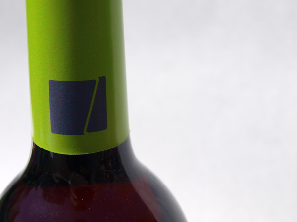
Zucchero Wine
ZUCCHERO was inspired by the northern Italian Deco style which we see in the logo. Collectively this project contains 9 different wines, 7 reds and 2 white. Color plays a huge role in this collection to allow the consumer immediate recognition of the brand from anywhere in the wine section of the store. A clean elegant design was implemented to allow ease of selection and clear identification of the flavor of choice.
The logo type is hand-lettered and is very attractively seated on the bottom left of the front label. It is knocked out to white to give even more pop and contrast to the very vibrant labels.
A small hang tag is provided with each bottle as a promotional piece for the brand as well as a food pairing guide if the consumer wishes to know the ideal selection of cuisine for each type of wine.
To see Jason’s portfolio, visit www.behance.net/jasonpallotti


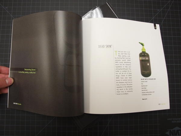
DEAD SKIN - Skin-Salve
This fictional product is a line of mens skin care lotions and scrubs. The theme behind is based on the popular cultural icon that is a Zombie. The logo combines whimsical illustration with a clean and structured use of type. The product also includes a humorous juxtaposition following the product and it's theme. By utilizing humor in my design I allow my target audience the comfort of using my product. The idea is to sell a skin care line to men who like zombies, who otherwise may find discomfort in the idea of skin care products.
To see Jason’s portfolio, visit www.behance.net/jasonpallotti
To see Jason’s portfolio, visit www.behance.net/jasonpallotti