


Logotype
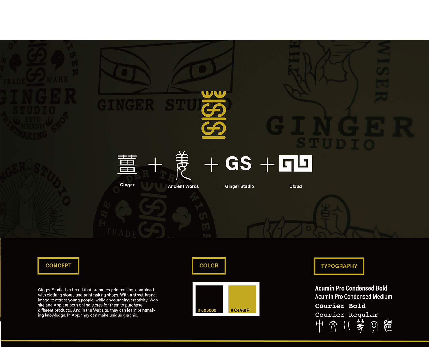


These are Graphic for print, in the design, add some Chinese and Western
retro elements. Such as fonts, hands, roles. Create a new style.

These are the character design, want to create a Chinese-style retro style
so add some Chinese characters, and the characters designed to visualize
some of the print programs, allowing users to more easily understand.

In order to give users a better understanding of the operation of Ginger Studio,
the use of illustrations in the shop to facilitate users to know the print workflow.

Icon Design
-Bring out the Chinese elements
-In the APP / WEB icon design
-Joined the Chinese elements
-Such as clothing, tools and special emblem etc…
-Bring out the Chinese elements
-In the APP / WEB icon design
-Joined the Chinese elements
-Such as clothing, tools and special emblem etc…


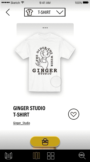
App
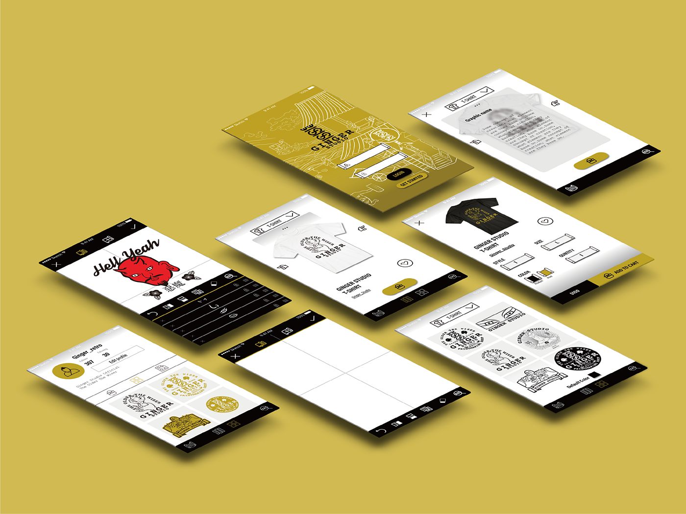

In addition to Website, Ginger Studio has App version. It also has a basic "Online Store" feature, and its feature is "Production", this feature can help users design unique graphic. We know that not everyone can draw, so "Production" is characterized by "Sticker", it defaults to a different pattern to the user to choose, as long as the selection and collage will be able to create graphic. Users can also create their own patterns and upload to APP.
Online Store
Information


