


Concept
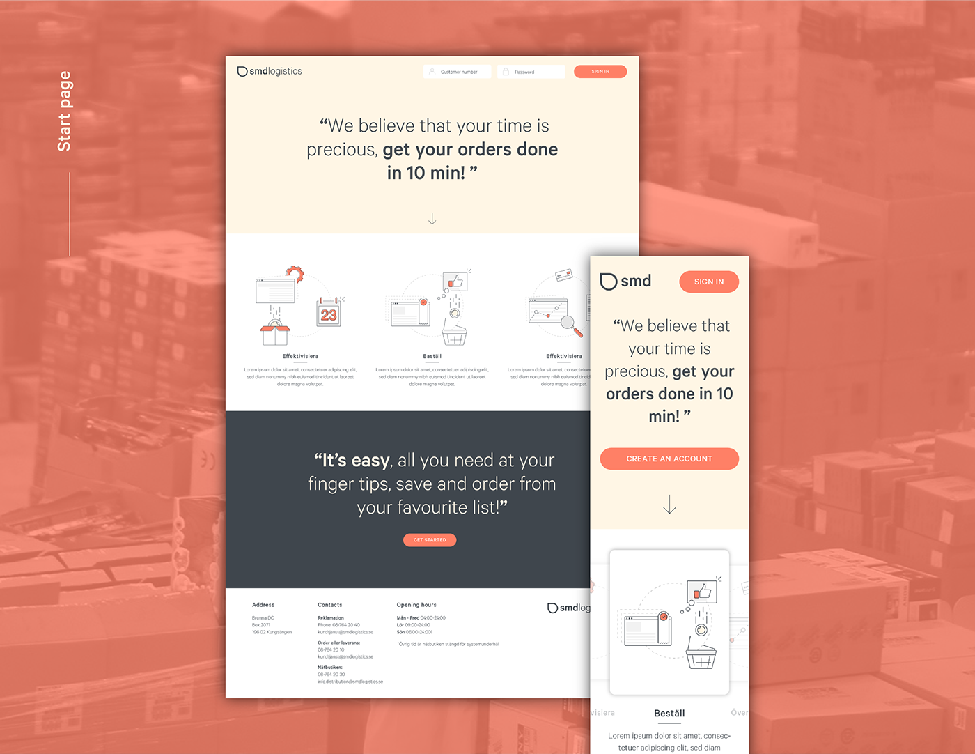
SMD Logistics is one of the biggest distributors of snus and tobacco products in the nordic countries. When we started working together they asked us to help them improve their digital services. Their goal was to strengthen and streamline their business to business operations. After a discovery phase we understood that they were not only in a need of a substantial improvement in their digital services, but they needed a stronger brand to create awareness among their customers and meet the expectaions of the millennials.
Logotype
The logotype reflects the brand values: accessibiliy and reliability. It is designed to be recognizable, flexible and adaptable to different media and formats. The square represents the delivery box and the circle the product. The two primitive shapes merged together form the characteristic SMD symbol, which communicates a sharp delivery.


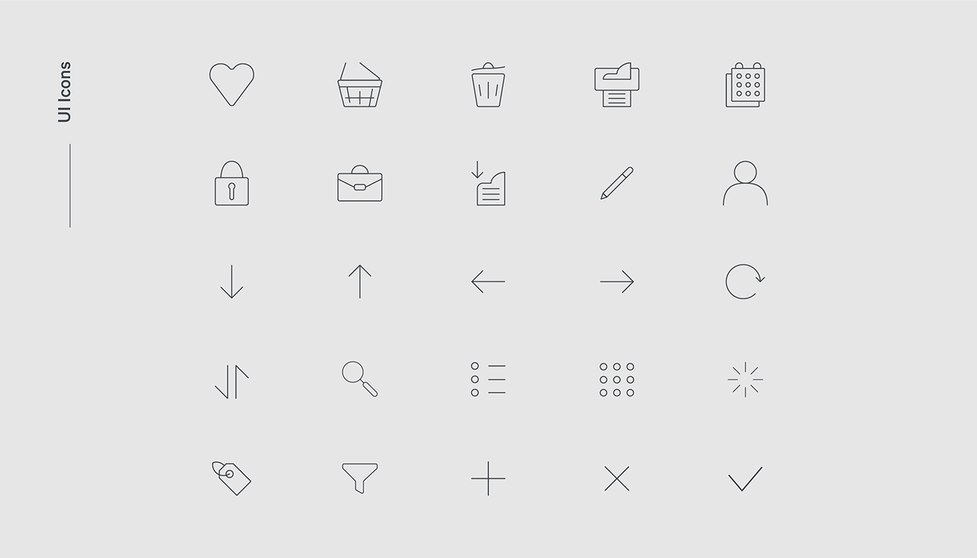
Iconography
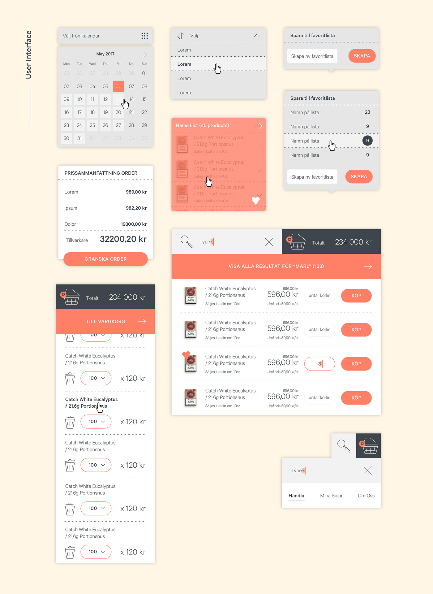
The identified user groups were not always familiar with the spoken language, that's why we favored a visual approach. We have created a custom library of icons with the intention to be relevant, clear and delightful. This library grows as the application grows but the icons are built on the same grid design to ensure consistency in style.

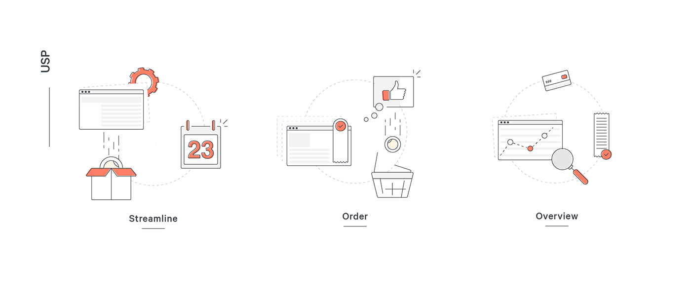
Web Application
The web application we created allows the retailers to streamline different tasks and operations. Despite the complexity of some of these flows, we designed the interface with a mobile first approach, without sacrificing any of the functionality on smaller devices.

Made with love and real team work
Thank you
for watching!


