


Hochelaga
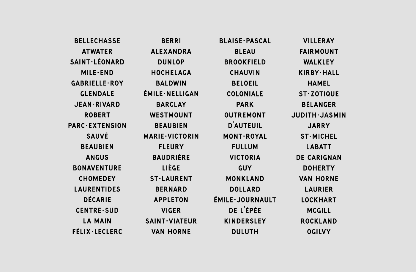
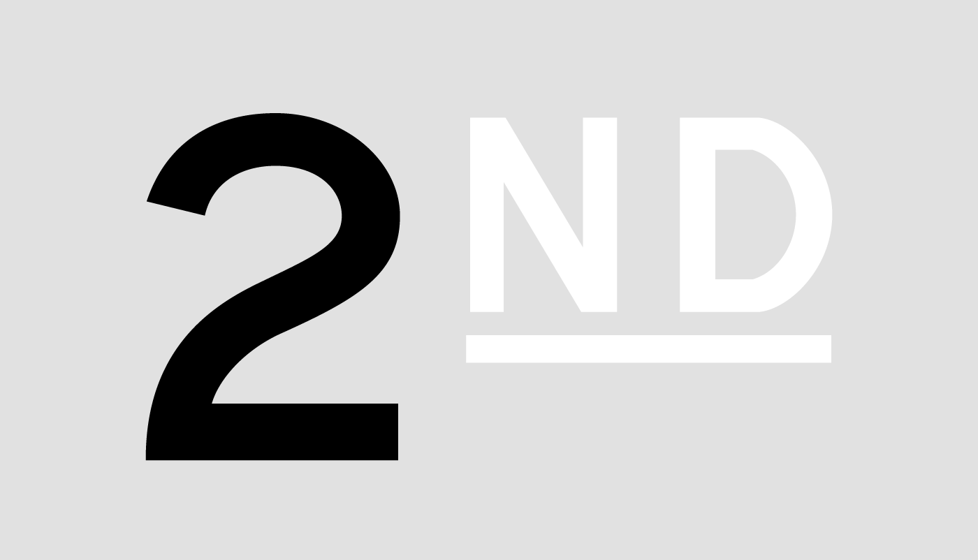
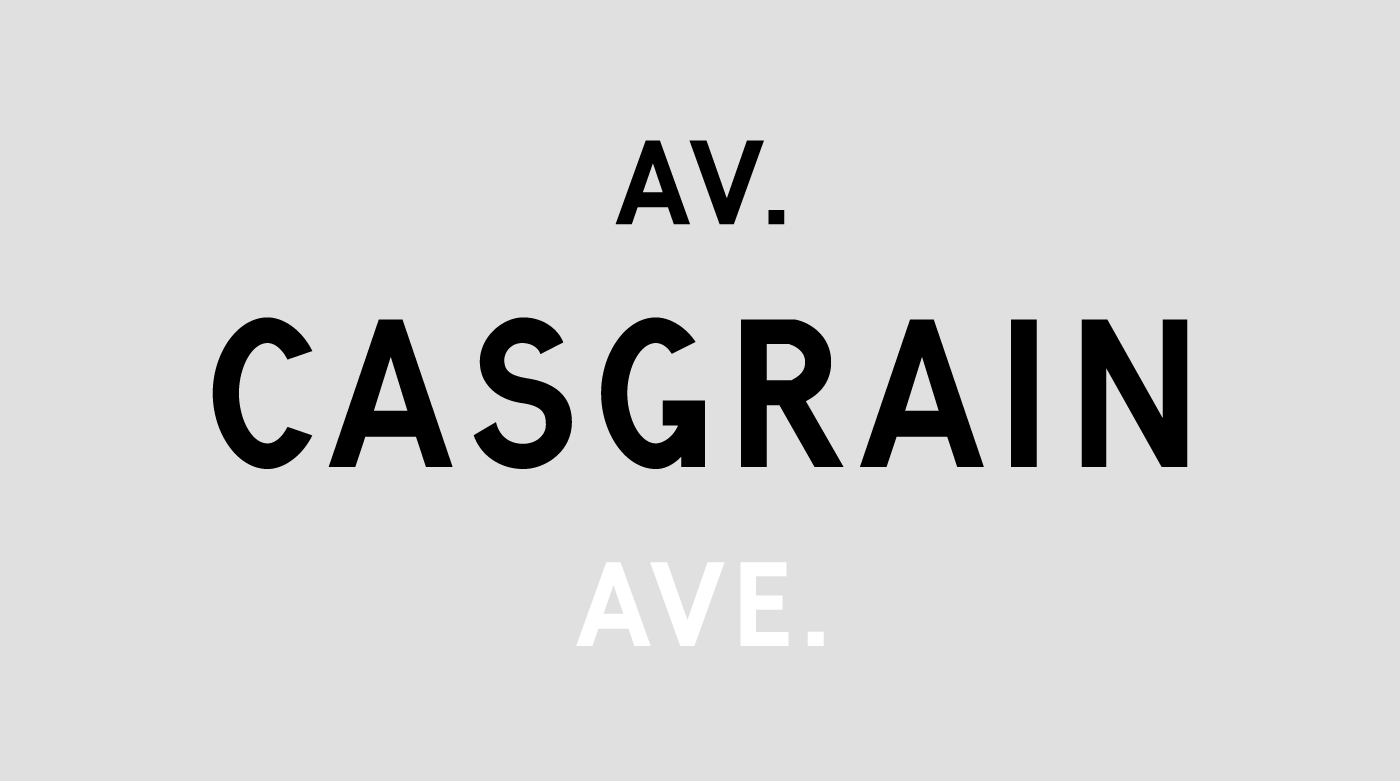
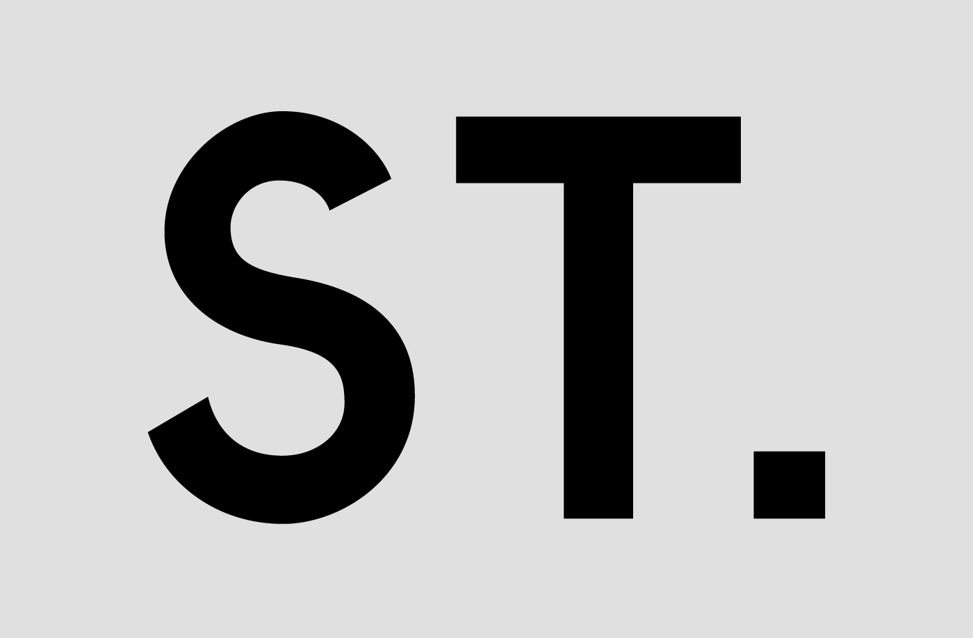
Hochelaga is a custom font drawn for the exhibition design of ABC:MTL presented at the Canadian Centre for Architecture in 2012–13. The exhibit was an open-source compendium of diverse strategies for understanding the city of Montreal, an urban abecedary with its evolving contents listed on the gallery walls. As the exhibition progressed, passed events were struck out with white stripes whose slight transparency betrayed the underlying messages. In the late 1970s, after the enactment of the Bill 101 (Charter of the French Language) in Quebec, a similar strategy was used by Montreal authorities in an effort to gallicize city street signs by whiting out english words like “Street,” “West,” etc. The vernacular shapes of Hochelaga refer directly to these old street signs, still standing in some neighbourhoods of the city.
—
Client: Canadian Centre for Architecture
Concept and documentation: Mathieu Dionne
Design: Feed & Étienne Aubert Bonn
Development: Coppers & Brasses
Design: Feed & Étienne Aubert Bonn
Development: Coppers & Brasses
© 2012-17, Studio Feed Inc.


