
KANS
- Premium Apparel Care and Organic Soap Artisans
Brand Identity, Application, Packaging, Editorial
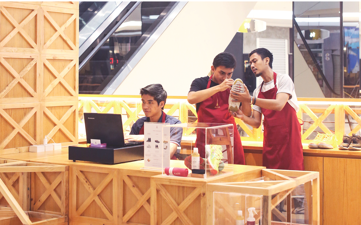
KANS is a premium apparel care and organic soap artisans based in Indonesia.
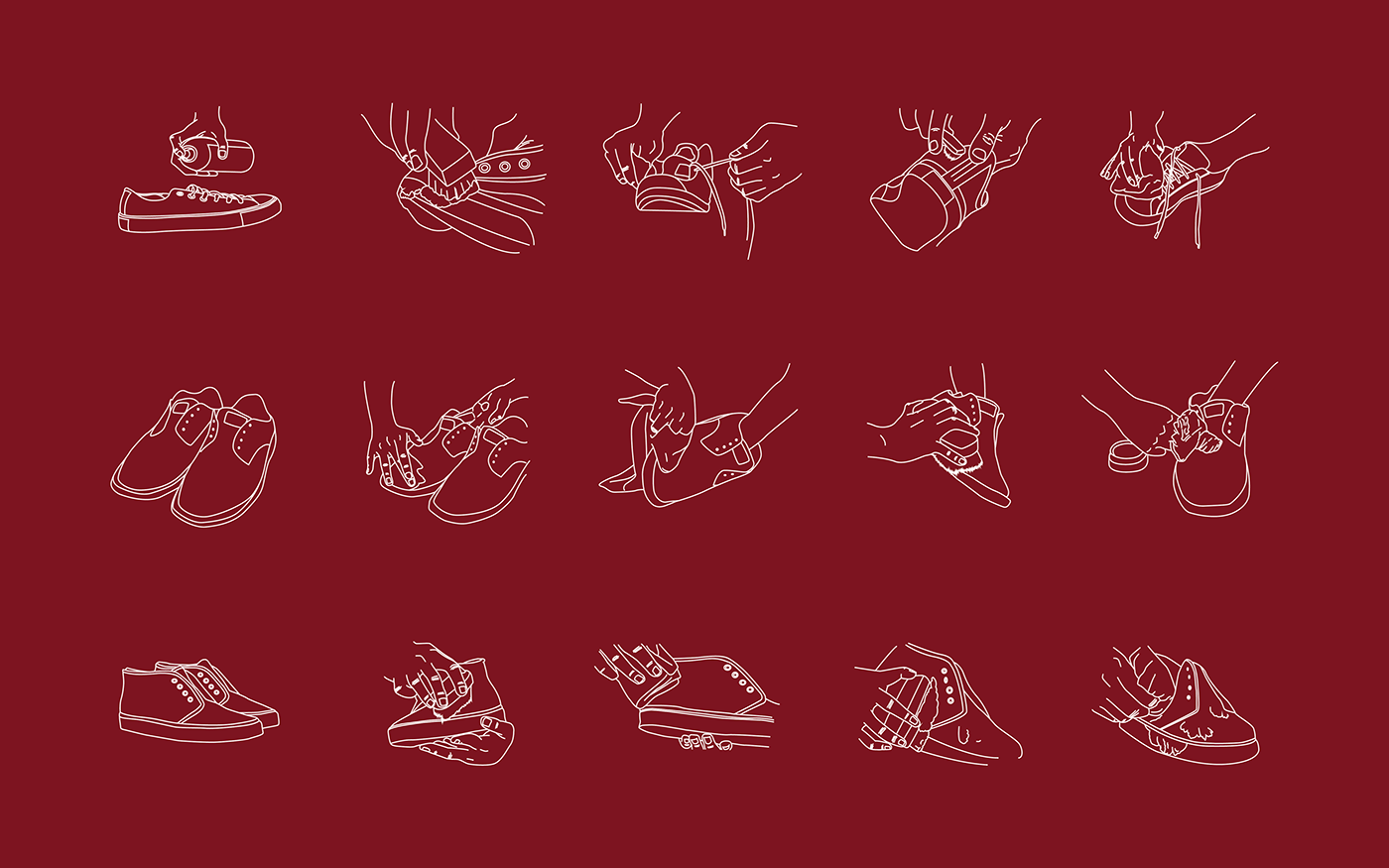
We believe that every product has its own story, built through travel or personal experience.This is how we appreciate the stories, and help our beloved customers to manage their dirty stuff, untreated stuff, whilst also support the “slow fashion movement” , by making the stuff possible to be reused again for years and feel like "brand new everyday”
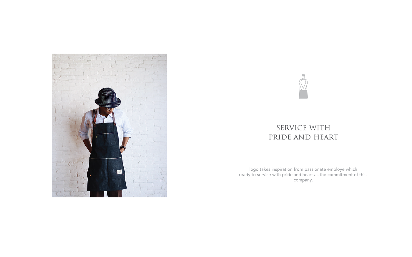
Fanrong studios began designing Kans brand identity by understanding the company, its culture and essentials philosophy, and its competitor. Service with passion and pride are essentials for this company, thats why we use deep red to become main color for Kans brand identity, whilst is selected because Kans's competitors mainly using blue as its identity, by using deep red color it will help consumen to recognise Kans. The Kans logo itself is inspired from simplifying the form of employees working wholeheartedly and for visualize as a premium brand, images are formed by using elegan font, minimalist layout with clean photography.