
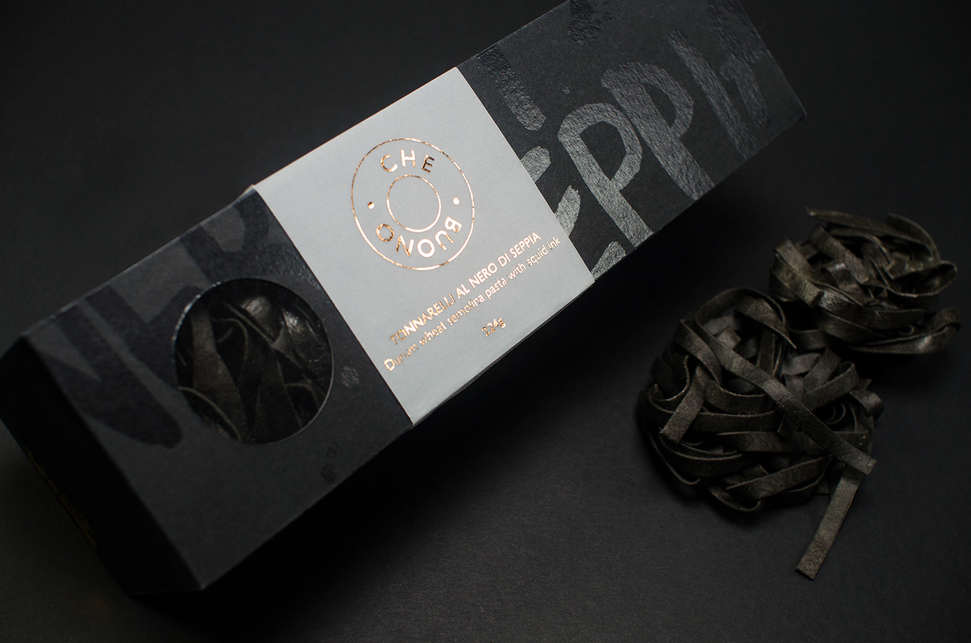
Nero di Seppia is squid or cuttlefish ink which is traditionally used as a pasta sauce, or rolled into the pasta dough, typically in coastal areas of Italy. I was inspired by this pasta after trying it in a Venetian restaurant on a trip to Italy and was drawn to its seductive dark colour.
My packaging aims to emphasise the inkiness of the pasta, by printing hand lettering and abstract marks in a spot gloss onto black uncoated card. A semi translucent band wraps around the packaging, featuring the logo which is printed with bronze foil to give a premium finish. A rounded window is cut out to mirror the shape of the logo and allows the viewer to preview the product before purchasing. The company name ‘Che Buono’ means ‘how delicious!’ in Italian and is printed in a sans-serif typeface contrasting against the graffiti like hand generated type on the box whilst retaining a contemporary style.
The oblong box was produced from a dieline featuring an easy to open lid and an auto-lock bottom providing strength for the weight of the
product contained inside. I expect that by packaging the pasta in premium packaging it will appeal to a modern audience, thus introducing
it to the western world.
product contained inside. I expect that by packaging the pasta in premium packaging it will appeal to a modern audience, thus introducing
it to the western world.


